One thing: could you post images using the [BigImg][/BigImg] tags, instead of the [img][/img] tags? This way your avatar & medals won't overlap with the image...
Just a nitpick, but I'd like to be able to see the whole map.
As for the map, it still looks a bit cluttered. I'm not sure how to fix it while preserving the graphical style (which does look great btw)... perhaps changing the font on the territory names, or making it a bit smaller...
Also, I would get rid of the space background and change it to something else. Perhaps something that fits the theme of the map a bit better... I'm sorry to say this, but I kinda agree with those who say that the space theme doesn't go well with the map. I'd rather you'd have stuck with the original style from the first draft... The graphics look great, but it has been said many times a map needs a theme. Here you have a historical map of historic events, with a space theme... It just seems to clash. It doesn't fit.
How about replacing the space background, replacing the moon on the legend, with something of an arabian theme? You know... sultans, djinnis in bottles, flying rugs... that sort of thing.
150 After Hijrah: The Battle for God
Moderator: Cartographers
Forum rules
Please read the Community Guidelines before posting.
Please read the Community Guidelines before posting.
-
natty dread

- Posts: 12876
- Joined: Fri Feb 08, 2008 8:58 pm
- Location: just plain fucked
-
Raskholnikov
- Posts: 638
- Joined: Fri Sep 11, 2009 3:40 pm
Re: 150 After Hijrah: The Battle for God
LOL ...women in burkhas, harems, eunuchs, camels, oil rigs, swirling dervishes, mad ayatollahs.. ya I get the picture. Nah, don't think so 
-
natty dread
- Posts: 12876
- Joined: Fri Feb 08, 2008 8:58 pm
- Location: just plain fucked
Re: 150 After Hijrah: The Battle for God
Well, it's your call, but I'd prefer you would try to think of something to replace the space background with. I quite like the map, and I wouldn't want it to get stuck in the draft room because of this...Raskholnikov wrote:LOL ...women in burkhas, harems, eunuchs, camels, oil rigs, swirling dervishes, mad ayatollahs.. ya I get the picture. Nah, don't think so

-
Raskholnikov
- Posts: 638
- Joined: Fri Sep 11, 2009 3:40 pm
Re: 150 After Hijrah: The Battle for God
I know what you're saying and appreciate the advice. Have you read the Note on the artistic direction at the top of the thread under the new map?
-
natty dread
- Posts: 12876
- Joined: Fri Feb 08, 2008 8:58 pm
- Location: just plain fucked
Re: 150 After Hijrah: The Battle for God
Yes, and I have also been following the discussion on this thread. I know what you're trying to accomplish with the style, and I appreciate the ideology behind it. However...
If the majority of the foundry people feel that the style is too confusing, and more important, if (when) the foundry staff decides the map won't move forward unless the majority of the foundry people will be satisfied, then you'll have to make compromises, or let the map be buried in the vast pile of other map ideas that failed to gather support... I have first hand experience, of having to (somewhat) sacrifice one's own vision in order to gather more solid support for the map. Because at that point, where you have to decide between making a compromise or letting the map die, I don't think it's a very difficult choice at all.
If the majority of the foundry people feel that the style is too confusing, and more important, if (when) the foundry staff decides the map won't move forward unless the majority of the foundry people will be satisfied, then you'll have to make compromises, or let the map be buried in the vast pile of other map ideas that failed to gather support... I have first hand experience, of having to (somewhat) sacrifice one's own vision in order to gather more solid support for the map. Because at that point, where you have to decide between making a compromise or letting the map die, I don't think it's a very difficult choice at all.

Re: 150 After Hijrah: The Battle for God
- Click image to enlarge.

looking back, it seems this is the concern among more than just me.
-
porkenbeans

- Posts: 2546
- Joined: Mon Sep 10, 2007 4:06 pm
Re: 150 After Hijrah: The Battle for God
To address the theme issue,
I realize that some of you are stuck within your preconception of things. You see an image of "space", and it immediately congers up the "future", as though space was not yet invented at this time. Please take off, the blinders. Allow yourself to see things with a more peripheral vision.
I have tried to explain my artistic vision for this project already, but I will try once again. Please first, try to have an open mind, and consider what I have to say, before you respond. Then, I will gladly debate this with anyone that cares to do so.
First, we all know that religion is a very touchy subject to approach. So, right off the top, I felt that this map should be as impartial and unbiased as possible. Try to step back from the subject if you will, and view it from a neutral position. Well, this view from space is doing just that. It is removing the viewer from inside the subject, and allowing him or her, to see things from outside of the box. As Rask so elegantly put it, It is the view that God would have had at the time. Way up high looking down, and witnessing mankind's struggle to prove, who's God was King.
I am sad to say, that we have not changed much since then. This silly fight has evolved, but we have not. It is in fact, the #1 issue that faces the world today. We still murder each other every day in the name of Religion. We create heroes on both sides so as to recruit the next generation of soldiers to prosecute this continuing "battle for God".
This view from space is an attempt to let people see just how silly all of this really is. How we are like a bunch of ants, that spend our time and effort on inconsequential issues, that from this view outside the box, allows us to see.
You say, well this space theme is NOT coherent with the subject. I say, it is exactly what is needed to approach the subject of, ... "the battle for God".
I realize that some of you are stuck within your preconception of things. You see an image of "space", and it immediately congers up the "future", as though space was not yet invented at this time. Please take off, the blinders. Allow yourself to see things with a more peripheral vision.
I have tried to explain my artistic vision for this project already, but I will try once again. Please first, try to have an open mind, and consider what I have to say, before you respond. Then, I will gladly debate this with anyone that cares to do so.
First, we all know that religion is a very touchy subject to approach. So, right off the top, I felt that this map should be as impartial and unbiased as possible. Try to step back from the subject if you will, and view it from a neutral position. Well, this view from space is doing just that. It is removing the viewer from inside the subject, and allowing him or her, to see things from outside of the box. As Rask so elegantly put it, It is the view that God would have had at the time. Way up high looking down, and witnessing mankind's struggle to prove, who's God was King.
I am sad to say, that we have not changed much since then. This silly fight has evolved, but we have not. It is in fact, the #1 issue that faces the world today. We still murder each other every day in the name of Religion. We create heroes on both sides so as to recruit the next generation of soldiers to prosecute this continuing "battle for God".
This view from space is an attempt to let people see just how silly all of this really is. How we are like a bunch of ants, that spend our time and effort on inconsequential issues, that from this view outside the box, allows us to see.
You say, well this space theme is NOT coherent with the subject. I say, it is exactly what is needed to approach the subject of, ... "the battle for God".
Last edited by porkenbeans on Mon Nov 23, 2009 12:41 pm, edited 1 time in total.

-
porkenbeans
- Posts: 2546
- Joined: Mon Sep 10, 2007 4:06 pm
Re: 150 After Hijrah: The Battle for God
Thank you RJ, Yes I have also been concerned with the very same questions that you are posing. And oh, I am so glad to hear some thoughtful dialog seeping into this conversation. My next update will address this issue. From the looks of my solution, I think it will be worked out fine.RjBeals wrote:cool looking map, like a chinese checkers game board sort of. Nice icons also. But personally, It's very hard to see what connects. The connecting lines are too muted in the background. It looks like a sea of icons, and without BOB I would have no idea where to attack. Especialy along the sides of the map, where the bg is darker.
- Click image to enlarge.
looking back, it seems this is the concern among more than just me.
Please stay tuned...
-
porkenbeans
- Posts: 2546
- Joined: Mon Sep 10, 2007 4:06 pm
Re: 150 After Hijrah: The Battle for God
Please check my layout. If I have made any mistakes, will you show as you did before with the red ink corrections.Raskholnikov wrote:Are you sure? Did you check the map at the top of this post? B5 is a battle, not even a city.
-
porkenbeans
- Posts: 2546
- Joined: Mon Sep 10, 2007 4:06 pm
Re: 150 After Hijrah: The Battle for God
Box of chocolates anyone ? 
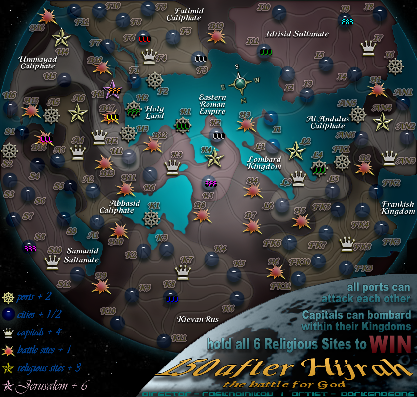
OK I have colored the land. I usually do not like to do that, but on this map, with all of its territs, I think it is necessary. Now you can very easily with a glance, tell whats going on. The battle areas, act as a kind of buffer between Kingdoms. You can not attack from one Kingdom to another without going threw a battle zone. Rask has certainly thought out this game play very well. The colored land helps to show this fact.
I hope that all agree with this assessment.
OK I have colored the land. I usually do not like to do that, but on this map, with all of its territs, I think it is necessary. Now you can very easily with a glance, tell whats going on. The battle areas, act as a kind of buffer between Kingdoms. You can not attack from one Kingdom to another without going threw a battle zone. Rask has certainly thought out this game play very well. The colored land helps to show this fact.
I hope that all agree with this assessment.
- Click image to enlarge.
-
porkenbeans
- Posts: 2546
- Joined: Mon Sep 10, 2007 4:06 pm
Re: 150 After Hijrah: The Battle for God
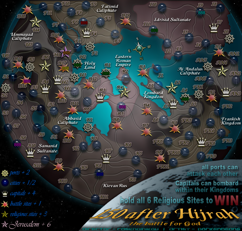
Here is V7b with the opacity turned up a bit on the roads. Which do y'all prefer ?
- Click image to enlarge.
Re: 150 After Hijrah: The Battle for God
i prefer the 2nd one - much better. Since at first glance, this reminds me of a board game, why not take it one step further and put a low hard bevel on the land regions, giving them the apearance of a second layer? Might look cool.
-
porkenbeans
- Posts: 2546
- Joined: Mon Sep 10, 2007 4:06 pm
Re: 150 After Hijrah: The Battle for God
Do you mean give the kingdoms a relief ? I went out of my way when coloring and shading them, to not give them relief. I will try a version to see if it is better that way or not.RjBeals wrote:i prefer the 2nd one - much better. Since at first glance, this reminds me of a board game, why not take it one step further and put a low hard bevel on the land regions, giving them the appearance of a second layer? Might look cool.
RJ, you do not know how grateful I am for your interest and help. Contrary to some peoples misconceptions, I am very open to CONstructive ideas from experienced map makers like yourself.
-
Raskholnikov
- Posts: 638
- Joined: Fri Sep 11, 2009 3:40 pm
Re: 150 After Hijrah: The Battle for God
Pork,
Take that dark color and use it for roads to make them stand out - don't use it to color the map, I don't think it adds much and in makes it look more complex. Let's try to solve the roads for now.
Thanks,
R
Take that dark color and use it for roads to make them stand out - don't use it to color the map, I don't think it adds much and in makes it look more complex. Let's try to solve the roads for now.
Thanks,
R
-
WidowMakers
- Posts: 2774
- Joined: Mon Nov 20, 2006 9:25 am
- Gender: Male
- Location: Detroit, MI
Re: 150 After Hijrah: The Battle for God
I tend to agree with several of the other posters. The map look does not seem to convey the feel or theme you have said you wish to portray.
Here are some images of early maps. There is not much color. They look old but your map does not.
I would suggest, if you really wish to make a map fit the period you are designing to, that you rework the map to look ancient. http://en.wikipedia.org/wiki/Early_world_maps
When I look at this map:
Suggestions:
Just trying to save some work. Who knows, the small map might raise issues that completely change the map (due to size limitations).
Why waste time on the large is the small will not work?
Here is a quick map I worked up to show several of the tert changes (cities, and battles) plus a completely different GFX look that , to me, is much more representative of an ancient map from this era. I did not spend much time on this. It is not to represent the layout of your map in any way. It is merely to show my vision of the era of map and sum GFX ques (cities, water, coastline, roads, battles, text, grunge, etc)
This does NOT look like an ancient map. When I think of ancient map of the Middle East I don't see stars. I don't see the moon (is that the moon in the legend?)Raskholnikov wrote:I would like to propose a map depicting the history of the Islamic Caliphate at its height, in 800 AD.
The artistic direction I'd like to take this is to re-create the famous early Islamic map of the Middle East and Europe drawn from an Arabic view of the world
Here are some images of early maps. There is not much color. They look old but your map does not.
I would suggest, if you really wish to make a map fit the period you are designing to, that you rework the map to look ancient. http://en.wikipedia.org/wiki/Early_world_maps
When I look at this map:
- -I have no clue where it is in the world. I may eventually but right now it is very confusing
-I have no idea that it is an ancient map. It looks new and clean and fresh. Those are not the words I would want people to use to describe a thing I am designing to be old and ancient.
Suggestions:
- 1) Make the map look old and feel ancient. Even if the material texture (paper, papyrus, stone, animal skin, whatever) is not 100% accurate to teh time period, it will look more authentic than what you currently have as an old map. Plus since the bonus regions are not based on color, the older black on canvas look of a map is perfect. Old maps look awesome but they are harder to use on CC since most bonus groups rely on color. You have an idea here that can use that to an advantage.
2) The font is hard to read. Instead of a dark glow around a light letter, try a dark letter with a slightly lighter glow. It is easier to read and helps the text stand out. Black text (less bold) on canvas texture look great.
3) The marbles are bad IMHO. They do not represent cities. Why not have a little town for each with the 88 in the middle
4) The battle is also not a good symbol for the reasons already described. What if you used a sword and shield or two crossed swords instead?
5) The steering wheels fit the idea of a port but they might be too big and bright. Again the overall look of the map does not seem fit the theme.
Just trying to save some work. Who knows, the small map might raise issues that completely change the map (due to size limitations).
Why waste time on the large is the small will not work?
Here is a quick map I worked up to show several of the tert changes (cities, and battles) plus a completely different GFX look that , to me, is much more representative of an ancient map from this era. I did not spend much time on this. It is not to represent the layout of your map in any way. It is merely to show my vision of the era of map and sum GFX ques (cities, water, coastline, roads, battles, text, grunge, etc)
- Click image to enlarge.


-
natty dread
- Posts: 12876
- Joined: Fri Feb 08, 2008 8:58 pm
- Location: just plain fucked
Re: 150 After Hijrah: The Battle for God
I respectfully disagree. For my first map, I started from small, and in the middle of development I had to redo all the graphics from scratch, to get a decent large version. It's a lot easier to shrink a large image to small size without losing image quality, than the other way around. When you enlarge an image, there is always pixelation. And that's not good.I would again suggest that the SMALL map be worked on first. Just because ti all fits on the large, does not mean anything for the small.
If you are worried about things not fitting on small version, you can always view your large version at 75% zoom as a test. If everything looks ok at 75%, then you're OK.
-
ghirrindin

- Posts: 129
- Joined: Sat Jan 12, 2008 9:34 pm
- Location: Urbana, IL
Re: 150 After Hijrah: The Battle for God
Oh man, what happened to this project? What started out as an emulation of an eleventh century map has turned into some sort of bizarre science fiction looking space battle. I don't want to be a crank, but I don't think that this theme works at all. I would expect that by the way you have the title "150 after Hijrah" laid out in the corner, it should begin scrolling up with a few paragraphs describing the epic struggle trailing behind it.
It's also sort of ironic because the original map that you were working off of centered North Africa and the Arabian peninsula while Europe lurked on its edges. You've maintained the correct perspective -- south facing up -- but now Europe occupies the majority of the space and the very center of the map. I believe this conflicts with your original vision. I think you should invoke that original map more and sketch, skew, and distort Europe, really placing it on the margins. Less emphasis on accurate geographic proportionality and more on stylistic representation.
I liked the original idea, but these changes...
But those are only my two cents. Take what you will away from my comments.
It's also sort of ironic because the original map that you were working off of centered North Africa and the Arabian peninsula while Europe lurked on its edges. You've maintained the correct perspective -- south facing up -- but now Europe occupies the majority of the space and the very center of the map. I believe this conflicts with your original vision. I think you should invoke that original map more and sketch, skew, and distort Europe, really placing it on the margins. Less emphasis on accurate geographic proportionality and more on stylistic representation.
I liked the original idea, but these changes...
But those are only my two cents. Take what you will away from my comments.

-
captainwalrus
- Posts: 1018
- Joined: Sun Nov 11, 2007 3:19 pm
- Location: Finnmark
Re: 150 After Hijrah: The Battle for God
You should start on the small, and once you know if fits, maybe around update 3-4, you will have to move to the large. Large is best to work on, but you don't want to do everything, and have the small one not fit.natty_dread wrote:I respectfully disagree. For my first map, I started from small, and in the middle of development I had to redo all the graphics from scratch, to get a decent large version. It's a lot easier to shrink a large image to small size without losing image quality, than the other way around. When you enlarge an image, there is always pixelation. And that's not good.I would again suggest that the SMALL map be worked on first. Just because ti all fits on the large, does not mean anything for the small.
If you are worried about things not fitting on small version, you can always view your large version at 75% zoom as a test. If everything looks ok at 75%, then you're OK.
~ CaptainWalrus
-
natty dread
- Posts: 12876
- Joined: Fri Feb 08, 2008 8:58 pm
- Location: just plain fucked
Re: 150 After Hijrah: The Battle for God
You're missing a point here... Why start from small, when you can just as easily view your large image at 75% zoom to ensure everything will fit in the small version?
-
WidowMakers
- Posts: 2774
- Joined: Mon Nov 20, 2006 9:25 am
- Gender: Male
- Location: Detroit, MI
Re: 150 After Hijrah: The Battle for God
Well I have started from the small map on all my projects. You just need to know how to build the map right to make it work. Plus I did not say complete the map 100% then make the LARGE. I said make sure the small works.natty_dread wrote:I respectfully disagree. For my first map, I started from small, and in the middle of development I had to redo all the graphics from scratch, to get a decent large version. It's a lot easier to shrink a large image to small size without losing image quality, than the other way around. When you enlarge an image, there is always pixelation. And that's not good.I would again suggest that the SMALL map be worked on first. Just because ti all fits on the large, does not mean anything for the small.
If you are worried about things not fitting on small version, you can always view your large version at 75% zoom as a test. If everything looks ok at 75%, then you're OK.
There are many potential issues with text, roads, icons and overlapping things on the small map. Plus legibility could also be an issue. I am not saying they need to do it. I am just saying that from experience, it works the best for me and has prevented many issues from coming up. Poker club, Arms race, Draknor, Conquerman, The HIVE, Montreal, etc all started small to make the stuff fit.
Not everything is the same. The 88's do not scale. If the font they used does not scale well either (i.e. it is hard to read when shrunk) it might need to be kept larger. Then with non-scaling 88's and adjusted text, the borders, names and other vital info might not fit. Better to be safe than sorry.natty_dread wrote:You're missing a point here... Why start from small, when you can just as easily view your large image at 75% zoom to ensure everything will fit in the small version?
There is a lot on this map. There could be space issues. that is all I am saying.
WM
-
natty dread
- Posts: 12876
- Joined: Fri Feb 08, 2008 8:58 pm
- Location: just plain fucked
Re: 150 After Hijrah: The Battle for God
Well I'm not going to argue with you. Obviously whatever works for you, you should use. The same as everyone else.
I start from large, then zoom to 75% to see if everything looks good at small. Sometimes I even use army numbers that are enlarged 133% to see that they all fit in the small version. If there's something that doesn't look good in small, ie. fonts being too small, I'll take that in consideration when designing the large map.
I start from large, then zoom to 75% to see if everything looks good at small. Sometimes I even use army numbers that are enlarged 133% to see that they all fit in the small version. If there's something that doesn't look good in small, ie. fonts being too small, I'll take that in consideration when designing the large map.
-
porkenbeans
- Posts: 2546
- Joined: Mon Sep 10, 2007 4:06 pm
Re: 150 After Hijrah: The Battle for God
WM,WidowMakers wrote:Well I have started from the small map on all my projects. You just need to know how to build the map right to make it work. Plus I did not say complete the map 100% then make the LARGE. I said make sure the small works.natty_dread wrote:I respectfully disagree. For my first map, I started from small, and in the middle of development I had to redo all the graphics from scratch, to get a decent large version. It's a lot easier to shrink a large image to small size without losing image quality, than the other way around. When you enlarge an image, there is always pixelation. And that's not good.I would again suggest that the SMALL map be worked on first. Just because ti all fits on the large, does not mean anything for the small.
If you are worried about things not fitting on small version, you can always view your large version at 75% zoom as a test. If everything looks ok at 75%, then you're OK.
There are many potential issues with text, roads, icons and overlapping things on the small map. Plus legibility could also be an issue. I am not saying they need to do it. I am just saying that from experience, it works the best for me and has prevented many issues from coming up. Poker club, Arms race, Draknor, Conquerman, The HIVE, Montreal, etc all started small to make the stuff fit.
Not everything is the same. The 88's do not scale. If the font they used does not scale well either (i.e. it is hard to read when shrunk) it might need to be kept larger. Then with non-scaling 88's and adjusted text, the borders, names and other vital info might not fit. Better to be safe than sorry.natty_dread wrote:You're missing a point here... Why start from small, when you can just as easily view your large image at 75% zoom to ensure everything will fit in the small version?
There is a lot on this map. There could be space issues. that is all I am saying.
WM
While I respect your advice, I do not believe that you have familiarized yourself with this project thoroughly. If you want and have the time, maybe you could go back to the beginning and read the whole thread. Virtually all of your concerns have been addressed and worked out already. I was not involved in this project from the start. As a matter of fact, it was one of my suggestions about the "outer Space" view that brought me on board.
Another old parchment map would be cool, but that is not the direction this project has taken. I have tried to explain the reasons for the space view. If there is something that you do not understand about my explanation, please ask me. I am happy to discuses it if you want.
About working on the small first. I respectively have to disagree with you on this one. As natty explained. just view it at a smaller scale for any concerns that you have about it translating to the small version.
I was told this by a friend of mine that is a graphic artist by trade. Your image will always loose detail when you scale up. But NOT so, the other way around. Therefor, you would be wise to always work on your large version first. You just need to keep in mind the various concerns that you correctly stated before. For example, when you are deciding your text style and size, make sure at that time, to check if it works on the small version. It may be a pain, but it is much less of a pain to start from scratch after you have finished your small version, and then find that it looks like crap when you try to scale it up.
I have already checked all of the issues that you have mentioned along the way as I built this map. Again if you go back and read the entire thread you would have known this.
About your concerns, Yes, everything will be alright for the small version.
Also you have given advice about how to make the text stand out. Your advice is dead on. But again, if you read the thread, you will find that this issue has already been dealt with and worked out. You see, there is just so much text that it is overpowering when made "to stand out". My solution is what you see here. For more details on this, please go back and read the thread.
I wish that you would come around to the "space view". It really is an interesting perspective on the subject.

Re: 150 After Hijrah: The Battle for God
Why this map is upside down? I.E. the north is where the south is suppose to be?


Re: 150 After Hijrah: The Battle for God
I have just skimmed (ie not read in great detail) this thread - and it appears that the biggest criticism of the map is the lack of thematic integrity.
Personally, I would take some time to address this concern.
Personally, I would take some time to address this concern.

PB: 2661 | He's blue... If he were green he would die | No mod would be stupid enough to do that
-
Raskholnikov
- Posts: 638
- Joined: Fri Sep 11, 2009 3:40 pm
Re: 150 After Hijrah: The Battle for God
Absolutely. In fact, this project started exactly as some are asking now - based on a islamic - motives designed map (see above). Comments were made that the attempt was "pretty atrocious", at which point porkenbeans came up with the idea of using the "space-view", which we both agreed could really bring something unique to the project by challenging a lot of assumptions, both about map-making here and more generally, about the way we look at history, culture, ourselves.
So for me, as a relative newcomer to the Foundry, this is a very interesting point: how do we decide what is appropriate? As long as the map and the game-play reach Foundry standards in terms of clarity, playability, etc., who decides on tyhe very subjective notion of appropriate theme? Is it a question of - getting "popular support"? In which case, it becomes extremely difficult to come up with something truly different and innovative. Or is it by making a clear and reasonable argument in favor of one's vision, which must be given a chance as long as the objective Foundry criteria are met?
In other words, does the Foundry make a difference in its decision-making process between objective and subjective factors? And how specifically does it deal with each?
Clarifying these issues would, I think, be helpful not just for this project but for many others (I'm thinking Proteins here, but not only...)
So for me, as a relative newcomer to the Foundry, this is a very interesting point: how do we decide what is appropriate? As long as the map and the game-play reach Foundry standards in terms of clarity, playability, etc., who decides on tyhe very subjective notion of appropriate theme? Is it a question of - getting "popular support"? In which case, it becomes extremely difficult to come up with something truly different and innovative. Or is it by making a clear and reasonable argument in favor of one's vision, which must be given a chance as long as the objective Foundry criteria are met?
In other words, does the Foundry make a difference in its decision-making process between objective and subjective factors? And how specifically does it deal with each?
Clarifying these issues would, I think, be helpful not just for this project but for many others (I'm thinking Proteins here, but not only...)