Japan - 日本 - Quenched
Moderator: Cartographers
Forum rules
Please read the Community Guidelines before posting.
Please read the Community Guidelines before posting.
-
natty dread

- Posts: 12876
- Joined: Fri Feb 08, 2008 8:58 pm
- Location: just plain fucked
Re: Japan - 日本 (D, Gp) V8.3 (Upd 10-8) pg25 Domo Arigato MrBenn!
I don't like the newest version that much, the borders look a bit pixelated that way. Maybe you could apply some subtle antialias on them...


Re: Japan - 日本 (D, Gp) V8.3 (Upd 10-8) pg25 Domo Arigato MrBenn!
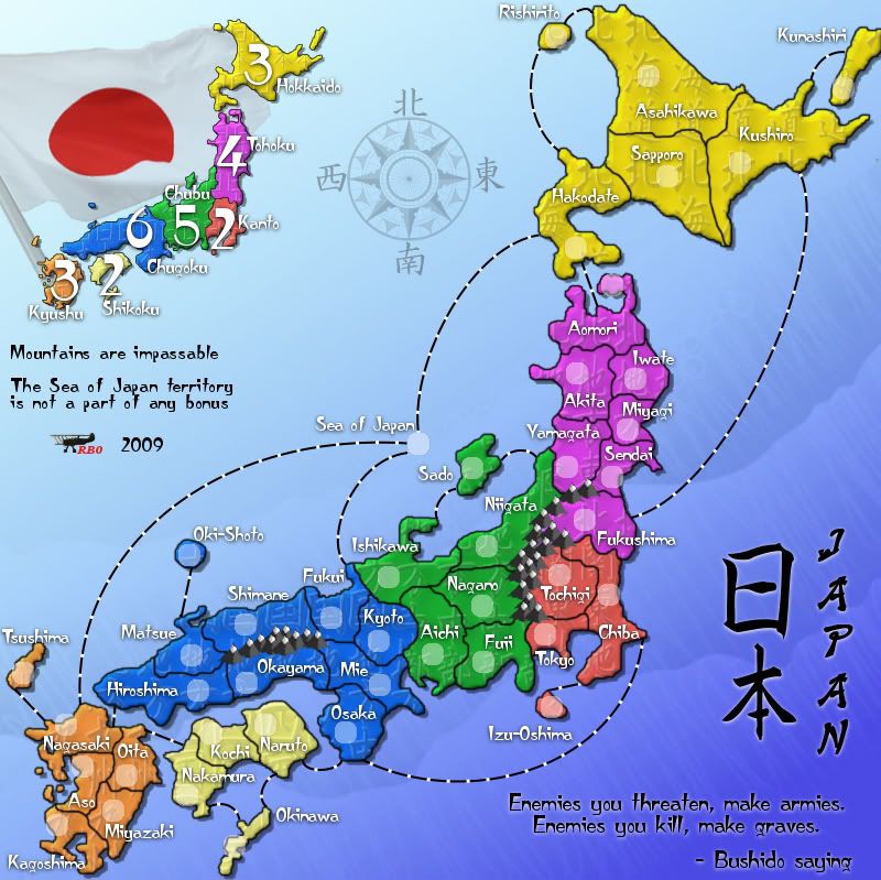
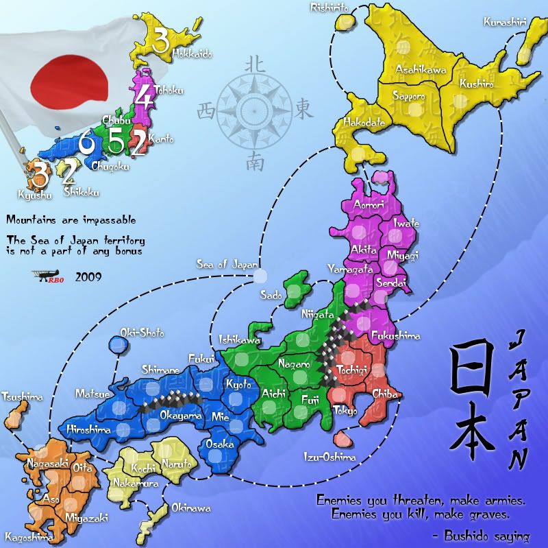
Added some blur:
8.5
8.4
8.5
- Click image to enlarge.
- Click image to enlarge.


-
natty dread
- Posts: 12876
- Joined: Fri Feb 08, 2008 8:58 pm
- Location: just plain fucked

Re: Japan - 日本 (D, Gp) V8.3 (Upd 10-8) pg25 Domo Arigato MrBenn!
I don't agree. The border is just as jaggy as it was, but manages to be blurry at the same time. Stick with 8.4, or spend a few days rounding out the corners which make the jaggies objectionable. It's totally your call 
-
natty dread
- Posts: 12876
- Joined: Fri Feb 08, 2008 8:58 pm
- Location: just plain fucked
Re: Japan - 日本 (D, Gp) V8.3 (Upd 10-8) pg25 Domo Arigato MrBenn!
Well now that you mention it, perhaps it could use a bit more antialias. It's going to be a whole lot of nitty-bitty pixel work...
Re: Japan - 日本 (D, Gp) V8.3 (Upd 10-8) pg25 Domo Arigato MrBenn!
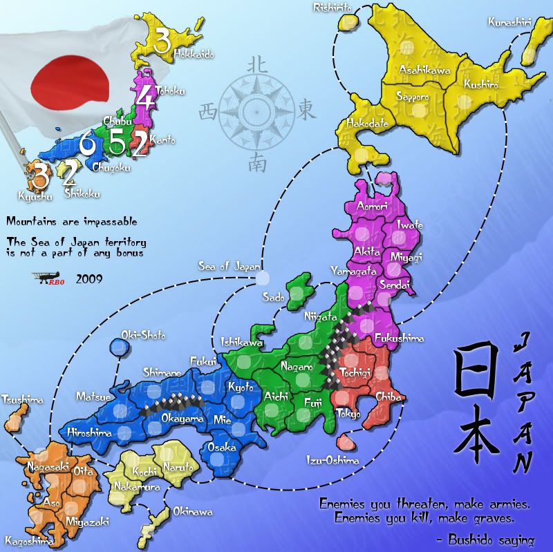
Borders redrawn again:
8.6
8.5
8.4
8.6
- Click image to enlarge.
- Click image to enlarge.
- Click image to enlarge.
Re: Japan - 日本 (D, Gp) V8.3 (Upd 10-8) pg25 Domo Arigato MrBenn!
I almost accused you of simply copying 8.4 to 8.6 until I managed to get them up side-by-side. I still prefer 8.4. I mean, really, many times borders are defined by straight lines and angles. Keep in mind, surveyors like straight lines, and politicians cannot cope with the math to define a curve. That being said, the differences from 8.4 to 8.6 are not as annoying as those from 8.4 to 8.5 were to me, so if there is strong support for 8.6, I would not oppose it.
Re: Japan - 日本 (D, Gp) V8.3 (Upd 10-8) pg25 Domo Arigato MrBenn!
Yeah... 8.4 and 8.6 are drawn using 2 of the border tutorials from the post MrBenn suggested: How to draw smooth borders
8.4 is done with the suggestions of post one, by Lone.prophet
8.5 is 8.4 blurred
8.6 is done with the suggestions of post two, by RjBeals (via MrBenn)
8.4 is done with the suggestions of post one, by Lone.prophet
8.5 is 8.4 blurred
8.6 is done with the suggestions of post two, by RjBeals (via MrBenn)
-
natty dread
- Posts: 12876
- Joined: Fri Feb 08, 2008 8:58 pm
- Location: just plain fucked
Re: Japan - 日本 (D, Gp) V8.3 (Upd 10-8) pg25 Domo Arigato MrBenn!
I think 8.6 looks better than both 8.4 and 8.5.
Re: Japan - 日本 (D, Gp) V8.3 (Upd 10-22)pg26 Borders smooth -Done
Anyone else have a problem with the borders now?
-
lt_oddball

- Posts: 364
- Joined: Mon Mar 05, 2007 11:17 am
- Location: Fortress Europe
Re: Japan - 日本 (D, Gp) V8.3 (Upd 10-8) pg25 Domo Arigato MrBenn!
ender516 wrote: spend a few days rounding out the corners which make the jaggies objectionable. It's totally your call
For god's sake..isn't this enough ?
Any other nittygritty pixely issues should be addressed in the next upgrade some time next year after the map has been played on extensively.
Come on !
Launch the <beta>map to play!
Barbarus hic ego sum, quia non intellegor ulli.
Re: Japan - 日本 (D, Gp) V8.3 (Upd 10-8) pg25 Domo Arigato MrBenn!
I quite agree. I hope everyone understood that my suggestion above was facetious, hence thelt_oddball wrote:ender516 wrote: spend a few days rounding out the corners which make the jaggies objectionable. It's totally your call
For god's sake..isn't this enough ?
Any other nittygritty pixely issues should be addressed in the next upgrade some time next year after the map has been played on extensively.
Come on !
Launch the <beta>map to play!
. It was just my way of saying stick with 8.4. But as I have already said, I am okay with 8.6 as well. On to the graphics stamp, then XML and Beta! Excelsior!Re: Japan - 日本 (D, Gp) V8.3 (Upd 10-22)pg26 Graphics Stamp??
Thanks guys, it's coming, hopefully a little sooner than later, but it's coming.

Re: Japan - 日本 (D, Gp) V8.3 (Upd 10-22)pg26 Graphics Stamp??
I think the Japanese text on the land makes it look like tire tread. It doesn't work. This map just doesn't have that classic japan feel to me. The colors are too vibrant. The water too blue. Even the fonts don't look right. I see you're stickied and almost to final forge, so I'm sure this map is bound to move on through. I guess I would suggest softer colors on parchment with some Japanese bamboo bordering the map, maybe some other culture mixed in also.
Sorry.
Sorry.

Re: Japan - 日本 (D, Gp) V8.3 (Upd 10-22)pg26 Graphics Stamp??
What he said. This map has a host of design problems beyond what RJ mentioned. I would get into if you really want me to.RjBeals wrote:I think the Japanese text on the land makes it look like tire tread. It doesn't work. This map just doesn't have that classic japan feel to me. The colors are too vibrant. The water too blue. Even the fonts don't look right. I see you're stickied and almost to final forge, so I'm sure this map is bound to move on through. I guess I would suggest softer colors on parchment with some Japanese bamboo bordering the map, maybe some other culture mixed in also.
Sorry.
Re: Japan - 日本 (D, Gp) V8.3 (Upd 10-22)pg26 Graphics Stamp??
Earlier there was more cultural additions, several things tried. What perhaps would you suggest? I can add some bamboo bordering, it'd fit with the bottom corner perhaps. The colors up till now have been something most people have liked about the map, so for now that will stay the same unless a larger consensus comes up against the colors. Parchment instead of water? I'm not really going for a old map look.RjBeals wrote:I think the Japanese text on the land makes it look like tire tread. It doesn't work. This map just doesn't have that classic japan feel to me. The colors are too vibrant. The water too blue. Even the fonts don't look right. I see you're stickied and almost to final forge, so I'm sure this map is bound to move on through. I guess I would suggest softer colors on parchment with some Japanese bamboo bordering the map, maybe some other culture mixed in also.
Sorry.
Go for it.mibi wrote:What he said. This map has a host of design problems beyond what RJ mentioned. I would get into if you really want me to.

Re: Japan - 日本 (D, Gp) V8.3 (Upd 10-22)pg26 Graphics Stamp??
I wouldn't change much of it Red. It definitely has a Japanese art style to it. I have a Japanese silk painting that has very vibrant colors. Your map reminds me of it.
This post was made by jefjef who should be on your ignore list.

drunkmonkey wrote:I'm filing a C&A report right now. Its nice because they have a drop-down for "jefjef".
Re: Japan - 日本 (D, Gp) V8.3 (Upd 10-22)pg26 Graphics Stamp??
I'm gonna nix the bamboo too, everything I've tried to put into the map as it stands doesn't really look good, giving I thought a more Hawaiian feel than anything else. Unless paired with a parchment Japanese art background it won't work. I can think about doing that as well, but I'm against it since this is an island nation and deserves to be on the sea.
Re: Japan - 日本 (D, Gp) V8.3 (Upd 10-22)pg26 Graphics Stamp??
You know instead of the compus you could replace it with a samurai warrior.
This post was made by jefjef who should be on your ignore list.
drunkmonkey wrote:I'm filing a C&A report right now. Its nice because they have a drop-down for "jefjef".
Re: Japan - 日本 (D, Gp) V8.3 (Upd 10-22)pg26 Graphics Stamp??
That's more of a Feudal era accent and be more in tune with a background change to a parchment. Maybe since that background part of the map is kinda bland I could look for a well known landscape from Japan, like Mt. Fuji perhaps?jefjef wrote:You know instead of the compus you could replace it with a samurai warrior.
I certainly appreciate your comments RJ, as I appreciate everyone's input and point of view for what will hopefully be for everyone's enjoyment.RjBeals wrote:fair enough. at least you tried.

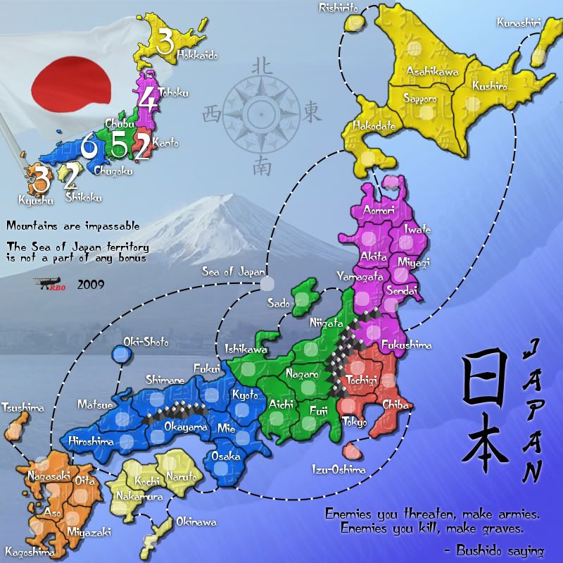
Re: Japan - 日本 (D, Gp) V8.3 (Upd 10-22)pg26 Graphics Stamp??
This new background is quite stunning, but not entirely in a good way.
It is a gorgeous picture, but now the ocean, no longer entirely surrounding the islands, looks less like the ocean,
 and the Sea of Japan is now located halfway up Mount Fuji.
The mountain might work if it were reduced in size so that the ocean could be retained entirely around the islands, but then it might be too small to be worth showing. Eliminating the ocean entirely might work too, but I agree with your classification of Japan as a maritime nation, and you would still have the Sea of Japan to place somewhere.
It is a gorgeous picture, but now the ocean, no longer entirely surrounding the islands, looks less like the ocean,
and the Sea of Japan is now located halfway up Mount Fuji. The mountain might work if it were reduced in size so that the ocean could be retained entirely around the islands, but then it might be too small to be worth showing. Eliminating the ocean entirely might work too, but I agree with your classification of Japan as a maritime nation, and you would still have the Sea of Japan to place somewhere.
Re: Japan - 日本 (D, Gp) V8.3 (Upd 10-22)pg26 Graphics Stamp??
Oooh! This map looks nice!
-
AndyDufresne

- Posts: 24919
- Joined: Fri Mar 03, 2006 8:22 pm
- Location: A Banana Palm in Zihuatanejo
- Contact:
Re: Japan - 日本 (D, Gp) V8.3 (Upd 10-22)pg26 Graphics Stamp??
Right, I think I see ender's point. I'm usually not a fan of image backgrounds or out of context backgrounds (before the revamp Germany), but maps can make it work (Indian Empire, etc) if it is a part of a greater theme (like the book idea).ender516 wrote:This new background is quite stunning, but not entirely in a good way.
It is a gorgeous picture, but now the ocean, no longer entirely surrounding the islands, looks less like the ocean,
The mountain might work if it were reduced in size so that the ocean could be retained entirely around the islands, but then it might be too small to be worth showing. Eliminating the ocean entirely might work too, but I agree with your classification of Japan as a maritime nation, and you would still have the Sea of Japan to place somewhere.
Right now, the background image doesn't totally feel a part of a greater theme---but just something that is a background placeholder.
--Andy