
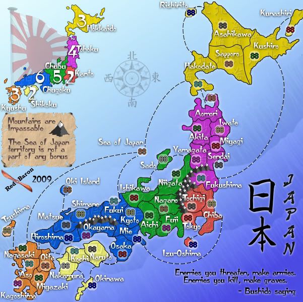
Oh yeah it's been talked about before, I consider myself well pretty well versed in history, and when I first brought up the use of a flag on the map, at first, I was against using the Naval ensign since there might be slight racial issues connected to that flag going back to WWII. But I gave that flag a try and sought community input, and the feedback was good, so I kept it. That flag just seems to fit right there fluttering next to the mini-map and it's been there since the drafting room.
I do fully acknowledge that once into circulation the flag may generate those bad feeling that I first thought might be there, and since Isaiah brought this up again I have thought about possible replacements, just in case, and will have something ready, IF the rest of the community say the flag is a bad thing.
Japan - 日本 - Quenched
Moderator: Cartographers
Forum rules
Please read the Community Guidelines before posting.
Please read the Community Guidelines before posting.
Re: Japan - 日本 [D, Gp] V7.0- Graphical Dis. {Updated 9-16} pg17
Sorry I didn't read through all 17 pages of this threadRedBaron0 wrote:Oh yeah it's been talked about before, I consider myself well pretty well versed in history, and when I first brought up the use of a flag on the map, at first, I was against using the Naval ensign since there might be slight racial issues connected to that flag going back to WWII. But I gave that flag a try and sought community input, and the feedback was good, so I kept it. That flag just seems to fit right there fluttering next to the mini-map and it's been there since the drafting room.
I do fully acknowledge that once into circulation the flag may generate those bad feeling that I first thought might be there, and since Isaiah brought this up again I have thought about possible replacements, just in case, and will have something ready, IF the rest of the community say the flag is a bad thing.
 I have no bad feelings, my first thought was "Hey wait a minute, that flag is from WWII" But it would be a good idea just in case people really start complaining about it. I'm for it since since those in the community said it was good
-
lt_oddball

- Posts: 364
- Joined: Mon Mar 05, 2007 11:17 am
- Location: Fortress Europe
Re: Japan - 日本 [D, Gp] V7.0- Graphical Dis. {Updated 9-16} pg17
Well, among the victims of the japanese in ww2 it is regarded as offensive as the nazi swastika... but I suppose you won't find surviving victims on this website.isaiah40 wrote:If the community says it's alright then I'm good with it. I just didn't now if you knew that that's all as That was the first thing I saw on the map.RedBaron0 wrote:The Japanese Naval ensign is still easily recognizable as Japanese, and still currently used by the Japan Maritime Self-Defense Force. In fact better depicts Japan, the flag has 16 rays like the symbol of the Japanese Imperial seal, the chrysanthemum, which has 16 petals.
I could go look for one that more like:
but I'd doubt I'd find one better. The community, from when the map was in the drafting room, accepted it, and has considered it a wonderful graphical addition.

But you could argue indeed that the map is about japan of today (and also not the japanese navy of today) , so the "red dot" flag is more in place here.

Last edited by lt_oddball on Thu Sep 17, 2009 10:24 am, edited 1 time in total.
Barbarus hic ego sum, quia non intellegor ulli.
Re: Japan - 日本 [D, Gp] V7.0- Graphical Dis. {Updated 9-16} pg17
Nah don't worry about, I wouldn't expect anybody to read 17 pages worth of stuff. It reminds me though that I'll need to be ready in case something doesn't work; to quickly fix it, else the map ends up like Das Schloss, closed and going through the Foundry a second time.
Honestly the flag that is on the map right now, I think better accents the map, and we've discussed this already. If there is enough decenting opinions I can create a second version with a modern version of the flag, and then take a poll. I don't want to get bogged down in poll taking since I hope the map is a hop-skip-and-a-jump from Beta. So, should there be issue with the use of the Japanese Naval ensign, speak up now.
Honestly the flag that is on the map right now, I think better accents the map, and we've discussed this already. If there is enough decenting opinions I can create a second version with a modern version of the flag, and then take a poll. I don't want to get bogged down in poll taking since I hope the map is a hop-skip-and-a-jump from Beta. So, should there be issue with the use of the Japanese Naval ensign, speak up now.


Re: Japan - 日本 [D, Gp] V7.1- Which flag? {Updated 9-18} pg17
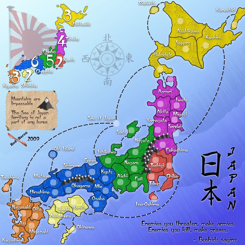
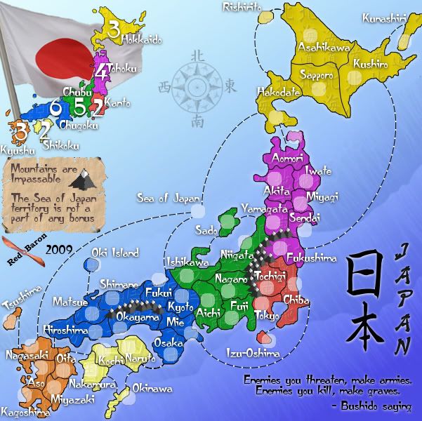
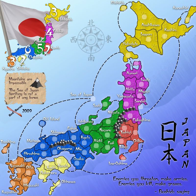
Version 7.0
Small - 601x600
Large - 800x799
Version 7.1
Small - 601x600
Large - 800x799
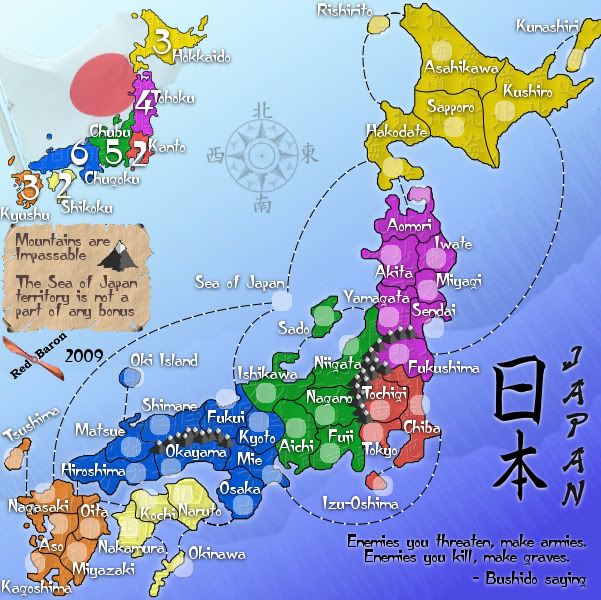
Alright... I've got a second version with the modern national flag of Japan. I gotta say, the modern flag is kinda growing on me, but I can go either way. Since the flag is just a graphical addition, with no bearing on gameplay, I'll keep the poll out of this for the moment. I'd prefer comments rather then just a poll.
Small - 601x600
- Click image to enlarge.
- Click image to enlarge.
Small - 601x600
- Click image to enlarge.
- Click image to enlarge.

Re: Japan - 日本 [D, Gp] V7.1- Which flag? {Updated 9-18} pg17
I think its totally up to you as its clear that your intentions are not meant to belittle or harm ones emotions
Both look good as some may take offense to the naval ensign because of a historic event
it seems petty to drudge up such reasoning and is very subject to personal opinion
Both look good as some may take offense to the naval ensign because of a historic event
it seems petty to drudge up such reasoning and is very subject to personal opinion
-
porkenbeans

- Posts: 2546
- Joined: Mon Sep 10, 2007 4:06 pm
Re: Japan - 日本 [D, Gp] V7.1- Which flag? {Updated 9-18} pg17
I like your original flag, but only because it shows up better. I suppose that the other could be made to be just as clear. This matter can go either way if you ask me. I have no strong feelings one way or the other.


Re: Japan - 日本 [D, Gp] V7.1- Which flag? {Updated 9-18} pg17
The original flag is much more clearly a flag. I saw that you had changed the topic title, so I was expecting the plain national flag, but when it scrolled onto the screen, I still looked at it and thought, "What is that red splotch next to the minimap?" Looking a little longer, I saw the outline of the white field of the flag, but it really only registered properly when I realized you had tilted the flagpole so that its tip was off the page. If you decide to go with the national flag instead of the ensign, consider restoring the flagpole to the vertical, or at least enough so that the tip is on the page: it's an important visual clue that there is a flag there, one that is mostly white against a very pale background. (You might even consider using that chrysanthemum you mentioned as the finial on the flagpole.)
Re: Japan - 日本 [D, Gp] V7.1- Which flag? {Updated 9-18} pg17
The problem there is going to be the background is basically the same color as the white field of the flag. Even if I turn the opacity all the way up, it still blends and all you really see is the red dot. Unless there is any more opinions to the contrary over the next day or so, I'm going to say definitively that the Japanese Naval Ensign is my flag for this map.

Re: Japan - 日本 [D, Gp] V7.1- Which flag? {Updated 9-18} pg17
I would have to say I prefer the naval flag rather than the other flag. As mentioned in the thread the other flag is quite hard to see with the background. All that really stands out is the red dot.
I have to applaud your use of bright vivid colours for the map and I love the minimap numbers they stand out really well!
Keep up the good work!
Premier2k
I have to applaud your use of bright vivid colours for the map and I love the minimap numbers they stand out really well!
Keep up the good work!
Premier2k

Re: Japan - 日本 [D, Gp] V7.1- Which flag? {Updated 9-18} pg17
Aesthetically, the naval flag looks better, but I do think you should go for the modern flag if you want a modern map. The imperial flag doesn't really reflect the nation.
Just as a mention- I lived in the country for three years. It's been well noted that few people would be offended, and that you have no intention of causing any offence if somebody did decide to get upset. I'd just say that that flag doesn't represent Japan, and I think that the map is trying to be a national map, rather than one that reflects Imperial Japan, or the Japanese navy. The Imperial flag would be more familiar in its historical context for most Japanese, and for most Koreans and Chinese. The self defence force is more like a coastguard.
Basically, it's not the flag of modern day Japan. It's the flag of a pre-democratic empire.
Anyway- I think it's up to you. I'd go with the flag of the nation that you want to represent, unless you want to represent a different period of that nation.
Just as a mention- I lived in the country for three years. It's been well noted that few people would be offended, and that you have no intention of causing any offence if somebody did decide to get upset. I'd just say that that flag doesn't represent Japan, and I think that the map is trying to be a national map, rather than one that reflects Imperial Japan, or the Japanese navy. The Imperial flag would be more familiar in its historical context for most Japanese, and for most Koreans and Chinese. The self defence force is more like a coastguard.
Basically, it's not the flag of modern day Japan. It's the flag of a pre-democratic empire.
Anyway- I think it's up to you. I'd go with the flag of the nation that you want to represent, unless you want to represent a different period of that nation.
Re: Japan - 日本 [D, Gp] V7.1- Which flag? {Updated 9-18} pg17
I think if you want to use the national flag, you need to increase the contrast somehow. I can only think of three ways:
- move the flag (with or without the minimap) to the lower right where the background gives more contrast
(problem: I think it spoils the fit of the images (the minimap, the flag, the title and such)) - flip the background from bottom right to top left
(problem: I think lighting from below will look odd) - outline the flag somehow (some flags have gold braid or fringe on the edges)
(problem: I don't know about you, but I wouldn't want to try to draw that)
Re: Japan - 日本 [D, Gp] V7.2- Which flag? {Updated 9-18} pg18
Version 7.2
Small - 601x600
Large - 800x799
Version 7.0
Small - 601x600
Large - 800x799
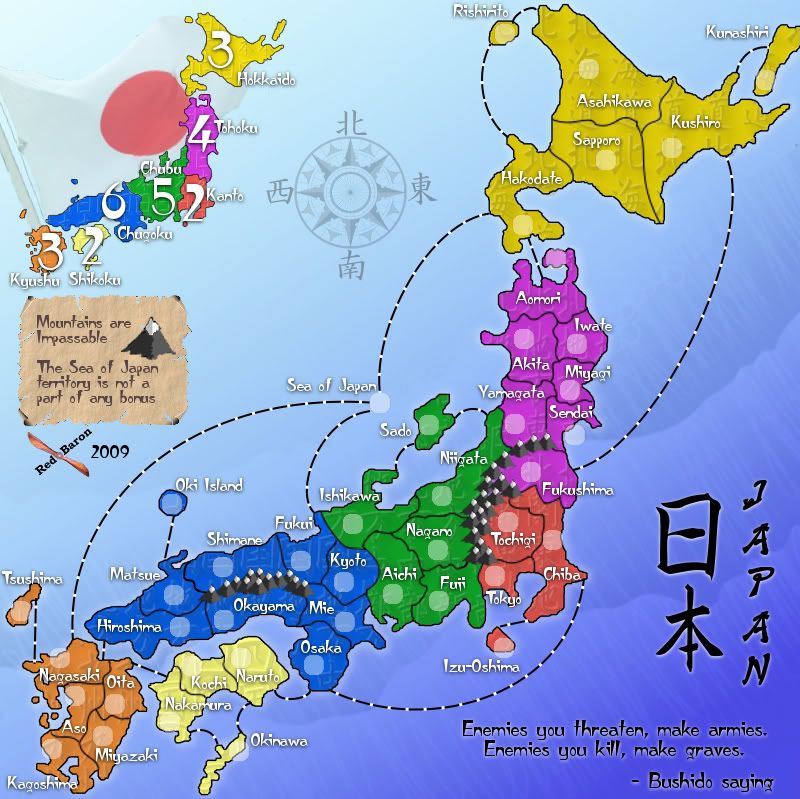
The other idea is to try a different modern Japanese flag, the other one was just too white. This one is darker and more well defined, it could even use a little less opacity, not too much though the background will overpower the flag less than about 85% opacity I think. The opacity is much lower on the Naval ensign, there's more color there.
I can feel the wind blow, and it seems to be heading more in the direction of the modern flag, but I still have both versions there for comparison.
Last note, I nudged the compass rose up and to the right a little bit.
Small - 601x600
- Click image to enlarge.
- Click image to enlarge.
Small - 601x600
- Click image to enlarge.
- Click image to enlarge.
I can feel the wind blow, and it seems to be heading more in the direction of the modern flag, but I still have both versions there for comparison.
Last note, I nudged the compass rose up and to the right a little bit.
Re: Japan - 日本 [D, Gp] V7.2- Which flag? {Updated 9-18} pg18
Now I see both, I think the modern one will do better! (sorry about bring this up  Who would have thought this would happen)
Who would have thought this would happen)Re: Japan - 日本 [D, Gp] V7.2- Which flag? {Updated 9-18} pg18
Well.... the mapmakers creed should include "Nothing is set in stone." Just because something works for a long time doesn't mean it should be a part of the final version.
Re: Japan - 日本 [D, Gp] V7.2- Which flag? {Updated 9-18} pg18
With this new clear version of the national flag, my vote is solidly for it. As eyecatching as that ghostly version of the naval ensign was, I am quite willing to let it and any bitter feelings it might stir up fade into distant memory. I still would like to see the tip of the flagpole, but it is not needed to make the flag obvious. This is certainly good enough.
Re: Japan - 日本 [D, Gp] V7.2- Which flag? {Updated 9-18} pg18
Unfortunately, there isn't anything on the tip of the flagpole, so I had it go off the corner on purpose.
-
Industrial Helix

- Posts: 3462
- Joined: Mon Jul 14, 2008 6:49 pm
- Gender: Female
- Location: Ohio
Re: Japan - 日本 [D, Gp] V7.2- Which flag? {Updated 9-18} pg18
Well, to be honest, i think the current Japanese flag is prolly the way to go as it is the current flag used by Japan (though I do like the design of the old flag better). I'd suggest tuning down the opacity on the flag like it is with the old flag.
Sketchblog [Update 07/25/11]: http://indyhelixsketch.blogspot.com/
Living in Japan [Update 07/17/11]: http://mirrorcountryih.blogspot.com/
Russian Revolution map for ConquerClub [07/20/11]: http://www.conquerclub.com/forum/viewto ... 1&t=116575
Living in Japan [Update 07/17/11]: http://mirrorcountryih.blogspot.com/
Russian Revolution map for ConquerClub [07/20/11]: http://www.conquerclub.com/forum/viewto ... 1&t=116575
Re: Japan - 日本 (D, Gp) V7.3- (Updated 9-19) pg18 - What else?
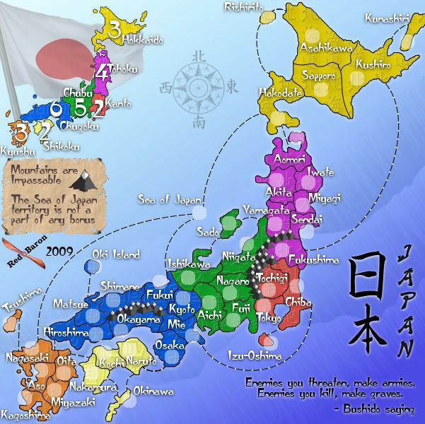
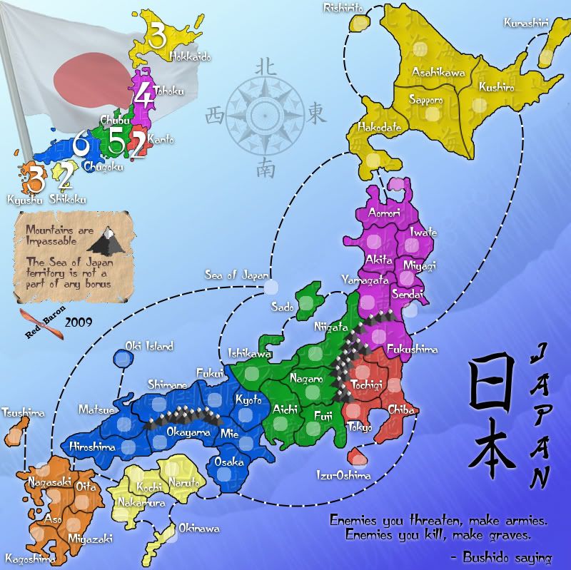
Version 7.3
Small - 601x600
Large - 800x799
Modern flag it is, opacity 60%
Small - 601x600
- Click image to enlarge.
- Click image to enlarge.
-
porkenbeans
- Posts: 2546
- Joined: Mon Sep 10, 2007 4:06 pm
Re: Japan - 日本 (D, Gp) V7.3- (Updated 9-19) pg18 - What else?
Sweet. 
Did you try the "-Bushito saying" on the first line ? Then you could lower that whole paragraph down to the bottom. I think that it might fit even better.
Did you try the "-Bushito saying" on the first line ? Then you could lower that whole paragraph down to the bottom. I think that it might fit even better.
Re: Japan - 日本 (D, Gp) V7.3- (Updated 9-19) pg18 - What else?
I did, but when you quote someone, or a saying, the "author" comes after the part in quotation. (with a notable exception of online BBS systems that put the author first...) I think it looks, and reads better this way.
-
porkenbeans
- Posts: 2546
- Joined: Mon Sep 10, 2007 4:06 pm
Re: Japan - 日本 (D, Gp) V7.3- (Updated 9-19) pg18 - What else?
Maybe if you worded it like the "Confucius say -"
Re: Japan - 日本 (D, Gp) V7.3- (Updated 9-19) pg18 - What else?
Bushido isn't a person so it wouldn't sound right. and Confucius is Chinese.
It fits really nice in that corner as is. There isn't any reason to fiddle with the spacing, pushing the words further into the corner will only make it look off center.
It fits really nice in that corner as is. There isn't any reason to fiddle with the spacing, pushing the words further into the corner will only make it look off center.
-
porkenbeans
- Posts: 2546
- Joined: Mon Sep 10, 2007 4:06 pm
Re: Japan - 日本 (D, Gp) V7.3- (Updated 9-19) pg18 - What else?
Bushido Usually defined as: "The code of the Samurai" or literally speaking it translates: "The way of the warrior." Similar to the European concept of chivalry.