[Abandoned] - Goblin Tribes
Moderator: Cartographers
Re: Goblin Tribes[D]v13 pg1&8 Aug04 finalizing gameplay
I want to play in the first game!!
Something I just realized I like-since there's only 4 "continents", it will make 5 or more player games nice and lively. Kind of like musical chairs. There's a guarantee that at least 2 people will be gunning for the same area.
Yay Danyael!
Something I just realized I like-since there's only 4 "continents", it will make 5 or more player games nice and lively. Kind of like musical chairs. There's a guarantee that at least 2 people will be gunning for the same area.
Yay Danyael!
-

 squishyg
- Posts: 2651
- Joined: Sun Jan 04, 2009 11:05 pm


Re: Goblin Tribes[D]v13.5 pg1&9 Aug06 finalizing gameplay
squishyg wrote:I want to play in the first game!!
Something I just realized I like-since there's only 4 "continents", it will make 5 or more player games nice and lively. Kind of like musical chairs. There's a guarantee that at least 2 people will be gunning for the same area.
Yay Danyael!
i completly agree as a 5 player game it would be possible to hold a bonus each but tough i think the stratagey on this map will be awesome in games bigger then 4 players as well i think team games will also be neat as part of the team could help protect the player that holds a chief
in short i'm stoked to play this so stoked but i need more stamp first
on the upside
i started the small map
i'm going to remove the basic army circles to make it not as cluttered
and will most likely use a different font or at least a sharper look instead of the fat look i have now
but still in works
on the other hand
i shaved down the mountains on the sakz and flart connection too improve clarity
as moved the circle away from the opening
whitestazn88 wrote:a few of the skulls, bloods, muds, and fangs are too close to the army circles or territ names. space them out a bit more?
i have started on this with the large map
anyones that stick out bad now that the 888s are on there
i think most are good but some could be moved slightly 1-2 pixels
-

 Danyael
- Posts: 352
- Joined: Fri Jul 04, 2008 4:26 pm
- Location: Winnipeg, Manitoba


Re: Goblin Tribes[D]v13.5 pg1&9 Aug06 finalizing gameplay
no,it looks fine. after i read what i posted a day later, i realized that i didn't mean they were overlapping the army circles. just some of the territ names are a little close to the symbols. especially the skulls. and the bottom left territory is overlapping onto the next territory
-
 whitestazn88
- Posts: 3128
- Joined: Mon Feb 05, 2007 2:59 pm
- Location: behind you


Re: Goblin Tribes[D]v12 pg1&8 July21 Chiefs assault or bombard?
Danyael wrote:chiefs can bombard other chiefs
and assault the territory the
{*} sits in
the bombard looks as if it'll work well. try changing the wording to assault the region containing their {*}. we're now very close to a gameplay stamp.
ian.
-

 iancanton
- Foundry Foreman

- Posts: 2431
- Joined: Fri Jun 01, 2007 5:40 am
- Location: europe


Re: Goblin Tribes[D]v13.5 pg1&9 Aug06 finalizing gameplay
iancanton wrote:Danyael wrote:chiefs can bombard other chiefs
and assault the territory the
{*} sits in
the bombard looks as if it'll work well. try changing the wording to assault the region containing their {*}. we're now very close to a gameplay stamp.
ian.
yes that will look a lot better and save space
-

 Danyael
- Posts: 352
- Joined: Fri Jul 04, 2008 4:26 pm
- Location: Winnipeg, Manitoba


Re: Goblin Tribes[D]v14 pg1&9 Aug11 finalizing gameplay
version 14
changes
moved skull icons down a bit from names moved skizz over so no longer overlapping the border
moved mud icons and some names slightly
changed wording in the chief legend
due to real work the small map update will be ready on Thursday
changes
moved skull icons down a bit from names moved skizz over so no longer overlapping the border
moved mud icons and some names slightly
changed wording in the chief legend
due to real work the small map update will be ready on Thursday
-

 Danyael
- Posts: 352
- Joined: Fri Jul 04, 2008 4:26 pm
- Location: Winnipeg, Manitoba


Re: Goblin Tribes[D]v14 pg1&9 Aug11 finalizing gameplay
just one more thing,
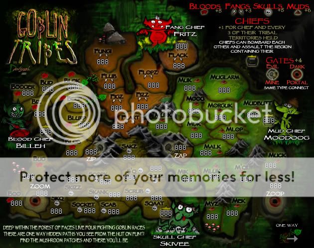
it looks like zip zap and zoom all have two or three territories they can attack, and they are far away to the chiefs. I look at zoop, and it only has one territ it can attack, which is practically next to the cheif territ. it might cause an unbalence for Zoop to be bottlenecked and next to the cheif, while zoom is almost in the middle of three territs, and is far away from either chief.
hmmmm
Woop Woop, i love conquer club, why'd i leave for a year?
Who LIkes finishing what they started?

Who LIkes finishing what they started?

-

 sinctheassasin
- Posts: 490
- Joined: Fri Feb 06, 2009 5:57 pm
- Location: probably in chat room, advertising conquer crater


Re: Goblin Tribes[D]v14 pg1&9 Aug11 finalizing gameplay
sinctheassasin wrote:just one more thing,
it looks like zip zap and zoom all have two or three territories they can attack, and they are far away to the chiefs. I look at zoop, and it only has one territ it can attack, which is practically next to the cheif territ. it might cause an unbalence for Zoop to be bottlenecked and next to the cheif, while zoom is almost in the middle of three territs, and is far away from either chief.
hmmmm
zip connects to 2 territs(1 skull 1 blood) zap connects to 2 territs(both mud)
zoom connects to 3(2 blood 1 skull) zoop connects to 1 mud
but i don't really understand why this might unbalance it
gates all start 2 neutral so no one would start with them
and starting 2 makes it a gamble too attack them and a potential waste of troops
so with proper strategy you would necessarily not use them unless 1 of 3 reasons
1 mud chief keeps a big load on muck to cover the easy access to the muds backdoor
2 you want to over take the muds but all other borders are to well defend and the back door is a better reason but then you might be in a pickle as zoom has the three surrounding territs may have another player ready to follow you right up the poop shoot
3 its safe for you to break them and be able to hold the +4 bonus but that wouldn't be the best move
as well having it close to the mud chief makes it harder to hold the mud chief in the long run
which who is worth more
so due to the nature of the gates i believe it does not give any disadvantage that would give one player an easy benefit and ruin the game
and its more of a strategy choice
-

 Danyael
- Posts: 352
- Joined: Fri Jul 04, 2008 4:26 pm
- Location: Winnipeg, Manitoba


Re: Goblin Tribes[D]v14 pg1&9 Aug13 finalizing gameplay
alright
here is the small map update
changes legend organization is it legible?
shrunk down chiefs for room
moved the mud icon on mlop beside the name for room
and i just noticed i forgot to make the chief names visible again damn skippy
but off to work so will fix that later
and another look at the large
here is the small map update
changes legend organization is it legible?
shrunk down chiefs for room
moved the mud icon on mlop beside the name for room
and i just noticed i forgot to make the chief names visible again damn skippy
but off to work so will fix that later
and another look at the large
-

 Danyael
- Posts: 352
- Joined: Fri Jul 04, 2008 4:26 pm
- Location: Winnipeg, Manitoba


Re: Goblin Tribes[D]v14 pg1&9 Aug13 finalizing gameplay
The small legend is a little hard to read, but if anyone has trouble, they can just click "larger map", right?
-

 squishyg
- Posts: 2651
- Joined: Sun Jan 04, 2009 11:05 pm


Re: Goblin Tribes[D]v14 pg1&9 Aug13 finalizing gameplay
squishyg wrote:The small legend is a little hard to read, but if anyone has trouble, they can just click "larger map", right?
yes the small map legend is hard to read
"same type connect" in the gate legend is pretty hard to read still i did make it a little bigger but not yet big enough
same goes with the text under chiefs
and the evil mine icon is pretty much impossible to tell what it represents
i will improve all of these(may use different font if unable to size this one right
are those the only culprits ?
and yes logically thats what i would do is to just look at the large to know what i can read
but as we all know not everyone is logical and new players may not know of being able to change the map size
So i need to make the small as 100% legible as possible so nothing will be unclear
but yah if you can't read it just look at the large
new page map bump
-

 Danyael
- Posts: 352
- Joined: Fri Jul 04, 2008 4:26 pm
- Location: Winnipeg, Manitoba


Re: Goblin Tribes[D]v14 pg1&9 Aug13 finalizing gameplay
Danyael wrote:So i need to make the small as 100% legible as possible so nothing will be unclear
making the small map slightly taller will solve the text problem. this will let u either make the bonus legend bigger or move it to a bar at the bottom that isn't part of the map graphics (as in eastern hemisphere). incidentally, u've misspelled their as thier on both maps.
to my eyes, the colours of the blood regions, skull regions and gates are very similar. from the symbols, we can immediately tell that the blood and skull regions are part of different bonuses. however, using the brown fang colour for the gates will help to distinguish them at first glance from bloods and skulls, since the gates do not border any fang regions.
with the addition of the second mushroom path, the bloods are slightly more difficult to hold than the skulls, so give a +5 bonus, instead of +4, to the bloods. this bonus change will make only a small difference (if any) to most games, so i am happy to stamp this map for gameplay in advance.

ian.
-

 iancanton
- Foundry Foreman

- Posts: 2431
- Joined: Fri Jun 01, 2007 5:40 am
- Location: europe


Re: Goblin Tribes[D]v14 pg1&9 Aug13 finalizing gameplay
Yay! Congrats Danyael!!! Can't wait to play!
-

 squishyg
- Posts: 2651
- Joined: Sun Jan 04, 2009 11:05 pm


Re: Goblin Tribes[D,GP]v14 pg1&9 Aug13
iancanton wrote:Danyael wrote:So i need to make the small as 100% legible as possible so nothing will be unclear
making the small map slightly taller will solve the text problem. this will let u either make the bonus legend bigger or move it to a bar at the bottom that isn't part of the map graphics (as in eastern hemisphere). incidentally, u've misspelled their as thier on both maps.
to my eyes, the colours of the blood regions, skull regions and gates are very similar. from the symbols, we can immediately tell that the blood and skull regions are part of different bonuses. however, using the brown fang colour for the gates will help to distinguish them at first glance from bloods and skulls, since the gates do not border any fang regions.
with the addition of the second mushroom path, the bloods are slightly more difficult to hold than the skulls, so give a +5 bonus, instead of +4, to the bloods. this bonus change will make only a small difference (if any) to most games, so i am happy to stamp this map for gameplay in advance.
ian.
Thank you very much ian
I'll make it taller that will clear up a lot of room. Damn dyslexia I'll fix the their good catch.
all this time i thought the fangs were red I'll see about using the fang colour on the gate but I'll also try a few different idea to make it stand out more from the other land colours
the adjustment to the bloods makes perfect sense will do
if i get the chance all changes will be done next update hopefully Monday evening after work but for sure Tuesday
once again thanks for the stamp!!!
squishyg wrote:Yay! Congrats Danyael!!! Can't wait to play!
i can almost smell the muds im so excited graphic and xml to go
UPDATED TO DO
chief names and text still working on good setup
large map graphics
fix fuzz around legend text
fix weird straight line in legend in tribes
small map graphics
make taller and improve spacing
work on better font format for "regions"
many other things
Gameplay *give a +5 bonus, instead of +4, to the bloods.
-

 Danyael
- Posts: 352
- Joined: Fri Jul 04, 2008 4:26 pm
- Location: Winnipeg, Manitoba


Re: Goblin Tribes[D,GP]v15 pg1&10 Aug18
quick update
Version 15 large map
Changes
fixed fuzz on legend and spelling error
fixed perfect line in the legend
changed vivid light colour overlay on zip and zap
upped bloods to +5
small update will be ready on thursday
Version 15 large map
Changes
fixed fuzz on legend and spelling error
fixed perfect line in the legend
changed vivid light colour overlay on zip and zap
upped bloods to +5
small update will be ready on thursday
-

 Danyael
- Posts: 352
- Joined: Fri Jul 04, 2008 4:26 pm
- Location: Winnipeg, Manitoba


Re: Goblin Tribes[D,GP]v15 pg1&10 Aug20 Small legibility
Version 15 small map
i have increased the height by 30 pixels scaling the top and clone and bandageing the bottom
this as allowed me too increase the legend quite a bit
is it more legible? should it be increased more
moved around region icons and names as well increased the text size of the name their is a few that still need tweaking but i think this will work great and save time from switching the font type
I have moved the one way tree down to the bottom right and blacking out the background to make it more noticeable
as well with the added space the mythos now fits nicely but i noticed "fungi" has a shadow on it i will fix this
I have also noticed that the colour change doesn't stand out as much on zip and zap as it does with the big or is that just my colourblindness screwing with me
anyways
TO DO
I'm going to make a shot of both maps with different army number colours to make sure they all look ok
fix mythos as stated
tweak names and symbol sizes
tweak any legibility concerns
other minor things
-

 Danyael
- Posts: 352
- Joined: Fri Jul 04, 2008 4:26 pm
- Location: Winnipeg, Manitoba


Re: Goblin Tribes[D,GP]v15 pg1&10 Aug20 Small legibility
Hey, congrats on the second stamp, i wish conquer crater had one of those, it's our fifth month in the draft room 
Anyway, looks great to me. You might want to look at and post on different maps in here as well as the draft room to see what people are looking for in terms of tweaking graphics....
Just in case
Anyway, looks great to me. You might want to look at and post on different maps in here as well as the draft room to see what people are looking for in terms of tweaking graphics....
Just in case
Woop Woop, i love conquer club, why'd i leave for a year?
Who LIkes finishing what they started?

Who LIkes finishing what they started?

-

 sinctheassasin
- Posts: 490
- Joined: Fri Feb 06, 2009 5:57 pm
- Location: probably in chat room, advertising conquer crater


Re: Goblin Tribes[D,GP]v15 pg1&10 Aug20 Small legibility
sinctheassasin wrote:Hey, congrats on the second stamp, i wish conquer crater had one of those, it's our fifth month in the draft room
Anyway, looks great to me. You might want to look at and post on different maps in here as well as the draft room to see what people are looking for in terms of tweaking graphics....
Just in case
thanks
and please don't complaint about your stalled map in another persons topic
it will not help you out
*I'll try and point you in the right direction read what i wrote and follow it carefully then you might not be stalled
next time you will be foed
*see your map topic
-

 Danyael
- Posts: 352
- Joined: Fri Jul 04, 2008 4:26 pm
- Location: Winnipeg, Manitoba


Re: Goblin Tribes[D,GP]v15 pg1&10 Aug20 Small legibility
Looking pretty good kiddo, couple little things:
I think the edges of the map are too dark, especially around the 2 chiefs, mudd and blood. Your numbers look good, and will fit into their territories well, check the colors of the armies... which I see is on your list. I'm not sure, but I'm not sure exactly how the numbers get written on the image whether they get centered over the coordinates or if it starts at the left edge of the coordinates. That's probably for down the road, but it'll affect where you place army circles. Last thing, the text looks very readable in the territories, but looks squashed. Specifically the "F's" in most words you can figure out are "F's" but look more like an uppercase gamma in most cases.
Simple things there, shouldn't be to long before you get that next stamp!


-

 RedBaron0
- Posts: 2657
- Joined: Sun Aug 19, 2007 12:59 pm
- Location: Pennsylvania


Re: Goblin Tribes[D,GP]v15 pg1&10 Aug20 Small legibility
Baron has a point about the edges. The area around blood chief is particularly dark, now that i take a second look. The text doesn't bother me though, I like how rounded it is, which is probably what gives it a slight squashed look.
I like your mountains more every time I look at the map.
I like your mountains more every time I look at the map.
-

 squishyg
- Posts: 2651
- Joined: Sun Jan 04, 2009 11:05 pm


Re: Goblin Tribes[D,GP]v15 pg1&10 Aug20 Small legibility
its been awhile since i've been called kiddo
thanks for the comments and suggestions
Today while at work i was showing off my map to a co worker and on the old computer i used
the map was super dark it was mainly a monitor adjust to bring it almost to what i see on my computer
But its true around the mud and blood chief its very gloomy and sinisterly dark
i kinda like it but i will try out a few different thing to brighten up those sides
but i might just end up re tweaking the jpeg setting a higher overall brightness
which in turn may pop out even more details
as i do not want it to bright taking away from the overall forest of faces background
with kinda sets the mood if you know what i mean
but yes it will be brighter
As for the F in this may and may not cause problems on the large in my option they are distinguishable as Fs but on the small is a different story
squishyg is right that the roundness is what causes the squished look but for the small i'll try a vertical scale 1 or two notches to improve the F
thanks again squishyg
yes there are so many small details in there a 1 pixel smudge brush is what i used to get the neat look it took a long time to perfect but hell it was worth it
thanks again squishyg and baron-o
thanks for the comments and suggestions
Today while at work i was showing off my map to a co worker and on the old computer i used
the map was super dark it was mainly a monitor adjust to bring it almost to what i see on my computer
But its true around the mud and blood chief its very gloomy and sinisterly dark
i kinda like it but i will try out a few different thing to brighten up those sides
but i might just end up re tweaking the jpeg setting a higher overall brightness
which in turn may pop out even more details
as i do not want it to bright taking away from the overall forest of faces background
with kinda sets the mood if you know what i mean
but yes it will be brighter
As for the F in this may and may not cause problems on the large in my option they are distinguishable as Fs but on the small is a different story
squishyg is right that the roundness is what causes the squished look but for the small i'll try a vertical scale 1 or two notches to improve the F
squishyg wrote:I like your mountains more every time I look at the map.
thanks again squishyg
yes there are so many small details in there a 1 pixel smudge brush is what i used to get the neat look it took a long time to perfect but hell it was worth it
thanks again squishyg and baron-o
-

 Danyael
- Posts: 352
- Joined: Fri Jul 04, 2008 4:26 pm
- Location: Winnipeg, Manitoba


Re: Goblin Tribes[D,GP]v15 10 sept 2 is that bright enough
i have been damn busy working but no work this week end
I'll have v16 ready large and small this week end but i need no know
is this bright enough around the blood chief and mud chief
if so i got some major blending todo mainly
see 1, 2, 3
and i need to fix up a few other things small stuff and where 4. points to i'm going to darken this up slightly so it looks more like the other inner forestry areas
-

 Danyael
- Posts: 352
- Joined: Fri Jul 04, 2008 4:26 pm
- Location: Winnipeg, Manitoba


Re: Goblin Tribes[D,GP]v15 pg10 sept 2 is that bright enough
Blood and Mud are bright enough for me. Fangy is getting a little too bright now... His background looks like it's glowing. Was he bitten by a radioactive spider? 
-

 squishyg
- Posts: 2651
- Joined: Sun Jan 04, 2009 11:05 pm


Re: Goblin Tribes[D,GP]v15 pg10 sept 2 is that bright enough
squishyg wrote:Blood and Mud are bright enough for me. Fangy is getting a little too bright now... His background looks like it's glowing. Was he bitten by a radioactive spider?
Yeah, I agree. I have not really said much about this map, but I have poked my head in here a bit every now and then, and I like it a lot. The Fang guy does look a little bight but on a whole it is good.
~ CaptainWalrus
-
 captainwalrus
- Posts: 1018
- Joined: Sun Nov 11, 2007 3:19 pm
- Location: Finnmark


Re: Goblin Tribes[D,GP]v15 pg10 sept 2 is that bright enough
Really great work. I too have been in an out of this map thread.
Quick text suggestion, can you move the Skivee text up a little off his head?
Quick text suggestion, can you move the Skivee text up a little off his head?
-

 jpcloet
- Posts: 4317
- Joined: Sat Mar 17, 2007 9:18 am
- Location: Greater Toronto Area


Who is online
Users browsing this forum: No registered users


