Route 66 [Quenched]
Moderator: Cartographers
Forum rules
Please read the Community Guidelines before posting.
Please read the Community Guidelines before posting.

Re: Route 66: page 7 update
I think you have room to jazz up the title treatment. It looks a bit anemic.
-
Teflon Kris

- Posts: 4236
- Joined: Sun Jul 13, 2008 4:39 pm
- Gender: Male
- Location: Lancashire, United Kingdom
Re: Route 66: page 7 update
I'm liking this map in theme and graphically.
Just wondering if the coloured terits represent starting points (as there are 9 red)? Apologies if starting positions have been discussed previously.
Just an idea - might it be worth having non-route 66 terits as +2s? It would give more incentive for players to take them etc.
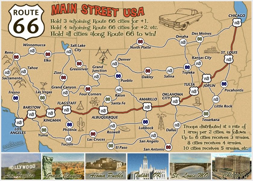
If I understand the map correctly then I cant see any problems with the bonus system apart from possible minor adjustments. I assume 5 route 66 cities is +3 etc. I'm sure most players would get this, although I have a slight doubt that some may not.
Just wondering if the coloured terits represent starting points (as there are 9 red)? Apologies if starting positions have been discussed previously.
Just an idea - might it be worth having non-route 66 terits as +2s? It would give more incentive for players to take them etc.
If I understand the map correctly then I cant see any problems with the bonus system apart from possible minor adjustments. I assume 5 route 66 cities is +3 etc. I'm sure most players would get this, although I have a slight doubt that some may not.


Re: Route 66: white shields, p. 5
if they're both in the song, then why not have both? from los angeles, would it work to have route 66 go east to san bernardino, then exaggerated north to barstow, with yuma connecting to san bernardino instead of to barstow (which links to las vegas instead)? mind u, i notice that all cities that connect to route 66 do so at only one point. is this deliberate and would my suggestion for barstow and las vegas spoil the desired arrangement of start positions?lostatlimbo wrote:I also don't understand San Bernadino. Geographically (and even thematically), that should be Barstow - or at the very least, Victorville. I see that you intended it as the crux between I-15 and I-10, but I think it would be more interesting to have 10 connect with LA and add Palm Springs in between, and then replace San Bernadino with Mojave. I've had the misfortune of spending some time in San Bernadino, so forgive my prejudice.
i second that.DJ Teflon wrote:Just an idea - might it be worth having non-route 66 terits as +2s? It would give more incentive for players to take them etc.
ian.


Re: Route 66: white shields, p. 5
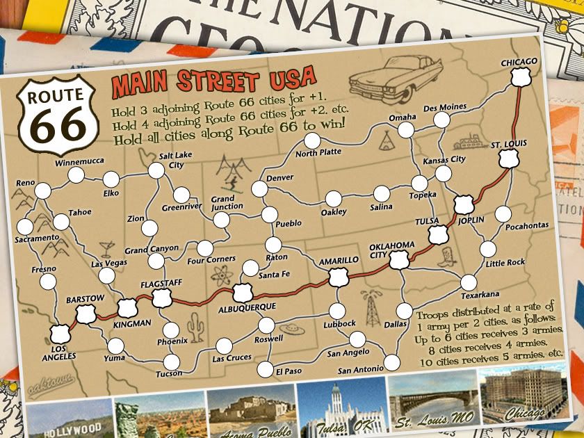
- Click image to enlarge.
I've already changed San Bernadino to Barstow, but I'm reluctant to add another city between LA and Kingman, both because of the tight spacing and because I'm not sure how to route the connecting highways. The start territories in there are nicely split up North, South, North, South.iancanton wrote:if they're both in the song, then why not have both? from los angeles, would it work to have route 66 go east to san bernardino, then exaggerated north to barstow, with yuma connecting to san bernardino instead of to barstow (which links to las vegas instead)? mind u, i notice that all cities that connect to route 66 do so at only one point. is this deliberate and would my suggestion for barstow and las vegas spoil the desired arrangement of start positions?lostatlimbo wrote:I also don't understand San Bernadino. Geographically (and even thematically), that should be Barstow - or at the very least, Victorville. I see that you intended it as the crux between I-15 and I-10, but I think it would be more interesting to have 10 connect with LA and add Palm Springs in between, and then replace San Bernadino with Mojave. I've had the misfortune of spending some time in San Bernadino, so forgive my prejudice.
And the Route 66 territories do not all connect in only one direction, but they each only connect to one (or in one case zero) starting territories. There are four Route cities that can be hit from both the north and the south.
I wouldn't be opposed to adding another city along the Route (even though I already think it will be hard enough to hold for the victory condition), but I think I'd rather see it in the eastern or central part of the map. The west already seems fairly busy, and neither Barstow nor Kingman were the most exciting stops along the way. Sticking another city in there would, in my opinion, upset the balance both in terms of play and graphics.
Really? So we'd giving a bonus of +1 for holding three of the territories for which this map is named, and a +2 for holding just one random peripheral territory? I'm not sure why this is an improvement, as it makes the Route cities less attractive than the non-route cities. And it seems like by giving random territories a bonus we're setting up a situation in which a player can get lucky by getting dropped next to more +2s than his opponent.iancanton wrote:i second that.DJ Teflon wrote:Just an idea - might it be worth having non-route 66 terits as +2s? It would give more incentive for players to take them etc.
Or wait - does TJ Teflon mean that none-route 66 territories should start with neutral 2s to encourage taking them? That I can get behind, even though others argued against it earlier... I recognize that there are argument for and against.
Note that the standard per turn territory/army ratio is already reduced on the map, so picking up any two territories - Route 66 or otherwise - nets you an extra army. This was done specifically to encourage expansion in otherwise unattractive regions of the map. And because of this there are going to be some interesting starts...
- 1v1 games: each player starts with 9 territories, good for an initial placement of four armies. I think this is fine because P1 can't hit his opponent, only neutrals. And by hitting a neutral that borders an opponent space he has just opened himself up to attack. In round two each player will be able to place 5 armies (assuming having taken a neutral in round one), but again this works because they still probably can't see anything but neutrals.
- 3 player games: each player starts with 7 territories, and needs only one territory to up that to four. Again, all they see in those opening two rounds are neutrals, and to hit somebody else they have to break through a neutral wall putting their own real estate in harm's way.
- In games of four players and up it will be awfully difficult to string together Route 66 cities unless you get extremely lucky on the drop. I'd say big games on this map will be cat and mouse affairs, strategically pecking away at thin opponents and keeping your own borders to a minumum.

-
gimil

- Posts: 8599
- Joined: Sat Mar 03, 2007 12:42 pm
- Gender: Male
- Location: United Kingdom (Scotland)
Re: Route 66: updated! (finally) p 7
Just a passing thought but how about apply a filter (I know what one, just don't know where to find it  ) to reduce the amount of colours used in your photos at the bottom. Try and make them appear a little more (not to much) appearing like the rest of the main map. Sort of detaching from reality a little so that the 'realistic' photos don't clash (not that they do so much) with the not so realistic map.
Does that make sense?
Does that make sense?
What do you know about map making, bitch?
Top Score:2403natty_dread wrote:I was wrong
Re: Route 66: updated! (finally) p 7
Sure - I had started by sepia toning them all to fit the rest of the postcard, but the consensus was that there was not enough color. I've colorized them and tried to make them look overly saturated in a 1950s, kodak, technicolor kind of way. I could desaturate the colors to fit the map, but I'm also going to play with bringing more color out of the map to make the pictures seem more appropriate. I think there is a happy medium somewhere.gimil wrote:Just a passing thought but how about apply a filter (I know what one, just don't know where to find it
Does that make sense?
-
ghirrindin

- Posts: 129
- Joined: Sat Jan 12, 2008 9:34 pm
- Location: Urbana, IL
Re: Route 66: updated! (finally) p 7
The tipi doesn't belong in Arizona. Natives inhabiting the Great Plains lived in tipis, not those in the desert Southwest.
-
gimil
- Posts: 8599
- Joined: Sat Mar 03, 2007 12:42 pm
- Gender: Male
- Location: United Kingdom (Scotland)
Re: Route 66: updated! (finally) p 7
I don't see any reason why the Cadillac can't have a bit of colour also, im thinking red or blue. Add a little more variety to the pallet.
What do you know about map making, bitch?
Top Score:2403natty_dread wrote:I was wrong
-
lgoasklucyl

- Posts: 526
- Joined: Mon Apr 07, 2008 8:49 pm
- Gender: Male
- Location: Somewhere in the 20th century.
Re: Route 66: updated! (finally) p 7
I think the problem with the photos may be too much grain, not enough vignetting.
Let me see if I can try something out in photoshop right quick to land a more vintage feel
(this may be for my own shits-and-giggles, however, though I'm more than welcome to share ideas if you'd like )
)
Let me see if I can try something out in photoshop right quick to land a more vintage feel
(this may be for my own shits-and-giggles, however, though I'm more than welcome to share ideas if you'd like

-
lgoasklucyl
- Posts: 526
- Joined: Mon Apr 07, 2008 8:49 pm
- Gender: Male
- Location: Somewhere in the 20th century.
Re: Route 66: updated! (finally) p 7
Original Image:

Pshopped (ain't photoshop great? update to CS4- it's freaking awesome ):
):

Not an enormous change and I obviously could have spent more than the 10 or so minutes I did on it, but I think I like this direction =)
Pshopped (ain't photoshop great? update to CS4- it's freaking awesome
Not an enormous change and I obviously could have spent more than the 10 or so minutes I did on it, but I think I like this direction =)
-
Incandenza

- Posts: 4949
- Joined: Thu Oct 19, 2006 5:34 pm
- Gender: Male
- Location: Playing Eschaton with a bucket of old tennis balls
Re: Route 66: updated! (finally) p 7
One small suggestion: redraw the Cadillac to either feature the tailfins or really emphasize how giant the freaking grilles are on those things. Hell, the whole car was monstrous. You could land fighter planes on the back of a '59 Eldorado. Right now the gaphic looks like it could be anything (with a hint of tailfins).
Otherwise, I got nothing. Well done, good sir lepropotamus (that seriously sounds like a hippo with leprosy).
Otherwise, I got nothing. Well done, good sir lepropotamus (that seriously sounds like a hippo with leprosy).
THOTA: dingdingdingdingdingdingBOOM
Te Occidere Possunt Sed Te Edere Non Possunt Nefas Est
Te Occidere Possunt Sed Te Edere Non Possunt Nefas Est
-
lostatlimbo

- Posts: 1386
- Joined: Wed Mar 28, 2007 3:56 pm
- Location: Portland, OR
Re: Route 66: updated! (finally) p 7
I agree and I think you are already a little graphic heavy in that part of the map.ghirrindin wrote:The tipi doesn't belong in Arizona. Natives inhabiting the Great Plains lived in tipis, not those in the desert Southwest.
Maybe try an adobe pueblo in the empty part of Utah below Green River?
Re: Route 66: updated! (finally) p 7
Alright, put yourself in 1952, driving through Arizona. You are nearing Navajo country, and on the side of the road next to the "Trading Post" tourist trap is what? A teepee. I know and you know that teepees aren't southwestern, but this map is about kitschy roadside attractions. I can lose the teepee, but it should be replaced with something equally kitsch.ghirrindin wrote:The tipi doesn't belong in Arizona. Natives inhabiting the Great Plains lived in tipis, not those in the desert Southwest.
But lostatlimbo may be right in that it may be too busy in there as is.
Re: Route 66: updated! (finally) p 7
- Click image to enlarge.
-
the.killing.44

- Posts: 4724
- Joined: Thu Oct 23, 2008 7:43 pm
- Gender: Male
- Location: now tell me what got two gums and knows how to spit rhymes
- Contact:
Re: Route 66: new look pg 8
Yeah, I like it, only two things:
1. I'd make it so the edges go off the canvas, but you can still see some of them below? Like, crop through the big "T"
2. Do something with the border/edge? I dunno, might look cool.
.44
1. I'd make it so the edges go off the canvas, but you can still see some of them below? Like, crop through the big "T"
2. Do something with the border/edge? I dunno, might look cool.
.44
Re: Route 66: new look pg 8
Not sure I follow either suggestion.the.killing.44 wrote:1. I'd make it so the edges go off the canvas, but you can still see some of them below? Like, crop through the big "T"
2. Do something with the border/edge? I dunno, might look cool.
-
the.killing.44
- Posts: 4724
- Joined: Thu Oct 23, 2008 7:43 pm
- Gender: Male
- Location: now tell me what got two gums and knows how to spit rhymes
- Contact:
Re: Route 66: new look pg 8
First sugg:

(where I would crop)
Second:
Right now around the map you have just a white border — I think you could/should do something with that, as it's lying on a stack and it gives you a chance to show off the border from a '50s card, rather than the usual canvas = parameters.
————————————————————
My other suggestion I already sorta told you about is that I think you can do more with the roads, instead of just having them as black lines with a white stroke on them. I know it's on a map and they wouldn't be shown as realistic, laned (that's not a real word ) roads, but even carrying out a simple action like changing the color to a more sepia-toned one would help them be more integrated with the time period/theme and the map itself.
As an addendum, doing something with the circles, like adding noise and a sepia tone, would do the same. And while we're at it, why not choose a more theme-related font, like this, or maybe this? You could shrink the horizontal spread of the latter (which I'm partial to right now…) down a bit, perhaps — or the spacing. I just think the current, straight black sans serif font doesn't let the map fully go 1950's…
Oh, and your big "Route 66" shield's edges are pixely
Lovin' the map,
.44
(where I would crop)
Second:
Right now around the map you have just a white border — I think you could/should do something with that, as it's lying on a stack and it gives you a chance to show off the border from a '50s card, rather than the usual canvas = parameters.
————————————————————
My other suggestion I already sorta told you about is that I think you can do more with the roads, instead of just having them as black lines with a white stroke on them. I know it's on a map and they wouldn't be shown as realistic, laned (that's not a real word
As an addendum, doing something with the circles, like adding noise and a sepia tone, would do the same. And while we're at it, why not choose a more theme-related font, like this, or maybe this? You could shrink the horizontal spread of the latter (which I'm partial to right now…) down a bit, perhaps — or the spacing. I just think the current, straight black sans serif font doesn't let the map fully go 1950's…
Oh, and your big "Route 66" shield's edges are pixely
Lovin' the map,
.44

Re: Route 66: new look pg 8
It looks great oaktown, since you've got the map on a postcard how about adding a stamp & postmark in the top corner, around Chicago?
I like seeing the little bit of the National Geographic logo, but would there be an issue with copyright?
I like seeing the little bit of the National Geographic logo, but would there be an issue with copyright?


-
gimil
- Posts: 8599
- Joined: Sat Mar 03, 2007 12:42 pm
- Gender: Male
- Location: United Kingdom (Scotland)
Re: Route 66: new look pg 8
Don't stamps go on the back of postcards? Or is this a British thing?RedBaron0 wrote:It looks great oaktown, since you've got the map on a postcard how about adding a stamp & postmark in the top corner, around Chicago?
I like seeing the little bit of the National Geographic logo, but would there be an issue with copyright?
What do you know about map making, bitch?
Top Score:2403natty_dread wrote:I was wrong
Re: Route 66: new look pg 8
right, the stamp and the postmark would be on the other side of the postcard, unless they did things differently 50 year ago.
Copyright: this was a quick and dirty sample of what I could do to make it look like a stack of mail... I'll have to research what I can legally get away with.
Copyright: this was a quick and dirty sample of what I could do to make it look like a stack of mail... I'll have to research what I can legally get away with.
-
gimil
- Posts: 8599
- Joined: Sat Mar 03, 2007 12:42 pm
- Gender: Male
- Location: United Kingdom (Scotland)
Re: Route 66: new look pg 8
44.'s crop doesn't seem to show anything incriminating and still looks good.oaktown wrote: Copyright: this was a quick and dirty sample of what I could do to make it look like a stack of mail... I'll have to research what I can legally get away with.
What do you know about map making, bitch?
Top Score:2403natty_dread wrote:I was wrong
-
targetman377

- Posts: 2217
- Joined: Wed Jan 17, 2007 9:52 pm
- Gender: Male
Re: Route 66: new look pg 8
i think this map has come around and i look forward to playing it. great job i think its perfect
VOTE AUTO/TARGET in 12
Re: Route 66: new look pg 8
- Click image to enlarge.
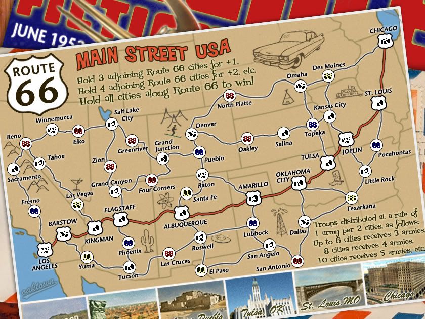
- The background images are now my own - the bottom layer is a fabricated Science Fiction magazine (borrowing the look from the 1940s-50s Science Fiction Quarterly) featuring a bit of gimil's Mars at the bottom and one of my spaceships. National Geographic was fun because, well, we make maps here, but the copyright hassle isn't worth it.
- The circles have been restored to 24 pixels in width.
- I restored the little doodles to their earlier quality.
- More corners of the postcard run off the image.
-
the.killing.44
- Posts: 4724
- Joined: Thu Oct 23, 2008 7:43 pm
- Gender: Male
- Location: now tell me what got two gums and knows how to spit rhymes
- Contact:
Re: Route 66: mars? pg 9
Hmm … I like the idea, and I think putting the date on there is a 110% great idea, but the blue and red seems a bit harsh on the eyes, as firstly they're just brash colors (and the combination moreso), but also it seems a bit much really because it takes one's attention off the map itself and onto the magazine.
.44
.44

Re: Route 66: mars? pg 9
hmmmmm
just a thought inspired by the mars snippet there
why not put it on top of piles of other maps?
*cough* CC Bank *cough* *cough*
just a thought inspired by the mars snippet there
why not put it on top of piles of other maps?
*cough* CC Bank *cough* *cough*