
If you say soiancanton wrote:u need only 3 sets of starting positions; to make sense, each set must include one village and one french left flank division.
Austerlitz Map [Quenched]
Moderator: Cartographers
Forum rules
Please read the Community Guidelines before posting.
Please read the Community Guidelines before posting.
Re: AUSTERLITZ [D] v05 17apr2009
De gueules à la tour d'argent ouverte, crénelée de trois pièces, sommée d'un donjon ajouré, crénelé de deux pièces
Gules an open tower silver, crenellated three parts, topped by a apertured turret, crenellated two parts
Gules an open tower silver, crenellated three parts, topped by a apertured turret, crenellated two parts
-
Incandenza

- Posts: 4949
- Joined: Thu Oct 19, 2006 5:34 pm
- Gender: Male
- Location: Playing Eschaton with a bucket of old tennis balls
Re: AUSTERLITZ [D] v05 17apr2009
Hey pamoa, I'm looking in on this for ian. The thing he wanted me to make sure of is what you guys have just been talking about:
If you're good with that, then I believe this is ready for gameplay stampin'.pamoa wrote:If you say soiancanton wrote:u need only 3 sets of starting positions; to make sense, each set must include one village and one french left flank division.
THOTA: dingdingdingdingdingdingBOOM
Te Occidere Possunt Sed Te Edere Non Possunt Nefas Est
Te Occidere Possunt Sed Te Edere Non Possunt Nefas Est
Re: AUSTERLITZ [D] v05 17apr2009
I'll code it as following
Code: Select all
<positions>
   <position>
      <territory>Suchet</territory>
      <territory>Pratzen</territory>
   </position>

   <position>
      <territory>Kellerman</territory>
      <territory>Skolnitz</territory>
   </position>

   <position>
      <territory>Caffarelli</territory>
      <territory>Telnitz</territory>
   </position>
</positions>
De gueules à la tour d'argent ouverte, crénelée de trois pièces, sommée d'un donjon ajouré, crénelé de deux pièces
Gules an open tower silver, crenellated three parts, topped by a apertured turret, crenellated two parts
Gules an open tower silver, crenellated three parts, topped by a apertured turret, crenellated two parts
-
Incandenza
- Posts: 4949
- Joined: Thu Oct 19, 2006 5:34 pm
- Gender: Male
- Location: Playing Eschaton with a bucket of old tennis balls
Re: AUSTERLITZ [D] v05 17apr2009
Well, someone who knows xml better than I do should probably look that over... that being said, here ya go:

THOTA: dingdingdingdingdingdingBOOM
Te Occidere Possunt Sed Te Edere Non Possunt Nefas Est
Te Occidere Possunt Sed Te Edere Non Possunt Nefas Est
-
captainwalrus
- Posts: 1018
- Joined: Sun Nov 11, 2007 3:19 pm
- Location: Finnmark
Re: AUSTERLITZ [D,Gp] v05 17apr2009
Yay! I like this a lot, but I am at a loss for what to advise. From the begining I thought it was really good and I can't wait to see it keep going.
Re: AUSTERLITZ [D,Gp] v05 17apr2009
thanks for the stamp Incandenza
thanks for the support captainwalrus
thanks for the support captainwalrus
Last edited by pamoa on Wed May 27, 2009 1:10 pm, edited 1 time in total.
De gueules à la tour d'argent ouverte, crénelée de trois pièces, sommée d'un donjon ajouré, crénelé de deux pièces
Gules an open tower silver, crenellated three parts, topped by a apertured turret, crenellated two parts
Gules an open tower silver, crenellated three parts, topped by a apertured turret, crenellated two parts

Re: AUSTERLITZ [D,Gp] v05 17apr2009
Congratulations on the stamp pamoa! Is the version of the map you posted on Apr 17th the most recent? It's looking pretty good to be honest... Do you have an update to post, or are you pretty much settled?

PB: 2661 | He's blue... If he were green he would die | No mod would be stupid enough to do that
Re: AUSTERLITZ [D,Gp] v05 17apr2009
tx
graphically I'm ready
I only have to make the large version which should be posted in a week
the xml is also ready missing only the large map coordinates
graphically I'm ready
I only have to make the large version which should be posted in a week
the xml is also ready missing only the large map coordinates
Last edited by pamoa on Wed May 27, 2009 1:11 pm, edited 1 time in total.
De gueules à la tour d'argent ouverte, crénelée de trois pièces, sommée d'un donjon ajouré, crénelé de deux pièces
Gules an open tower silver, crenellated three parts, topped by a apertured turret, crenellated two parts
Gules an open tower silver, crenellated three parts, topped by a apertured turret, crenellated two parts
-
the.killing.44

- Posts: 4724
- Joined: Thu Oct 23, 2008 7:43 pm
- Gender: Male
- Location: now tell me what got two gums and knows how to spit rhymes
- Contact:
Re: AUSTERLITZ [D,Gp] v05 17apr2009
Did you consider stroking the paths with a 1px black (possibly low-ish opacity) stroke? It might just improve the clarity.
.44
.44
Re: AUSTERLITZ [D,Gp] v05 17apr2009
yes I thought some solution like this but did decide to reserve it for the main road which didn't enter in gameplaythe.killing.44 wrote:Did you consider stroking the paths with a 1px black (possibly low-ish opacity) stroke? It might just improve the clarity.
and keep a single line for the path which are attack route 2px wide and unused path 1px wide
the colour I choose is to blend in the map bg so as not to have a drawing for gameplay glued on a faded inutile bg
if you really think it is difficult to figure out the attack line I can try a darker shade (or maybe just you should increase your monitor contrast
Last edited by pamoa on Wed May 27, 2009 1:11 pm, edited 1 time in total.
De gueules à la tour d'argent ouverte, crénelée de trois pièces, sommée d'un donjon ajouré, crénelé de deux pièces
Gules an open tower silver, crenellated three parts, topped by a apertured turret, crenellated two parts
Gules an open tower silver, crenellated three parts, topped by a apertured turret, crenellated two parts
Re: AUSTERLITZ [D,Gp] v05 27may2009
v05 new features:large map
- Click image to enlarge.

De gueules à la tour d'argent ouverte, crénelée de trois pièces, sommée d'un donjon ajouré, crénelé de deux pièces
Gules an open tower silver, crenellated three parts, topped by a apertured turret, crenellated two parts
Gules an open tower silver, crenellated three parts, topped by a apertured turret, crenellated two parts
Re: AUSTERLITZ [D,Gp] v05 27may2009
Right... I'm looking at the large and small images listed at the top of the 1st post, and have the following comments/observations:
The historical text at the top of the map is incredibly difficult to read on the small map. Legibility could be improved by making the title & drawing slightly smaller; width is more of an issue than height, but you could shuffle Suchet, Engelhardt and Kellerman down a bit if you need. The descriptive text can then be made slightly larger to fit the space.
Both maps feels a bit too spaced out - there appears to be 40px of dead space at the bottom of the small map and around 60px on the large.. Is there any way you could move the bonus legend up a little bit, without losing the clarity of the Central Flank indicator? There looks to be enough room to move the Cetnral Flank indicator nearer to Alexandre, which would make it easier to move the legend up.
It may help space if you were to change Left-Central-Right Flanks to North-Central-South - that way you could have a single set of indicators on one side of the map, which would give you a bit more room to squeeze things in more comfortably; although you may not need to change it if you can fit everything in
On the legend you have Alex. & Liechten. +1... It's not clear whether you need both of them for a +1 bonus, or whether they are +1 autodeploy each (like Napoleon)
Just as an aside, have you experimented with any textures in the background? (something like this) The map looks like it should be aged, but feels too clean and modern...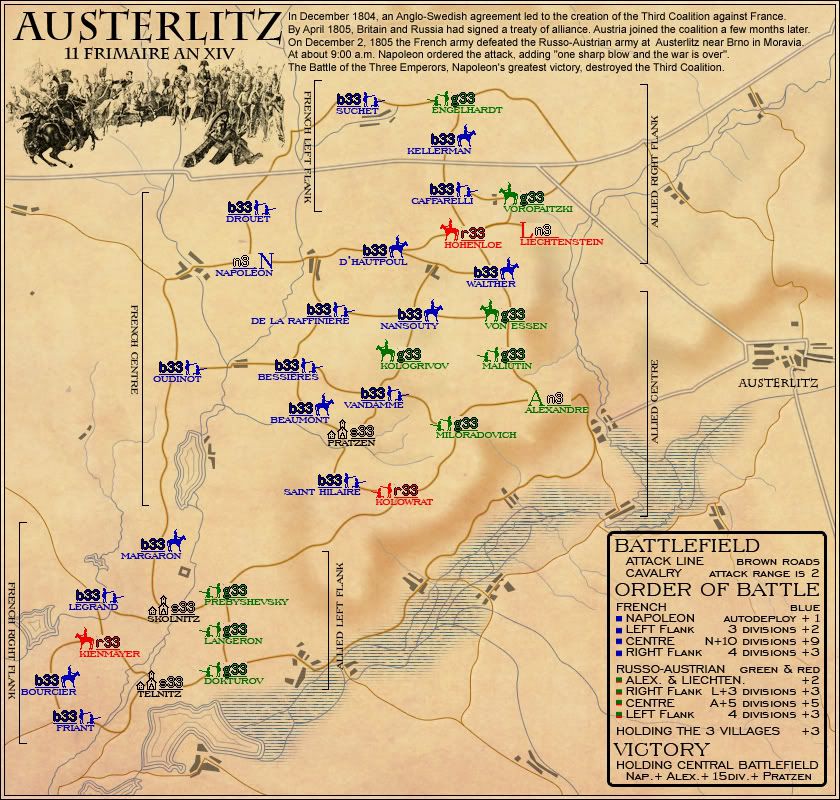
example
PB: 2661 | He's blue... If he were green he would die | No mod would be stupid enough to do that
Re: AUSTERLITZ [D,Gp] v05 27may2009
I'll try to enlarge the text a bit but it isn't really important to be able to read it in perfect condition on the small map as it is only a quote and you can read it perfectly on the large oneMrBenn wrote:The historical text at the top of the map is incredibly difficult to read on the small map. Legibility could be improved by making the title & drawing slightly smaller; width is more of an issue than height, but you could shuffle Suchet, Engelhardt and Kellerman down a bit if you need. The descriptive text can then be made slightly larger to fit the space.
I can't see having space and air in a map as a problemMrBenn wrote:Both maps feels a bit too spaced out - there appears to be 40px of dead space at the bottom of the small map and around 60px on the large.. Is there any way you could move the bonus legend up a little bit, without losing the clarity of the Central Flank indicator? There looks to be enough room to move the Cetnral Flank indicator nearer to Alexandre, which would make it easier to move the legend up.
It may help space if you were to change Left-Central-Right Flanks to North-Central-South - that way you could have a single set of indicators on one side of the map, which would give you a bit more room to squeeze things in more comfortably; although you may not need to change it if you can fit everything in
I did go until this point at the bottom of the map to have both lakes in
by not saying autodeploy it is clear it isn't like NapoléonMrBenn wrote:On the legend you have Alex. & Liechten. +1... It's not clear whether you need both of them for a +1 bonus, or whether they are +1 autodeploy each (like Napoleon)
I think the confusion came for you from the fact you did remember the previous situation with only Alexandre getting a +1 autodeploy bonus
by principle I against making look old what occur in the past only because it happens long agoMrBenn wrote:Just as an aside, have you experimented with any textures in the background? The map looks like it should be aged, but feels too clean and modern...
but in this case I must think about it because it darken the map which gives me a good feeling
thanks for commenting this map, there isn't a lot of people dropping in
De gueules à la tour d'argent ouverte, crénelée de trois pièces, sommée d'un donjon ajouré, crénelé de deux pièces
Gules an open tower silver, crenellated three parts, topped by a apertured turret, crenellated two parts
Gules an open tower silver, crenellated three parts, topped by a apertured turret, crenellated two parts
-
captainwalrus
- Posts: 1018
- Joined: Sun Nov 11, 2007 3:19 pm
- Location: Finnmark
Re: AUSTERLITZ [D,Gp] v05 27may2009
I wonder if this might get confusing if the blue player controled a lot of red or Green teritories. Perhaps you should show that, instead of what you have now, where the blue all have blue army numbers and te green all have green, ect.
I think not many people are commenting, because it is hard to find things to comment about.
I think not many people are commenting, because it is hard to find things to comment about.
Re: AUSTERLITZ [D,Gp] v05 27may2009
you mean a test with all 8 colours displayed randomly around like here undercaptainwalrus wrote:I wonder if this might get confusing if the blue player controlled a lot of red or Green territories. Perhaps you should show that, instead of what you have now, where the blue all have blue army numbers and the green all have green, ect.
that's a good signcaptainwalrus wrote:I think not many people are commenting, because it is hard to find things to comment about.
it means I'm ready for live ...
- Click image to enlarge.

De gueules à la tour d'argent ouverte, crénelée de trois pièces, sommée d'un donjon ajouré, crénelé de deux pièces
Gules an open tower silver, crenellated three parts, topped by a apertured turret, crenellated two parts
Gules an open tower silver, crenellated three parts, topped by a apertured turret, crenellated two parts
Re: AUSTERLITZ [D,Gp] v05 27may2009
I think that instead of the bar look for the red/green alliance, why not have them diagonally? At first it's hard to tell that it is intentionally two colors. Diagonally could increase the relative visibility.
On the order of battle, at first I thought "oh, the 15th division", then realized there is no 15th division and you meant 15 DIVISIONS. Adding an S to the abbreviation should help.
There is no note of attack routes. It's been assumed that people will know that the brown lines are attacks. Please find some way to explicitly note this, as some moron will not figure it out.
Re: AUSTERLITZ [D,Gp] v05 27may2009
Pamoa, was that last image just to test the 888s in different colours?? Have you made any other adjustments?
PB: 2661 | He's blue... If he were green he would die | No mod would be stupid enough to do that
-
Blitzaholic

- Posts: 23050
- Joined: Wed Aug 09, 2006 11:57 pm
- Location: Apocalyptic Area
Re: AUSTERLITZ [D,Gp] v05 27may2009
If you could only change the name please to AUSTERBLITZ 
be wonderful
be wonderful

-
dolomite13

- Posts: 1379
- Joined: Mon Aug 18, 2008 5:54 pm
Re: AUSTERLITZ [D,Gp] v05 27may2009
Forgive me if I am wrong but I believe longer numbers flow to the right so it would be better to have unit symbols left of the unit numbers. Also I believe they want new maps to conform to 800x800 max for large and this is 840 wide. To be honest you could probably get away with 700x700 for large and 400x400 for the small as there is a ton of wasted space on the right side of the map. I am looking forward to playing this map tho =)
--D
--D
Where Have I Been? ... Testing a prototype board game that I co-designed called Alien Overrun!
-
LED ZEPPELINER
- Posts: 1088
- Joined: Tue Nov 25, 2008 10:09 pm
Re: AUSTERLITZ [D,Gp] v05 27may2009
I was not aware that there was a new requirement for maps. I thought it was still 840px
sailorseal wrote:My big boy banana was out the whole time
AndyDufresne wrote:Forever linked at the hip's-banana! (That sounds strange, don't quote me.)AndyDufresne wrote:Many Happy Bananas to everyone, lets party...with Bananas.
--Andy
Re: AUSTERLITZ [D,Gp] v05 27may2009
9. A map must work within the following map size restrictions:1. SMALL MAP: WIDTH up to 630 px; HEIGHT 600 px
2. LARGE MAP: WIDTH up to 840 px ; HEIGHT 800 px.
PB: 2661 | He's blue... If he were green he would die | No mod would be stupid enough to do that
-
dolomite13
- Posts: 1379
- Joined: Mon Aug 18, 2008 5:54 pm
Re: AUSTERLITZ [D,Gp] v05 27may2009
AH i was sure I read 800x800 somewhere... thanx mrbenn... however I do believe you don't need to use all of that space =)
Where Have I Been? ... Testing a prototype board game that I co-designed called Alien Overrun!

Re: AUSTERLITZ [D,Gp] v05 17apr2009
pamoa wrote:yes I thought some solution like this but did decide to reserve it for the main road which didn't enter in gameplaythe.killing.44 wrote:Did you consider stroking the paths with a 1px black (possibly low-ish opacity) stroke? It might just improve the clarity.
and keep a single line for the path which are attack route 2px wide and unused path 1px wide
the colour I choose is to blend in the map bg so as not to have a drawing for gameplay glued on a faded inutile bg
if you really think it is difficult to figure out the attack line I can try a darker shade (or maybe just you should increase your monitor contrast
i can follow the paths nicely but i think that a stroke is not necessarily the best way to way them pop out with keeping the clean look of everything
maybe try a black glow instead this will make it stick out a liittle better so you don't have to be inches from the screen
by the way Nice clean look i like it
Re: AUSTERLITZ [D,Gp] v05 27may2009
do you really think it would make any difference, maybe I'll try itTaCktiX wrote:I think that instead of the bar look for the red/green alliance, why not have them diagonally? At first it's hard to tell that it is intentionally two colors. Diagonally could increase the relative visibility.
sure you're right, I'll change itTaCktiX wrote:On the order of battle, at first I thought "oh, the 15th division", then realized there is no 15th division and you meant 15 DIVISIONS. Adding an S to the abbreviation should help.
does "attack line brown roads" sounds familiar... second line of the legend, maybe you need better glassesTaCktiX wrote:There is no note of attack routes. It's been assumed that people will know that the brown lines are attacks. Please find some way to explicitly note this, as some moron will not figure it out.
yes just an answer to captainwalrus and for me the completion of xmlMrBenn wrote:Pamoa, was that last image just to test the 888s in different colours?? Have you made any other adjustments?
v06 as soon as I can but I got a lot of work so it may last a few days...
your just a Blitzaholic who need a good cure but I won't say it aroundBlitzaholic wrote:If you could only change the name please to AUSTERBLITZ
as told beforedolomite13 wrote:AH i was sure I read 800x800 somewhere... thanx mrbenn... however I do believe you don't need to use all of that space =)
I can't see having space and air in a map as a problemMrBenn wrote:Both maps feels a bit too spaced out - there appears to be 40px of dead space at the bottom of the small map and around 60px on the large.. Is there any way you could move the bonus legend up a little bit, without losing the clarity of the Central Flank indicator? There looks to be enough room to move the Cetnral Flank indicator nearer to Alexandre, which would make it easier to move the legend up.
It may help space if you were to change Left-Central-Right Flanks to North-Central-South - that way you could have a single set of indicators on one side of the map, which would give you a bit more room to squeeze things in more comfortably; although you may not need to change it if you can fit everything in
I did go until this point at the bottom of the map to have both lakes in
the.killing.44 wrote:Did you consider stroking the paths with a 1px black (possibly low-ish opacity) stroke? It might just improve the clarity.
pamoa wrote:yes I thought some solution like this but did decide to reserve it for the main road which didn't enter in gameplay
and keep a single line for the path which are attack route 2px wide and unused path 1px wide
the colour I choose is to blend in the map bg so as not to have a drawing for gameplay glued on a faded inutile bg
if you really think it is difficult to figure out the attack line I can try a darker shade (or maybe just you should increase your monitor contrast
sorry I'm not sure to understand what you mean by trying a black glow is it around the actual brown roadsDanyael wrote:i can follow the paths nicely but i think that a stroke is not necessarily the best way to way them pop out with keeping the clean look of everything
maybe try a black glow instead this will make it stick out a little better so you don't have to be inches from the screen
if that's it sound good to try
thanksDanyael wrote:by the way Nice clean look i like it
De gueules à la tour d'argent ouverte, crénelée de trois pièces, sommée d'un donjon ajouré, crénelé de deux pièces
Gules an open tower silver, crenellated three parts, topped by a apertured turret, crenellated two parts
Gules an open tower silver, crenellated three parts, topped by a apertured turret, crenellated two parts
Re: AUSTERLITZ [D,Gp] v05 27may2009
yes the "actual brown road" sorry i don't know i can't tell the colour but that is what i meantpamoa wrote:sorry I'm not sure to understand what you mean by trying a black glow is it around the actual brown roadsDanyael wrote:i can follow the paths nicely but i think that a stroke is not necessarily the best way to way them pop out with keeping the clean look of everything
maybe try a black glow instead this will make it stick out a little better so you don't have to be inches from the screen
if that's it sound good to try