Conquer Club

[Official] Brazil REVAMP [Quenched]

Care to peruse completed maps? Take a stroll through the Atlas.

Moderator: Cartographers

Forum rules
Please read the Community Guidelines before posting.

Re: [Official] Brazil REVAMP (Lrg & Sml maps pg.1&13) [I, GP]

Postby the.killing.44 on Fri May 01, 2009 3:39 pm

Perfect. I only have two quarrels (ermm … nitpicks) with the graphics:
  1. I still don't like the red glow/stroke coming off the impassables.
  2. There's a big glob just north of Solimöes (btw, what mark is that above the name? Certainly looks like a ¨ but I don't think that's it …
Co-ords are all centered properly atm, I'll recheck in FF of course but one problem has popped up:
Small
888 overlaps "P" in Paraíba
    move the army circle up 1-2px and left 1-2px, while moving the name down 1px. Should fix the overlap ;)
This is sweet.

.44
User avatar
Captain the.killing.44
 
Posts: 4724
Joined: Thu Oct 23, 2008 7:43 pm
Location: now tell me what got two gums and knows how to spit rhymes

Re: [Official] Brazil REVAMP (Lrg & Sml maps pg.1&13) [I, GP]

Postby MrBenn on Fri May 01, 2009 3:42 pm

the.killing.44 wrote:Perfect. I only have two quarrels (ermm … nitpicks) with the graphics:
  1. I still don't like the red glow/stroke coming off the impassables.
  2. There's a big glob just north of Solimöes (btw, what mark is that above the name? Certainly looks like a ¨ but I don't think that's it …
Co-ords are all centered properly atm, I'll recheck in FF of course but one problem has popped up:
Small
888 overlaps "P" in Paraíba
    move the army circle up 1-2px and left 1-2px, while moving the name down 1px. Should fix the overlap ;)
This is sweet.

.44

Good catch on Paraiba...
I believe the accent you refer to is a tilde ~
Image
PB: 2661 | He's blue... If he were green he would die | No mod would be stupid enough to do that
User avatar
Lieutenant MrBenn
 
Posts: 6880
Joined: Wed Nov 21, 2007 9:32 am
Location: Off Duty

Re: [Official] Brazil REVAMP (Lrg & Sml maps pg.1&13) [I, GP]

Postby LED ZEPPELINER on Fri May 01, 2009 4:29 pm

the.killing.44 wrote:I still don't like the red glow/stroke coming off the impassables.

I like that glow.
sailorseal wrote:My big boy banana was out the whole time :D
AndyDufresne wrote:
AndyDufresne wrote:Many Happy Bananas to everyone, lets party...with Bananas.
--Andy
Forever linked at the hip's-banana! (That sounds strange, don't quote me.)
Sergeant LED ZEPPELINER
 
Posts: 1088
Joined: Tue Nov 25, 2008 10:09 pm

Re: [Official] Brazil REVAMP (Lrg & Sml maps pg.1&13) [I, GP]

Postby RjBeals on Fri May 01, 2009 7:06 pm

the.killing.44 wrote:Perfect. I only have two quarrels (ermm … nitpicks) with the graphics:
  1. I still don't like the red glow/stroke coming off the impassables.
  2. There's a big glob just north of Solimöes (btw, what mark is that above the name? Certainly looks like a ¨ but I don't think that's it …
Co-ords are all centered properly atm, I'll recheck in FF of course but one problem has popped up:
Small
888 overlaps "P" in Paraíba
    move the army circle up 1-2px and left 1-2px, while moving the name down 1px. Should fix the overlap ;)
This is sweet.

.44


I'll fix the blotch.

I like the glow around the non-crossing borders. There's not much else that will work there. I'm not going to make a wall or anything. I think most of the people are okay with it. If it becomes more of a hot topic, I'll consider trying something else. But honestly, it's been like that since August of last year.

I'll have a look at the accent above the Paraiba.

Thanks for the feedback 44 (and everyone else)

I'm out of town for the weekend - i'll check back in a few days - maybe some others will have comments then.
Image
User avatar
Private RjBeals
 
Posts: 2506
Joined: Mon Nov 20, 2006 5:17 pm
Location: South Carolina, USA

Re: [Official] Brazil REVAMP (Lrg & Sml maps pg.1&13) [I, GP]

Postby the.killing.44 on Fri May 01, 2009 10:39 pm

Tilde's right, it just doesn't look very much like it … :?
The red isn't a big problem, it was just the complementary colors don't seem to go with the map's natural, unsatured feel. I'm just thinking more of a (dark) brown glow than red, maybe even something something along these lines (that is kinda right between red and brown). Color code is BF4000 btw.

The accent issue (hardly that) was on Solimões, not Paraíba ;)

.44
User avatar
Captain the.killing.44
 
Posts: 4724
Joined: Thu Oct 23, 2008 7:43 pm
Location: now tell me what got two gums and knows how to spit rhymes

Re: [Official] Brazil REVAMP (Lrg & Sml maps pg.1&13) [I, GP]

Postby gho on Sat May 02, 2009 2:39 am

RJBeals, you have taken this map from the worst graphically to the best (I think this surpasses Canada which i previously thought was the best).
Lieutenant gho
 
Posts: 129
Joined: Thu Jun 05, 2008 7:13 am

Re: [Official] Brazil REVAMP (Lrg & Sml maps pg.1&13) [I, GP]

Postby oaktown on Sat May 02, 2009 2:59 am

somebody should stick this map in the Forge... nice to see that you carried on despite it all, Rj. =D>
User avatar
Captain oaktown
 
Posts: 4451
Joined: Sun Dec 03, 2006 9:24 pm
Location: majorcommand

Re: [Official] Brazil REVAMP (Lrg & Sml maps pg.1&13) [I, GP]

Postby RjBeals on Sat May 02, 2009 6:53 am

gho wrote:RJBeals, you have taken this map from the worst graphically to the best (I think this surpasses Canada which i previously thought was the best).


It's these kind of comments that give me my fuel oaktown to carry on. Thanks gho!
44 - I'll give it a try and see what i think.
Image
User avatar
Private RjBeals
 
Posts: 2506
Joined: Mon Nov 20, 2006 5:17 pm
Location: South Carolina, USA

Re: [Official] Brazil REVAMP (Lrg & Sml maps pg.1&13) [I, GP]

Postby nature on Sat May 02, 2009 7:55 pm

Hey, the map is great, almost finish! I can wait anymore to play it!!! :D

I just found some problems in ortograph again:

Alto parnaiba - Alto parnaíba
Vihena - Vilhena
Foz Do Iguaçu - Foz do Iguaçu
User avatar
Sergeant 1st Class nature
 
Posts: 138
Joined: Fri Dec 19, 2008 1:46 pm
Location: Rio de Janeiro, Brazil

Re: [Official] Brazil REVAMP (Lrg & Sml maps pg.1&13) [I, GP]

Postby RjBeals on Sun May 03, 2009 7:01 am

nature wrote:Hey, the map is great, almost finish! I can wait anymore to play it!!! :D

I just found some problems in ortograph again:

Alto parnaiba - Alto parnaíba
Vihena - Vilhena
Foz Do Iguaçu - Foz do Iguaçu


nice proofing nature.
I'll fix those soon
Image
User avatar
Private RjBeals
 
Posts: 2506
Joined: Mon Nov 20, 2006 5:17 pm
Location: South Carolina, USA

Re: [Official] Brazil REVAMP (Lrg & Sml maps pg.1&13) [I, GP]

Postby gimil on Sun May 03, 2009 9:51 am

Hi RJ,

Just a small request today. Do you think it would be better to swap the positions of the minimap and the unpassable part of the legends? and somehow position them both to better spread out the use of the space? The only thing that is grabbing my attention is the chunck of space in the bottom left hand corner. Or maybe it is just becuase that part is much more plainly textured than the rest of the map, so maybe a little stronger texture could satisfy my issue.

What do you think?

I can't wait to stamp this :)
What do you know about map making, bitch?

natty_dread wrote:I was wrong


Top Score:2403
User avatar
Corporal 1st Class gimil
 
Posts: 8599
Joined: Sat Mar 03, 2007 12:42 pm
Location: United Kingdom (Scotland)

Re: [Official] Brazil REVAMP (Lrg & Sml maps pg.1&13) [I, GP]

Postby LED ZEPPELINER on Sun May 03, 2009 10:29 am

File: http://otissito.com/CCMaps/Brazil/Brazil.xml

Image

Image
just bringing it onto this page
sailorseal wrote:My big boy banana was out the whole time :D
AndyDufresne wrote:
AndyDufresne wrote:Many Happy Bananas to everyone, lets party...with Bananas.
--Andy
Forever linked at the hip's-banana! (That sounds strange, don't quote me.)
Sergeant LED ZEPPELINER
 
Posts: 1088
Joined: Tue Nov 25, 2008 10:09 pm

Re: [Official] Brazil REVAMP (Lrg & Sml maps pg.1&13) [I, GP]

Postby Tisha on Sun May 03, 2009 10:37 am

gimil wrote:Hi RJ,

Just a small request today. Do you think it would be better to swap the positions of the minimap and the unpassable part of the legends? and somehow position them both to better spread out the use of the space? The only thing that is grabbing my attention is the chunck of space in the bottom left hand corner. Or maybe it is just becuase that part is much more plainly textured than the rest of the map, so maybe a little stronger texture could satisfy my issue.

What do you think?

I can't wait to stamp this :)


i think the North East region of the mini map fits into Foz Do Iquacu very nice


and i can't believe this isn't in Final Forge yet :?
User avatar
Major Tisha
 
Posts: 1065
Joined: Sat Dec 23, 2006 12:41 am

Re: [Official] Brazil REVAMP (Lrg & Sml maps pg.1&13) [I, GP]

Postby gimil on Sun May 03, 2009 10:44 am

Tisha wrote:i think the North East region of the mini map fits into Foz Do Iquacu very nice


I suppose it is just a matter of opinion. The current setup annoys me a little just now :P
What do you know about map making, bitch?

natty_dread wrote:I was wrong


Top Score:2403
User avatar
Corporal 1st Class gimil
 
Posts: 8599
Joined: Sat Mar 03, 2007 12:42 pm
Location: United Kingdom (Scotland)

Re: [Official] Brazil REVAMP (Lrg & Sml maps pg.1&13) [I, GP]

Postby Tisha on Sun May 03, 2009 10:53 am

gimil wrote:
Tisha wrote:i think the North East region of the mini map fits into Foz Do Iquacu very nice


I suppose it is just a matter of opinion. The current setup annoys me a little just now :P


Get over it :P
User avatar
Major Tisha
 
Posts: 1065
Joined: Sat Dec 23, 2006 12:41 am

Re: [Official] Brazil REVAMP (Lrg & Sml maps pg.1&13) [I, GP]

Postby gimil on Sun May 03, 2009 10:56 am

Tisha wrote:
gimil wrote:
Tisha wrote:i think the North East region of the mini map fits into Foz Do Iquacu very nice


I suppose it is just a matter of opinion. The current setup annoys me a little just now :P


Get over it :P


You cheeky ... thing.

[/offtopic]

;)
What do you know about map making, bitch?

natty_dread wrote:I was wrong


Top Score:2403
User avatar
Corporal 1st Class gimil
 
Posts: 8599
Joined: Sat Mar 03, 2007 12:42 pm
Location: United Kingdom (Scotland)

Re: [Official] Brazil REVAMP (Lrg & Sml maps pg.1&13) [I, GP]

Postby LED ZEPPELINER on Sun May 03, 2009 12:41 pm

I think if you put the non crossing border at the bottom of the map, it would be to little noticable
sailorseal wrote:My big boy banana was out the whole time :D
AndyDufresne wrote:
AndyDufresne wrote:Many Happy Bananas to everyone, lets party...with Bananas.
--Andy
Forever linked at the hip's-banana! (That sounds strange, don't quote me.)
Sergeant LED ZEPPELINER
 
Posts: 1088
Joined: Tue Nov 25, 2008 10:09 pm

Re: [Official] Brazil REVAMP (Lrg & Sml maps pg.1&13) [I, GP]

Postby Optimus Prime on Mon May 04, 2009 5:32 pm

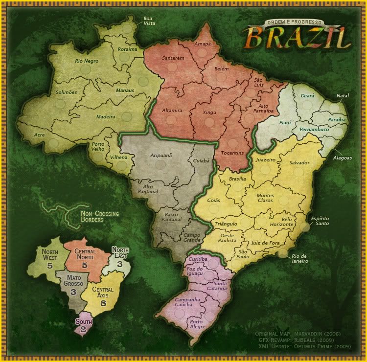
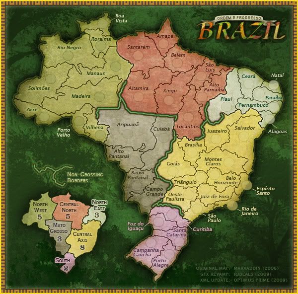
Alrighty, here is both the large and small maps (most recently posted versions) with the XML centering complete. Let me know if you see anything that is a little off at all. Won't take much to adjust things as necessary from this point. :)

File: http://otissito.com/CCMaps/Brazil/Brazil.xml

Image

Image

Click image to enlarge.
image


Click image to enlarge.
image
User avatar
Cadet Optimus Prime
 
Posts: 9665
Joined: Mon Mar 12, 2007 9:33 pm

Re: [Official] Brazil REVAMP (Lrg & Sml maps pg.1&13) [I, GP]

Postby LED ZEPPELINER on Mon May 04, 2009 7:19 pm

on small, the 888 still covors the P on the Parabaila, and the 888 covors the H on large on Belo Horizonte
sailorseal wrote:My big boy banana was out the whole time :D
AndyDufresne wrote:
AndyDufresne wrote:Many Happy Bananas to everyone, lets party...with Bananas.
--Andy
Forever linked at the hip's-banana! (That sounds strange, don't quote me.)
Sergeant LED ZEPPELINER
 
Posts: 1088
Joined: Tue Nov 25, 2008 10:09 pm

Re: [Official] Brazil REVAMP (Lrg & Sml maps pg.1&13) [I, GP]

Postby the.killing.44 on Mon May 04, 2009 7:22 pm

LED ZEPPELINER wrote:on small, the 888 still covors the P on the Parabaila, and the 888 covors the H on large on Belo Horizonte

Yeah, this wasn't an Rj update just a post with both L&S co-ords done. So those weren't addressed, and "H" on Belo Horizonte should be fine. I guess it wouldn't hurt to move it over 1px though.

.44
User avatar
Captain the.killing.44
 
Posts: 4724
Joined: Thu Oct 23, 2008 7:43 pm
Location: now tell me what got two gums and knows how to spit rhymes

Re: [Official] Brazil REVAMP (Lrg & Sml maps pg.1&13) [I, GP]

Postby jiminski on Wed May 06, 2009 5:30 am

still chasing tails!?

this map certainly bears testament to your creativity RJ... but what will be forgotten is the prolonged, constant test to your patience!
well done mate.
Image
User avatar
Captain jiminski
 
Posts: 5422
Joined: Tue Feb 20, 2007 3:30 pm
Location: London

Re: [Official] Brazil REVAMP (Lrg & Sml maps pg.1&13) [I, GP]

Postby RjBeals on Wed May 06, 2009 11:56 am

sailorseal wrote:I am not sure about the electric green impassible. It does not seem to fit with the rest of the map. The background gives a light forest feel and the colors second that but that electric green seems out of place.


the.killing.44 wrote: I still don't like the red glow/stroke coming off the impassables.


Sorry Sailor/44. I understand but I think I'll stick with the electric green. I think I am satisfied, and most of the community is satisfied with the graphics as they currently are.


the.killing.44 wrote:There's a big glob just north of Solimöes


Fixed

the.killing.44 wrote:...what mark is that above the name? Certainly looks like a ¨ but I don't think that's it...
...Tilde's right, it just doesn't look very much like it …...


Fixed

the.killing.44 wrote:Small 888 overlaps "P" in Paraíba move the army circle up 1-2px and left 1-2px, while moving the name down 1px. Should fix the overlap ;)


Fixed

nature wrote:
I just found some problems in ortograph again:

Alto parnaiba - Alto parnaíba
Vihena - Vilhena
Foz Do Iguaçu - Foz do Iguaçu


Fixed

gimil wrote:Just a small request today. Do you think it would be better to swap the positions of the minimap and the unpassable part of the legends? ...What do you think?


Sorry Gim. I'm not going to fart around anymore with this map. It is what it is.

LED ZEPPELINER wrote:I think if you put the non crossing border at the bottom of the map, it would be to little noticable


Naa... It's perfectly noticable as is.

LED ZEPPELINER wrote:... and the 888 covors the H on large on Belo Horizonte


Fixed

Click image to enlarge.
image

Image.

The 2 images above are my final images. I think this map has lived it's life. I've addressed all feedback and fixed what needed fixed. I'm done with this map. I've gotten some really positive feedback from it - I think when it's launched the general site will favor it over Marv's. Hope you guys understand, but I don't have the time or patience anymore to nit-pick this map apart. If there is a graphical problem relating to the xml, then let me know - otherwise, I've completed this map.

8-[
Image
User avatar
Private RjBeals
 
Posts: 2506
Joined: Mon Nov 20, 2006 5:17 pm
Location: South Carolina, USA

Re: [Official] Brazil REVAMP (Final Images pg.1&15) [I, GP]

Postby Optimus Prime on Wed May 06, 2009 12:13 pm

I'll finalize the XML in the next day or so. :)
User avatar
Cadet Optimus Prime
 
Posts: 9665
Joined: Mon Mar 12, 2007 9:33 pm

Re: [Official] Brazil REVAMP (Final Images pg.1&15) [I, GP]

Postby nature on Wed May 06, 2009 12:51 pm

RjBeals, thanks very much again for this beautiful map and for your patience! The MAP is amazing! :D

As a brazilian I wanna to congrats again to remake our map, the was not being used even from us. It is beautiful now thanks =D>

I wanna be in the first team to play this map :mrgreen:


Only a question, when it be aproved the map ll be in beta stage or it ll just replace the last one? :?
User avatar
Sergeant 1st Class nature
 
Posts: 138
Joined: Fri Dec 19, 2008 1:46 pm
Location: Rio de Janeiro, Brazil

Re: [Official] Brazil REVAMP (Final Images pg.1&15) [I, GP]

Postby AndyDufresne on Wed May 06, 2009 1:57 pm

The map will be in a short BETA stage most likely, just to make sure there aren't any unforseen strange occurrences. :)


--Andy
User avatar
Corporal 1st Class AndyDufresne
 
Posts: 24935
Joined: Fri Mar 03, 2006 8:22 pm
Location: A Banana Palm in Zihuatanejo

PreviousNext

Return to The Atlas

Who is online

Users browsing this forum: No registered users