Central America [Quenched]
Moderator: Cartographers
Forum rules
Please read the Community Guidelines before posting.
Please read the Community Guidelines before posting.
-
LED ZEPPELINER
- Posts: 1088
- Joined: Tue Nov 25, 2008 10:09 pm
Re: Central America [D] V5 !!!! (page 1 and 4)
i think it is better without army circles, the army circles detract from the bright and colourful feel of the map
-
lgoasklucyl

- Posts: 526
- Joined: Mon Apr 07, 2008 8:49 pm
- Gender: Male
- Location: Somewhere in the 20th century.
Re: Central America [D] V5 !!!! (page 1 and 4)
I second this notion, is anyone opposed to a lack of army circles? The only problem I could see is color confusion with the background.LED ZEPPELINER wrote:i think it is better without army circles, the army circles detract from the bright and colourful feel of the map


Re: Central America [D] V5 !!!! (page 1 and 4)
show us a map with examples of both and we can make an informed decisionLED ZEPPELINER wrote:i think it is better without army circles, the army circles detract from the bright and colourful feel of the map
-
LED ZEPPELINER
- Posts: 1088
- Joined: Tue Nov 25, 2008 10:09 pm
Re: Central America [D] V5 !!!! (page 1 and 4)
there are the examples on the first pageoaktown wrote:show us a map with examples of both and we can make an informed decisionLED ZEPPELINER wrote:i think it is better without army circles, the army circles detract from the bright and colourful feel of the map

Re: Central America [D] V5 !!!! (page 1 and 4)
They're not technically the correct 88's I don't think?!LED ZEPPELINER wrote:there are the examples on the first pageoaktown wrote:show us a map with examples of both and we can make an informed decisionLED ZEPPELINER wrote:i think it is better without army circles, the army circles detract from the bright and colourful feel of the map
C.

Highest score : 2297
-
LED ZEPPELINER
- Posts: 1088
- Joined: Tue Nov 25, 2008 10:09 pm
Re: Central America [D] V5 !!!! (page 1 and 4)
no, theyre no i dont think
-
lgoasklucyl
- Posts: 526
- Joined: Mon Apr 07, 2008 8:49 pm
- Gender: Male
- Location: Somewhere in the 20th century.
Re: Central America [D] V5 !!!! (page 1 and 4)
Whoopsie. I think the problem with the 88 lies in the last size reduction I did without changing the font back. Must have scaled down to 12.33 or somethingyeti_c wrote:They're not technically the correct 88's I don't think?!LED ZEPPELINER wrote:there are the examples on the first pageoaktown wrote:show us a map with examples of both and we can make an informed decisionLED ZEPPELINER wrote:i think it is better without army circles, the army circles detract from the bright and colourful feel of the map
C.

-
lgoasklucyl
- Posts: 526
- Joined: Mon Apr 07, 2008 8:49 pm
- Gender: Male
- Location: Somewhere in the 20th century.
Re: Central America [D] V5 !!!! (page 1 and 4)
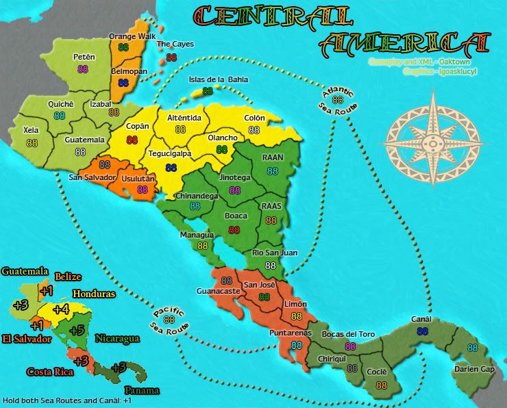
Okay, here's version 6 (freaking finally).
Changes:
-Bunches
-Fixed every attack route; added in new routes to the boats
-Flipped Pacific Boat
-Migrated key north
-Added in new bonus key
-Tweaked the border near Mexico a little
-Touched up the compass to make it less shtort
-Er, other things
Issues:
-I think a little red line just appeared in the Pacific though I'm not sure, I'll get back to you on that
-Attack routes:
a. I personally like the different colors a lot, others might not: comment!
b. They seem to be a little busy, as in there's too many of them now and all over the freaking place. I like them, but don't know how I feel about this.
c. May have to move the compass/resize/lower its opacity as it's getting crowded over there
-Still need to add the Atlantic Sea Routes name (forgot and they were uploaded/saved by that time so psha)
-Army circles or not? I think the Sea Routes ones might need them regardless but who knows
Hopefully we can get a bunch of good criticism this round to move things along quicker. The small map will come back into play once all this attack route junk is handled.
Thanks!
Circles:
No Circles:
Changes:
-Bunches
-Fixed every attack route; added in new routes to the boats
-Flipped Pacific Boat
-Migrated key north
-Added in new bonus key
-Tweaked the border near Mexico a little
-Touched up the compass to make it less shtort
-Er, other things
Issues:
-I think a little red line just appeared in the Pacific though I'm not sure, I'll get back to you on that
-Attack routes:
a. I personally like the different colors a lot, others might not: comment!
b. They seem to be a little busy, as in there's too many of them now and all over the freaking place. I like them, but don't know how I feel about this.
c. May have to move the compass/resize/lower its opacity as it's getting crowded over there
-Still need to add the Atlantic Sea Routes name (forgot and they were uploaded/saved by that time so psha)
-Army circles or not? I think the Sea Routes ones might need them regardless but who knows
Hopefully we can get a bunch of good criticism this round to move things along quicker. The small map will come back into play once all this attack route junk is handled.
Thanks!
Circles:
- Click image to enlarge.

- Click image to enlarge.

-
LED ZEPPELINER
- Posts: 1088
- Joined: Tue Nov 25, 2008 10:09 pm
Re: Central America [D] V6 FINALLY!!!!! (p1+6)
if you look at your sig compared to the compass in the actuall map, the one in the map is still rather short
-
Blitzaholic

- Posts: 23050
- Joined: Wed Aug 09, 2006 11:57 pm
- Location: Apocalyptic Area
Re: Central America [D] V6 FINALLY!!!!! (p1+6)
little small, 29 lands? but like your effort, looking better

-
LED ZEPPELINER
- Posts: 1088
- Joined: Tue Nov 25, 2008 10:09 pm
Re: Central America [D] V6 FINALLY!!!!! (p1+6)
actually i think its 34Blitzaholic wrote:little small, 29 lands? but like your effort, looking better
-
lgoasklucyl
- Posts: 526
- Joined: Mon Apr 07, 2008 8:49 pm
- Gender: Male
- Location: Somewhere in the 20th century.
Re: Central America [D] V6 FINALLY!!!!! (p1+6)
Contemplating adding a slight outer glow on the territ borders.
The black is kinda plain/bland, though it does fit the scheme.
Any other ideas for the next draft?
The black is kinda plain/bland, though it does fit the scheme.
Any other ideas for the next draft?
-
LED ZEPPELINER
- Posts: 1088
- Joined: Tue Nov 25, 2008 10:09 pm
Re: Central America [D] V6 FINALLY!!!!! (p1+6)
if you were to put an outer glow, i would advize it to be a very light yellow
sailorseal wrote:My big boy banana was out the whole time
AndyDufresne wrote:Forever linked at the hip's-banana! (That sounds strange, don't quote me.)AndyDufresne wrote:Many Happy Bananas to everyone, lets party...with Bananas.
--Andy
-
lgoasklucyl
- Posts: 526
- Joined: Mon Apr 07, 2008 8:49 pm
- Gender: Male
- Location: Somewhere in the 20th century.

-
gimil

- Posts: 8599
- Joined: Sat Mar 03, 2007 12:42 pm
- Gender: Male
- Location: United Kingdom (Scotland)
Re: Central America [D] V6 FINALLY!!!!! (p1+6)
In my honest opinion lgoasklucyl I can say I see any progress with your map. There is alot I don't like about it right now.lgoasklucyl wrote:C'mon foundry, help me out a bit here
-The boats to me satnd out as an elemet that doesn't fit the general theme of the map.
-The sea route lines don't look all to great to me either. I feel they are to detailed for what they are. I would suggest making them all one colour (black or grey) and removing (or geatly reduce) the bevel.
-I know the compass is there to fill some dead space but I don't think its style is justifable on this map. Its colours are to pale and its patterns don't like to the rest of the theme in any way.
Those are my major concerns, I have some smaller ones but I think there is enought there for you to think about just now. I bid you good luck

What do you know about map making, bitch?
Top Score:2403natty_dread wrote:I was wrong
Re: Central America [D] V6 FINALLY!!!!! (p1+6)
lots of little things I see that could use some tweaking...
- • the bright parts of the signature are almost unreadable. The text on the territories themselves is very user-friendly.

• the dark stroke around the text on the mini map is way too strong - nothing else on the map is that heavy.
• how come the compass is squashed? Round would look better - this way it just looks like you were pressed for space. Better to make it smaller and round.
• boats are indeed still weird. Since the territory is a "Sea Route" there may be an alternative to a boat, but I'm too sleepy to think of one right now. Maybe just arch the text around the army count... "pacific" over the top, "sea route" below, making a circle. It would mimic the circle of the compass.
• the comment about the glow on the borders is an interesting one; I would say some kind of glow on the region borders to set them apart may be in order.
• I'd give a little more space between Usulutan and Chinandega - right now they almost look to be touching.
-
sailorseal

- Posts: 2735
- Joined: Sun May 25, 2008 1:49 pm
- Gender: Male
- Location: conquerclub.com
Re: Central America [D] V6 FINALLY!!!!! (p1+6)
Look the pirate ship doesn't work why not just put a island out there. I don't like how the lines are color coded, it hurts my eyes, just pick a color and stick with it.
Nice Map!
Nice Map!
-
samuelc812

- Posts: 2215
- Joined: Sun Dec 30, 2007 6:56 am
- Gender: Male
Re: Central America [D] V6 FINALLY!!!!! (p1+6)
You can't just add land on a geographical mapsailorseal wrote:Look the pirate ship doesn't work why not just put a island out there. I don't like how the lines are color coded, it hurts my eyes, just pick a color and stick with it.
Nice Map!
 You can't just put land where land doesn't belong can you?
Re: Central America [D] V6 FINALLY!!!!! (p1+6)
Agreed... my suggestion (above) was to just make it simple and lose the boats for now. If you come up with something better as the map progresses so be it, but I'd like to see you somehow incorporate the shape of the compass into the map in another way. Creating a sea route image out of the compass shape would tie things together nicely.samuelc812 wrote:You can't just add land on a geographical mapsailorseal wrote:Look the pirate ship doesn't work why not just put a island out there. I don't like how the lines are color coded, it hurts my eyes, just pick a color and stick with it.
Nice Map!
Here's the basic shape...
- Click image to enlarge.
-
lgoasklucyl
- Posts: 526
- Joined: Mon Apr 07, 2008 8:49 pm
- Gender: Male
- Location: Somewhere in the 20th century.
Re: Central America [D] V6 FINALLY!!!!! (p1+6)
Hmmm. Interesting with just the words- I'll give that a shot!
Lots to work with- thanks guys =)
A draft should be out sometimes soooon
Lots to work with- thanks guys =)
A draft should be out sometimes soooon
-
Incandenza

- Posts: 4949
- Joined: Thu Oct 19, 2006 5:34 pm
- Gender: Male
- Location: Playing Eschaton with a bucket of old tennis balls
Re: Central America [D] V6 FINALLY!!!!! (p1+6)
So graphically it's coming along nicely, tho I still think you'd be better off with icons on the terits that connect to the sea lanes, with some sort of thing in the legend about how icons can attack respective sea lanes, sea lanes can attack any respective icon, something along those lines...
Gameplay looks solid: the bonuses are good, high connectivity, choke points nicely mitigated with the sea lanes... unless anyone has any particular issues with the gameplay as it stands, it looks ready for stampin' (of course, it helps that a lot of the gameplay was ironed out before the competition, hat tip to oaky)
Gameplay looks solid: the bonuses are good, high connectivity, choke points nicely mitigated with the sea lanes... unless anyone has any particular issues with the gameplay as it stands, it looks ready for stampin' (of course, it helps that a lot of the gameplay was ironed out before the competition, hat tip to oaky)
THOTA: dingdingdingdingdingdingBOOM
Te Occidere Possunt Sed Te Edere Non Possunt Nefas Est
Te Occidere Possunt Sed Te Edere Non Possunt Nefas Est
-
lgoasklucyl
- Posts: 526
- Joined: Mon Apr 07, 2008 8:49 pm
- Gender: Male
- Location: Somewhere in the 20th century.
Re: Central America [D] V6 FINALLY!!!!! (p1+6)
I agree that the gameplay seems like it could stand as currently is, though one thing may still stand for discussion: the proposed bonus for both sea routes + Canal.Incandenza wrote:So graphically it's coming along nicely, tho I still think you'd be better off with icons on the terits that connect to the sea lanes, with some sort of thing in the legend about how icons can attack respective sea lanes, sea lanes can attack any respective icon, something along those lines...
Gameplay looks solid: the bonuses are good, high connectivity, choke points nicely mitigated with the sea lanes... unless anyone has any particular issues with the gameplay as it stands, it looks ready for stampin' (of course, it helps that a lot of the gameplay was ironed out before the competition, hat tip to oaky)
I believe Oak proposed it as a potential +1, but I'm not sure it has really been discussed.
Anyone have ideas pertaining to the icons attacking sea routes? I second this as the better option (the lines are a bit much), but fail to think of anything to stand for a port.
Another map used a helm, I could make a helm in similar style to the compass (though keep it circle, something i still have to fix
).Re: Central America [D] V6 FINALLY!!!!! (p1+6)
Can you please fix the compass!!
C.
C.
Highest score : 2297
-
lgoasklucyl
- Posts: 526
- Joined: Mon Apr 07, 2008 8:49 pm
- Gender: Male
- Location: Somewhere in the 20th century.
Re: Central America [D] V6 FINALLY!!!!! (p1+6)
I promise I will fix it next draft, it's priority =)yeti_c wrote:Can you please fix the compass!!
C.
-
AndyDufresne

- Posts: 24919
- Joined: Fri Mar 03, 2006 8:22 pm
- Location: A Banana Palm in Zihuatanejo
- Contact:
Re: Central America [D] V6 FINALLY!!!!! (p1+6)
The lines are indeed a bit much---and I don't see the need for any additional bonuses.
--Andy
--Andy