i was thinking the same exact thing, i think that would also look better than a minimap and how it looks nowBrendanGillis wrote:Alternatively, you could try kinda curving them around the shoreline but they may entail moving the tert names that are currently over water.
Greenland [Quenched]
Moderator: Cartographers
Forum rules
Please read the Community Guidelines before posting.
Please read the Community Guidelines before posting.
-
LED ZEPPELINER
- Posts: 1088
- Joined: Tue Nov 25, 2008 10:09 pm
Re: Greenland - v1 on p1
Re: Greenland - v1 on p1
Just a comment on graphics.
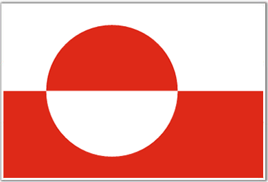
Would love to see the Greenland flag added in some how.
Maybe you can make the Polar Bear the colors of the flag and add the circle into it.
Also wouldnt mind seeing some Viking or Inuit (eskimo?) symbols or people.
But looks good and I look forward to this map.
Regards, Jaytorade
Would love to see the Greenland flag added in some how.
- Click image to enlarge.
Also wouldnt mind seeing some Viking or Inuit (eskimo?) symbols or people.
But looks good and I look forward to this map.
Regards, Jaytorade
-
the.killing.44

- Posts: 4724
- Joined: Thu Oct 23, 2008 7:43 pm
- Gender: Male
- Location: now tell me what got two gums and knows how to spit rhymes
- Contact:
Re: Greenland - v1 on p1
RjBeals
Nice first draft TK. Colors look great. The white territ names also add a nice "cold" touch. The polar bear is also nice,
thanks
however it may take up too much room. I would suggest making it maybe smaller. You don't that extra 1/3 space on the right side where the legend / bear are. The map is the most important. The ocean already is top notch. The territ colors also. I like this draft. I know you say you like the title, but it's too large for me. This map could be really cut down in size if you resize some of the objects and reposition them.
Done - see version at the end of the post.
Now - isn't like 99% of Greenland a glacier? I'm not sure I would have picked Greenland to make a CC map out of, but you have, so I'll leave it at that. Are your borders made up or based off something?
Yeah, well truth is a vast majority of the population is along the southwest coast, but I made the borders around the general area of where cities are located.
I think you need to represent the glacier better. Sort of like I did Iceland. You need to scrap that blue swirl in the center, and make it a white glacier. Not just plain white, but put some texture in it. It may take some work, but I think you'll get more positive feedback if you do.
After a night of fooling around, and filter upon blending style upon effects, the result is below. Still a work in progress, as everything is.
Personally, I'm not a fan of curving the region names ontop/behind the entire region. Oaktown does that a lot. It's really hard to get it to look good. I think for this map, I would prefer a minimap. There's nothing wrong with them. It helps the colorblind people as well.
Well I fixed the locations, but not sure about the minimap.
As noted already - the straight dotted connection lines look funny. I would try some alternative connectors. Dotted lines are fine, but maybe curve them a bit. Maybe once you add the glaciers, make the dotted lines curve over the glaciers, to give the illusion of some height.
Made them curve around glaciers, arrows didn't really look great. Hmmm…
Finally - I think a few extra touches would be nice. Minimal of course, but some drop shadows, glows, maybe bevels & such. It looks very flat now. Not bad, but I think some more efx could go far with this map.
I experimented with some, but still fooling around
Overall - excellent first draft. This is a nice one. Good work.
Thanks Rj.
BrendanGillis
Nice start but a few things need addressing.
Firstly, you gotta get rid of the 'continent' names from the playable area. While the territory names are all very legible, the continent names are very hard to read and just look generally messy. I think the suggestion someone had about using a mini-map map is your best bet, and may help fill up some dead space as well.
I think I fixed the dead space pretty well … thoughts?
Alternatively, you could try kinda curving them around the shoreline but they may entail moving the tert names that are currently over water. Also, it'd be nice if you could keep Ilulissat, Savissivik, and Sisimiut the same color as the rest (the white tert names do help with the icy-feel), but with the current background color in Upernavik I can see how that will be a problem.
Done.
Secondly, the ice-cap needs to look more like an icecap, and the connections across need to bend more. I like someone's suggestion of placing territories on the ice cap itself, but barring that, rj beals suggestion of contouring them around whatever glacier features you come up with would look way better.
This is what I really want comments on. How do the glacial areas look?
Thirdly, the polar bear looks good but is way too big. Also, technically speaking the Greenland coat of arms is a polar bear on a blue shield, and throwing that in behind him wouldn't hurt I don't think (a metallic blue instead of the flat azure that is traditionally used could look cool).
Resized. About the shield … doesn't look all that great. I think the polar bear is one, if not the, best part(s) of the map
Lastly, the bonuses are way off (not that that is important at this stage) and the legend needs some work to make it more visually appealing.
Yeah, bonuses are just placeholders. Legend … hmm.
But all in all, this is a pretty good start. Keep it up.
Thanks
jaytorade
Just a comment on graphics.
Would love to see the Greenland flag added in some how.
Maybe you can make the Polar Bear the colors of the flag and add the circle into it.
Doesn't look very good with the red against the blue.
Also wouldnt mind seeing some Viking or Inuit (eskimo?) symbols or people.
Hmm…
Version 2 (Large) — 2/26/09
EDIT: by the way, the map 11px too wide, so I'll resize the map part and crop the left off.
Keep 'em coming!
.44
Nice first draft TK. Colors look great. The white territ names also add a nice "cold" touch. The polar bear is also nice,
thanks
however it may take up too much room. I would suggest making it maybe smaller. You don't that extra 1/3 space on the right side where the legend / bear are. The map is the most important. The ocean already is top notch. The territ colors also. I like this draft. I know you say you like the title, but it's too large for me. This map could be really cut down in size if you resize some of the objects and reposition them.
Done - see version at the end of the post.
Now - isn't like 99% of Greenland a glacier? I'm not sure I would have picked Greenland to make a CC map out of, but you have, so I'll leave it at that. Are your borders made up or based off something?
Yeah, well truth is a vast majority of the population is along the southwest coast, but I made the borders around the general area of where cities are located.
I think you need to represent the glacier better. Sort of like I did Iceland. You need to scrap that blue swirl in the center, and make it a white glacier. Not just plain white, but put some texture in it. It may take some work, but I think you'll get more positive feedback if you do.
After a night of fooling around, and filter upon blending style upon effects, the result is below. Still a work in progress, as everything is.
Personally, I'm not a fan of curving the region names ontop/behind the entire region. Oaktown does that a lot. It's really hard to get it to look good. I think for this map, I would prefer a minimap. There's nothing wrong with them. It helps the colorblind people as well.
Well I fixed the locations, but not sure about the minimap.
As noted already - the straight dotted connection lines look funny. I would try some alternative connectors. Dotted lines are fine, but maybe curve them a bit. Maybe once you add the glaciers, make the dotted lines curve over the glaciers, to give the illusion of some height.
Made them curve around glaciers, arrows didn't really look great. Hmmm…
Finally - I think a few extra touches would be nice. Minimal of course, but some drop shadows, glows, maybe bevels & such. It looks very flat now. Not bad, but I think some more efx could go far with this map.
I experimented with some, but still fooling around
Overall - excellent first draft. This is a nice one. Good work.
Thanks Rj.
BrendanGillis
Nice start but a few things need addressing.
Firstly, you gotta get rid of the 'continent' names from the playable area. While the territory names are all very legible, the continent names are very hard to read and just look generally messy. I think the suggestion someone had about using a mini-map map is your best bet, and may help fill up some dead space as well.
I think I fixed the dead space pretty well … thoughts?
Alternatively, you could try kinda curving them around the shoreline but they may entail moving the tert names that are currently over water. Also, it'd be nice if you could keep Ilulissat, Savissivik, and Sisimiut the same color as the rest (the white tert names do help with the icy-feel), but with the current background color in Upernavik I can see how that will be a problem.
Done.
Secondly, the ice-cap needs to look more like an icecap, and the connections across need to bend more. I like someone's suggestion of placing territories on the ice cap itself, but barring that, rj beals suggestion of contouring them around whatever glacier features you come up with would look way better.
This is what I really want comments on. How do the glacial areas look?
Thirdly, the polar bear looks good but is way too big. Also, technically speaking the Greenland coat of arms is a polar bear on a blue shield, and throwing that in behind him wouldn't hurt I don't think (a metallic blue instead of the flat azure that is traditionally used could look cool).
Resized. About the shield … doesn't look all that great. I think the polar bear is one, if not the, best part(s) of the map
Lastly, the bonuses are way off (not that that is important at this stage) and the legend needs some work to make it more visually appealing.
Yeah, bonuses are just placeholders. Legend … hmm.
But all in all, this is a pretty good start. Keep it up.
Thanks
jaytorade
Just a comment on graphics.
Would love to see the Greenland flag added in some how.
Maybe you can make the Polar Bear the colors of the flag and add the circle into it.
Doesn't look very good with the red against the blue.
Also wouldnt mind seeing some Viking or Inuit (eskimo?) symbols or people.
Hmm…
Version 2 (Large) — 2/26/09
- Click image to enlarge.

Updates and To-Do
Updates:
- rearranged map (tilted, redone bonus names, etc.)
- made ice cap more realistic
- small changes of borders
- note for assault route
- suggestions on ice cap?
- bonuses
- umm…
Keep 'em coming!
.44
Last edited by the.killing.44 on Thu Feb 26, 2009 3:10 pm, edited 4 times in total.

Re: Greenland - v1 on p1
Not bad noob. Update page 1.

WANT AN ADVANTAGE WHILE WORKING TOWARDS MEDALS?
https://www.conquerclub.com/forum/viewt ... 9&t=226714
Re: Greenland - v2 on p1&2 › new icecap
horrible in centre
-
the.killing.44
- Posts: 4724
- Joined: Thu Oct 23, 2008 7:43 pm
- Gender: Male
- Location: now tell me what got two gums and knows how to spit rhymes
- Contact:
Re: Greenland - v2 on p1&2 › new icecap
and …?miniwally wrote:horrible in centre
wow it looks like what Rj did on Charleston …

.44
-
aequitas08
- Posts: 28
- Joined: Tue Jan 20, 2009 1:41 pm
Re: Greenland - v2 on p1&2 › new icecap
there are some cool arial photos of greenland's glaciers at http://www.notsogreen.com/. i think what you have done is an improvement but the pics might give you ideas should you choose to look at them, granted the map view is different from the closer ups in the pictures.
I also think NARSAQ should go on the other side of the map and ILLOQQORTOORMIUT seems slightly out of place, maybe move it down the coast a bit.
Good work so far.
-aequitas08
I also think NARSAQ should go on the other side of the map and ILLOQQORTOORMIUT seems slightly out of place, maybe move it down the coast a bit.
Good work so far.
-aequitas08
-
The Neon Peon
- Posts: 2342
- Joined: Sat Jun 14, 2008 12:49 pm
- Gender: Male
Re: Greenland - v2 on p1&2 › new icecap
I like the center.
I am guessing that it looks like you took some islands and overlayed them with the image? Seems kind of like that.
I am guessing that it looks like you took some islands and overlayed them with the image? Seems kind of like that.
-
the.killing.44
- Posts: 4724
- Joined: Thu Oct 23, 2008 7:43 pm
- Gender: Male
- Location: now tell me what got two gums and knows how to spit rhymes
- Contact:
Re: Greenland - v3 on p1&3 › new icecap
aequitas08
there are some cool arial photos of greenland's glaciers at http://www.notsogreen.com/. i think what you have done is an improvement but the pics might give you ideas should you choose to look at them, granted the map view is different from the closer ups in the pictures.
Thanks, I used those.
I also think NARSAQ should go on the other side of the map and ILLOQQORTOORMIUT seems slightly out of place, maybe move it down the coast a bit.
Done.
The Neon Peon
I like the center.
Good
I am guessing that it looks like you took some islands and overlayed them with the image? Seems kind of like that.
On the below version, that's exactly what I did.
Keep 'em coming!
.44
there are some cool arial photos of greenland's glaciers at http://www.notsogreen.com/. i think what you have done is an improvement but the pics might give you ideas should you choose to look at them, granted the map view is different from the closer ups in the pictures.
Thanks, I used those.
I also think NARSAQ should go on the other side of the map and ILLOQQORTOORMIUT seems slightly out of place, maybe move it down the coast a bit.
Done.
The Neon Peon
I like the center.
Good
I am guessing that it looks like you took some islands and overlayed them with the image? Seems kind of like that.
On the below version, that's exactly what I did.
- Click image to enlarge.

Updates and To-Do
Updates:
- different ice cap
- redid some borders (for GP & army no. purposes)
- changed "Nat. Park" to "Nurdø…"
- added names of bordering water bodies
- changed name placement around
- Small map
- possibly redraw intra-ice connections
- reduce opacity of water names
.44
Re: Greenland - v2 on p1&2 › new icecap
I'd like to see you add the native name of the island: Kalaallit Nunaat and also there flag. Maybe to mix up the game play a bit the cross-island routes should be territories which lose 1 or 2 troops per turn like dust bowl does (except these territories will be neutral)
Re: Greenland - v2 on p1&2 › new icecap
 ice cap looks a lot better
-
samuelc812

- Posts: 2215
- Joined: Sun Dec 30, 2007 6:56 am
- Gender: Male
Re: Greenland - v3 on p1&3 › new icecap
A very nice looking map .44, very clean and it looks nice. It will be a great addition to Rj's fantastic Iceland Map.
A few things i noticed:
A few things i noticed:
- The bonus colours on the key are a little hard to distinguish, they could be defined a little better.
- I think the Bonus Titles around the coastline of the map could be in a better font, something stylish would look better.
- I am also wondering whether the bonus regions are a little too large, is there any way to break some of the bigger ones up into smaller bonuses?
- Love the Polar Bear
-
the.killing.44
- Posts: 4724
- Joined: Thu Oct 23, 2008 7:43 pm
- Gender: Male
- Location: now tell me what got two gums and knows how to spit rhymes
- Contact:
Re: Greenland - v3 on p1&3 › new icecap
Let's get to some feedback…
gho
I'd like to see you add the native name of the island: Kalaallit Nunaat and also there flag.
I like the native name idea. I'll incorporate that into v4. As for the flag, like I stated above, it doesn't really go well with the overall scheme of the map.
Maybe to mix up the game play a bit the cross-island routes should be territories which lose 1 or 2 troops per turn like dust bowl does (except these territories will be neutral)
Not a bad idea. I'll think about it.
miniwally
ice cap looks a lot better
Good.
lanyards
Not bad noob.
(fsm)
samuelc812
A very nice looking map .44, very clean and it looks nice. It will be a great addition to Rj's fantastic Iceland Map.
Thanks, and I wish I could compete with Rj *sigh*
A few things i noticed:
• The bonus colours on the key are a little hard to distinguish, they could be defined a little better.
I just realized I messed up on those, like when I changed the color of Upernavik. But I'll make them more defined.
• I think the Bonus Titles around the coastline of the map could be in a better font, something stylish would look better.
I'll look around.
• I am also wondering whether the bonus regions are a little too large, is there any way to break some of the bigger ones up into smaller bonuses?
Oh, I forgot to say: DON'T COMMENT ON BONUSES — THEY AREN'T REAL #s JUST PLACEHOLDERS
• Love the Polar Bear
As do I, and basically everyone else
Other than that it is really nice, keep up the great work
Thanks, sam.
Thanks for the feedback, let's keep 'em coming!
.44
gho
I'd like to see you add the native name of the island: Kalaallit Nunaat and also there flag.
I like the native name idea. I'll incorporate that into v4. As for the flag, like I stated above, it doesn't really go well with the overall scheme of the map.
Maybe to mix up the game play a bit the cross-island routes should be territories which lose 1 or 2 troops per turn like dust bowl does (except these territories will be neutral)
Not a bad idea. I'll think about it.
miniwally
ice cap looks a lot betterGood.
lanyards
Not bad noob.
(fsm)
samuelc812
A very nice looking map .44, very clean and it looks nice. It will be a great addition to Rj's fantastic Iceland Map.
Thanks, and I wish I could compete with Rj
*sigh*A few things i noticed:
• The bonus colours on the key are a little hard to distinguish, they could be defined a little better.
I just realized I messed up on those, like when I changed the color of Upernavik. But I'll make them more defined.
• I think the Bonus Titles around the coastline of the map could be in a better font, something stylish would look better.
I'll look around.
• I am also wondering whether the bonus regions are a little too large, is there any way to break some of the bigger ones up into smaller bonuses?
Oh, I forgot to say: DON'T COMMENT ON BONUSES — THEY AREN'T REAL #s JUST PLACEHOLDERS
• Love the Polar Bear
As do I, and basically everyone else
Other than that it is really nice, keep up the great work
Thanks, sam.
Thanks for the feedback, let's keep 'em coming!
.44
-
samuelc812
- Posts: 2215
- Joined: Sun Dec 30, 2007 6:56 am
- Gender: Male
Re: Greenland - v3 on p1&3 › new icecap
I didn't mean the bonus amount that a player get's i was talking about the bonus regions themselves. Perhaps it would be better to split "Nurdostgronland" into 2 bonuses?the.killing.44 wrote: samuelc812
• I am also wondering whether the bonus regions are a little too large, is there any way to break some of the bigger ones up into smaller bonuses?
Oh, I forgot to say: DON'T COMMENT ON BONUSES — THEY AREN'T REAL #s JUST PLACEHOLDERS
Sam
-
the.killing.44
- Posts: 4724
- Joined: Thu Oct 23, 2008 7:43 pm
- Gender: Male
- Location: now tell me what got two gums and knows how to spit rhymes
- Contact:
Re: Greenland - v3 on p1&3 › new icecap
samuelc812
I didn't mean the bonus amount that a player get's i was talking about the bonus regions themselves. Perhaps it would be better to split "Nurdostgronland" into 2 bonuses?
Sam
I'm running out of names here! … nah I got something that can work over there, but there is definitely a lack of names out of the south and west regions. Anyway, hmm … that sounds like a pretty good idea to me
.44
I didn't mean the bonus amount that a player get's i was talking about the bonus regions themselves. Perhaps it would be better to split "Nurdostgronland" into 2 bonuses?
Sam
I'm running out of names here! … nah I got something that can work over there, but there is definitely a lack of names out of the south and west regions. Anyway, hmm … that sounds like a pretty good idea to me
.44

Re: Greenland - v3 on p1&3 › new icecap
The graphics are straight out of RJ's playbook. Nothing wrong with that though.

Re: Greenland - v3 on p1&3 › new icecap
- Click image to enlarge.
- Click image to enlarge.

-
el-presidente
- Posts: 158
- Joined: Fri Sep 19, 2008 2:14 pm
Re: Greenland - v3 on p1&3 › new icecap
Some ports would be good. The paths across the ice cap are good, but some ports would make travel from top to bottom easier. I don't know Greenland very well but I think there are some cities along the western coast which would make good ports.
-
InsomniaRed

- Posts: 2246
- Joined: Sun Dec 30, 2007 2:58 am
- Gender: Female
- Location: In Nick's heart
Re: Greenland - v3 on p1&3 › new icecap
I think the texture is bland and the borders are very thin and plain. I don't know. The map is good, but it seems a bit boring. All colors are about the same. Kind of reminds me of the Middle East map and how the entire map looks like different shades of sand (not exactly the most amazing map to look at on the site) and I don't want this to turn into a map of the different shades of water. I don't really have any specific ideas of how to liven it up, but right now, it's not as attractive as it could be.
However, the layout, territory count, etc. is all great.
The legend should be a bit more...I don't know...telling, if that makes any sense.
However, the layout, territory count, etc. is all great.
The legend should be a bit more...I don't know...telling, if that makes any sense.
- I will always love you Nick, Forever.

- I will always love you Nick, Forever.
-
the.killing.44
- Posts: 4724
- Joined: Thu Oct 23, 2008 7:43 pm
- Gender: Male
- Location: now tell me what got two gums and knows how to spit rhymes
- Contact:
Re: Greenland - v3 on p1&3 › new icecap
Another healthy dose of good feedback from some good members around here … nice:
mibi
The graphics are straight out of RJ's playbook. Nothing wrong with that though.
RjBeals
I think it's looking good. Sort of does take the style of the Iceland map.
I'll take that as a compliment I think the theme works well in both these places … perhaps an idea to spruce things up is to overlay that image of ice over the inland Greenland like you did Rj?
el-presidente
Some ports would be good. The paths across the ice cap are good, but some ports would make travel from top to bottom easier. I don't know Greenland very well but I think there are some cities along the western coast which would make good ports.
Added one from Nuuk to Muriusaq.
InsomniaRed
I think the texture is bland and the borders are very thin and plain. I don't know. The map is good, but it seems a bit boring. All colors are about the same. Kind of reminds me of the Middle East map and how the entire map looks like different shades of sand (not exactly the most amazing map to look at on the site) and I don't want this to turn into a map of the different shades of water. I don't really have any specific ideas of how to liven it up, but right now, it's not as attractive as it could be.
I do know what you mean — maybe my above comment about a low-opacity image(s) overlayed over the entire island would be a nice touch?
However, the layout, territory count, etc. is all great.
The legend should be a bit more...I don't know...telling, if that makes any sense.
Minimap help
Okay … here's Large Version 4 … please note the bonus numbers are just placeholders. And, per my note on the map, lany(ards) will be doing the XML here.
Keep 'em coming, let's get this map goin'! Thanks for the support,
.44
mibi
The graphics are straight out of RJ's playbook. Nothing wrong with that though.
RjBeals
I think it's looking good. Sort of does take the style of the Iceland map.
I'll take that as a compliment
I think the theme works well in both these places … perhaps an idea to spruce things up is to overlay that image of ice over the inland Greenland like you did Rj?el-presidente
Some ports would be good. The paths across the ice cap are good, but some ports would make travel from top to bottom easier. I don't know Greenland very well but I think there are some cities along the western coast which would make good ports.
Added one from Nuuk to Muriusaq.
InsomniaRed
I think the texture is bland and the borders are very thin and plain. I don't know. The map is good, but it seems a bit boring. All colors are about the same. Kind of reminds me of the Middle East map and how the entire map looks like different shades of sand (not exactly the most amazing map to look at on the site) and I don't want this to turn into a map of the different shades of water. I don't really have any specific ideas of how to liven it up, but right now, it's not as attractive as it could be.
I do know what you mean — maybe my above comment about a low-opacity image(s) overlayed over the entire island would be a nice touch?
However, the layout, territory count, etc. is all great.
The legend should be a bit more...I don't know...telling, if that makes any sense.
Minimap help
Okay … here's Large Version 4 … please note the bonus numbers are just placeholders. And, per my note on the map, lany(ards) will be doing the XML here.
- Click image to enlarge.

Updates and To-Do
Updates:
- added minimap
- took away region names from the land
- took away all but two water body names
- added Nuuk ‹—› Moriusaq connection
- small map
- bonuses
- overlay image across whole map?
.44
-
InsomniaRed
- Posts: 2246
- Joined: Sun Dec 30, 2007 2:58 am
- Gender: Female
- Location: In Nick's heart
Re: Greenland - v4 on p1&3 › added minimap
Love the mini-map! Great work 
- I will always love you Nick, Forever.
- I will always love you Nick, Forever.
-
aequitas08
- Posts: 28
- Joined: Tue Jan 20, 2009 1:41 pm
Re: Greenland - v4 on p1&3 › added minimap
The mini map is better then the key, but there is something missing texture-wise. I like the idea of overlaying an image on the inland areas, also you could try adding shadow along outer perimeter or something that will make the island look more "natural" against the ocean background.
also killing neutral territs in the glacier zone would be an interesting element, but it all depends on whether you want this map to be classic play or not (i would play either). The map is really coming along nicely.
keep up the good work.
-aequitas08
also killing neutral territs in the glacier zone would be an interesting element, but it all depends on whether you want this map to be classic play or not (i would play either). The map is really coming along nicely.
keep up the good work.
-aequitas08
-
the.killing.44
- Posts: 4724
- Joined: Thu Oct 23, 2008 7:43 pm
- Gender: Male
- Location: now tell me what got two gums and knows how to spit rhymes
- Contact:
Re: Greenland - v4 on p1&3 › added minimap
Here's the image for page 4:
InsomniaRed
Love the mini-map! Great work
Nice
aequitas08
The mini map is better then the key,
Good
but there is something missing texture-wise. I like the idea of overlaying an image on the inland areas, also you could try adding shadow along outer perimeter or something that will make the island look more "natural" against the ocean background.
Alright, I'll play around in PS
also killing neutral territs in the glacier zone would be an interesting element, but it all depends on whether you want this map to be classic play or not (i would play either). The map is really coming along nicely.
keep up the good work.
-aequitas08
What do other people think of this? I think it'd be cool, personally, but not over-the-top.
Thanks, and lets keep the feedback flowin' in
.44
- Click image to enlarge.
Love the mini-map! Great work
Nice
aequitas08
The mini map is better then the key,
Good
but there is something missing texture-wise. I like the idea of overlaying an image on the inland areas, also you could try adding shadow along outer perimeter or something that will make the island look more "natural" against the ocean background.
Alright, I'll play around in PS
also killing neutral territs in the glacier zone would be an interesting element, but it all depends on whether you want this map to be classic play or not (i would play either). The map is really coming along nicely.
keep up the good work.
-aequitas08
What do other people think of this? I think it'd be cool, personally, but not over-the-top.
Thanks, and lets keep the feedback flowin' in
.44
-
The Neon Peon
- Posts: 2342
- Joined: Sat Jun 14, 2008 12:49 pm
- Gender: Male
Re: Greenland - v4 on p1&3 › added minimap
Add something to the land. It still looks really plain and boring.
Take a look at the Iceland map, it has a lot of snow areas and other things in the land, which you might not notice at first glance, but add a lot of effect. Or perhaps simply do what the Scotland map does with the darker colors around borders.
Just play around with some stuff.
A few other points:
1. "Denmark Strait" should be horizontal, or change the "Baffin Bay" to run along the edge of the continent too.
2. I would like to see the glacier texture more pronounced.
3. There is gray between Nord and Danmarkshavn (top right tip.), along with some other inlets.
I love the background, and your attack lines especially. Map looks great. Good luck with it.
Take a look at the Iceland map, it has a lot of snow areas and other things in the land, which you might not notice at first glance, but add a lot of effect. Or perhaps simply do what the Scotland map does with the darker colors around borders.
Just play around with some stuff.
A few other points:
1. "Denmark Strait" should be horizontal, or change the "Baffin Bay" to run along the edge of the continent too.
2. I would like to see the glacier texture more pronounced.
3. There is gray between Nord and Danmarkshavn (top right tip.), along with some other inlets.
I love the background, and your attack lines especially. Map looks great. Good luck with it.

Re: Greenland - v4 on p1&3 › added minimap
a bonus for holding the "capital" might be nice
TheSaxlad wrote:The Dice suck a lot of the time.
And if they dont suck then they blow.