
Poison Rome [Quenched]
Moderator: Cartographers
Forum rules
Please read the Community Guidelines before posting.
Please read the Community Guidelines before posting.
-
Qwert

- SoC Training Adviser
- Posts: 9262
- Joined: Tue Nov 07, 2006 5:07 pm
- Location: VOJVODINA
- Contact:
Re: [POLL] POISON ROME V27(P17) [D] - L & S Preview
hmm i just wonder who vote for no.4

-
the.killing.44

- Posts: 4724
- Joined: Thu Oct 23, 2008 7:43 pm
- Gender: Male
- Location: now tell me what got two gums and knows how to spit rhymes
- Contact:
Re: [POLL] POISON ROME V27(P17) [D] - L & S Preview
I just looked at the poll and it is 12-12 … however everyone who's commented has liked the graphics Voice your opinions, people!
.44
Voice your opinions, people!.44

Re: [POLL] POISON ROME V28
MrBenn wrote:Actually, I quite like the brick work in the title. Sure .44 made it too heavy, but the effect could work if it was toned down and blended in a bit more?
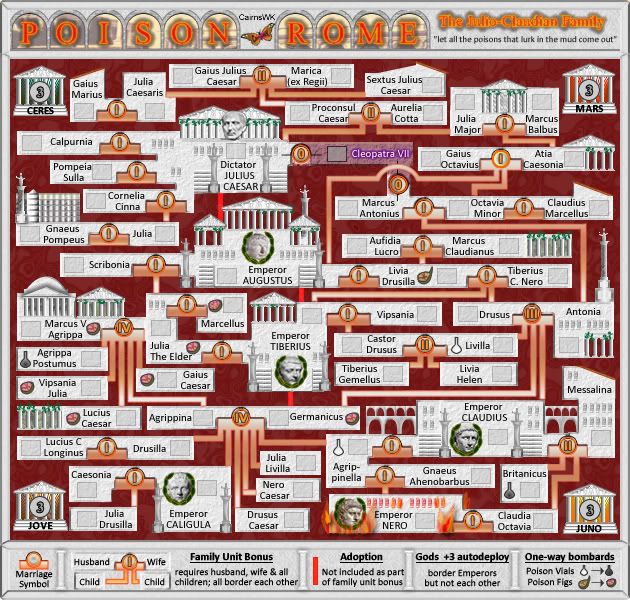
OK here's V28, with subtle stonework around the arches, and the fix on Cleopatra.the.killing.44 wrote:cairns, why don't you try it on just a couple of the letters and post it? I think if done properly (and not in less than 5 minutes) it could look nice, and you're certainly capable of that
.44


* Pearl Harbour * Waterloo * Forbidden City * Jamaica * Pot Mosbi
-
Incandenza

- Posts: 4949
- Joined: Thu Oct 19, 2006 5:34 pm
- Gender: Male
- Location: Playing Eschaton with a bucket of old tennis balls
Re: [POLL] POISON ROME V28(P19) [D] - Stonework
I kinda like the stonework... and since we're talking about the title, at some point while my back was turned it seemed to get awful bright... the "Julio-Claudian family" bit is so bright as to appear blurry, and I'm not wild about the bright orange in "poison rome" either... just seems to bright for a map that's mostly pretty subtle colors.
THOTA: dingdingdingdingdingdingBOOM
Te Occidere Possunt Sed Te Edere Non Possunt Nefas Est
Te Occidere Possunt Sed Te Edere Non Possunt Nefas Est
Re: [POLL] POISON ROME V28(P19) [D] - Stonework
Stonework i agree.Incandenza wrote:I kinda like the stonework... and since we're talking about the title, at some point while my back was turned it seemed to get awful bright... the "Julio-Claudian family" bit is so bright as to appear blurry, and I'm not wild about the bright orange in "poison rome" either... just seems to bright for a map that's mostly pretty subtle colors.
The title, please discuss with Gimil...he seems to have grand ideas that this map should be all about gold and flames....

* Pearl Harbour * Waterloo * Forbidden City * Jamaica * Pot Mosbi

Re: [POLL] POISON ROME V28(P19) [D] - Stonework
I don't like the actual text of the title either, actually. I agree it does look blurry, and the glow doesn't look good either.
I say you should maybe try a different font, but above all try to minimize the effects on the letters.
I say you should maybe try a different font, but above all try to minimize the effects on the letters.
Re: [POLL] POISON ROME V28(P19) [D] - Stonework
I agree with Gimil that the actual title "Poison Rome" could be better. The stroke is not the right way to go with sprucing it up.
-
Incandenza
- Posts: 4949
- Joined: Thu Oct 19, 2006 5:34 pm
- Gender: Male
- Location: Playing Eschaton with a bucket of old tennis balls
Re: [POLL] POISON ROME V28(P19) [D] - Stonework
Gold and flames? Madness, it should be about white marble and purple togas and laurel wreathes and subtle poisonings. The name itself implies a deeper game being played within the Family than that of pyrotechnics and shiny metals.cairnswk wrote:Stonework i agree.Incandenza wrote:I kinda like the stonework... and since we're talking about the title, at some point while my back was turned it seemed to get awful bright... the "Julio-Claudian family" bit is so bright as to appear blurry, and I'm not wild about the bright orange in "poison rome" either... just seems to bright for a map that's mostly pretty subtle colors.
The title, please discuss with Gimil...he seems to have grand ideas that this map should be all about gold and flames....
THOTA: dingdingdingdingdingdingBOOM
Te Occidere Possunt Sed Te Edere Non Possunt Nefas Est
Te Occidere Possunt Sed Te Edere Non Possunt Nefas Est
Re: [POLL] POISON ROME V28(P19) [D] - Stonework
Agreed, that's why i had purple statues (probably a little misplaces), marble (white/grey) statues, leaurels wreaths (which already exist), and the few flames for Nero burning Rome.Incandenza wrote:....
Gold and flames? Madness, it should be about white marble and purple togas and laurel wreathes and subtle poisonings. The name itself implies a deeper game being played within the Family than that of pyrotechnics and shiny metals.
But what do you do when someone is dogmatic about what they want, and think they know better artistically than what the mapmaker produces
](./images/smilies/eusa_wall.gif "Brick wall") ?
?* Pearl Harbour * Waterloo * Forbidden City * Jamaica * Pot Mosbi
-
gimil

- Posts: 8599
- Joined: Sat Mar 03, 2007 12:42 pm
- Gender: Male
- Location: United Kingdom (Scotland)
Re: [POLL] POISON ROME V28(P19) [D] - Stonework
Cairns I never said anything about liking or wanting the title to represent flames...
What do you know about map making, bitch?
Top Score:2403natty_dread wrote:I was wrong
Re: [POLL] POISON ROME V29
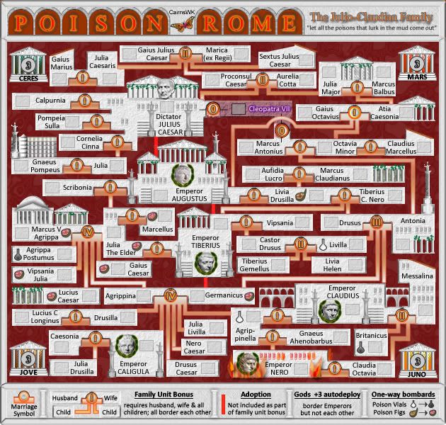
Version 29...new title
* Pearl Harbour * Waterloo * Forbidden City * Jamaica * Pot Mosbi
-
the.killing.44
- Posts: 4724
- Joined: Thu Oct 23, 2008 7:43 pm
- Gender: Male
- Location: now tell me what got two gums and knows how to spit rhymes
- Contact:
Re: [POLL] POISON ROME V29(P10) [D] - Title?
I like the title but I say get rid of stroke on "The Julio-Claudian Family" — it makes it hard to read. Also I would think about making the |'s between the arches 1.5ish x as thick.
.44
.44
Re: [POLL] POISON ROME V29(P10) [D] - Title?
That was the exact opposite of what I suggested. I liked the background picture, I thought it fit perfectly; it's just the layer style of the actual font that bothers me.
And I disagree about the stroke on "The Julio Claudian Family" - I think that makes it easier to read, not harder.
I think you should add the same stroke to "Poison Rome" to replace the glow, actually, and return to the background picture of the arches.
And I disagree about the stroke on "The Julio Claudian Family" - I think that makes it easier to read, not harder.
I think you should add the same stroke to "Poison Rome" to replace the glow, actually, and return to the background picture of the arches.
-
the.killing.44
- Posts: 4724
- Joined: Thu Oct 23, 2008 7:43 pm
- Gender: Male
- Location: now tell me what got two gums and knows how to spit rhymes
- Contact:
Re: [POLL] POISON ROME V29(P10) [D] - Title?
Sorry about the wording: I meant make the title fill where your stroke is atm, but make a stroke outside of that.
.44
.44
-
The Neon Peon
- Posts: 2342
- Joined: Sat Jun 14, 2008 12:49 pm
- Gender: Male
Re: [POLL] POISON ROME V27(P17) [D] - L & S Preview
Sorry to continuously bring this back up, but this is the only thing that I can still see that needs fixing with the graphics.cairnswk wrote:Yeh Neon Peon....that cleopatra connection was because of the bevelling...and i didn't notice it.The Neon Peon wrote:Once again, the Cleopatra-Marcus Atonius connection has uneven shaking and is not even (the lower part extends farther left than the upper part.)
Thanks, and it is fixed as i ahve changed the bevelling on her tert there.
Gameplay stuff...
Agrippina-Germanicus bonus has 8 territories in it, yet it is only worth 4 troops. Seems like it should be 5. (PS, Nero Caesar connection has a little rectangle at the end that should not be there.)
Livia Drusilla-Tibernius C. Nero bonus has 4 territories, so it should be worth 2 troops, not 1. Same with Gaius Octavius and Atia Caesonia family.
Re: [POLL] POISON ROME V29(P10) [D] - Title?
What do you mean stroke? Are you referring to: the fill, the outline, or the emboss?the.killing.44 wrote:I like the title but I say get rid of stroke on "The Julio-Claudian Family" — it makes it hard to read. Also I would think about making the |'s between the arches 1.5ish x as thick.
.44
Arches. I think they are fine, and if i make them thicker i'll have to move everything, and that isn't worth the effort.

* Pearl Harbour * Waterloo * Forbidden City * Jamaica * Pot Mosbi
Re: [POLL] POISON ROME V27(P17) [D] - L & S Preview
The Cleopatra graphic connection is fixed. It is as good as it's going to get.The Neon Peon wrote:Sorry to continuously bring this back up, but this is the only thing that I can still see that needs fixing with the graphics.cairnswk wrote:Yeh Neon Peon....that cleopatra connection was because of the bevelling...and i didn't notice it.The Neon Peon wrote:Once again, the Cleopatra-Marcus Atonius connection has uneven shaking and is not even (the lower part extends farther left than the upper part.)
Thanks, and it is fixed as i ahve changed the bevelling on her tert there.
Done.Gameplay stuff...
Agrippina-Germanicus bonus has 8 territories in it, yet it is only worth 4 troops. Seems like it should be 5. (PS, Nero Caesar connection has a little rectangle at the end that should not be there.)
Livia Drusilla-Tibernius C. Nero bonus has 4 territories, so it should be worth 2 troops, not 1. Same with Gaius Octavius and Atia Caesonia family.
* Pearl Harbour * Waterloo * Forbidden City * Jamaica * Pot Mosbi
-
the.killing.44
- Posts: 4724
- Joined: Thu Oct 23, 2008 7:43 pm
- Gender: Male
- Location: now tell me what got two gums and knows how to spit rhymes
- Contact:
Re: [POLL] POISON ROME V29(P10) [D] - Title?
Stroke = outline. And no worries about the arches … they're fine as is.cairnswk wrote:What do you mean stroke? Are you referring to: the fill, the outline, or the emboss?the.killing.44 wrote:I like the title but I say get rid of stroke on "The Julio-Claudian Family" — it makes it hard to read. Also I would think about making the |'s between the arches 1.5ish x as thick.
.44
Arches. I think they are fine, and if i make them thicker i'll have to move everything, and that isn't worth the effort.
.44
Re: [POLL] POISON ROME V30
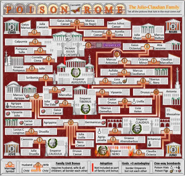
I think the font is perfect...Times New Roman. At size 30 it allows the fill to work well.InkL0sed wrote:I don't like the actual text of the title either, actually. I agree it does look blurry, and the glow doesn't look good either.
I say you should maybe try a different font, but above all try to minimize the effects on the letters.
Now the only thing the title has on it is: fill, outline and raised emboss
And this one i like.
* Pearl Harbour * Waterloo * Forbidden City * Jamaica * Pot Mosbi
-
the.killing.44
- Posts: 4724
- Joined: Thu Oct 23, 2008 7:43 pm
- Gender: Male
- Location: now tell me what got two gums and knows how to spit rhymes
- Contact:
Re: [POLL] POISON ROME V30(P20) [D] - New Title
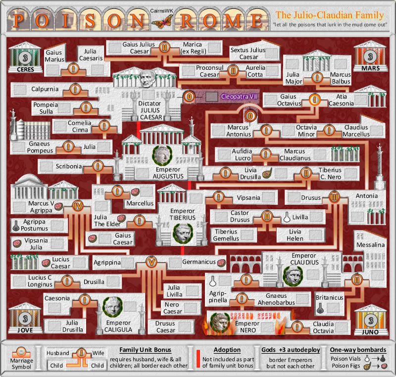
It's still blurry, but I don't think the problem is actual blur — it's the fact that your stroke (outline) around that text is hitting into the stroke of other letters, which smears the outline into being a bit hard to read and, tbh, a bit messy.
.44
.44
Re: [POLL] POISON ROME V30(P20) [D] - New Title
Yeh. look. i can't reduce the outline to thinner than 1px. so i'll have to remove it altogether, and i have put a yellow slight drop shadow behind it.the.killing.44 wrote:It's still blurry, but I don't think the problem is actual blur — it's the fact that your stroke (outline) around that text is hitting into the stroke of other letters, which smears the outline into being a bit hard to read and, tbh, a bit messy.
.44
Please refresh to see the change.
- Click image to enlarge.
* Pearl Harbour * Waterloo * Forbidden City * Jamaica * Pot Mosbi
-
Incandenza
- Posts: 4949
- Joined: Thu Oct 19, 2006 5:34 pm
- Gender: Male
- Location: Playing Eschaton with a bucket of old tennis balls
Re: [POLL] POISON ROME V30(P20) [D] - New Title
That's a damn nice title right there.
THOTA: dingdingdingdingdingdingBOOM
Te Occidere Possunt Sed Te Edere Non Possunt Nefas Est
Te Occidere Possunt Sed Te Edere Non Possunt Nefas Est
-
the.killing.44
- Posts: 4724
- Joined: Thu Oct 23, 2008 7:43 pm
- Gender: Male
- Location: now tell me what got two gums and knows how to spit rhymes
- Contact:
Re: [POLL] POISON ROME V30(P20) [D] - New Title
Seconded (and thanks for the sig!)Incandenza wrote:That's a damn nice title right there.
.44
-
Incandenza
- Posts: 4949
- Joined: Thu Oct 19, 2006 5:34 pm
- Gender: Male
- Location: Playing Eschaton with a bucket of old tennis balls
Re: [POLL] POISON ROME V30(P20) [D] - New Title
I would've been disappointed if someone hadn't used that as a sig, so I'm obliged to ya.the.killing.44 wrote:Seconded (and thanks for the sig!)Incandenza wrote:That's a damn nice title right there.
.44
THOTA: dingdingdingdingdingdingBOOM
Te Occidere Possunt Sed Te Edere Non Possunt Nefas Est
Te Occidere Possunt Sed Te Edere Non Possunt Nefas Est


Re: [POLL] POISON ROME V26
here i am!cairnswk wrote:Awaiting incanton now to stamp this, where is he?
having finally had a chance to sit down and examine the gameplay, the main flaw that i can see in what is a highly-original concept is the +1 bonus for most of the childless marriages, which consist of only 2 territories. this will lead a significant proportion of 2-player games to be decided by the drop.
i propose that the bonus system is changed so that there is only a +0.5 bonus, rounded down, for each childless marriage (or, equivalently, +1 for every two childless marriages). alternatively, +1 for each, but the first childless marriage held does not count for bonuses. in either case, for each marriage with one child, +1 is sufficient.
the implications of the +3 autodeploy for the gods, who can be accessed only by the emperors, i have yet to fathom. i'm thinking that a natural strategy for player 1 (in a 2-player game) will be to attack a god, then fort as many there as possible.
ian.