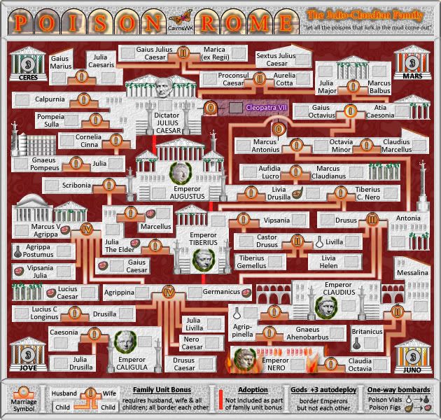
Thanks Zeak.ZeakCytho wrote:Love the new statues, Cairns!
Poison Rome [Quenched]
Moderator: Cartographers
Forum rules
Please read the Community Guidelines before posting.
Re: [POLL] POISON ROME V26(P17) [D] - different stuff

* Pearl Harbour * Waterloo * Forbidden City * Jamaica * Pot Mosbi
Re: [POLL] POISON ROME V26
Oh yes great onegimil wrote:I disagree on this cairns. I would like to hear more opinions on it if you don't mindThat is deliberate and i think looks good.-The arches to the left of Emperor CLAUDIUS don't look very evenly put together.
Then new texture on the legends has added much needed character. Very nice! Although the general colouring of the title (and the text to the right of the title) arn't doing the map justice. Some golds and reds like the rest of the map and less glows and strokes around the text are what is needed.

* Pearl Harbour * Waterloo * Forbidden City * Jamaica * Pot Mosbi
- gimil
- Posts: 8599
- Joined: Sat Mar 03, 2007 12:42 pm
- Gender: Male
- Location: United Kingdom (Scotland)
Re: [POLL] POISON ROME V26(P17) [D] - different stuff
Well, the foundry doesn't like slacker!cairnswk wrote:Yes the Foundry qwertqwert wrote:What these poll present![]()
Cairnswk are you with war with someon?They don't seem to like this map
What do you know about map making, bitch?
Top Score:2403natty_dread wrote:I was wrong
Re: [POLL] POISON ROME V26
Well you would disagree on it because you don't like. but good luck in getting some other opinions.gimil wrote:I disagree on this cairns. I would like to hear more opinions on it if you don't mind-The arches to the left of Emperor CLAUDIUS don't look very evenly put together.[/quote="cairnswk"]That is deliberate and i think looks good.![]()

* Pearl Harbour * Waterloo * Forbidden City * Jamaica * Pot Mosbi
Re: [POLL] POISON ROME V26(P17) [D] - different stuff
Talking about yourself again Gimil. Bitch!!gimil wrote:Well, the foundry doesn't like slacker!cairnswk wrote:Yes the Foundry qwertqwert wrote:What these poll present![]()
Cairnswk are you with war with someon?They don't seem to like this map

* Pearl Harbour * Waterloo * Forbidden City * Jamaica * Pot Mosbi
- gimil
- Posts: 8599
- Joined: Sat Mar 03, 2007 12:42 pm
- Gender: Male
- Location: United Kingdom (Scotland)
Re: [POLL] POISON ROME V26
It doesn't take a genius to work out that the title colours are brighter flame colours than the actual flames on the map...cairnswk wrote:Oh yes great onegimil wrote:I disagree on this cairns. I would like to hear more opinions on it if you don't mindThat is deliberate and i think looks good.-The arches to the left of Emperor CLAUDIUS don't look very evenly put together.
Then new texture on the legends has added much needed character. Very nice! Although the general colouring of the title (and the text to the right of the title) arn't doing the map justice. Some golds and reds like the rest of the map and less glows and strokes around the text are what is needed.Knower of all things artistic.
What do you know about map making, bitch?
Top Score:2403natty_dread wrote:I was wrong
- gimil
- Posts: 8599
- Joined: Sat Mar 03, 2007 12:42 pm
- Gender: Male
- Location: United Kingdom (Scotland)
Re: [POLL] POISON ROME V26(P17) [D] - different stuff
I do 10x more work that you don't see than you do see cairnscairnswk wrote:Talking about yourself again Gimil. Bitch!!gimil wrote:Well, the foundry doesn't like slacker!cairnswk wrote:Yes the Foundry qwertqwert wrote:What these poll present![]()
Cairnswk are you with war with someon?They don't seem to like this map
What do you know about map making, bitch?
Top Score:2403natty_dread wrote:I was wrong
Re: [POLL] POISON ROME V26(P17) [D] - different stuff
Good on you then, you're such a champion.gimil wrote:I do 10x more work that you don't see than you do see cairnscairnswk wrote:Talking about yourself again Gimil. Bitch!!gimil wrote:Well, the foundry doesn't like slacker!cairnswk wrote:Yes the Foundry qwertqwert wrote:What these poll present![]()
Cairnswk are you with war with someon?They don't seem to like this map

* Pearl Harbour * Waterloo * Forbidden City * Jamaica * Pot Mosbi
- Incandenza
- Posts: 4949
- Joined: Thu Oct 19, 2006 5:34 pm
- Gender: Male
- Location: Playing Eschaton with a bucket of old tennis balls
Re: [POLL] POISON ROME V26(P17) [D] - different stuff
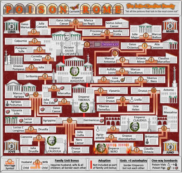
Call me crazy, but I liked the statues and columns the way they were originally... when I think of classical rome, I think of white marble, not gold.
THOTA: dingdingdingdingdingdingBOOM
Te Occidere Possunt Sed Te Edere Non Possunt Nefas Est
Re: [POLL] POISON ROME V27
Yes I do too...so i have changed the statues back to almost similar to what the other statues are but with just s different tinge of grey around the outline to at least make them more visible on the white/grey backgrounds.Incandenza wrote:Call me crazy, but I liked the statues and columns the way they were originally... when I think of classical rome, I think of white marble, not gold.
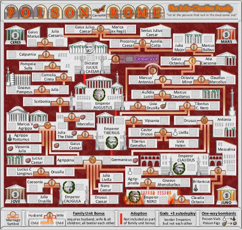
Both titles are now the same. I don't think putting the "flame" colours from the flames around Nero are going to do to tricks for the title, and since the title on the right is a sub-title, i'd am pretty happy for them to both have the same appearance - they do not look out of place.
The bottom legend section was previously replaced with a textured background.
The columns on all the building (except the God temples) have been redone with bitmaps so that no issues arise from propagation to large size.

Preview of Large.

* Pearl Harbour * Waterloo * Forbidden City * Jamaica * Pot Mosbi
- gimil
- Posts: 8599
- Joined: Sat Mar 03, 2007 12:42 pm
- Gender: Male
- Location: United Kingdom (Scotland)
Re: [POLL] POISON ROME V27(P17) [D] - L & S Preview
I still don't like the title area cairns but if no one else agrees with me I am not going to hold it against you 
What do you know about map making, bitch?
Top Score:2403natty_dread wrote:I was wrong

- the.killing.44
- Posts: 4724
- Joined: Thu Oct 23, 2008 7:43 pm
- Gender: Male
- Location: now tell me what got two gums and knows how to spit rhymes
- Contact:
Re: [POLL] POISON ROME V27(P17) [D] - L & S Preview
Here's a thought to improve the title: why not outline the archs in stone like around the Colosseum?

.44

.44
Re: [POLL] POISON ROME V27(P17) [D] - L & S Preview
Mmmmm, that statement concerns megimil wrote:I still don't like the title area cairns but if no one else agrees with me I am not going to hold it against you

* Pearl Harbour * Waterloo * Forbidden City * Jamaica * Pot Mosbi
- gimil
- Posts: 8599
- Joined: Sat Mar 03, 2007 12:42 pm
- Gender: Male
- Location: United Kingdom (Scotland)
Re: [POLL] POISON ROME V27(P17) [D] - L & S Preview
Well, we just have to wait and see!cairnswk wrote:Mmmmm, that statement concerns megimil wrote:I still don't like the title area cairns but if no one else agrees with me I am not going to hold it against you
What do you know about map making, bitch?
Top Score:2403natty_dread wrote:I was wrong
Re: [POLL] POISON ROME V27(P17) [D] - L & S Preview
I don't love the title area, but I hardly hate it. And since I don't have any suggestions on how to make it better, I'm fine with the way it is now. But if someone else happens to have a better idea, I'd be happy to see it change.
- The Neon Peon
- Posts: 2342
- Joined: Sat Jun 14, 2008 12:49 pm
- Gender: Male
Re: [POLL] POISON ROME V27(P17) [D] - L & S Preview
Second this.ZeakCytho wrote:I don't love the title area, but I hardly hate it. And since I don't have any suggestions on how to make it better, I'm fine with the way it is now. But if someone else happens to have a better idea, I'd be happy to see it change.
Once again, the Cleopatra-Marcus Atonius connection has uneven shaking and is not even (the lower part extends farther left than the upper part.)
The gray columns are the right way to go, and congratulations on the awesome connections.
Re: [POLL] POISON ROME V27(P17) [D] - L & S Preview
tk44....i've just tried to see what that background would look like with a different "brick work" type texture behind the title. For it to look good and clear, I have to darken the whole colour behind there and that then throws the entire feel of the plastering effect across the map and borders. (click below)the.killing.44 wrote:Here's a thought to improve the title: why not outline the archs in stone like around the Colosseum?
.44
Apart from that, I would have to build in brick by brick and i'm not wanting to spend so much time in order to achieve that affect. Let me know if you come up with any further, and thanks for the suggestion.
http://i155.photobucket.com/albums/s282 ... Sstone.jpg

* Pearl Harbour * Waterloo * Forbidden City * Jamaica * Pot Mosbi
Re: [POLL] POISON ROME V27(P17) [D] - L & S Preview
Yeh Neon Peon....that cleopatra connection was because of the bevelling...and i didn't notice it.The Neon Peon wrote:Second this.ZeakCytho wrote:I don't love the title area, but I hardly hate it. And since I don't have any suggestions on how to make it better, I'm fine with the way it is now. But if someone else happens to have a better idea, I'd be happy to see it change.
Once again, the Cleopatra-Marcus Atonius connection has uneven shaking and is not even (the lower part extends farther left than the upper part.)
Thanks, and it is fixed as i ahve changed the bevelling on her tert there.
CoolThe gray columns are the right way to go, and congratulations on the awesome connections.

* Pearl Harbour * Waterloo * Forbidden City * Jamaica * Pot Mosbi
- the.killing.44
- Posts: 4724
- Joined: Thu Oct 23, 2008 7:43 pm
- Gender: Male
- Location: now tell me what got two gums and knows how to spit rhymes
- Contact:
Re: [POLL] POISON ROME V27(P17) [D] - L & S Preview
I meant something along the lines of the archs (black strokes) that you have being stones - this took me 2 1/2 mins, so sorry for the crudeness, but I hope you see the point (outlining with stones):

.44

.44
- gimil
- Posts: 8599
- Joined: Sat Mar 03, 2007 12:42 pm
- Gender: Male
- Location: United Kingdom (Scotland)
Re: [POLL] POISON ROME V27(P17) [D] - L & S Preview
Sorry killing, I can't say in my opinion that your idea fits the overall theme of the map.
What do you know about map making, bitch?
Top Score:2403natty_dread wrote:I was wrong

- the.killing.44
- Posts: 4724
- Joined: Thu Oct 23, 2008 7:43 pm
- Gender: Male
- Location: now tell me what got two gums and knows how to spit rhymes
- Contact:
Re: [POLL] POISON ROME V27(P17) [D] - L & S Preview
Yeah, upon looking it over and starting to brick it out it seems that way IMO toogimil wrote:Sorry killing, I can't say in my opinion that your idea fits the overall theme of the map.
.44
Re: [POLL] POISON ROME V27(P17) [D] - L & S Preview
Are you using photoshop?the.killing.44 wrote:I meant something along the lines of the archs (black strokes) that you have being stones - this took me 2 1/2 mins, so sorry for the crudeness, but I hope you see the point (outlining with stones):
.44

* Pearl Harbour * Waterloo * Forbidden City * Jamaica * Pot Mosbi
- the.killing.44
- Posts: 4724
- Joined: Thu Oct 23, 2008 7:43 pm
- Gender: Male
- Location: now tell me what got two gums and knows how to spit rhymes
- Contact:
Re: [POLL] POISON ROME V27(P17) [D] - L & S Preview
Yeah, but all I did was took the image I posted, erased around the arch, and duplicated the layer into the other file. I coulda done it in anything, most likely. I wasn't necessarily going for beauty, but after I started bricking it it doesn't look great in the map either so …
.44
.44
Re: [POLL] POISON ROME V27(P17) [D] - L & S Preview
Actually, I quite like the brick work in the title. Sure .44 made it too heavy, but the effect could work if it was toned down and blended in a bit more?

PB: 2661 | He's blue... If he were green he would die | No mod would be stupid enough to do that
- the.killing.44
- Posts: 4724
- Joined: Thu Oct 23, 2008 7:43 pm
- Gender: Male
- Location: now tell me what got two gums and knows how to spit rhymes
- Contact:
Re: [POLL] POISON ROME V27(P17) [D] - L & S Preview
cairns, why don't you try it on just a couple of the letters and post it? I think if done properly (and not in less than 5 minutes
) it could look nice, and you're certainly capable of that 

.44
.44