Me and ed have been aware of this, ust lazy in looking for those types of terrs and fixing them.yeti_c wrote: My other concern is that AR2 & AN2 border each other (remember that from Feudal Gimil?)
C.
Land and Sea [Quenched]
Moderator: Cartographers
Forum rules
Please read the Community Guidelines before posting.
Please read the Community Guidelines before posting.
-
gimil

- Posts: 8599
- Joined: Sat Mar 03, 2007 12:42 pm
- Gender: Male
- Location: United Kingdom (Scotland)
Re: Land And Sea v9p11 S&L
What do you know about map making, bitch?
Top Score:2403natty_dread wrote:I was wrong
-
gimil
- Posts: 8599
- Joined: Sat Mar 03, 2007 12:42 pm
- Gender: Male
- Location: United Kingdom (Scotland)
Re: Land And Sea v9p11 S&L
Ok here are those changes:
Still to do:
-Center med minimap
-Make new arrows (I don't like these ones now)
- Click image to enlarge.
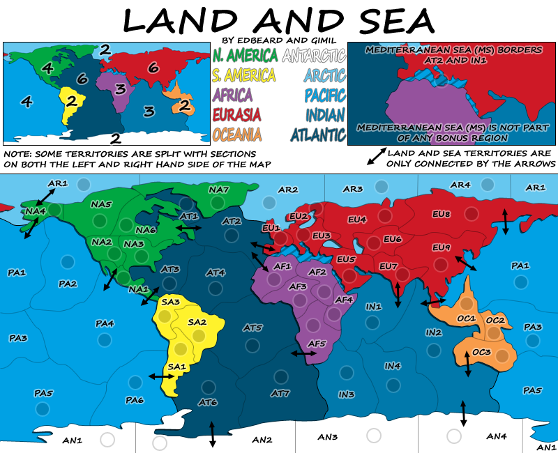
- Click image to enlarge.
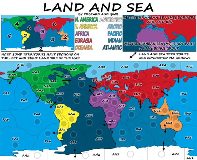
-Center med minimap
-Make new arrows (I don't like these ones now)
What do you know about map making, bitch?
Top Score:2403natty_dread wrote:I was wrong

Re: Land And Sea v9p11 S&L
a couple of comments if i may guys....
1. in most of the regions you have the terts numbered from left to right top to bottom, but this is not so in s america & n america - can you fix for consistency please.
2. graphically there are two things that could do with improvement - the black arrows and the entire title region....is there anything that could be done to enahnce these two items to give the map a lift. the arrows stand out too much like big pieces of sticky tape, and the whole title area looks messy....not like a map worthy of such grand material.
1. in most of the regions you have the terts numbered from left to right top to bottom, but this is not so in s america & n america - can you fix for consistency please.
2. graphically there are two things that could do with improvement - the black arrows and the entire title region....is there anything that could be done to enahnce these two items to give the map a lift. the arrows stand out too much like big pieces of sticky tape, and the whole title area looks messy....not like a map worthy of such grand material.

* Pearl Harbour * Waterloo * Forbidden City * Jamaica * Pot Mosbi
-
WidowMakers
- Posts: 2775
- Joined: Mon Nov 20, 2006 9:25 am
- Gender: Male
- Location: Detroit, MI
Re: Land And Sea v9p11 S&L
Well I have a couple of suggestions. and instead of trying to explain what I meant I just tweaked your images
First off I think that the legend for the Mediterranean sea is too big and not needed. If you chop that off and then move your title down, you can make the map a bit smaller.
I still took the text explaining the connections for the Med Sea and I also made it visibly connect to the Indian ocean and then added arrows across Africa to Asia.
For teh second image I took the names of the bonus regions (sorry I did not have the font but you get the idea) and put them into the mini map. Now the minimap can get bigger (which I have shown here) and the info can be put onto the right side. Now if the minmap stays te4h same size as the first image, the overall height of the map can get smaller yet.
WM
First off I think that the legend for the Mediterranean sea is too big and not needed. If you chop that off and then move your title down, you can make the map a bit smaller.
I still took the text explaining the connections for the Med Sea and I also made it visibly connect to the Indian ocean and then added arrows across Africa to Asia.
- Click image to enlarge.

For teh second image I took the names of the bonus regions (sorry I did not have the font but you get the idea) and put them into the mini map. Now the minimap can get bigger (which I have shown here) and the info can be put onto the right side. Now if the minmap stays te4h same size as the first image, the overall height of the map can get smaller yet.
- Click image to enlarge.



Re: Land And Sea v9p11 S&L
yea that looks a million times better. gimil what do you think?
-
gimil
- Posts: 8599
- Joined: Sat Mar 03, 2007 12:42 pm
- Gender: Male
- Location: United Kingdom (Scotland)
Re: Land And Sea v9p11 S&L
I like WM's first image alot. I will look into this in alot more detail in the morning thou, its getting a little late her to look into it just now.
What do you know about map making, bitch?
Top Score:2403natty_dread wrote:I was wrong
-
gimil
- Posts: 8599
- Joined: Sat Mar 03, 2007 12:42 pm
- Gender: Male
- Location: United Kingdom (Scotland)
Re: Land And Sea v9p11 S&L
- Click image to enlarge.
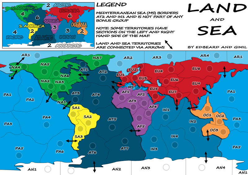
- Click image to enlarge.
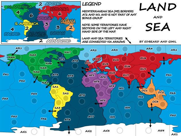
-Reworked entire title area
-Made MS play on the map rather than the legends.
TODO:
-New Arrows
What do you know about map making, bitch?
Top Score:2403natty_dread wrote:I was wrong
Re: Land And Sea v9p11 S&L
my name is edbeard and I approve of this message
well actually I have a slight problem with EU2 on both maps. the lines there are very short so it's hard to see that it borders EU3 on the south. and also the EU1-EU3 border line can be overlooked. I think moving the army circles and the labels slightly would help especially if you can move the border lines slightly in those areas so that they're longer (and therefore more visible)
if that doesn't work, maybe slightly darkening the lines JUST on Eurasia?
also, why is the AN2-AN3 border line darker than the other ones? well actually I should say why are the other lines there lighter? I think the darker looks better.
finally, shouldn't the numbers in the mini-map be the same style/font as the continent names? see thru looks good
well actually I have a slight problem with EU2 on both maps. the lines there are very short so it's hard to see that it borders EU3 on the south. and also the EU1-EU3 border line can be overlooked. I think moving the army circles and the labels slightly would help especially if you can move the border lines slightly in those areas so that they're longer (and therefore more visible)
if that doesn't work, maybe slightly darkening the lines JUST on Eurasia?
also, why is the AN2-AN3 border line darker than the other ones? well actually I should say why are the other lines there lighter? I think the darker looks better.
finally, shouldn't the numbers in the mini-map be the same style/font as the continent names? see thru looks good
-
gimil
- Posts: 8599
- Joined: Sat Mar 03, 2007 12:42 pm
- Gender: Male
- Location: United Kingdom (Scotland)
Re: Land And Sea v9p11 S&L
edbeard wrote:well actually I have a slight problem with EU2 on both maps. the lines there are very short so it's hard to see that it borders EU3 on the south. and also the EU1-EU3 border line can be overlooked. I think moving the army circles and the labels slightly would help especially if you can move the border lines slightly in those areas so that they're longer (and therefore more visible)
I have an idea for this. Let me work on it.
also, why is the AN2-AN3 border line darker than the other ones? well actually I should say why are the other lines there lighter? I think the darker looks better.
They are all the same darkness, some areas are sharper than others. It will take a fair bit of work with the pen tool paths. In my opinion its to much work to do for such a little gain. You don't mind letting this one slip do you?
finally, shouldn't the numbers in the mini-map be the same style/font as the continent names? see thru looks good
Easily done.
What do you know about map making, bitch?
Top Score:2403natty_dread wrote:I was wrong
-
gimil
- Posts: 8599
- Joined: Sat Mar 03, 2007 12:42 pm
- Gender: Male
- Location: United Kingdom (Scotland)
Re: Land And Sea v9p11 S&L
- Click image to enlarge.
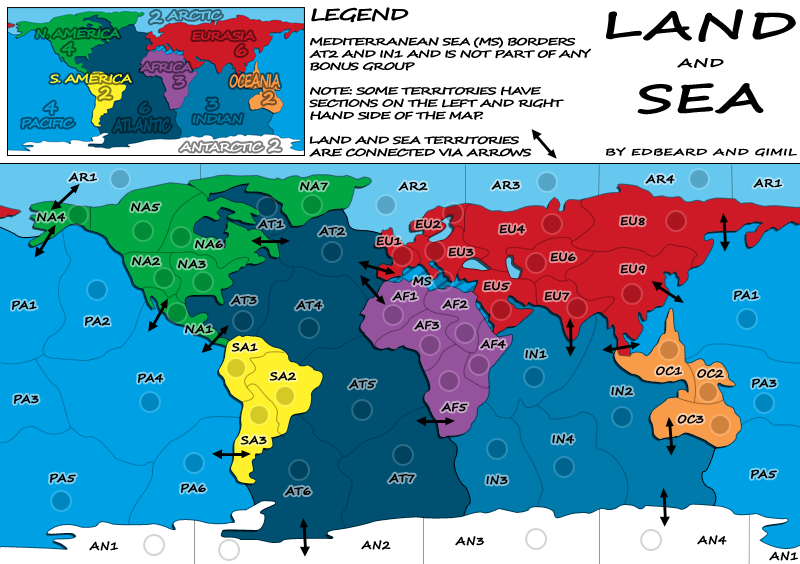
- Click image to enlarge.
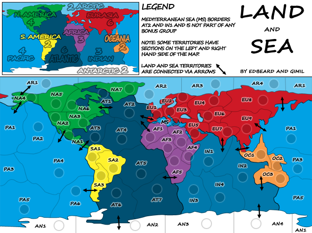
Changes:
-EU3 border on small
-consistancy in minimap continent names and numbers
TODO:
-New arrows
What do you know about map making, bitch?
Top Score:2403natty_dread wrote:I was wrong
-
Incandenza

- Posts: 4949
- Joined: Thu Oct 19, 2006 5:34 pm
- Gender: Male
- Location: Playing Eschaton with a bucket of old tennis balls
Re: Land And Sea v9p11 S&L
Not to be a nitpicker, but it really should be "Antarctica", that's the proper name of the continent.
THOTA: dingdingdingdingdingdingBOOM
Te Occidere Possunt Sed Te Edere Non Possunt Nefas Est
Te Occidere Possunt Sed Te Edere Non Possunt Nefas Est
Re: Land And Sea v9p11 S&L
you are very correct
the name got changed accidentally in a previous version
the name got changed accidentally in a previous version

Re: Land And Sea v9p11 S&L
Can't the land/sea connections be shown with something other than an arrow?
Re: Land And Sea v9p11 S&L
well obviously they CAN but is there a need to do that? you haven't really said why you don't like it. I personally think it fits well with the whole look and I haven't seen gimil say anything contrary about that medium for the land/sea connections so where is our motivation? honestly, I can't really think of a better way to do it that works with how the rest of the map looks. But, if gimil wants to do something else it's his area to do so.InkL0sed wrote:Can't the land/sea connections be shown with something other than an arrow?
-
gimil
- Posts: 8599
- Joined: Sat Mar 03, 2007 12:42 pm
- Gender: Male
- Location: United Kingdom (Scotland)
Re: Land And Sea v9p11 S&L
- Click image to enlarge.
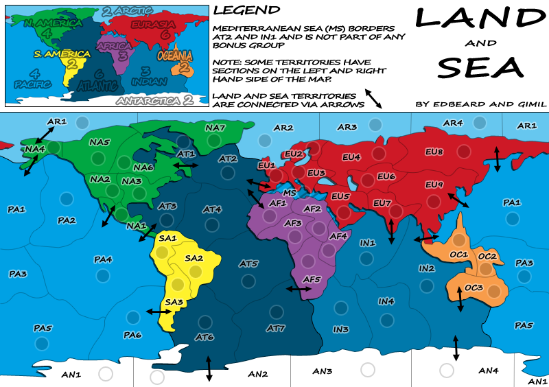
- Click image to enlarge.
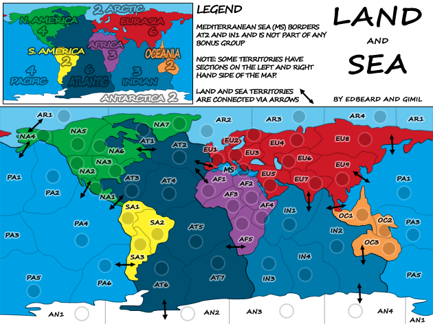
-EU3 border fix is now on both maps.
-Antarctica spelling mistake fixed.
TODO:
-new land to sea arrows.
What do you know about map making, bitch?
Top Score:2403natty_dread wrote:I was wrong
-
the.killing.44

- Posts: 4724
- Joined: Thu Oct 23, 2008 7:43 pm
- Gender: Male
- Location: now tell me what got two gums and knows how to spit rhymes
- Contact:
Re: Land And Sea v9p11 S&L
Is it? I don't really see a difference, although it could just be megimil wrote:-EU3 border fix is now on both maps.
Re: Land And Sea v10p13 S&L
it was just about making the borders evident which they are much more so in this version than before so yes it is
-
gimil
- Posts: 8599
- Joined: Sat Mar 03, 2007 12:42 pm
- Gender: Male
- Location: United Kingdom (Scotland)
Re: Land And Sea v10p13 S&L
edbeard do we really need new arrows? I can't think of anything better than what we have.
What do you know about map making, bitch?
Top Score:2403natty_dread wrote:I was wrong
Re: Land And Sea v10p13 S&L
you were the one saying we needed new arrows not me 
-
gimil
- Posts: 8599
- Joined: Sat Mar 03, 2007 12:42 pm
- Gender: Male
- Location: United Kingdom (Scotland)
Re: Land And Sea v10p13 S&L
Someone else did as well! I can't remeber who.edbeard wrote:you were the one saying we needed new arrows not me
What do you know about map making, bitch?
Top Score:2403natty_dread wrote:I was wrong
-
the.killing.44
- Posts: 4724
- Joined: Thu Oct 23, 2008 7:43 pm
- Gender: Male
- Location: now tell me what got two gums and knows how to spit rhymes
- Contact:
Re: Land And Sea v9p11 S&L
InkL0sed wrote:Can't the land/sea connections be shown with something other than an arrow?
Re: Land And Sea v10p13 S&L
yea it was him but like I already said
if we don't see a reason to do it we're not going to just do it to do it. right now we have no reason to do it other than InkL0sed asked about it which to me isn't a great reason to do so when like I've said neither of us see a reason to do it and can't think of an alternative that would look good with the rest of the map
edbeard wrote:well obviously they CAN but is there a need to do that? you haven't really said why you don't like it. I personally think it fits well with the whole look and I haven't seen gimil say anything contrary about that medium for the land/sea connections so where is our motivation? honestly, I can't really think of a better way to do it that works with how the rest of the map looks. But, if gimil wants to do something else it's his area to do so.InkL0sed wrote:Can't the land/sea connections be shown with something other than an arrow?
if we don't see a reason to do it we're not going to just do it to do it. right now we have no reason to do it other than InkL0sed asked about it which to me isn't a great reason to do so when like I've said neither of us see a reason to do it and can't think of an alternative that would look good with the rest of the map
-
gimil
- Posts: 8599
- Joined: Sat Mar 03, 2007 12:42 pm
- Gender: Male
- Location: United Kingdom (Scotland)
Re: Land And Sea v10p13 S&L
Deal.edbeard wrote:yea it was him but like I already said
edbeard wrote:well obviously they CAN but is there a need to do that? you haven't really said why you don't like it. I personally think it fits well with the whole look and I haven't seen gimil say anything contrary about that medium for the land/sea connections so where is our motivation? honestly, I can't really think of a better way to do it that works with how the rest of the map looks. But, if gimil wants to do something else it's his area to do so.InkL0sed wrote:Can't the land/sea connections be shown with something other than an arrow?
if we don't see a reason to do it we're not going to just do it to do it. right now we have no reason to do it other than InkL0sed asked about it which to me isn't a great reason to do so when like I've said neither of us see a reason to do it and can't think of an alternative that would look good with the rest of the map
What do you know about map making, bitch?
Top Score:2403natty_dread wrote:I was wrong
Re: Land And Sea v10p13 S&L
I am requesting that also....the arrows are fine up to a point....but it needs something better. Docks would do, but something alternative is required here....put your thinking caps on guys.gimil wrote:Someone else did as well! I can't remeber who.edbeard wrote:you were the one saying we needed new arrows not me
And Gimil, the Americas still needs re-ordering top to bottom left to right.

This map (and i am sorry to say this guys and you will crucify me for this, but i don't mean offense in any manner) has no soul....it needs a theme that just doesn't look like it could be anyone's drawing off the production line....unless you think it should be just such a minimalist map.
While WM has done something with the title to re-arrange it...perhaps you could enhance the title area and give it a picture of a large seagoing steamer docked at port faded in the background, with scrolled edges. The squarish title area doesn't fit design-wise with the rolling lines that occur in every region of the map.
If it was done well enough, i would be most supportive of this becoming a new World Classic...it has potential, but it's gotta be done properly.
Make it look brilliant, outstanding, and have everyone gob-smacked.


Last edited by cairnswk on Sun Dec 28, 2008 7:59 pm, edited 1 time in total.
* Pearl Harbour * Waterloo * Forbidden City * Jamaica * Pot Mosbi