Vancouver [Quenched]
Moderator: Cartographers
Forum rules
Please read the Community Guidelines before posting.
Please read the Community Guidelines before posting.
Re: Vancouver Map
I think it was declared 'dead' because I hadn't worked on it in 10 days or so, no posts in the forum for a week.
Is it just the small map, or does the large map's text displease you? The small map, I haven't actually made one yet. I'll throw one together with pretty text when next I can.
Is it just the small map, or does the large map's text displease you? The small map, I haven't actually made one yet. I'll throw one together with pretty text when next I can.
Last edited by shakeycat on Mon Dec 15, 2008 12:21 am, edited 1 time in total.
- the.killing.44
- Posts: 4724
- Joined: Thu Oct 23, 2008 7:43 pm
- Gender: Male
- Location: now tell me what got two gums and knows how to spit rhymes
- Contact:
Re: Vancouver Map
No, I meant the colors, especially in the orange area.shakeycat wrote:I think it was declared 'dead' because I hadn't worked on it in 10 days or so, no posts in the forum for a week.I was looking at the most recent post, not yours. My bad.
shakeycat wrote:Is it just the small map, or does the large map's text displease you? The small map, I haven't actually "made" one yet. I'll throw one together with pretty text when next I can.
-
Bavarian Raven
- Posts: 261
- Joined: Fri Nov 17, 2006 10:52 pm
- Location: Canada, Vancouver
Re: Vancouver Map
i dont see whats wrong with it. i mean its not the best text i've ever seen but its decentNo, I meant the colors, especially in the orange area.
Re: Vancouver Map
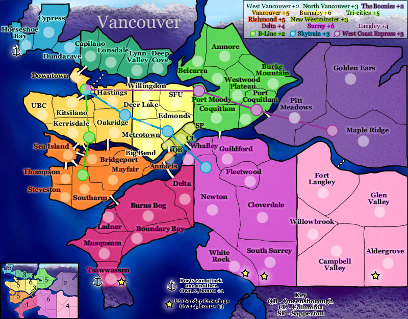
I think I see what he means. While the text effect works when the background is a similar colour, it makes the text hard to read when the background is an opposite colour.
I've changed it: http://www.atomation.com/~thazzard/fun/gva/dec15.jpg
Bold + white ... maybe it's too much now. Certainly easier to read.
I've changed it: http://www.atomation.com/~thazzard/fun/gva/dec15.jpg
Bold + white ... maybe it's too much now. Certainly easier to read.
Re: Vancouver Map
I concur the mountains on the top bring out the contrast in the top 1/2  love the big bold letters, makes it easier to read
Re: Vancouver Map
Are there any glaring issues or difficulties of play that I've overlooked?
Is Horseshoe Bay too isolated? Should I give it a port that can attack Tsawwassen, to make the map more circular? Or is this just the nature of the map and it should stay? (as something easy to conquer and hold, but rather worthless.)
Any cosmetic suggestions? I'm thinking it needs quite an overhaul there, to make a clean map. It seems more like a painting now than a Conquer Club map (which tend to be clean and stylized.) Maybe redraw the lines, add shadows to things.
It also seems to lack unique gameplay, being simply geographically unique. Hopefully that is enough. There has been one suggestion to make it Olympic themed. Maybe I'll draw a prototype and see if that one is preferred.
-
Bavarian Raven
- Posts: 261
- Joined: Fri Nov 17, 2006 10:52 pm
- Location: Canada, Vancouver
Re: Vancouver Map
horseshoe bay is a port of sorts. so give it port abilities 
Re: Vancouver Map [v6]
Thank you Led Zeppeliner. Is there anything you would change or improve upon?
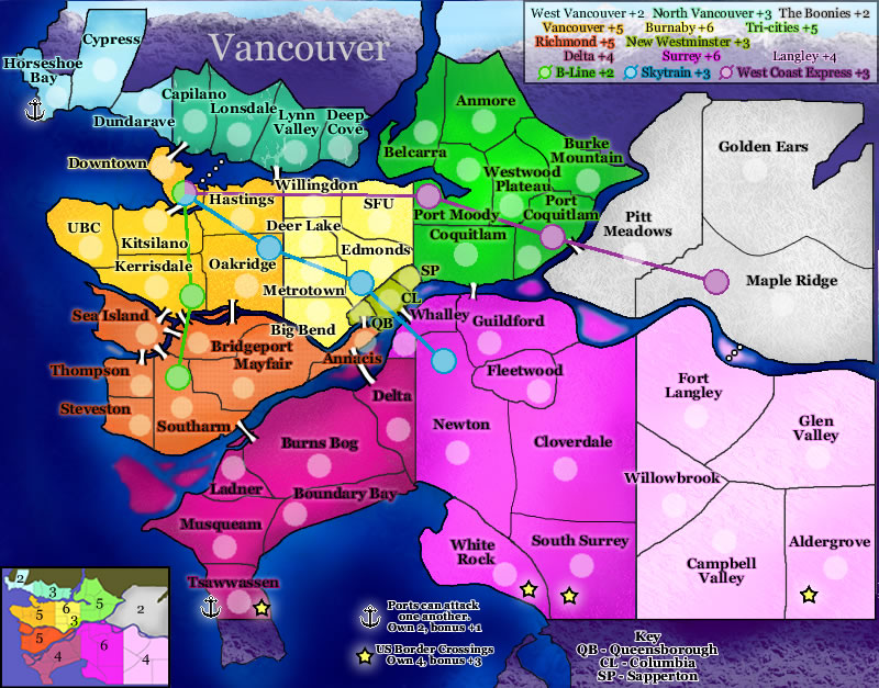
Bavarian Raven, I added the ports and border towns again, to mix up the bonus groups and make Horseshoe Bay and Tsawwassen more accessible. Here's the latest.
Bavarian Raven, I added the ports and border towns again, to mix up the bonus groups and make Horseshoe Bay and Tsawwassen more accessible. Here's the latest.
-
LED ZEPPELINER
- Posts: 1088
- Joined: Tue Nov 25, 2008 10:09 pm
Re: Vancouver Map [v6]
i cant tell if the port symbol is an anchor or an airplane (try making it a little clearer)
sailorseal wrote:My big boy banana was out the whole time
AndyDufresne wrote:Forever linked at the hip's-banana! (That sounds strange, don't quote me.)AndyDufresne wrote:Many Happy Bananas to everyone, lets party...with Bananas.
--Andy
Re: Vancouver Map [v6]
Actually, the intention was that it look like both an anchor AND an airplane ...
-
LED ZEPPELINER
- Posts: 1088
- Joined: Tue Nov 25, 2008 10:09 pm
Re: Vancouver Map [v6]
ok but then shouldn't it not be called a portshakeycat wrote:Actually, the intention was that it look like both an anchor AND an airplane ...
sailorseal wrote:My big boy banana was out the whole time
AndyDufresne wrote:Forever linked at the hip's-banana! (That sounds strange, don't quote me.)AndyDufresne wrote:Many Happy Bananas to everyone, lets party...with Bananas.
--Andy
Re: Vancouver Map [v6]
if you have it wrote that ports attack each other, then i don't think you really need the big glowing dots
- the.killing.44
- Posts: 4724
- Joined: Thu Oct 23, 2008 7:43 pm
- Gender: Male
- Location: now tell me what got two gums and knows how to spit rhymes
- Contact:
Re: Vancouver Map [v6]
I'm with Tisha. Either make the dots not stand out so much (reduce the glow, maybe size?) or just be rid of em altogether.
Re: Vancouver Map [v6]
I'll see how they look smaller, then probably strike them out altogether. I've seen the lines of attack nixed on other maps too, as unnecessary. I just felt they may make it easier, reduce the surprise when one is attacked from afar. But yes, I do mention it in the notes so .. good.
Perhaps Port is the wrong name, especially seeing as the "Port of Vancouver" isn't even on there. Maybe I'll just make the symbol clearly nautical and call it the Ferry.
In that case, does the "ferry" need to run to Sea Island? or is the Tsawwassen to Horseshoe Bay connection enough to open up those two areas? Sea Island doesn't need opening.
Re: Vancouver Map [v7]
Here we go, how's this? Pretty little anchor connecting Horseshoe Bay to Tsawwassen.
-
LED ZEPPELINER
- Posts: 1088
- Joined: Tue Nov 25, 2008 10:09 pm
Re: Vancouver Map [v8]
the anchors are a lot bettter, but i noticed that you took one out, any specific reason?
sailorseal wrote:My big boy banana was out the whole time
AndyDufresne wrote:Forever linked at the hip's-banana! (That sounds strange, don't quote me.)AndyDufresne wrote:Many Happy Bananas to everyone, lets party...with Bananas.
--Andy
Re: Vancouver Map [v8]
I'm curious if the Sea Island anchor was necessary. Was it? Should it stay? I have nothing against it, I just think the game plays quite differently if it is there. If you think it should stay, back it goes.
-
LED ZEPPELINER
- Posts: 1088
- Joined: Tue Nov 25, 2008 10:09 pm
Re: Vancouver Map [v8]
i personaly think it should be there, because sea island connects to so many places, im thinking that it would be cool if it also connected to places through sea, but thats just me
sailorseal wrote:My big boy banana was out the whole time
AndyDufresne wrote:Forever linked at the hip's-banana! (That sounds strange, don't quote me.)AndyDufresne wrote:Many Happy Bananas to everyone, lets party...with Bananas.
--Andy
- the.killing.44
- Posts: 4724
- Joined: Thu Oct 23, 2008 7:43 pm
- Gender: Male
- Location: now tell me what got two gums and knows how to spit rhymes
- Contact:
Re: Vancouver Map [v8]
Yes but it would be very very very hard to hold, plus the other 3 terts you have to defend to keep that bonus. I say get rid of the port there.LED ZEPPELINER wrote:i personaly think it should be there, because sea island connects to so many places, im thinking that it would be cool if it also connected to places through sea, but thats just me
.44
Re: Vancouver Map [v8]
I agree. I want to open up West Vancouver just enough that it is not a dead end with one entrance. Every map needs a little 'Australia' that gives you a little bonus for not much work. As it is, most of the bonuses on the map require an awful lot of territories.Yes but it would be very very very hard to hold, plus the other 3 terts you have to defend to keep that bonus. I say get rid of the port there.
Re: Vancouver Map [v7]
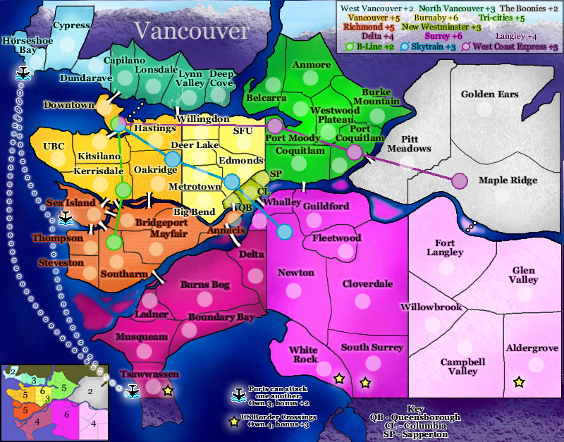
This map feels incredibly busy, and it really is! You've got islands and bridges, ports/docks, Border Crossing and Trains/Monorails.... And they're all competing for my attention!
Gameplay-wise, I think there is so much going on, that things are rapidly going to get very confusing - especially as your instructions are littered around the edges of the map rather than consolidated into one place. Complexity isn't a bad thing, but if you've got a lot going on, then it needs to be clearly explained.
Graphics-wise, the map looks a little blurry for some reason? There are pools of colour in the river that look out of place, and the most noticeable thing is the neon pink of Delta and Surrey - this is the first thing I would change
There is some texture in the background (most noticeable in the white region) which is a nice touch, and I think you could bring this out a bit more once the colours have been toned down a bit.
The borders are fairly pixellated, so at some point you'll need to look at them again. Having said that, you're also going to struggle with getting names and army numbers in parts of the map that are incredibly congested.
Why do some territories have dotted lines connecting them instead of bridges?

PB: 2661 | He's blue... If he were green he would die | No mod would be stupid enough to do that
Re: Vancouver Map [v8]
Thank you MrBenn. I truly appreciate the feedback.
I probably should've made a post when I changed it to the most recent one (which has changes up to January :
The blurry pink river blobs are gone, the borders have all been redrawn, and I've put a white uniform texture over all territories (which could be thicker to tone down the bright colours.) I'll tone down Delta and Surrey in particular.
Perhaps I should nix some smaller territories to prevent congestion and confusion? Burnaby can stand to lose one or two, and New West would prevent a lot of trouble if it was just a 1 territory continent with +1 bonus. And on second thought, the little border stars don't really add to the map at all (though the ports do.) Plus, it makes it too many bonus groups. Without New West or the stars, the only explanation on the sidelines is for the anchors. Does the train need to be explained as well?
The dotted lines instead of bridges are just ferries, but since it has no effect on gameplay, perhaps they should be drawn as bridges just to make things more uniform and easy to read.
Monday I'll have something prettier and more straightforward.
I probably should've made a post when I changed it to the most recent one (which has changes up to January
Perhaps I should nix some smaller territories to prevent congestion and confusion? Burnaby can stand to lose one or two, and New West would prevent a lot of trouble if it was just a 1 territory continent with +1 bonus. And on second thought, the little border stars don't really add to the map at all (though the ports do.) Plus, it makes it too many bonus groups. Without New West or the stars, the only explanation on the sidelines is for the anchors. Does the train need to be explained as well?
The dotted lines instead of bridges are just ferries, but since it has no effect on gameplay, perhaps they should be drawn as bridges just to make things more uniform and easy to read.
Monday I'll have something prettier and more straightforward.
-
Bavarian Raven
- Posts: 261
- Joined: Fri Nov 17, 2006 10:52 pm
- Location: Canada, Vancouver
Re: Vancouver Map [v8]
take out those dotted lines (the north shore is fine with two bridges and the port), but add a bridge between maple ridge and fort langly *representing the bridge they are building)The dotted lines instead of bridges are just ferries, but since it has no effect on gameplay, perhaps they should be drawn as bridges just to make things more uniform and easy to read.
other then that i like the map as it is
- sailorseal
- Posts: 2735
- Joined: Sun May 25, 2008 1:49 pm
- Gender: Male
- Location: conquerclub.com
Re: Vancouver Map [v8.1]
I love the idea and the map.
I thik Belcarra and Deep Cove need to connect.
I thik Belcarra and Deep Cove need to connect.


