Added a signal gantry to the State bonuses.
- Click image to enlarge.

Moderator: Cartographers
![]() by cairnswk on Fri Oct 17, 2008 8:09 pm
by cairnswk on Fri Oct 17, 2008 8:09 pm


![]() by TaCktiX on Sat Oct 18, 2008 1:42 pm
by TaCktiX on Sat Oct 18, 2008 1:42 pm


![]() by cairnswk on Sat Oct 18, 2008 2:30 pm
by cairnswk on Sat Oct 18, 2008 2:30 pm
TaCktiX wrote:The train is a nice touch, but it looks "spliced in". Perhaps darkening the saturation so that it melds into the map a bit more would fix that.

![]() by cairnswk on Sat Oct 18, 2008 2:44 pm
by cairnswk on Sat Oct 18, 2008 2:44 pm
gimil wrote:I have two minor points cairns mate:
1. I can't remeber but have I mentioned I don't really like the title all that much? It seems a little to distracting and doesn't fit the style of the map in my opinion.
2. I am not much of a fan of the white lines on the HUD. They look pixalated. I don't know, but maybe you could try something different instead of white lines please?
![]() by gimil on Mon Oct 20, 2008 5:26 am
by gimil on Mon Oct 20, 2008 5:26 am

natty_dread wrote:I was wrong


![]() by cairnswk on Mon Oct 20, 2008 6:53 am
by cairnswk on Mon Oct 20, 2008 6:53 am
gimil wrote:Cairns I'm happy and it seems eveyone else is!
![]() by yeti_c on Mon Oct 20, 2008 8:43 am
by yeti_c on Mon Oct 20, 2008 8:43 am


![]() by e_i_pi on Mon Oct 20, 2008 9:01 am
by e_i_pi on Mon Oct 20, 2008 9:01 am


![]() by cairnswk on Mon Oct 20, 2008 2:32 pm
by cairnswk on Mon Oct 20, 2008 2:32 pm
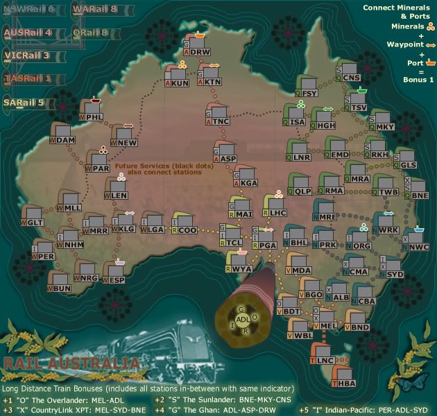
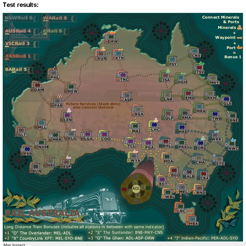
e_i_pi wrote:I just noticed you have Bomaderry as the station south of Sydney. Being from this area (Illawarra South Coast), I'm pretty familiar with the lines. Bomaderry is the terminal, but Port Kembla is the biggest line, and also one of the biggest mineral exporting ports in Australia. Whether or not you want to take that on board is up to you
![]() by cairnswk on Thu Oct 23, 2008 3:53 pm
by cairnswk on Thu Oct 23, 2008 3:53 pm
![]() by Jumentum on Tue Nov 04, 2008 9:02 am
by Jumentum on Tue Nov 04, 2008 9:02 am


![]() by cairnswk on Sun Nov 09, 2008 1:18 am
by cairnswk on Sun Nov 09, 2008 1:18 am
![]() by AndyDufresne on Tue Nov 11, 2008 12:48 pm
by AndyDufresne on Tue Nov 11, 2008 12:48 pm


![]() by cairnswk on Tue Nov 11, 2008 2:48 pm
by cairnswk on Tue Nov 11, 2008 2:48 pm
AndyDufresne wrote:
--Andy
![]() by LLLUUUKKKEEE on Thu Nov 13, 2008 5:48 am
by LLLUUUKKKEEE on Thu Nov 13, 2008 5:48 am
cairnswk wrote:Thanks Andy,
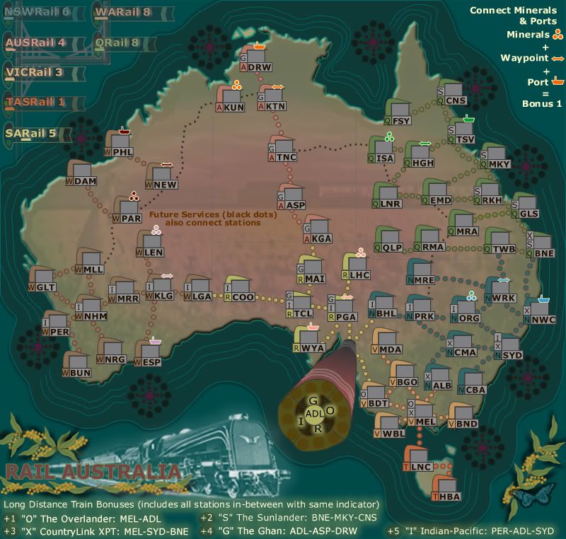
Howver, I am looking into reducing the number of stations on the map particularly in NSW where it si very cluttered, and i now don't like it.


![]() by cairnswk on Thu Nov 13, 2008 6:02 am
by cairnswk on Thu Nov 13, 2008 6:02 am
LLLUUUKKKEEE wrote:First of all, once again, another buet.
you are a true treasure to this site.cairnswk wrote:Thanks Andy,
Howver, I am looking into reducing the number of stations on the map particularly in NSW where it si very cluttered, and i now don't like it.
I was gunna say the same thing.
And is it possible to make it more brighter and dull down the oceans
And can you make the top left legend more clearer
Apart from that it looks great!
![]() by cairnswk on Sat Nov 15, 2008 3:03 am
by cairnswk on Sat Nov 15, 2008 3:03 am
![]() by cairnswk on Sun Nov 16, 2008 4:31 am
by cairnswk on Sun Nov 16, 2008 4:31 am
Forza AZ wrote:Rail Australia XML has been checked and is OK.
![]() by yeti_c on Sun Nov 16, 2008 5:00 am
by yeti_c on Sun Nov 16, 2008 5:00 am
![]() by cairnswk on Sun Nov 16, 2008 5:47 am
by cairnswk on Sun Nov 16, 2008 5:47 am
yeti_c wrote:Great work Cairns.
FF here we come for yet another Cairns map... closing in on the 20 at full speed!!
C.
yeti_c wrote:Hmmm - I'm not sure I like the new legend in the top left...
Why? - I'm not sure - but it all seems a little - er - busy? or contrived? I'm not sure - but basically - something seems a bit off!!
C.
![]() by Night Strike on Sun Nov 16, 2008 6:44 pm
by Night Strike on Sun Nov 16, 2008 6:44 pm


![]() by cairnswk on Mon Nov 17, 2008 12:54 pm
by cairnswk on Mon Nov 17, 2008 12:54 pm
Night Strike wrote:Hmm.....I kind of agree with yeti when I think about it. Perhaps get rid of that wood/medal "P" shaped thing. If you don't want to get rid of it, try pushing it towards the background/blended in more and make the signal boxes around the text "pop" a bit more.
![]() by AndyDufresne on Sat Nov 22, 2008 2:11 pm
by AndyDufresne on Sat Nov 22, 2008 2:11 pm

![]() by cairnswk on Sat Nov 22, 2008 2:30 pm
by cairnswk on Sat Nov 22, 2008 2:30 pm
AndyDufresne wrote:
Thanks Forza!
--Andy
![]() by cairnswk on Sat Nov 29, 2008 1:08 am
by cairnswk on Sat Nov 29, 2008 1:08 am
Users browsing this forum: No registered users
|
|||||||
| Conquer Club is not associated with RISK online in any way. Copyright © 2006-2024 by Big Wham LLC | |||||||