Rail Australia [Quenched]
Moderator: Cartographers
Forum rules
Please read the Community Guidelines before posting.
Please read the Community Guidelines before posting.
- gimil
- Posts: 8599
- Joined: Sat Mar 03, 2007 12:42 pm
- Gender: Male
- Location: United Kingdom (Scotland)
Re: RAIL AUSTRALIA V12 (p9) [I] - Starting Again!
cairns whats happening with this puppy?
What do you know about map making, bitch?
Top Score:2403natty_dread wrote:I was wrong
Re: RAIL AUSTRALIA V12 (p9) [I] - [ON VACATION]
Gimil, i was going to start it again, but ran out of creativity...and time. So for now it will fall to the dungeons for Vacation until such time as i resurrect it again.gimil wrote:cairns whats happening with this puppy?

* Pearl Harbour * Waterloo * Forbidden City * Jamaica * Pot Mosbi
Re: RAIL AUSTRALIA V12 (p9) [I] - [On Vacation]
Wow, I reckon it's pretty good.
You included Bunbury, I wub you
But please continue, I want people to do more maps of Australia! I mean, it's going good. I reckon you should make it a little less complex for idiots like me though.
Edit: Seriously, c'mon! Vacations are for... People, well please continue!

You included Bunbury, I wub you
But please continue, I want people to do more maps of Australia! I mean, it's going good. I reckon you should make it a little less complex for idiots like me though.
Edit: Seriously, c'mon! Vacations are for... People, well please continue!
Re: RAIL AUSTRALIA V12 (p9) [I] - [On Vacation]
Of course i included Bunbury. It will continue but not at this time, later.Merker wrote:Wow, I reckon it's pretty good.
You included Bunbury, I wub you
But please continue, I want people to do more maps of Australia! I mean, it's going good. I reckon you should make it a little less complex for idiots like me though.
Edit: Seriously, c'mon! Vacations are for... People, well please continue!

* Pearl Harbour * Waterloo * Forbidden City * Jamaica * Pot Mosbi
- gimil
- Posts: 8599
- Joined: Sat Mar 03, 2007 12:42 pm
- Gender: Male
- Location: United Kingdom (Scotland)
Re: RAIL AUSTRALIA V12 (p9) [I] - [On Vacation]
moving on over to the vacation forum! Let me know when you want it moved back cairns!
What do you know about map making, bitch?
Top Score:2403natty_dread wrote:I was wrong
Re: RAIL AUSTRALIA V12 (p9) [I]
I'd like this moved back to the main Forum thanks Gimil.gimil wrote:moving on over to the vacation forum! Let me know when you want it moved back cairns!
It is in no longer on vacation.

* Pearl Harbour * Waterloo * Forbidden City * Jamaica * Pot Mosbi
Re: RAIL AUSTRALIA V13 (p9) [I] - New station designs
Current Version 13
This is where the station designs are heading....back to the similar curved roofs that existed before. This keeps the curvy nature of the design as opposed to the rectangle/squarish design from V12.
This is where the station designs are heading....back to the similar curved roofs that existed before. This keeps the curvy nature of the design as opposed to the rectangle/squarish design from V12.

* Pearl Harbour * Waterloo * Forbidden City * Jamaica * Pot Mosbi
-
whitestazn88
- Posts: 3128
- Joined: Mon Feb 05, 2007 2:59 pm
- Gender: Male
- Location: behind you
- Contact:
Re: RAIL AUSTRALIA V13 (p9) [I] - New Station Designs
wait... i thought you were going without the central hub???
- lord voldemort
- Posts: 9596
- Joined: Sat Oct 20, 2007 4:39 am
- Gender: Male
- Location: Launceston, Australia
- Contact:
Re: RAIL AUSTRALIA V13 (p9) [I] - New Station Designs
nah the hub was included to keep in tie with the rail series nice to see this baby back cairns

-
whitestazn88
- Posts: 3128
- Joined: Mon Feb 05, 2007 2:59 pm
- Gender: Male
- Location: behind you
- Contact:
Re: RAIL AUSTRALIA V13 (p9) [I] - New Station Designs
well he originally didn't have that saying he didn't think it would be that good for the aussie rail system, so i was confused lovo....
- lord voldemort
- Posts: 9596
- Joined: Sat Oct 20, 2007 4:39 am
- Gender: Male
- Location: Launceston, Australia
- Contact:
Re: RAIL AUSTRALIA V13 (p9) [I] - New Station Designs
he changed it if memory serves me right cause the map was lacking somethingwhitestazn88 wrote:well he originally didn't have that saying he didn't think it would be that good for the aussie rail system, so i was confused lovo....
there is no real hub as there is in europe usa
adeliade is used cause its the central part to most interstate travel

-
whitestazn88
- Posts: 3128
- Joined: Mon Feb 05, 2007 2:59 pm
- Gender: Male
- Location: behind you
- Contact:
Re: RAIL AUSTRALIA V13 (p9) [I] - New Station Designs
good to know... i suppose i should take the time to read cairns' posts properly instead of just looking at the pictures.
i guess that was always my problem
i guess that was always my problem
Re: RAIL AUSTRALIA V12 (p9) [I] - Starting Again!
Just to remind you of this post Cairns!!!cairnswk wrote:For you C...mosts things are possible...Hehehe!yeti_c wrote:I think the sides of the map are too close - a bit cramped - could you grow the image - but keep the map the same size to give it a bit of breathing space on either side?
C.
C.

Highest score : 2297
Re: RAIL AUSTRALIA V12 (p9) [I] - Starting Again!
Sure c. no probs.yeti_c wrote:Just to remind you of this post Cairns!!!cairnswk wrote:For you C...mosts things are possible...Hehehe!yeti_c wrote:I think the sides of the map are too close - a bit cramped - could you grow the image - but keep the map the same size to give it a bit of breathing space on either side?
C.
C.

* Pearl Harbour * Waterloo * Forbidden City * Jamaica * Pot Mosbi
Re: RAIL AUSTRALIA V13 (p9) [I] - New Station Designs
I hope your vacation was restfull. I'm glad to see this map back in the forge. Can't wait to play it. Keep up the good work.
"We are advancing constantly and not interested in holding anything except the enemy. We're gonna hold 'em by the nose and we're gonna kick 'em in the ass!" -PATTON
Re: RAIL AUSTRALIA V14 New LD trains legend
Thanks trk1994.trk1994 wrote:I hope your vacation was restfull. I'm glad to see this map back in the forge. Can't wait to play it. Keep up the good work.
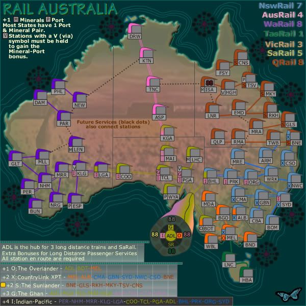
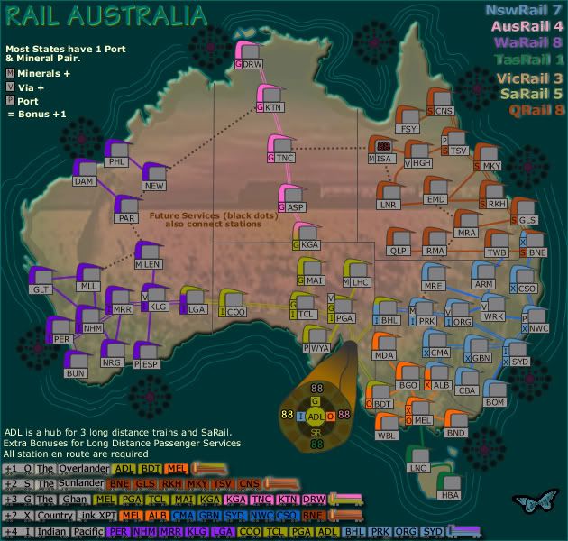
Version 14 Changes:
1. Old legend station removed and replaced with train images for long distance trains.
2. ADL hub changed colour and still to be done is the didgerido makrings.
3. Mineral port pairs simplified in legend.
4. 30 PX added to overall map.
Possible to be changed - I might look at placing a back ground on those legend pieces with curvy border as long as it doesn't go overboard and interfere with the overall desing artwork.

* Pearl Harbour * Waterloo * Forbidden City * Jamaica * Pot Mosbi
-
whitestazn88
- Posts: 3128
- Joined: Mon Feb 05, 2007 2:59 pm
- Gender: Male
- Location: behind you
- Contact:
Re: RAIL AUSTRALIA V14 (p12) [I] - New LD Trains legend
i do like the new thing next to each station labeling whether its part of a long range one
Re: RAIL AUSTRALIA V14 (p12) [I] - New LD Trains legend
That's what i like to hear. thanks whitestazn88whitestazn88 wrote:i do like the new thing next to each station labeling whether its part of a long range one

* Pearl Harbour * Waterloo * Forbidden City * Jamaica * Pot Mosbi
-
whitestazn88
- Posts: 3128
- Joined: Mon Feb 05, 2007 2:59 pm
- Gender: Male
- Location: behind you
- Contact:
Re: RAIL AUSTRALIA V14 (p12) [I] - New LD Trains legend
i just took a real close look at this big one, and i just realized that there are some stations with 2 different colors, i'm assuming you have to hold those to get the bonus.
and you should really fix the colors in the legend so they match with those on the map or vice versa
and you should really fix the colors in the legend so they match with those on the map or vice versa
Re: RAIL AUSTRALIA V14 (p12) [I] - New LD Trains legend
Cairns, I'm going to brutally honest. Compared to all your other recent quenches (including Rail Europe), this looks light years behind graphically. The color palette is drab, the clarity extant in other Rail maps isn't there, and the bonus descriptions are both really long and inelegant (long-distance routes) or cramped into a corner (normal bonuses). Give it the Cairnswk touch, as right now it doesn't look like there is one.
-
whitestazn88
- Posts: 3128
- Joined: Mon Feb 05, 2007 2:59 pm
- Gender: Male
- Location: behind you
- Contact:
Re: RAIL AUSTRALIA V14 (p12) [I] - New LD Trains legend
i think it looks pretty good... although i must admit, the curved design of the stations is just... eh nothing special at all and it does look kinda weird after a bit
i don't really know what all the other technical jargon tac talked about means, but i suppose he has some good points in saying the graphics could stand to be tweaked
i don't really know what all the other technical jargon tac talked about means, but i suppose he has some good points in saying the graphics could stand to be tweaked
Re: RAIL AUSTRALIA V14 (p12) [I] - New LD Trains legend
those were originally in early version meant to be like boomerangs.whitestazn88 wrote:i think it looks pretty good... although i must admit, the curved design of the stations is just... eh nothing special at all and it does look kinda weird after a bit
Australia does not have the distinct old European charm of the larger city stations except in the cities.
The remote stations are more like flat tin roofs, and now larger stations like here in Cairns are nothing more than a couple of railways lines running through underneath a large shopping centre.
So if these designs offend anyone ro they think they are "just Tad" then they're a little more conceptual than real life stations here in Oz.
of course, this is probably far from finished, howver as to the design, i am kind of liking it very much now.i don't really know what all the other technical jargon tac talked about means, but i suppose he has some good points in saying the graphics could stand to be tweaked

* Pearl Harbour * Waterloo * Forbidden City * Jamaica * Pot Mosbi
Re: RAIL AUSTRALIA V14 (p12) [I] - New LD Trains legend
Hold your horses and be patient please.TaCktiX wrote:Cairns, I'm going to brutally honest. Compared to all your other recent quenches (including Rail Europe), this looks light years behind graphically. The color palette is drab, the clarity extant in other Rail maps isn't there, and the bonus descriptions are both really long and inelegant (long-distance routes) or cramped into a corner (normal bonuses). Give it the Cairnswk touch, as right now it doesn't look like there is one.

* Pearl Harbour * Waterloo * Forbidden City * Jamaica * Pot Mosbi
Re: RAIL AUSTRALIA V14 (p12) [I] - New LD Trains legend
Will dowhitestazn88 wrote:i just took a real close look at this big one, and i just realized that there are some stations with 2 different colors, i'm assuming you have to hold those to get the bonus.
and you should really fix the colors in the legend so they match with those on the map or vice versa

* Pearl Harbour * Waterloo * Forbidden City * Jamaica * Pot Mosbi
Re: RAIL AUSTRALIA V15 (p12) [I] - Legend!
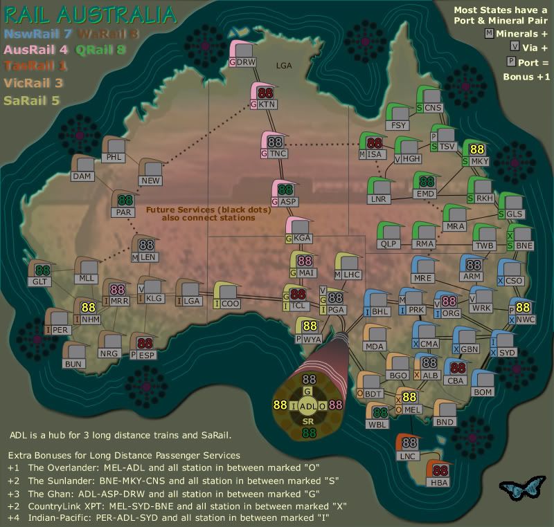
Version 15 Changes.
1. Trains removed and those long distance train explanation simplified.
2. some swapping around in the legend.
3. colours coordinated with legend and stations
4. all lines moving to black
1. Trains removed and those long distance train explanation simplified.
2. some swapping around in the legend.
3. colours coordinated with legend and stations
4. all lines moving to black

* Pearl Harbour * Waterloo * Forbidden City * Jamaica * Pot Mosbi


