
Sorry but it is one of the first decision I took when I started this map. Based on the 18th century way of doing map: White background, black borders and just a border of color for regions. Of course I could have choosen an other graphic chart but I'll stick to this one as I really like it and I'm sorry if you're not pleased with it.Ruben Cassar wrote:As I told you in earlier posts the colour scheme needs to change. It's too hard to differentiate between a region and another with only that thin border of colouring. Check my previous posts regarding this issue. You should try to fill the region with colour perhaps?
France 1789
Moderator: Cartographers
Forum rules
Please read the Community Guidelines before posting.
Please read the Community Guidelines before posting.
Re: FRANCE 18th century v07 [I] june16 p5
De gueules à la tour d'argent ouverte, crénelée de trois pièces, sommée d'un donjon ajouré, crénelé de deux pièces
Gules an open tower silver, crenellated three parts, topped by a apertured turret, crenellated two parts
Gules an open tower silver, crenellated three parts, topped by a apertured turret, crenellated two parts
-
Ruben Cassar
- Posts: 2160
- Joined: Thu Nov 16, 2006 6:04 am
- Gender: Male
- Location: Civitas Invicta, Melita, Evropa
Re: FRANCE 18th century v07 [I] june16 p5
It's not a question of liking or not liking. Have you ever read the map guidelines? A map should be playable for all people on CC even people who are colour blind. The way you have decided to colour the different regions makes it extremely difficult for me to differentiate between a region and another. Besides even Andy has already told you to try something else in earlier posts if I'm not mistaken. You can't ignore these comments and move on.pamoa wrote:Sorry but it is one of the first decision I took when I started this map. Based on the 18th century way of doing map: White background, black borders and just a border of color for regions. Of course I could have choosen an other graphic chart but I'll stick to this one as I really like it and I'm sorry if you're not pleased with it.Ruben Cassar wrote:As I told you in earlier posts the colour scheme needs to change. It's too hard to differentiate between a region and another with only that thin border of colouring. Check my previous posts regarding this issue. You should try to fill the region with colour perhaps?
I am quite surprised you are so adamant to change considering how you insisted I should change my colours on Cyprus, something that in fact I'm going to do to try to please you and others who wanted that change. Would you be happy to have a map that cannot be enjoyed by all the CC community? I'm sure that if you think a bit about it you'll change your mind. Don't get me wrong I like this map or else I wouldn't be commenting on it, but I want to be able to play it, and right now I can't.
Here is an extract from the guidelines in case you missed them. I highlighted the aspects which I feel you are not addressing.
"To earn your graphics stamp you must comply to the following conditions:
1) Image must present itself as clear and legible.
2) The aesthetics must be to a presentable foundry standard and must also satisfy the community at large.
3) Cartographers must ,where possible, reduce any disadvantage that can be caused to a colorblind individual."


-
gimil

- Posts: 8599
- Joined: Sat Mar 03, 2007 12:42 pm
- Gender: Male
- Location: United Kingdom (Scotland)
Re: FRANCE 18th century v07 [I] june16 p5
pamoa if the colours are causing issues for the colour blind then it has to be addressed, sorry to be a ball buster but thats the way it is.
What do you know about map making, bitch?
Top Score:2403natty_dread wrote:I was wrong
Re: FRANCE 18th century v08 [I] june17 p5
I'm not ignoring the problem!
As you can see, I tried the map without colors and it seems to me it is playable even like this:
- regions borders can be clearly idendified as they appear "thicker",
- each different region can visually connected to the one in the minimap by it's position,
- the hatching is improving this differenciation of each region (it is a direct use of the heraldic hatching code for colors in balck and white printing)
Now, Rubben, it seems to me I adressed the problem and find a solution that should fit even fully colorblind people.
Maybe you don't like it on aesthetic point of view, but you must admit that on a practical one I did find a solution.
As you can see, I tried the map without colors and it seems to me it is playable even like this:
- regions borders can be clearly idendified as they appear "thicker",
- each different region can visually connected to the one in the minimap by it's position,
- the hatching is improving this differenciation of each region (it is a direct use of the heraldic hatching code for colors in balck and white printing)
Now, Rubben, it seems to me I adressed the problem and find a solution that should fit even fully colorblind people.
Maybe you don't like it on aesthetic point of view, but you must admit that on a practical one I did find a solution.
- Click image to enlarge.

De gueules à la tour d'argent ouverte, crénelée de trois pièces, sommée d'un donjon ajouré, crénelé de deux pièces
Gules an open tower silver, crenellated three parts, topped by a apertured turret, crenellated two parts
Gules an open tower silver, crenellated three parts, topped by a apertured turret, crenellated two parts

Re: FRANCE 18th century v08 [I] june17 p5
colour blind doesnt necessarily mean that they just see in black and white, i used the website that (i think) MrBenn suggested..
original:

with Deuteranope Simulation:

with Tritanope Simulation:

i would have done the other one but seeing as this is taking up a lot of space already, and the other is a bit like the 1st, i will leave it out.
original:
with Deuteranope Simulation:
with Tritanope Simulation:
i would have done the other one but seeing as this is taking up a lot of space already, and the other is a bit like the 1st, i will leave it out.
-
Ruben Cassar
- Posts: 2160
- Joined: Thu Nov 16, 2006 6:04 am
- Gender: Male
- Location: Civitas Invicta, Melita, Evropa
Re: FRANCE 18th century v08 [I] june17 p5
Sorry but it's very difficult to read for me or else I wouldn't have said so would I?
I also made some suggestions in previous posts which you never tried out. Perhaps you could make it more similar to the mini map and fill more of the regions with colours. Also some of the colours in regions which are adjacent to one another look nearly the same to me.
I also made some suggestions in previous posts which you never tried out. Perhaps you could make it more similar to the mini map and fill more of the regions with colours. Also some of the colours in regions which are adjacent to one another look nearly the same to me.
Re: FRANCE 18th century v08 [I] june17 p5
i think the outer glow on the land is a bit too strong, maybe try making it spread further and turn the ocpacity down a touch?
-
gimil
- Posts: 8599
- Joined: Sat Mar 03, 2007 12:42 pm
- Gender: Male
- Location: United Kingdom (Scotland)
Re: FRANCE 18th century v08 [I] june17 p5
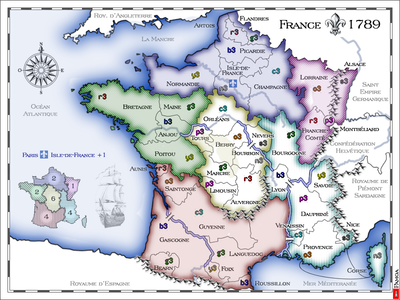
go on add that touch of colour, you can achieve much better results without loosing what your going for overall. Go on, what do ya say? make ruben happy?
HERE IS MY EXAMPLE THAT I THINK YOU SHOULD GO WITH
HERE IS MY EXAMPLE THAT I THINK YOU SHOULD GO WITH
- Click image to enlarge.
What do you know about map making, bitch?
Top Score:2403natty_dread wrote:I was wrong
Re: FRANCE 18th century v08 [I] june17 p5
i still think, even on your version gimil, that the outer glow on the land (closest to the land) is really still too strong for me.
-
gimil
- Posts: 8599
- Joined: Sat Mar 03, 2007 12:42 pm
- Gender: Male
- Location: United Kingdom (Scotland)
Re: FRANCE 18th century v08 [I] june17 p5
Its just a draft of the direction i think the map should go, dont look to far into it.t-o-m wrote:i still think, even on your version gimil, that the outer glow on the land (closest to the land) is really still too strong for me.
What do you know about map making, bitch?
Top Score:2403natty_dread wrote:I was wrong
-
Ruben Cassar
- Posts: 2160
- Joined: Thu Nov 16, 2006 6:04 am
- Gender: Male
- Location: Civitas Invicta, Melita, Evropa
Re: FRANCE 18th century v08 [I] june17 p5
PERFECT! Thanks Gimil!gimil wrote:go on add that touch of colour, you can achieve much better results without loosing what your going for overall. Go on, what do ya say? make ruben happy?
HERE IS MY EXAMPLE THAT I THINK YOU SHOULD GO WITH
- Click image to enlarge.
That's what I've been telling pamoa to do since page 1 I think. The only thing I would ask him to do is change one of the colours of the West or South West regions which are very similar or else swap South West with South East. Then I would give it a thumbs up.
Re: FRANCE 18th century v08 [I] june17 p5
yes, i know what you meangimil wrote:Its just a draft of the direction i think the map should go, dont look to far into it.t-o-m wrote:i still think, even on your version gimil, that the outer glow on the land (closest to the land) is really still too strong for me.
also - the white land, could it have a tiny hint of this sort of colour:
just a tiny bit that makes it feel a little older and not half-done...when i say tiny bit, i mean a really tiny bit of colour

but i know you say that you intended from the start to make it white, so it's just a thought.
p.s gimil's draft IS the way forward.
Re: FRANCE 18th century v08 [I] june17 p5
Now gimil tell me why you ever autorised a map like ireland to be quenched!
Then I may consider abandonning this map!
Then I may consider abandonning this map!
De gueules à la tour d'argent ouverte, crénelée de trois pièces, sommée d'un donjon ajouré, crénelé de deux pièces
Gules an open tower silver, crenellated three parts, topped by a apertured turret, crenellated two parts
Gules an open tower silver, crenellated three parts, topped by a apertured turret, crenellated two parts
-
Ruben Cassar
- Posts: 2160
- Joined: Thu Nov 16, 2006 6:04 am
- Gender: Male
- Location: Civitas Invicta, Melita, Evropa
Re: FRANCE 18th century v08 [I] june17 p5
Pamoa this is not the right attitude.pamoa wrote:Now gimil tell me why you ever autorised a map like ireland to be quenched!
Then I may consider abandonning this map!
Ireland was quenched ages ago, at least 2 years ago if not more, when Gimil was not even on CC. Standards have risen since then and that map would never have made it to quench as it is. I mean you've seen that some of the older maps are very lacking graphic wise, and in fact some of them are now getting revamps.
Besides Gimil tried to help you and the tweaks he made to your map are very positive and solve the problem entirely. Come on now, don't be stubborn. We are all trying to make this map better not hinder your work. I believe you could have a great map here so don't try to use blackmail by threatening us to abandon it. Be proactive my friend. You have talent so don't let stubbornness get in the way.
Good luck.
Re: FRANCE 18th century v08 [I] june17 p5
My dear Ruben,
if you can not even admit that in black and white it is readable and so playable, I think there we couldn't go ahead with this topic. And sorry about that but I'll never accept to fill region with color as it is one of my starting point for this map. So if you think I should stop because it is not readable for color disabled people then my conclusion is that my contributions to this site does not fit, which make me sad. But I'll leave you plenty of space to developp your point of view about graphic design and would never dare again to disturb your vision.
Sincerly yours,
Pamoa
if you can not even admit that in black and white it is readable and so playable, I think there we couldn't go ahead with this topic. And sorry about that but I'll never accept to fill region with color as it is one of my starting point for this map. So if you think I should stop because it is not readable for color disabled people then my conclusion is that my contributions to this site does not fit, which make me sad. But I'll leave you plenty of space to developp your point of view about graphic design and would never dare again to disturb your vision.
Sincerly yours,
Pamoa
De gueules à la tour d'argent ouverte, crénelée de trois pièces, sommée d'un donjon ajouré, crénelé de deux pièces
Gules an open tower silver, crenellated three parts, topped by a apertured turret, crenellated two parts
Gules an open tower silver, crenellated three parts, topped by a apertured turret, crenellated two parts
-
gimil
- Posts: 8599
- Joined: Sat Mar 03, 2007 12:42 pm
- Gender: Male
- Location: United Kingdom (Scotland)
Re: FRANCE 18th century v08 [I] june17 p5
Mr P. all we are doing is giving you sound advise which will help to better your map and move it through the process. The rebuttel of "its my map and i want to do it this way" doesnt stick if somethnig is causing a problem. Ruben has said he finds problems due to him being color blind, then we have a duty to address that as best we can.
Using the example of ireland is irelevent, it was before my time and before the modern foundry process as a whole. All we are asking it for a viable solution to the problem that has been clearly addressed.
Your a smart and talent person im sure you understand what we are saying and know that we arnt saying for the sake of ball busting.
cheers.
Using the example of ireland is irelevent, it was before my time and before the modern foundry process as a whole. All we are asking it for a viable solution to the problem that has been clearly addressed.
Your a smart and talent person im sure you understand what we are saying and know that we arnt saying for the sake of ball busting.
cheers.
What do you know about map making, bitch?
Top Score:2403natty_dread wrote:I was wrong

Re: FRANCE 18th century v08 [I] june17 p5
Please don't abandon this map Pamoa. It's too beautiful and you're in the top tier of graphic talents we have. I personally don't mind the white version or the gimil's color version. They both look great to me. But please don't be offended when somebody requests a change. It's gonna happen to all of us.pamoa wrote:My dear Ruben,
if you can not even admit that in black and white it is readable and so playable, I think there we couldn't go ahead with this topic. And sorry about that but I'll never accept to fill region with color as it is one of my starting point for this map. So if you think I should stop because it is not readable for color disabled people then my conclusion is that my contributions to this site does not fit, which make me sad. But I'll leave you plenty of space to developp your point of view about graphic design and would never dare again to disturb your vision.
Sincerly yours,
Pamoa
-
gimil
- Posts: 8599
- Joined: Sat Mar 03, 2007 12:42 pm
- Gender: Male
- Location: United Kingdom (Scotland)
Re: FRANCE 18th century v08 [I] june17 p5
RjBeals wrote:But please don't be offended when somebody requests a change.
Remember P. weve all had to make sacrifices for the greater good at one point or another.
What do you know about map making, bitch?
Top Score:2403natty_dread wrote:I was wrong
-
Ruben Cassar
- Posts: 2160
- Joined: Thu Nov 16, 2006 6:04 am
- Gender: Male
- Location: Civitas Invicta, Melita, Evropa
Re: FRANCE 18th century v08 [I] june17 p5
What should I admit? I already told you what i think but you don't want to believe me. You are acting like a baby. I am trying to help you make the map better and playable for all. You forget quickly pamoa. Do you remember who spoke to you first and encouraged you to pursue this map via pm before you even started this thread? It was me.pamoa wrote:My dear Ruben,
if you can not even admit that in black and white it is readable and so playable, I think there we couldn't go ahead with this topic. And sorry about that but I'll never accept to fill region with color as it is one of my starting point for this map. So if you think I should stop because it is not readable for color disabled people then my conclusion is that my contributions to this site does not fit, which make me sad. But I'll leave you plenty of space to developp your point of view about graphic design and would never dare again to disturb your vision.
Sincerly yours,
Pamoa
Also your silly comments about my colour blindness here and in my Cyprus map are frankly becoming insulting and irritating. Grow up. You're nothing special or above the rest of us. If you feel you have to abandon the map because you are too stubborn to make changes go ahead because you won't get far anyway. I won't beg you to continue like others did. It's your call at the end of the day.
-
AndyDufresne

- Posts: 24919
- Joined: Fri Mar 03, 2006 8:22 pm
- Location: A Banana Palm in Zihuatanejo
- Contact:
Re: FRANCE 18th century v08 [I] june17 p5
Lets all remember to smile and eat bananas, yes?
I know where Pamoa is coming from, and I'm sure many of the cartographers do also. But the bottom bananas are that a map must be understandable as we can possibly make it (without going into excessive things such as maps for every language, etc). We try to reach as many users as we can with our maps, and we'd like everyone to be able to play it.
Always remember that...we just want everyone to be able to play your map. We want your map to be successful and popular and playable to a large audience.
--Andy
I know where Pamoa is coming from, and I'm sure many of the cartographers do also. But the bottom bananas are that a map must be understandable as we can possibly make it (without going into excessive things such as maps for every language, etc). We try to reach as many users as we can with our maps, and we'd like everyone to be able to play it.
Always remember that...we just want everyone to be able to play your map. We want your map to be successful and popular and playable to a large audience.
--Andy
FRANCE 18th century [I] v09
v08
v08 deuteranope colorblind simulation

v08 tritanope colorblind simulation

v09
v09 deuteranope colorblind simulation

v09 tritanope colorblind simulation

- Click image to enlarge.
v08 tritanope colorblind simulation
v09
- Click image to enlarge.

v09 tritanope colorblind simulation
Last edited by pamoa on Tue Jun 24, 2008 3:14 am, edited 4 times in total.
De gueules à la tour d'argent ouverte, crénelée de trois pièces, sommée d'un donjon ajouré, crénelé de deux pièces
Gules an open tower silver, crenellated three parts, topped by a apertured turret, crenellated two parts
Gules an open tower silver, crenellated three parts, topped by a apertured turret, crenellated two parts

Re: FRANCE 18th century [I] v09
Looking at that last post - it looks like Pamoa's original map is easier to distinguish (colour wise)...
That being said - with the images being so small it's hard to really tell...
Perhaps instead of colouring the entire continent the colour... consider increasing the border "glow" (I'm assuming this is the correct terminology) by a few more percent - to give a bigger colour area?
C.
That being said - with the images being so small it's hard to really tell...
Perhaps instead of colouring the entire continent the colour... consider increasing the border "glow" (I'm assuming this is the correct terminology) by a few more percent - to give a bigger colour area?
C.

Highest score : 2297

Re: FRANCE 18th century [I] v09
Yeti's suggestion is a good one - I prefer the look of the white one, but increasing the width of the coloured band may be a good compromise??

PB: 2661 | He's blue... If he were green he would die | No mod would be stupid enough to do that
-
Ruben Cassar
- Posts: 2160
- Joined: Thu Nov 16, 2006 6:04 am
- Gender: Male
- Location: Civitas Invicta, Melita, Evropa
FRANCE 18th century [I] v10
v10
v10 deuteranope colorblind simulation

v10 tritanope colorblind simulation

- Click image to enlarge.

v10 tritanope colorblind simulation
Last edited by pamoa on Tue Jun 24, 2008 3:15 am, edited 1 time in total.
De gueules à la tour d'argent ouverte, crénelée de trois pièces, sommée d'un donjon ajouré, crénelé de deux pièces
Gules an open tower silver, crenellated three parts, topped by a apertured turret, crenellated two parts
Gules an open tower silver, crenellated three parts, topped by a apertured turret, crenellated two parts