Oooooohh....right.gimil wrote:Im just saying I would like to see those little discret roads all over the map.
Charleston, SC [Quenched]
Moderator: Cartographers
Forum rules
Please read the Community Guidelines before posting.
Please read the Community Guidelines before posting.
-
Optimus Prime

- Posts: 9665
- Joined: Mon Mar 12, 2007 9:33 pm
- Gender: Male
Re: Charleston, SC (Even Newer Colors Update, Pg-8) [I]

Re: Charleston, SC (Even Newer Colors Update, Pg-8) [I]
Rj, if you really want to be accurate on the historic district, I'd suggest pulling out a Google map of the downtown area and copying things from there. Right now you're missing one of the best downtown vistas: the Battery (it encircles the tip of the peninsula). As for roads everywhere, I concur on not doing that for the same reasons stated before.
New colors, word. Good job on getting a good compromise on things.
New colors, word. Good job on getting a good compromise on things.

Re: Charleston, SC (Even Newer Colors Update, Pg-8) [I]
I don't want to be that accurate. This is not a road map, the grid was simply for visual appeal. Thanks for the comments though.TaCktiX wrote:Right now you're missing one of the best downtown vistas: the Battery (it encircles the tip of the peninsula)
-
pepperonibread

- Posts: 954
- Joined: Sun Jan 28, 2007 4:33 pm
- Location: The Former Confederacy
Re: Charleston, SC (Even Newer Colors Update, Pg-8) [I]
The new colors are a great compromise, I think.
Also, I disagree with gimil about the roads. Like someone said before, they look a bit like a circuit board, but I think it looks okay on just that one continent. If they're all over the map, though, I think it'd be too much.
Also, I disagree with gimil about the roads. Like someone said before, they look a bit like a circuit board, but I think it looks okay on just that one continent. If they're all over the map, though, I think it'd be too much.

Re: Charleston, SC (Even Newer Colors Update, Pg-8) [I]
- Click image to enlarge.

-
gimil

- Posts: 8599
- Joined: Sat Mar 03, 2007 12:42 pm
- Gender: Male
- Location: United Kingdom (Scotland)
Re: Charleston, SC (Newest Update, Pg-9) [I]
I don't like the yellow army circles on the sea or the lines around the sea.
However everything else is wonderful
However everything else is wonderful
What do you know about map making, bitch?
Top Score:2403natty_dread wrote:I was wrong
Re: Charleston, SC (Newest Update, Pg-9) [I]
Hmm.. Fort Sumter & Folly Island? I don't know how to remedy that. Those islands are small, in fact I've enlarged them a bit just to be able to see well on this map. Any suggestions? And I really like the waves (lines) around the outer land. I think it gives the map a unique look. But if others are unhappy with this, it's a simple delete.gimil wrote:I don't like the yellow army circles on the sea or the lines around the sea.
However everything else is wonderful
- Click image to enlarge.

Also, I'm concerned about the gray armies on the dark colors, on certain monitors - so please comment if you can't see the gray armies. I think all other colors will be fine.
Re: Charleston, SC (Newest Update, Pg-9) [I]
I think I need to work the legend into the map somehow. Now it's kinda just sitting there and looks out of place. Like a card.
Re: Charleston, SC (Newest Update, Pg-9) [I]
the map looks good. Maybe for the islands overlap the army circles onto the land partially? I don't like when there isn't a physical connection.
And my comment before on the ocean. I basically think it looks too fake. I thought maybe lessening the opacity would help. It isn't the kind of thing that bothers me much. The nice colors on the map and what not will make it playable.
EDITED TO ADD. the grays look fine on my laptop monitor which is a good sign. Sitting back too. As for the legend, I recommend removing the text and using the colored map in there and working it in like, I think it is the madagascar map? Or am I just thinking about that map because of incessant signature ads?
And my comment before on the ocean. I basically think it looks too fake. I thought maybe lessening the opacity would help. It isn't the kind of thing that bothers me much. The nice colors on the map and what not will make it playable.
EDITED TO ADD. the grays look fine on my laptop monitor which is a good sign. Sitting back too. As for the legend, I recommend removing the text and using the colored map in there and working it in like, I think it is the madagascar map? Or am I just thinking about that map because of incessant signature ads?
Re: Charleston, SC (Newest Update, Pg-9) [I]
Not sure I follow that. So you think I should scrap the text bonus lines (bars) under the mini-map? I think people prefer to be able to call a bonus region by a name, not a color. There's no way I could work it into the regions background, like I did on Dustbowl, or like New World. I thought about removing the mini-map, but I think it's needed here. There's just too many bonus regions and colors to not have a visual representation.seamusk wrote: As for the legend, I recommend removing the text and using the colored map in there and working it in like, I think it is the madagascar map?
Thanks for the feedback - I understand what you're saying about the waves. I can tone them a down a bit so they aren't so bold.
Re: Charleston, SC (Newest Update, Pg-9) [I]
Yes, that was what I was thinking. And I agree with you about the names thing. I don't think it looks that bad though either. Sorry can't think of any other suggestions right now. But I think you are right to want to keep the text.RjBeals wrote:Not sure I follow that. So you think I should scrap the text bonus lines (bars) under the mini-map? I think people prefer to be able to call a bonus region by a name, not a color. There's no way I could work it into the regions background, like I did on Dustbowl, or like New World. I thought about removing the mini-map, but I think it's needed here. There's just too many bonus regions and colors to not have a visual representation.

Re: Charleston, SC (Newest Update, Pg-9) [I]
Hey Rj, as you already know Ruben Cassar will be in charge of the gameplay stamp on this map... I'm still available if you have any specific concerns or questions, but he'll be following the discussion more closely than I.
Re: Charleston, SC (Newest Update, Pg-9) [I]
Yep. I'm aware of that, but don't abandoned the thread on me. 

Re: Charleston, SC (Newest Update, Pg-9) [I]
I'm with RJ on this. The minimap helps show where the bonusses are, and the labels help interpret the game log. On the Madagascar map, I dislike how the region names are on the opposite side of the map to the legend... I think it is good to keep the two things togeher wherever possible, as it aids understanding.RjBeals wrote:Not sure I follow that. So you think I should scrap the text bonus lines (bars) under the mini-map? I think people prefer to be able to call a bonus region by a name, not a color.seamusk wrote: As for the legend, I recommend removing the text and using the colored map in there and working it in like, I think it is the madagascar map?
Re: Charleston, SC (Newest Update, Pg-9) [I]
My wifey looked at the map (finally) last night and said the water looks too gray - like a storm's rolling in. She said to make the water more blue. Anyone agree? If needed, I could post a visual (but only if a real CC member requests it)
- Click image to enlarge.
Re: Charleston, SC (Newest Update, Pg-9) [I]
I think your wife is right... you should listen to her more often (at least, that's what mine says )
)Re: Charleston, SC (Newest Update, Pg-9) [I]
Your's wasn't standing right behind you when you typed that was she Mr.Benn? Ha... I dunno though, I'll try a more blue water, but the grey is kinda gloomy and cool.MrBenn wrote:I think your wife is right... you should listen to her more often (at least, that's what mine says
Re: Charleston, SC (Newest Update, Pg-9) [I]
I can tell the difference on all those images, so perhaps you've just discovered that you're colourblind!RjBeals wrote:I ran my map trough as well. I can tell the regions apart, except for the yellow/green colorblind version at the bottom (Tritanope). But it sure doesn't look pretty. I guress there's no way to check the validity of the conversion though - as nobody can turn colorblindness on and off when they want
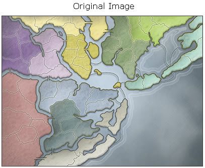
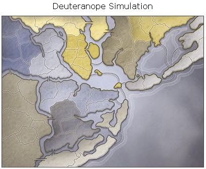
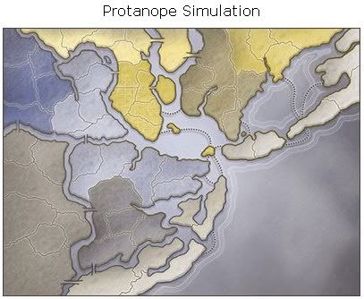
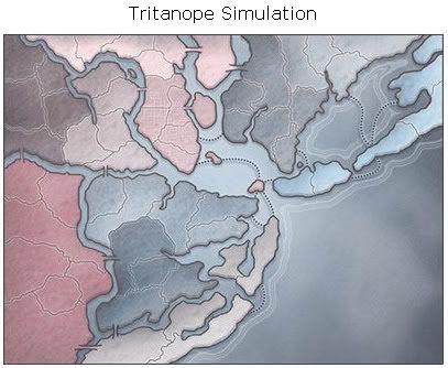

I think there's a disclaimer on the site about the validity of the conversion... It depends on monitor settings as well as the whole psychological debate about whether my green is the same as your green...

I anything, I'd make the grey region very slightly lighter, and I think you shold be allright colourblindwise (after you're visit to the optician!
)Re: Charleston, SC (Newest Update, Pg-9) [I]
The 2nd and 3rd images look identical to me. You see a difference in them?
Re: Charleston, SC (Newest Update, Pg-9) [I]
No - they're virtually identical... Isle of plams looks slightly bluer in the 2nd version, and East Cooper slightly lighter on the 3rd, but other than that, they're the same.
On another note, I think East Cooper and Mt Pleasant could be swapped around in the legend (by that I mean the text for each region). It would help the top-bottom balance (that sounds like me inventing some pseudo-waffle!)
On another note, I think East Cooper and Mt Pleasant could be swapped around in the legend (by that I mean the text for each region). It would help the top-bottom balance (that sounds like me inventing some pseudo-waffle!)

Re: Charleston, SC (Newest Update, Pg-9) [I]
identical to me aswel...you're not going crazyRjBeals wrote:The 2nd and 3rd images look identical to me. You see a difference in them?
(or colourblind)Re: Charleston, SC (Newest Update, Pg-9) [I]
You didn't notice that St. John's Island has a slightly different shade in the 2nd and 3rd images. In general, deuteranope shades are slightly darker than protanope ones.
Looking at the map from a colorblind view, I have to appreciate even more your color choices between regions. There is no mistaking a single one for being mixed with another, even across the map.
Looking at the map from a colorblind view, I have to appreciate even more your color choices between regions. There is no mistaking a single one for being mixed with another, even across the map.
-
AndyDufresne

- Posts: 24919
- Joined: Fri Mar 03, 2006 8:22 pm
- Location: A Banana Palm in Zihuatanejo
- Contact:
Re: Charleston, SC (Newest Update, Pg-9) [I]
I knew I liked the Pastels from the earlier drafts...but I must say I like the latest posted version as well! Regarding the water...I kind of like the foreboding feel it has... They get frequent storms in the area, don't they?
--Andy
They get frequent storms in the area, don't they?--Andy
Re: Charleston, SC (Newest Update, Pg-9) [I]
- Made the water a little bluer
- Added the swirls & some texture around the legend. Kind of looks like iron work now. Tried to blend into the map a little more.
- Adjusted names & army circles of places in Northern Charleston (Riverview, Dorchester and N.Charleston)
- Made Folly Island and Fort Sumter (Yellow Islands) Much Bigger so the army is on the island. Not true to real life, but it seemed to bother a lot of people that the army circles were on the water and not on the land. I think the City of Charleston will forgive me from resizing, for the good of the game
- Swapped the Mt.Pleasant / East Cooper text legend bars so they are listed from the top down now.
Do you like the waves around the coastal lands, or no waves?
WAVES
- Click image to enlarge.

- Click image to enlarge.

Last edited by RjBeals on Thu Jun 05, 2008 6:10 pm, edited 1 time in total.
Re: Charleston, SC (Legend Flare, Pg-10) [I]
* Made the water a little bluer
Looks a bit more Charleston. Yes, we get storms, but Hugo hasn't been matched in over 24 years.
* Added the swirls & some texture around the legend. Kind of looks like iron work now. Tried to blend into the map a little more.
Not Charleston iron. It needs to be much closer to black to seem like ironwork you'd find on something South of Broad (the ultra-ritzy, ultra-expensive, ultra-historic section of downtown, for the unknowing).
* Adjusted names & army circles of places in Northern Charleston (Riverview, Dorchester and N.Charleston)
Looks good.
* Made Folly Island and Fort Sumter (Yellow Islands) Much Bigger so the army is on the island. Not true to real life, but it seemed to bother a lot of people that the army circles were on the water and not on the land. I think the City of Charleston will forgive me from resizing, for the good of the game
You are so getting sued.
Do you like the waves around the coastal lands, or no waves?
Waves, keep them. Without, the coast loses a lot of the life to it.
Looks a bit more Charleston. Yes, we get storms, but Hugo hasn't been matched in over 24 years.
* Added the swirls & some texture around the legend. Kind of looks like iron work now. Tried to blend into the map a little more.
Not Charleston iron. It needs to be much closer to black to seem like ironwork you'd find on something South of Broad (the ultra-ritzy, ultra-expensive, ultra-historic section of downtown, for the unknowing).
* Adjusted names & army circles of places in Northern Charleston (Riverview, Dorchester and N.Charleston)
Looks good.
* Made Folly Island and Fort Sumter (Yellow Islands) Much Bigger so the army is on the island. Not true to real life, but it seemed to bother a lot of people that the army circles were on the water and not on the land. I think the City of Charleston will forgive me from resizing, for the good of the game
You are so getting sued.
Do you like the waves around the coastal lands, or no waves?
Waves, keep them. Without, the coast loses a lot of the life to it.