Golfe du St. Laurent[FD,G,GP,FF]
Moderator: Cartographers
Forum rules
Please read the Community Guidelines before posting.
Please read the Community Guidelines before posting.
-
Unit_2

- Posts: 1834
- Joined: Sun Jan 14, 2007 12:59 pm
- Gender: Male
- Location: Pennsylvania, U.S.A, North America, Earth, Milky Way, Universe.
Re: Gulf Of St. Lawrence[I](Update p. 20)
>_> You think? I got a BIG list of updates for L.P now, look for a update by the end of this week.

-
Lone.prophet
- Posts: 1467
- Joined: Thu Oct 12, 2006 4:37 pm
- Location: Your basement Muahaha
Re: Gulf Of St. Lawrence[I](Update p. 20)
doing some things but it will take awile cause the weather is way to nice 

-
Lone.prophet
- Posts: 1467
- Joined: Thu Oct 12, 2006 4:37 pm
- Location: Your basement Muahaha
Re: Gulf Of St. Lawrence[I](Update p. 20)
ok heres the update
and why is this not moved to Final Forge all i do is change names
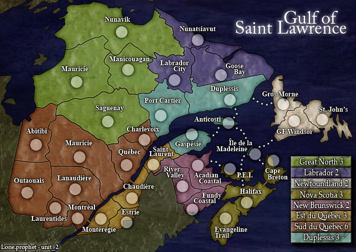
- Click image to enlarge.
and why is this not moved to Final Forge all i do is change names
-
Unit_2
- Posts: 1834
- Joined: Sun Jan 14, 2007 12:59 pm
- Gender: Male
- Location: Pennsylvania, U.S.A, North America, Earth, Milky Way, Universe.
Re: Gulf Of St. Lawrence[I](Update p. 20)
Because Gimil nor Oaktown game us the stamps yet, i'll PM them and ask them to post here.
Good job L.P, when we get the Graphics and Gameplay stamps i'll do the XML.
Good job L.P, when we get the Graphics and Gameplay stamps i'll do the XML.

Re: Gulf Of St. Lawrence[I](Update p. 22 & 1)
It's still far from my favorite map to go through the Foundry, but I won't hold it up any more on my end. If you end up changing anything else be wary of your bonuses - they're pretty high across the map which is fine, but be careful you aren't creating an overly-advantageous start.
If you can darken what I think is New Brunswick just a tad, it will make it more distinct from Gaspesie for us color blind folks.

If you can darken what I think is New Brunswick just a tad, it will make it more distinct from Gaspesie for us color blind folks.
-
Unit_2
- Posts: 1834
- Joined: Sun Jan 14, 2007 12:59 pm
- Gender: Male
- Location: Pennsylvania, U.S.A, North America, Earth, Milky Way, Universe.
Re: Gulf Of St. Lawrence[I](Update p. 22 & 1)
Thanks Oak, if there are anymore problems with the colorblind let us know.
-
Lone.prophet
- Posts: 1467
- Joined: Thu Oct 12, 2006 4:37 pm
- Location: Your basement Muahaha
Re: Gulf Of St. Lawrence[I,Gp](Update p. 22 & 1)
oak you think it that lightning gaspesie works the same cause i thik that will work better
-
gimil

- Posts: 8599
- Joined: Sat Mar 03, 2007 12:42 pm
- Gender: Male
- Location: United Kingdom (Scotland)
Re: Gulf Of St. Lawrence[I,Gp](Update p. 22 & 1)
Lone I just noticed how beautiful your borders are. Mind letting me in on the secret on how you done then?
What do you know about map making, bitch?
Top Score:2403natty_dread wrote:I was wrong
-
Unit_2
- Posts: 1834
- Joined: Sun Jan 14, 2007 12:59 pm
- Gender: Male
- Location: Pennsylvania, U.S.A, North America, Earth, Milky Way, Universe.
Re: Gulf Of St. Lawrence[I,Gp](Update p. 22 & 1)
If you give us the graphics stamp 
What else needs done gimil?
What else needs done gimil?
-
Lone.prophet
- Posts: 1467
- Joined: Thu Oct 12, 2006 4:37 pm
- Location: Your basement Muahaha
Re: Gulf Of St. Lawrence[I,Gp](Update p. 22 & 1)
mhhhh sure i just gotta figure it out in my maze of layers ill make a post in the other part of the forum about it
-
gimil
- Posts: 8599
- Joined: Sat Mar 03, 2007 12:42 pm
- Gender: Male
- Location: United Kingdom (Scotland)
Re: Gulf Of St. Lawrence[I,Gp](Update p. 22 & 1)
Everything about this map feels right. Its clean consistant and clear. However the title jsut doesnt do the rest of the map justice. I think it may jsut need a large font size of a stronger appearing font. It just seems to be lacking something that the rest of the map has.
Other than that good work lads:

Other than that good work lads:
What do you know about map making, bitch?
Top Score:2403natty_dread wrote:I was wrong
-
Ruben Cassar
- Posts: 2160
- Joined: Thu Nov 16, 2006 6:04 am
- Gender: Male
- Location: Civitas Invicta, Melita, Evropa
Re: Gulf Of St. Lawrence[I,Gp](Update p. 22 & 1)
Congrats for the stamps guys.
I noticed there is something wrong with the "s" or the "t" in Est du Québec. Maybe you can fix this?
I noticed there is something wrong with the "s" or the "t" in Est du Québec. Maybe you can fix this?


-
Lone.prophet
- Posts: 1467
- Joined: Thu Oct 12, 2006 4:37 pm
- Location: Your basement Muahaha
Re: Gulf Of St. Lawrence[I,Gp](Update p. 22 & 1)
its not wrong its the fint, but if people say its ugly ill delte it
-
Ruben Cassar
- Posts: 2160
- Joined: Thu Nov 16, 2006 6:04 am
- Gender: Male
- Location: Civitas Invicta, Melita, Evropa
Re: Gulf Of St. Lawrence[I,Gp](Update p. 22 & 1)
What is a fint? If you mean font I noticed the other "t" and "s" in the legend using the same font do not have this problem.Lone.prophet wrote:its not wrong its the fint, but if people say its ugly ill delte it
-
Lone.prophet
- Posts: 1467
- Joined: Thu Oct 12, 2006 4:37 pm
- Location: Your basement Muahaha
Re: Gulf Of St. Lawrence[I,Gp](Update p. 22 & 1)
wow, i just realized that i dont think that i have ever commented on this! oh well, theres always time to start! (unless it gets quenched first....)
1) From the way you have the attack dots, it looks like you can go from halifax to Ile de la Madeleine
wow im getting in on commenting really late, cause thats the only thing i can find, other than the fact that in the corner where it says Lone.prphet - unit_2, u might want to capitalize the U in Unit

Re: Gulf Of St. Lawrence[I,Gp](Update p. 22 & 1)
Guys, can you update the [I,Gp,Gr] in your title please, since you have all three stamps. Thanks 

* Pearl Harbour * Waterloo * Forbidden City * Jamaica * Pot Mosbi
-
Lone.prophet
- Posts: 1467
- Joined: Thu Oct 12, 2006 4:37 pm
- Location: Your basement Muahaha
Re: Gulf Of St. Lawrence[I,Gp](Update p. 22 & 1)
ahh ok maybe i will shift some of the dots to fix thatbryguy wrote:wow, i just realized that i dont think that i have ever commented on this! oh well, theres always time to start! (unless it gets quenched first....)
1) From the way you have the attack dots, it looks like you can go from halifax to Ile de la Madeleine
wow im getting in on commenting really late, cause thats the only thing i can find, other than the fact that in the corner where it says Lone.prphet - unit_2, u might want to capitalize the U in Unit
and title and names will be done better when i get the lost
-
Ruben Cassar
- Posts: 2160
- Joined: Thu Nov 16, 2006 6:04 am
- Gender: Male
- Location: Civitas Invicta, Melita, Evropa
Re: Gulf Of St. Lawrence[I,Gp](Update p. 22 & 1)
I am talking about the legend. They are the same font.Lone.prophet wrote:thats because it are different Font's
-
Lone.prophet
- Posts: 1467
- Joined: Thu Oct 12, 2006 4:37 pm
- Location: Your basement Muahaha
Re: Gulf Of St. Lawrence[I,Gp](Update p. 22 & 1)
uhuh but that line only occurs if you put the t behind the s and they have to be small both so only with
st
not with St, sT, ST dunno why but it is that way
st
not with St, sT, ST dunno why but it is that way
-
Ruben Cassar
- Posts: 2160
- Joined: Thu Nov 16, 2006 6:04 am
- Gender: Male
- Location: Civitas Invicta, Melita, Evropa
Re: Gulf Of St. Lawrence[I,Gp](Update p. 22 & 1)
That's a very, very strange thing!Lone.prophet wrote:uhuh but that line only occurs if you put the t behind the s and they have to be small both so only with
st
not with St, sT, ST dunno why but it is that way
-
gimil
- Posts: 8599
- Joined: Sat Mar 03, 2007 12:42 pm
- Gender: Male
- Location: United Kingdom (Scotland)
Re: Gulf Of St. Lawrence[I,Gp](Update p. 22 & 1)
Take a new layer and draw over the extra little line or duplicated the text later, hide one of them and rasterzie the viable one so that you can erase the little line. Much easier than finding a new fontLone.prophet wrote:uhuh but that line only occurs if you put the t behind the s and they have to be small both so only with
st
not with St, sT, ST dunno why but it is that way
What do you know about map making, bitch?
Top Score:2403natty_dread wrote:I was wrong
-
Lone.prophet
- Posts: 1467
- Joined: Thu Oct 12, 2006 4:37 pm
- Location: Your basement Muahaha
Re: Gulf Of St. Lawrence [I,Gp,Gr](Update p. 22 & 1)
i dont really mind how it looks thats why i didnt remove it, but if you guys want it ill delete it

Re: Gulf Of St. Lawrence [I,Gp,Gr](Update p. 22 & 1)
This map is really great in the graphics department, except for the title type which is a bit of a train wreck.