oaktown wrote:I'm liking the Egypt maps - visually this may be my favorite so far.
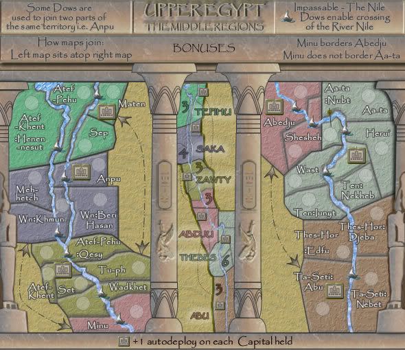
it took me a few minutes to wrap my head on exactly where the attack routes go from map to map. Because the northern border of Aa-ta-nubt seems to be cut-off by the graphics rather than being actually shown it seems to me like it should be able to attack something to its north, or continue to extend and sit next to Minu. Perhaps you could fashion the outside borders of each territory to be less perfect?
oaktown, the problem there is that the bottom of the middle left column hides the connecting borders. I really don't know what to do with that but will try to experiment.
And some kind of indication on each map as to what can attack what might be needed... something as simple as an arrow or even showing part of the other territory bleed across on to the other map.
Taken care of in the instructions above that area.
Attack arrows - haven't read the entire thread so forgive me if you'll be working on them, but they seem out of place to me. Maybe just a road connecting the territories? As is I wonder why you can cross the desert to attack somebody five territories away, but not three territories away.
Well attacking across the desert would have be used I am sure rather than stick to the Nile River where all movements would be noticed. It really doesn't matter where the attacks, I have used those territories for gameplay, and to losen the map up the same with the sea routes in Lower Egypt.
Broken territories could be problematic, but i don't have a solution for that right now. I suspect somebody is going to be surprised that Anpu can attack WnKhmun, for example.
No neither do I, and that's why there is a note in the instructions that says:
Note that some Dows are used to join two parts of the same territory....i have added Anpu as an i.e.
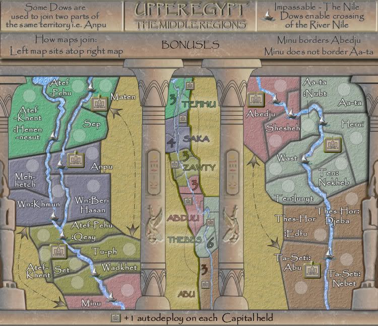
Other changes made to the map are in the height of the map and the way the columns relate to the dimensions of the perspective of the map.
TaCktiX wrote:- The bonus text is once again blending into the territories they represent (Lower Egypt had this problem, remember?

). Since you're strapped for space this time, I would suggest making the stroke or glow around the text a bit more bold.
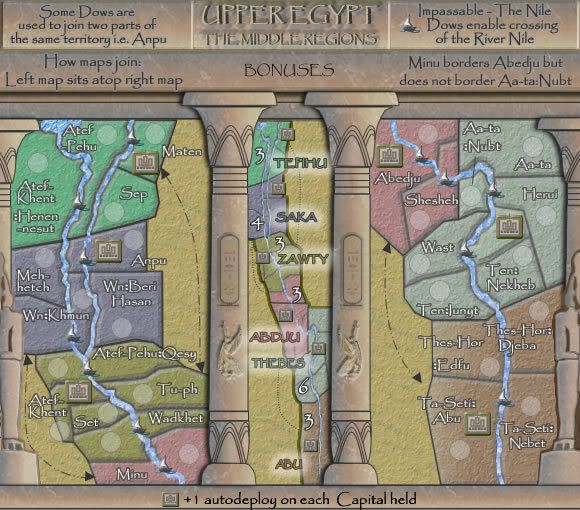
Done
- The arrows pointing at the bonuses are superfluous, as it's rather obvious it's the bonus description in the middle.
Done
- The winged creatures on the bonus pillars are blurry and look out of place next to all the other crisp detail you've put into the map's look.
Left the winged Gods as they were and added a gaussian blue to the cartouches.
- The two statues at the edges of the map are positioned in different places relative to the edge. Suggest moving the right one further right by a pixel or two to make them match up.
Done.
"Note that" has also been removed.
The arrows i will attend to next version.

Thanks Guys.
So this is a re-worked Version 9 from changes above.
Bloody photobucket has gone down.
EDIT: up again
- Click image to enlarge.