San Marino [Quenched]
Moderator: Cartographers
Forum rules
Please read the Community Guidelines before posting.
Please read the Community Guidelines before posting.

Re: Repubblica di San Marino - Vote in poll - Map on page 1 [I]
why are the rivers pinky/purpley?
-
Ruben Cassar
- Posts: 2160
- Joined: Thu Nov 16, 2006 6:04 am
- Gender: Male
- Location: Civitas Invicta, Melita, Evropa
Re: Repubblica di San Marino - Vote in poll - Map on page 1 [I]
Yes Montegiardino will be +1 in my next update.oaktown wrote:dropping the montegiardino bonus to +1 looks like a winner of an idea. I would encourage the same for chiesanuova.
Or better yet, you could put a bridge across the river from the chiesa and fiorentino territories; this would
1) add a border for the region to defend and makes it a more reasonable +2,
2) make starting in that corner a bit less of an advantage because you can't expand out quite as easily,
3) eliminate what is now a three-territory dead-end, and
4) eliminate the bottlenecks at both La Venezia and Casole.
As for the graphics, i agree that it's annoying when you like something as a mapmaker yet everybody else is pushing you to change it. But I encourage you to think about what the comments will be when the map is quenched and goes up for live play... for every voice now telling you that the rivers or towers look off there will be 1,000 users saying the same thing in a month or two.
About Chiesanuova I'll either run a poll like the one for Montegiardino or think about adding a bridge as you said.
I am working on some new rivers. I still don't know about the towers...I'll see if I can use a different version of the San Marino towers or else I will replace them with something else.


-
Ruben Cassar
- Posts: 2160
- Joined: Thu Nov 16, 2006 6:04 am
- Gender: Male
- Location: Civitas Invicta, Melita, Evropa
Re: Repubblica di San Marino - Map on page 1 [I]
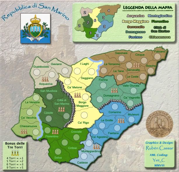
Version 1.18a - New rivers and new towers
Let me know if you prefer these ones.
Let me know if you prefer these ones.
- Click image to enlarge.

Re: San Marino - Map on page 1 & 11 - Update: 05.05.08 [I]
Ruben - how's about doing the towers like the ones in the Stamp on the left?
If you could make them look like that I think it would solve everything?!
C.
If you could make them look like that I think it would solve everything?!
C.

Highest score : 2297
-
Ruben Cassar
- Posts: 2160
- Joined: Thu Nov 16, 2006 6:04 am
- Gender: Male
- Location: Civitas Invicta, Melita, Evropa
Re: San Marino - Map on page 1 & 11 - Update: 05.05.08 [I]
Yeti...I actually used the same tower in the stamp this time!yeti_c wrote:Ruben - how's about doing the towers like the ones in the Stamp on the left?
If you could make them look like that I think it would solve everything?!
C.
Re: San Marino - Map on page 1 & 11 - Update: 05.05.08 [I]
Yeah - I quite like the way the three towers get smaller could you do that for the icon towers is what I meant?!Ruben Cassar wrote:Yeti...I actually used the same tower in the stamp this time!yeti_c wrote:Ruben - how's about doing the towers like the ones in the Stamp on the left?
If you could make them look like that I think it would solve everything?!
C.
C.
Highest score : 2297
-
Ruben Cassar
- Posts: 2160
- Joined: Thu Nov 16, 2006 6:04 am
- Gender: Male
- Location: Civitas Invicta, Melita, Evropa
Re: San Marino - Map on page 1 & 11 - Update: 05.05.08 [I]
Yes, I can try. I think it's possible. I'll wait until I receive more feedback on the towers though before...so guys tell me what you prefer.yeti_c wrote:Yeah - I quite like the way the three towers get smaller could you do that for the icon towers is what I meant?!Ruben Cassar wrote:Yeti...I actually used the same tower in the stamp this time!yeti_c wrote:Ruben - how's about doing the towers like the ones in the Stamp on the left?
If you could make them look like that I think it would solve everything?!
C.
C.
And let me know if you like the new rivers better as well...
Re: San Marino - Map on page 1 & 11 - Update: 05.05.08 [I]
[offtopic]I've only just noticed the accent on the e in your name - so whilst I assumed your name was pronounced "Roo Ben" - does this accent change the pronounciation?[/offtopic]
C.
C.
Highest score : 2297
-
gimil

- Posts: 8599
- Joined: Sat Mar 03, 2007 12:42 pm
- Gender: Male
- Location: United Kingdom (Scotland)
Re: San Marino - Map on page 1 & 11 - Update: 05.05.08 [I]
The new rivers are less than impressive. I liked the last set you had or the set I have you 
What do you know about map making, bitch?
Top Score:2403natty_dread wrote:I was wrong
-
Ruben Cassar
- Posts: 2160
- Joined: Thu Nov 16, 2006 6:04 am
- Gender: Male
- Location: Civitas Invicta, Melita, Evropa
Re: San Marino - Map on page 1 & 11 - Update: 05.05.08 [I]
I know...sadly only you and I liked the old rivers so I was forced to change them. People commented that they looked like plastic (or plasticine!) tubes. Perhaps the majority like these better?gimil wrote:The new rivers are less than impressive. I liked the last set you had or the set I have you
Edit: I added a poll about the rivers.
Re: San Marino - Map on page 1 & 11 - Update: 05.05.08 [I]
eh i voted, then realized that i liked the old rivers betterRuben Cassar wrote:I know...sadly only you and I liked the old rivers so I was forced to change them. People commented that they looked like plastic (or plasticine!) tubes. Perhaps the majority like these better?gimil wrote:The new rivers are less than impressive. I liked the last set you had or the set I have you
Edit: I added a poll about the rivers.
edit: so i switched my vote!
-
gimil
- Posts: 8599
- Joined: Sat Mar 03, 2007 12:42 pm
- Gender: Male
- Location: United Kingdom (Scotland)
Re: San Marino - Map on p1 & 11 - U: 05.05.08 - Vote in Poll [I]
Voted 
What do you know about map making, bitch?
Top Score:2403natty_dread wrote:I was wrong
-
Ruben Cassar
- Posts: 2160
- Joined: Thu Nov 16, 2006 6:04 am
- Gender: Male
- Location: Civitas Invicta, Melita, Evropa
Re: San Marino - Map on p1 & 11 - U: 05.05.08 - Vote in Poll [I]
Yes, interesting stuff.gimil wrote:Voted
Before no one said they liked the rivers, now after I did the new rivers everyone seems to like the old ones. I guess we have some lurkers in the foundry!
What about the towers guys. Do you prefer the new ones?
-
AndyDufresne

- Posts: 24919
- Joined: Fri Mar 03, 2006 8:22 pm
- Location: A Banana Palm in Zihuatanejo
- Contact:
Re: San Marino - Map on p1 & 11 - U: 05.05.08 - Vote in Poll [I]
I was "indifferent" to the previous version's rivers. What bothers me most about the Tower Graphics...they just seem to oddly sit on the map, independently, rather than being intergrated as a part of it...
--Andy
--Andy
-
Ruben Cassar
- Posts: 2160
- Joined: Thu Nov 16, 2006 6:04 am
- Gender: Male
- Location: Civitas Invicta, Melita, Evropa
Re: San Marino - Map on p1 & 11 - U: 05.05.08 - Vote in Poll [I]
Yeti suggested putting them one after the other instead of one next to the other. Would that be better?AndyDufresne wrote:I was "indifferent" to the previous version's rivers.
--Andy
-
AndyDufresne
- Posts: 24919
- Joined: Fri Mar 03, 2006 8:22 pm
- Location: A Banana Palm in Zihuatanejo
- Contact:
Re: San Marino - Map on p1 & 11 - U: 05.05.08 - Vote in Poll [I]
Perhaps. And if that doesn't work, you could always use a "flat" alternative, a circle, a star, etc. I'd you rather not use those, but they might look more a part of the map.
--Andy
--Andy
-
Ruben Cassar
- Posts: 2160
- Joined: Thu Nov 16, 2006 6:04 am
- Gender: Male
- Location: Civitas Invicta, Melita, Evropa
Re: San Marino - Map on p1 & 11 - U: 05.05.08 - Vote in Poll [I]
I can use any of those other options. I just wanted to use the San Marino towers to stick with the theme of the map.AndyDufresne wrote:Perhaps. And if that doesn't work, you could always use a "flat" alternative, a circle, a star, etc. I'd you rather not use those, but they might look more a part of the map.
--Andy

Re: San Marino - Map on p1 & 11 - U: 05.05.08 - Vote in Poll [I]
here's a question that may get you all upset at me, but stay with me...
What is the idea behind the towers anyway? My understanding of San Marino is that there are three famous towers in the country. You have nine. Well, you have 27 when you consider that each of the towers is represented by an image of three towers.
As I see it the three tower graphic is just a way of indicating where the town is in that district. So really it's not a bonus of the three towers, it's a bonus for holding towns.
Maybe it would be easier to just make the graphic a single tower?
-
Ruben Cassar
- Posts: 2160
- Joined: Thu Nov 16, 2006 6:04 am
- Gender: Male
- Location: Civitas Invicta, Melita, Evropa
Re: San Marino - Map on p1 & 11 - U: 05.05.08 - Vote in Poll [I]
Hehe I'm not upset don't worry.oaktown wrote:here's a question that may get you all upset at me, but stay with me...
What is the idea behind the towers anyway? My understanding of San Marino is that there are three famous towers in the country. You have nine. Well, you have 27 when you consider that each of the towers is represented by an image of three towers.
As I see it the three tower graphic is just a way of indicating where the town is in that district. So really it's not a bonus of the three towers, it's a bonus for holding towns.
Maybe it would be easier to just make the graphic a single tower?
I have made some new options for the towers. I did one of them as Yeti suggested and I like the look of it. I can do a one tower version as well as you are suggesting. I'll post them all once the river poll is over and let people decide which one they prefer.
-
Ruben Cassar
- Posts: 2160
- Joined: Thu Nov 16, 2006 6:04 am
- Gender: Male
- Location: Civitas Invicta, Melita, Evropa
Re: San Marino - Map on p1 & 11 - U: 05.05.08 - Vote in Poll [I]
Just bumping this up a bit because apparently it seems once the map goes down in the list the votes for the poll stop coming in...less exposure I guess.
-
Ruben Cassar
- Posts: 2160
- Joined: Thu Nov 16, 2006 6:04 am
- Gender: Male
- Location: Civitas Invicta, Melita, Evropa
Re: San Marino - Map on p1 & 11 - VOTE IN POLL [I]
Ok guys I have an small update for this one ready but I would like to finish the rivers poll and then perhaps start the towers poll before posting it.
Right now the rivers poll is tied so I guess I'll have to wait a bit more until taking a final decision.
Right now the rivers poll is tied so I guess I'll have to wait a bit more until taking a final decision.

Re: San Marino - Map on p1 & 11 - VOTE IN POLL [I]
I really don't like either of them, but 18 is way better than 16. 16 looks like someone painted tree roots grey for some weird reason.
Maybe consider not having the map be floating? Insert the surrounding non-playable area and then the river probably will look better rather than starting and ending somewhat randomly. Also, it'll just make the whole map look better.
Maybe consider not having the map be floating? Insert the surrounding non-playable area and then the river probably will look better rather than starting and ending somewhat randomly. Also, it'll just make the whole map look better.
-
Ruben Cassar
- Posts: 2160
- Joined: Thu Nov 16, 2006 6:04 am
- Gender: Male
- Location: Civitas Invicta, Melita, Evropa
Re: San Marino - Map on p1 & 11 - VOTE IN POLL [I]
Haha. Painted tree roots? I thought that for you they looked like (quoting edbeard from page 10) "They look like umm I dunno. Weird pipes". Actually the roots are supposed to be those little rivulets or whatever you call them in English that come out of a river. I guess it was a failed attempt to recreate them.edbeard wrote:I really don't like either of them, but 18 is way better than 16. 16 looks like someone painted tree roots grey for some weird reason.
Maybe consider not having the map be floating? Insert the surrounding non-playable area and then the river probably will look better rather than starting and ending somewhat randomly. Also, it'll just make the whole map look better.
As I said earlier I did not add the surrounding land area to San Marino because San Marino is an enclave in Italy and it is surrounded by Italy and only Italy, unlike other maps that have neighbouring states. But I'll give it some thought although I don't see how it could make the map look better...
-
Ruben Cassar
- Posts: 2160
- Joined: Thu Nov 16, 2006 6:04 am
- Gender: Male
- Location: Civitas Invicta, Melita, Evropa
Re: San Marino - Map on p1 & 12 - VOTE IN POLL - U: 09.05.08 [I]
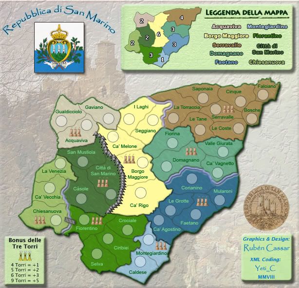
Here's the new update guys.
I will be opening a poll on the towers next with 5 options to choose from.
Version 1.18d - New rivers, added bridge between Chiesnuova and Fiorentino, replaced mountains between Faetano and Domagnano with a river, made Faetano slightly darker.
I will be opening a poll on the towers next with 5 options to choose from.
Version 1.18d - New rivers, added bridge between Chiesnuova and Fiorentino, replaced mountains between Faetano and Domagnano with a river, made Faetano slightly darker.
- Click image to enlarge.

Re: San Marino - Map on p1 & 12 - VOTE IN POLL - U: 09.05.08 [I]
Ruben - I'm not to crazy about your background here. The faded photo with a plaster type filter used on it kinda feels cheap. I know San Marino is surrounded by Italy - so have you thought of adding a non playable map around this one, kind of like I did for Italy? I think it would really help this map visually. You could keep San Marino raised from the background with a drop shadow, or bevel?
You need to change your Torri symbols in the legend to match the map.
I see a white line at the very top of the map - like the background image didn't extend far enough.
If you decide not to change the background, I think your light green legend background clashes with the greyish background image. Have you experimented with different colour schemes?
Oh - and I still think the blue words in your legend are too close in colour. It's hard to tell which region they are referring to. Your region colors look good.
