
Conquer Club

Age of Realms: Mayhem [Quenched]

Care to peruse completed maps? Take a stroll through the Atlas.

Moderator: Cartographers

Forum rules
Please read the Community Guidelines before posting.

Age of Realms: Mayhem [Quenched]

Postby DiM on Sat Feb 02, 2008 5:08 pm

stamps:
ImageImageImageImage


v13

done:

added small details
changed the legend a bit

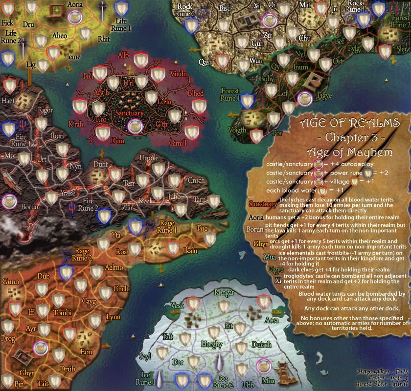
small
http://i178.photobucket.com/albums/w250/DiM-topia/AgeofRealms-AgeofMayhem-smallcop-4.jpg
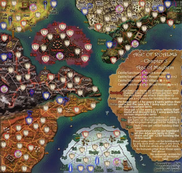
Image

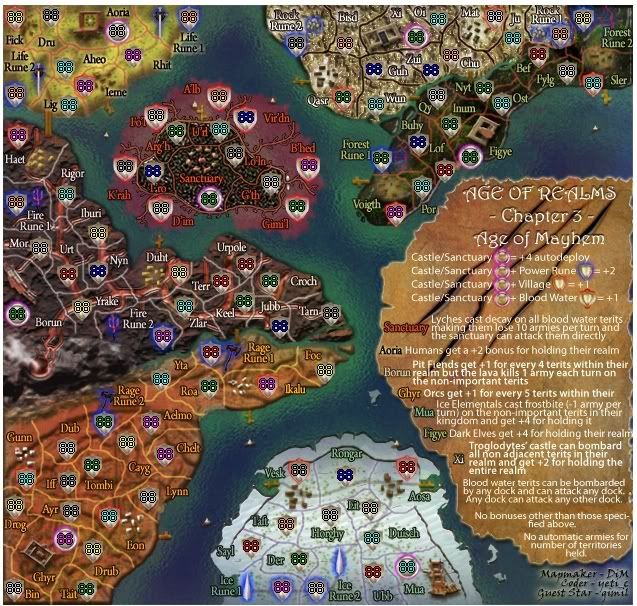
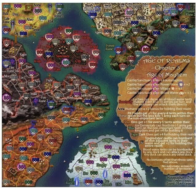
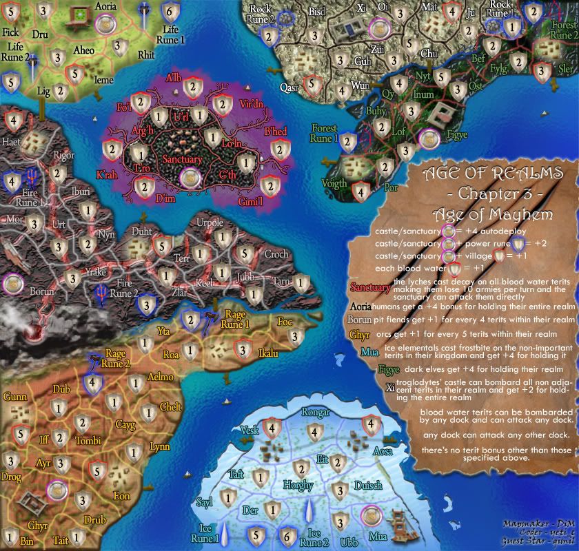
small army test (88&888)
Image
Image

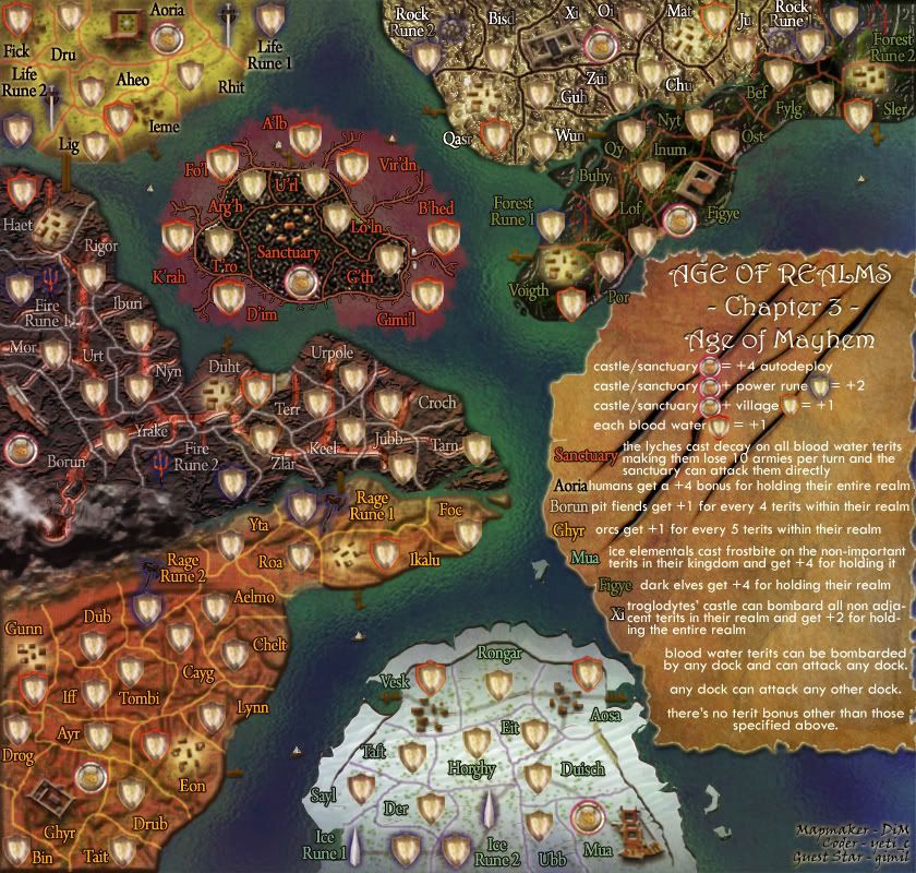
large
http://i178.photobucket.com/albums/w250/DiM-topia/AgeofRealms-AgeofMayhem-large1co-11.jpg
Image

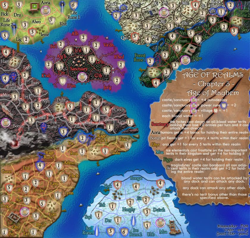
large army test (88&888)
Image
Image


xml:
http://www.sendspace.com/file/iyxnnn


v12

made orcs and pit fiends also lose -1 for non important terits (thanks Torter_of_Worlds)

Click image to enlarge.
image


v11
solved the small version text readability in the troglodites terits
made various other elements more visible in the small version.

large
Click image to enlarge.
image


small
Image


v10
* small version
* made the docks more visible
* made army circles more visible
* changed the bonus for humans from +4 to +2
* added the no automatic armies thing in the legend
* solved the weird greenish thing in the sanctuary island
* made the river between troglodytes and night elves thicker and more visible.

large
Click image to enlarge.
image


small
Image


V9
darker yet visible.
Click image to enlarge.
image


V8
done:
*made blood waters more flowy
*tweaked the Xi landscape
*made borun and xi continents to intersect better with the water
*added a few icebergs around mua
*changed the legend explanations regarding the blood waters
*added custom shields for blood waters for easy recognition.

Click image to enlarge.
image


V7
done:
-made the blood waters more flowy to blend better
-changed the troglodyte's continent colour
-changed the pit fiends' continent colour
-added neutrals
-added some claw scratches on the legend
-made a few border tweaks
-removed the animation
-changed the legend to reflect that blood waters can be attacked by any dock but they can also attack back.
-removed dock from u'rl

Click image to enlarge.
image


V6
done
- reworded parts of the legend and added various missing explanations (like the blood water bonus)
- got bored and animated the legend :)

Click image to enlarge.
image


V5
done
1. changed the pit fiends continent to a cool lava with burning lava flows type terrain.
2. changed terit name colour for pit fiends.
3. turn mountain into volcano

to do
1. fix the legend.

Click image to enlarge.
image


V4
done
1. changed rune names to life, ice, fire, rage, etc
2. changed the rune icon for pit fiends. the dwarven hammer was out of place
3. added icons for easy recognition in the legend.
4. changed troglodyte texture to a better suited one that's also easier to read.
5. changed troglodyte text

to do:

1. add flowy molten rivers, barren land and stuff for the pit fiends

Click image to enlarge.
image


V3
done
1. fixed short/long screwy borders
2. made u'rl dock more visible
3. replaced rock golems with troglodytes
4. faded the blood water.
5. reworded the lyches decay text in the legend
6. muted blue text in ice elementals continent


to do
1. replace power rune for pit fiends
2. add flowy molten rivers, barren land and stuff for the pit fiends
3. make rock golems/troglodytes land texture smoother so that text is easier to read.
4. add icons for easy recognition in the legend
5. rename runes to fire water ice life, etc

Click image to enlarge.
image


V2

changed dwarfs to pit fiends
changed ice golems to ice elementals
changed borders for golems, pit fiends and lyches
changed colours ot the text in the rock gollems, pit fiends and dark elves terits.

i still need to replace the pit fiend rune.

Click image to enlarge.
image


ORIGINAL POST:
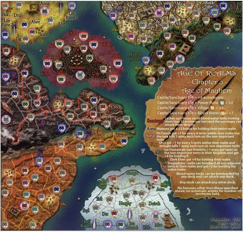
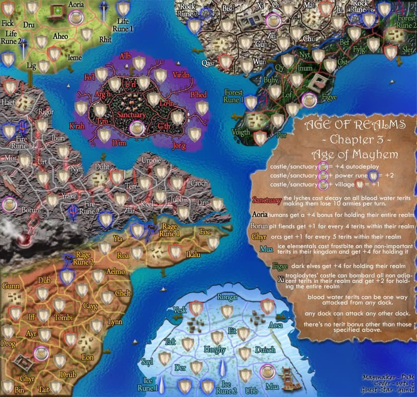
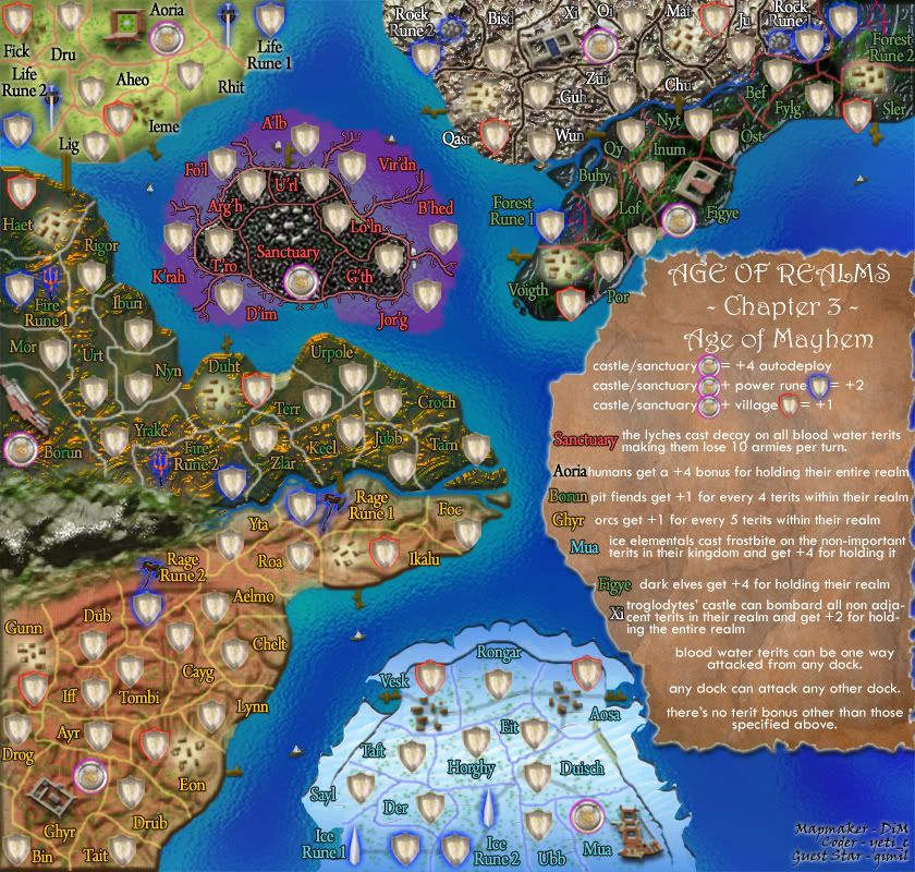
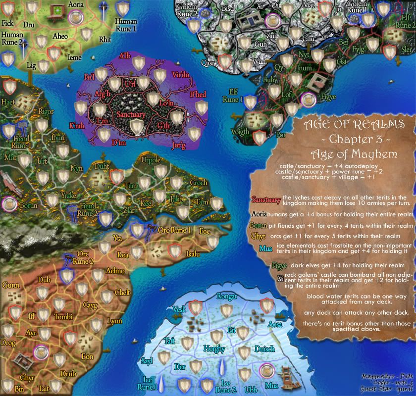
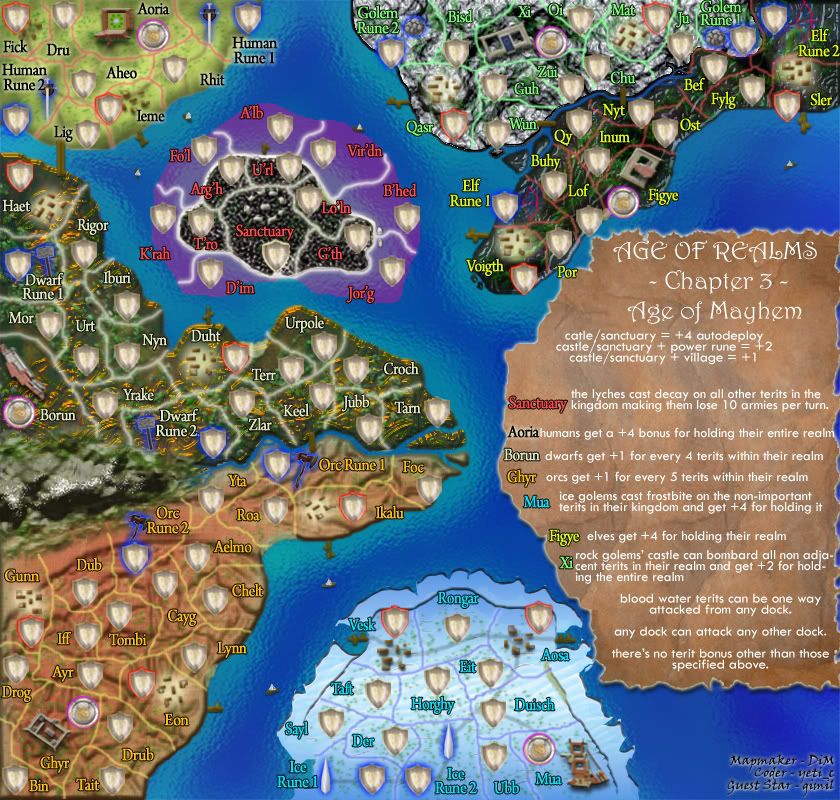
first there was a kingdom torn by war. 6 realms battled for supremacy but they trespassed the sanctuary and unleashed a terrible curse. all land was frozen. terrible ice storms ravaged the land but the humans survived and they kept fighting to unite the kingdom and to end the spell. they managed to break the spell but at a terrible cost. a magical portal opened and horrific creatures spew out of it. golems orcs dwarves elves and liches invaded the land and forced the humans to a hasty retreat in aoria. the safe haven of humanity. now each race has a domain and each wants total annihilation of the others. so the war rages on even more than before.
each races is unique and has a special trait that affect them and their homeland. each race has 2 power runes from which they gather their strength. the objective is only one. kill or be killed.

100 terits.
features:
- 1 way attacks
- decay
- starting neutrals
- possibly killer neutrals
- conquest gameplay
- resource type bonuses
- various terit count bonuses
- bombardments

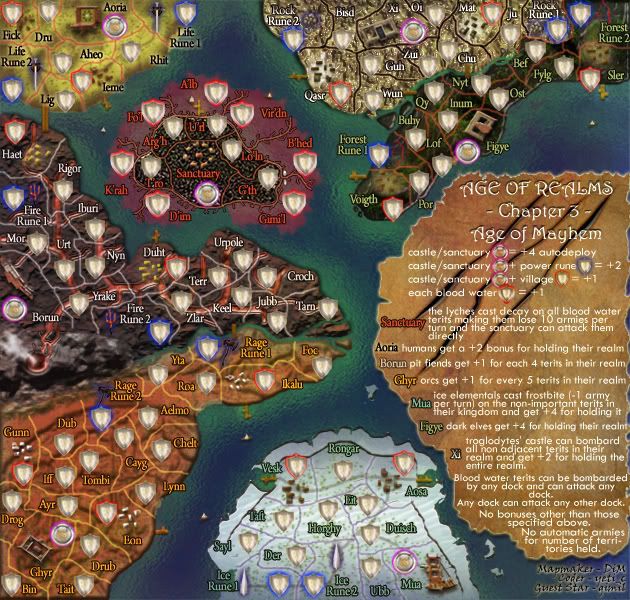
so here's the map.

Click image to enlarge.
image
Last edited by DiM on Sat May 03, 2008 7:57 am, edited 32 times in total.
“In the beginning God said, the four-dimensional divergence of an antisymmetric, second rank tensor equals zero, and there was light, and it was good. And on the seventh day he rested.”- Michio Kaku
User avatar
Major DiM
 
Posts: 10415
Joined: Wed Feb 14, 2007 6:20 pm
Location: making maps for scooby snacks

Postby wcaclimbing on Sat Feb 02, 2008 5:09 pm

yay!

first post

Suggestions:
decrease the contrast on some of the textures, especially around Borun and Xi. Aoria and Mua have really gentle textures, the others are a bit too intense for me to like.

For the new purple places around sanctuary, can you make them actual water, instead of purple painted onto the water? cause right now it just looks painted on. try blending it in a bit more and hilighting the edges so they look a bit more watery.

also, The first two maps had a good feeling in them. Might felt warm and open, Magic actually seemed cold and intense. Mayhem just seems to be a jumble of different parts put together and don't fit with each other wlel.
Last edited by wcaclimbing on Sat Feb 02, 2008 5:15 pm, edited 2 times in total.
Image
User avatar
Private 1st Class wcaclimbing
 
Posts: 5598
Joined: Fri May 12, 2006 10:09 pm
Location: In your quantum box....Maybe.

Postby soundout9 on Sat Feb 02, 2008 5:10 pm

cool
Private soundout9
 
Posts: 4519
Joined: Sun Aug 26, 2007 12:30 pm
Location: Good ol' MO Clan: Next-Gen Gamers

Postby DiM on Sat Feb 02, 2008 5:11 pm

btw, do you like my new sig?? :D

those flames were a bitch to create.
“In the beginning God said, the four-dimensional divergence of an antisymmetric, second rank tensor equals zero, and there was light, and it was good. And on the seventh day he rested.”- Michio Kaku
User avatar
Major DiM
 
Posts: 10415
Joined: Wed Feb 14, 2007 6:20 pm
Location: making maps for scooby snacks

Postby soundout9 on Sat Feb 02, 2008 5:12 pm

DiM wrote:btw, do you like my new sig?? :D

those flames were a bitch to create.

Those flames kick ass!
Private soundout9
 
Posts: 4519
Joined: Sun Aug 26, 2007 12:30 pm
Location: Good ol' MO Clan: Next-Gen Gamers

Postby militant on Sat Feb 02, 2008 5:16 pm

The map is looking great, especially the legend, nice work DiM :D
Guys I am intentionally lurking. Discuss; Play mafia, it is good.
Image
Oderint Dum Metuant says: Don't confuse the easily confused!
User avatar
Sergeant 1st Class militant
 
Posts: 923
Joined: Mon Jul 30, 2007 1:25 pm
Location: Playing Mafia

Postby DiM on Sat Feb 02, 2008 5:17 pm

militant wrote:The map is looking great, especially the legend, nice work DiM :D


glad you like it.
“In the beginning God said, the four-dimensional divergence of an antisymmetric, second rank tensor equals zero, and there was light, and it was good. And on the seventh day he rested.”- Michio Kaku
User avatar
Major DiM
 
Posts: 10415
Joined: Wed Feb 14, 2007 6:20 pm
Location: making maps for scooby snacks

Postby wcaclimbing on Sat Feb 02, 2008 5:18 pm

instead of all of those intense textures, have you tried recoloring each section to different kinds of land?

Such as sand, rock, dirt, clay, forests, etc.
I think that would look quite a bit better than the textures it has now.
Image
User avatar
Private 1st Class wcaclimbing
 
Posts: 5598
Joined: Fri May 12, 2006 10:09 pm
Location: In your quantum box....Maybe.

Postby a-person1192 on Sat Feb 02, 2008 5:24 pm

Dont quite understand all of the bonuses but i also think that the ice spires are too close to each other, so one should be moved to rongar or something like that.
Image
If I was lying wouldn't my pants be on fire?
User avatar
Cook a-person1192
 
Posts: 408
Joined: Tue Jun 26, 2007 3:08 pm
Location: It's very dark and I hear laughter...

Postby cairnswk on Sat Feb 02, 2008 5:25 pm

colourful!! but chaotic! :wink:
Image
* Pearl Harbour * Waterloo * Forbidden City * Jamaica * Pot Mosbi
User avatar
Private cairnswk
 
Posts: 11510
Joined: Sat Feb 03, 2007 8:32 pm
Location: Australia

Postby DiM on Sat Feb 02, 2008 5:28 pm

wcaclimbing wrote:instead of all of those intense textures, have you tried recoloring each section to different kinds of land?

Such as sand, rock, dirt, clay, forests, etc.
I think that would look quite a bit better than the textures it has now.


that's exactly what i didn't want. some simple flat textures. want the realms to stand out as much as possible. think of the graphic style as a hyperbole. that's what i wanted to achieve.

also i wanted to animate the whole map.
make it in flames (similar to the sig) and add various little animations, like griffins flying, harpies, dragons, the runes blinking as if they're oozing with power, some human troops marching, dust on the fields and waves in the sea. but just adding the flames makes the file 16Mb for the large version. then if i add all the other extra stuff i think i'll go up to 20-22Mb :(
“In the beginning God said, the four-dimensional divergence of an antisymmetric, second rank tensor equals zero, and there was light, and it was good. And on the seventh day he rested.”- Michio Kaku
User avatar
Major DiM
 
Posts: 10415
Joined: Wed Feb 14, 2007 6:20 pm
Location: making maps for scooby snacks

Postby DiM on Sat Feb 02, 2008 5:29 pm

a-person1192 wrote:Dont quite understand all of the bonuses but i also think that the ice spires are too close to each other, so one should be moved to rongar or something like that.


read the legend for the bonuses. i think it's pretty clearly explained.
“In the beginning God said, the four-dimensional divergence of an antisymmetric, second rank tensor equals zero, and there was light, and it was good. And on the seventh day he rested.”- Michio Kaku
User avatar
Major DiM
 
Posts: 10415
Joined: Wed Feb 14, 2007 6:20 pm
Location: making maps for scooby snacks

Postby whitestazn88 on Sat Feb 02, 2008 5:29 pm

that looks sick
Lieutenant whitestazn88
 
Posts: 3128
Joined: Mon Feb 05, 2007 2:59 pm
Location: behind you

Postby DiM on Sat Feb 02, 2008 5:30 pm

cairnswk wrote:colourful!! but chaotic! :wink:


it's mayhem not chaos. it has to start with an M :P
“In the beginning God said, the four-dimensional divergence of an antisymmetric, second rank tensor equals zero, and there was light, and it was good. And on the seventh day he rested.”- Michio Kaku
User avatar
Major DiM
 
Posts: 10415
Joined: Wed Feb 14, 2007 6:20 pm
Location: making maps for scooby snacks

Postby militant on Sat Feb 02, 2008 5:30 pm

Love the sig by the way :wink:
Guys I am intentionally lurking. Discuss; Play mafia, it is good.
Image
Oderint Dum Metuant says: Don't confuse the easily confused!
User avatar
Sergeant 1st Class militant
 
Posts: 923
Joined: Mon Jul 30, 2007 1:25 pm
Location: Playing Mafia

Postby DiM on Sat Feb 02, 2008 5:30 pm

whitestazn88 wrote:that looks sick


militant wrote:Love the sig by the way :wink:


thanks both.
“In the beginning God said, the four-dimensional divergence of an antisymmetric, second rank tensor equals zero, and there was light, and it was good. And on the seventh day he rested.”- Michio Kaku
User avatar
Major DiM
 
Posts: 10415
Joined: Wed Feb 14, 2007 6:20 pm
Location: making maps for scooby snacks

Postby edbeard on Sat Feb 02, 2008 5:31 pm

does U'rl still count as a dock?

is a power rune when you hold both runes of a certain type? (eg Dwarf 1 and 2)

does everyone think it's fair to treat players as if they've already played the first two maps? What I mean is there is no explanation of what a village is or what frostbite means?

I think every map (even those in a series) should be treated individually so explanations for gameplay should be there.
User avatar
Lieutenant edbeard
 
Posts: 2501
Joined: Thu Mar 29, 2007 12:41 am

Postby cairnswk on Sat Feb 02, 2008 5:32 pm

DiM wrote:
cairnswk wrote:colourful!! but chaotic! :wink:


it's mayhem not chaos. it has to start with an M :P


Bugger the mayhem,,,the colours are chaotic!
Image
* Pearl Harbour * Waterloo * Forbidden City * Jamaica * Pot Mosbi
User avatar
Private cairnswk
 
Posts: 11510
Joined: Sat Feb 03, 2007 8:32 pm
Location: Australia

Postby DiM on Sat Feb 02, 2008 5:34 pm

edbeard wrote:does U'rl still count as a dock?

is a power rune when you hold both runes of a certain type? (eg Dwarf 1 and 2)

does everyone think it's fair to treat players as if they've already played the first two maps? What I mean is there is no explanation of what a village is or what frostbite means?

I think every map (even those in a series) should be treated individually so explanations for gameplay should be there.


urls is still a dock. the blood waters are navigable.

a power rune is a rune. hold one and you get +2 hold both and you get +2.

don't worry the legend will be modified. it will be as clear as the others. i will show what a village/castle/sanctuary is. and all details. just like i did in the previous versions.
“In the beginning God said, the four-dimensional divergence of an antisymmetric, second rank tensor equals zero, and there was light, and it was good. And on the seventh day he rested.”- Michio Kaku
User avatar
Major DiM
 
Posts: 10415
Joined: Wed Feb 14, 2007 6:20 pm
Location: making maps for scooby snacks

Postby DiM on Sat Feb 02, 2008 5:35 pm

cairnswk wrote:
DiM wrote:
cairnswk wrote:colourful!! but chaotic! :wink:


it's mayhem not chaos. it has to start with an M :P


Bugger the mayhem,,,the colours are chaotic!


that's what i wanted. something to stick you in the eye grab you by the collar and smash your face on the screen. hyperbole, emphasis, call it however you want. everything is exaggerated.
“In the beginning God said, the four-dimensional divergence of an antisymmetric, second rank tensor equals zero, and there was light, and it was good. And on the seventh day he rested.”- Michio Kaku
User avatar
Major DiM
 
Posts: 10415
Joined: Wed Feb 14, 2007 6:20 pm
Location: making maps for scooby snacks

Postby Kaplowitz on Sat Feb 02, 2008 5:46 pm

DiM, im disappointed. The graphics look ugly, and hurt my eyes. Its hard to tell whats going one. I dont like the textures and colors.

I like the idea though! Im sure it will look great when its done! :P

(and i was hoping for AoR:Modern....)
Image
User avatar
Private 1st Class Kaplowitz
 
Posts: 3088
Joined: Tue May 01, 2007 5:11 pm

Postby gimil on Sat Feb 02, 2008 5:46 pm

Sorry but for the most part im disapointed with this so far.

To much neow glowing going on. Has a much to futurisitic feel to it.

Im happy with the humans and ice golems feel but everything else is just bleh. Sorry DiM, but i think some more though is going to have to go into some of the landscape.

PM me when your ready to talk :P
What do you know about map making, bitch?

natty_dread wrote:I was wrong


Top Score:2403
User avatar
Corporal 1st Class gimil
 
Posts: 8599
Joined: Sat Mar 03, 2007 12:42 pm
Location: United Kingdom (Scotland)

Postby DiM on Sat Feb 02, 2008 5:48 pm

Kaplowitz wrote:DiM, im disappointed. The graphics look ugly, and hurt my eyes. Its hard to tell whats going one. I dont like the textures and colors.

I like the idea though! Im sure it will look great when its done! :P

(and i was hoping for AoR:Modern....)


no modern.

as for the colours, what hard to tell? they are pretty distinct.
“In the beginning God said, the four-dimensional divergence of an antisymmetric, second rank tensor equals zero, and there was light, and it was good. And on the seventh day he rested.”- Michio Kaku
User avatar
Major DiM
 
Posts: 10415
Joined: Wed Feb 14, 2007 6:20 pm
Location: making maps for scooby snacks

Postby wcaclimbing on Sat Feb 02, 2008 5:50 pm

DiM wrote:
Kaplowitz wrote:DiM, im disappointed. The graphics look ugly, and hurt my eyes. Its hard to tell whats going one. I dont like the textures and colors.

I like the idea though! Im sure it will look great when its done! :P

(and i was hoping for AoR:Modern....)


no modern.

as for the colours, what hard to tell? they are pretty distinct.


its not that its hard to tell what is what, its just that everything clashes with everything else. I strongly suggest changing the textures, making them a bit more natural. If you do that, itll look much better, and fit with the nature/environment theme of the other two maps.
Last edited by wcaclimbing on Sat Feb 02, 2008 5:50 pm, edited 1 time in total.
Image
User avatar
Private 1st Class wcaclimbing
 
Posts: 5598
Joined: Fri May 12, 2006 10:09 pm
Location: In your quantum box....Maybe.

Postby Kaplowitz on Sat Feb 02, 2008 5:50 pm

The text. Especially near the Xi castle. It just looks rushed or something

edit: agree with wcaclimbing
Image
User avatar
Private 1st Class Kaplowitz
 
Posts: 3088
Joined: Tue May 01, 2007 5:11 pm

Next

Return to The Atlas

Who is online

Users browsing this forum: No registered users