Moderator: Cartographers
It is hard on the eyes because it is a 1980's video game.hecter wrote:I find it to be hard on the eyes, with all the contrast.
hecter wrote:Also, why is any alien AND conquer man and any alien both -2?
KraphtOne wrote:when you sign up a new account one of the check boxes should be "do you want to foe colton24 (it is highly recommended) "
Incandenza wrote:Wow. As someone who cut his video gaming teeth pumping nickels into Pac-Man, this looks like some great kitschy fun. When on earth do you sleep, wm?
A couple of questions:
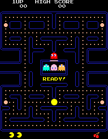
is it -2 per ghost? 'cause should someone start with, say three of them, the fact that they'll be getting a bunch of armies just from the high numbers of territories will be massively offset by the penalty. I understand that they're useful as teleports and bonus components, but the penalty seems high, and will severaly penalize people that start with them... maybe they could start neutral?
In a way, I have the same beef with pac-man, tho it looks like having pac-man and a ghost have bonuses/penalties that cancel each other out. Again, maybe a neutral start.
Given how many armies people will start with (hell, in 3p, each player will start with 50 territories), maybe the neutral values could be set higher than 3... even as high as ten.
One element from the game that you didn't put in is the fruit bonus, which could be an independent +2 or so territory towards the top of the map... or even in the spot below the ghost deployment box.
As far as color group and aliens go, the more asymmetrical, the better. Having one part of the map more powerful than another isn't a bad thing, and in fact only on the deliberately symmetrical maps are things balanced. You don't hear anyone complain that the north of San Francisco or the south of Middle Earth are stronger places to start than anywhere else on the map.
Wow, that turned into quite a few things...
Skittles! wrote:Ah ah ah ah. Where you get this idea?
Looking good, but as a 1980's game.. It could look better. Yeah, the red hurts the eyes and it really, really contrasts with the blue blockades.
WidowMakers wrote:4) asymmetrical is the way I want to go. The issue is there are 151 possible spots for everything. WHERE does everthing go to make the game work????
WM
:lol:Incandenza wrote:I bet you could place the ghosts completely randomly.....and the only one who would complain is marvaddin.
WidowMakers wrote:Skittles! wrote:Ah ah ah ah. Where you get this idea?
Looking good, but as a 1980's game.. It could look better. Yeah, the red hurts the eyes and it really, really contrasts with the blue blockades.
I know there need to be compromises. The number of pellets is less becasue they need to be bigger for th e"88" to fit. Plus there needs to be color to distinguish between the different groups.
It will look better once there are 10 or so different colors out there.
WM
KraphtOne wrote:when you sign up a new account one of the check boxes should be "do you want to foe colton24 (it is highly recommended) "
It was this thread.Skittles! wrote:I know you got the idea from PacMan, but about a week ago I put an idea in the map idea thread so I was thinking you got the idea there. Anyway
I hope this does to quenched.. I would love to play PacMan on CC
I used ALIENS because I wanted to make sure that it was different but still the same. Plus this way each "ALIEN" looks a little different.RjBeals wrote:Are you creating aliens because ghosts are "copyrighted"? And widow, pretty much anything you create gets my approval.
Would that be quarter per post or per complete map. You almost owe me $2.RjBeals wrote: And widow, pretty much anything you create gets my approval. If you had a tips jar on your desk I'd toss you a quarter.
I will definitley look into this. I just want to get the framework finished first. We might find that the white circles could get smaller or the opacity turned down a bit too.hecter wrote:I still think the colour intensity and contrast needs to be toned down a bit.
Widow Maker wrote:I am glad you like the idea. I voted non-symmetrical as well. I am going to continue with the hard edge. I spent around 4 hours drawing with a 1x1 pixel pencil in photoshop so I could keep the hard edge on all the pieces of the map. It is the way the video game looked int eh 80's. So it is the style I want to see.cairnswk wrote:WM...i like the idea myself, and i think it would fill a niche market play out there.
I voted for non-symmetrical.
Also, if you go ahead, are you planning on continuing with the hard edged style, or will you use some anti-aliasing to reduce that hard edge?
I think it could do with less harshness, and as mentioned, the colours are very bold....i agree thay need toning down a fraction.
Good start though.
As far as the colors being bold, I am going to look into toning down the white army circles and (I believe) once the different colored pellets (currently all red) are changed to different bonus colors (cyan, pink, orange, blue , magenta, yellow, gray, green, etc) the map will feel better.
But we shall see.
WM
Unit_2 wrote:its a good map but there is too many territorys, like you could take out everyother one so that there is less but there is still some
KraphtOne wrote:when you sign up a new account one of the check boxes should be "do you want to foe colton24 (it is highly recommended) "
Skittles! wrote:Unit_2 wrote:its a good map but there is too many territorys, like you could take out everyother one so that there is less but there is still some
What's wrong with that many territories?
Coleman wrote:Well... There is currently a demand for a few more higher count territories. Although I made that observation 3 months ago so who knows what people feel now.
Users browsing this forum: No registered users