
Only 4 is an island...1, 2, 3, and 5 all show Mexico and Colombia.waseemalim wrote:hmm... why do we have so many island versions of central America? Does that bother anyone else?
Official: Central America Competition - complete!
Moderator: Cartographers
Forum rules
Please read the community guidelines before posting.
Please read the community guidelines before posting.
Re: Official: Central America Competition - VOTE!
-
gimil

- Posts: 8599
- Joined: Sat Mar 03, 2007 12:42 pm
- Gender: Male
- Location: United Kingdom (Scotland)
Re: Official: Central America Competition - VOTE!
Great competition! I would argue that this one is better quailty than the Centerscape one 
Some thoughts:
1. To be honest I don't really see anything in it. Nothing I can really say about it.
2. Very bright and vibrant. Has a similar look to madagascar, which I love. I think the colours could use some playing around with to get some that fall more into place. Not a big fan of the compass and title thou, they don't feel like they fit to me. The inland lakes are a different colour to the sea, which I don't really like. Overall, I think with some more work this one could clean up nicely.
3. The only thing I can say that brings this entry down is the canvas style. Everything else from its colouring to the layout work nicley together.
4. Probably my personal favourite at the moment. Everything is neat, tidy and fits together. My only concerns is that some of the glows on the map may be a little bright, mainly El Salvador and Belize. Very nice entry and its easy to see that this character could become a pro if they stick around.
5. Not 100% sure what to think of this one. Compared to other entries this one seems plain and a little clumpsy. The title and the compass look like they are after thoughts as tyhey don't sit very well on the map in my opinion.
4 is probably my favourite, but I also like 3 and have voted for it because I would like to see if the potential for this one I see is really there (Which I think it is).
Good luck to everyone.
What do you know about map making, bitch?
Top Score:2403natty_dread wrote:I was wrong
-
jako

- Posts: 1022
- Joined: Sun Jun 03, 2007 4:50 am
- Gender: Male
- Location: A lost soul with no-one to stalk.
Re: Official: Central America Competition - VOTE!
entry 4 is totally kiking ass with the great graphics. also using icons to get around the long water route was genius. didnt like how there were 2 huge water routes on the other maps.

Time to retire this much loved sig of mine with a new clan.

Re: Official: Central America Competition - VOTE!
have to say they all look nice except entry 3 .... for colorblind person like me it's a map i wont play if it's entry 3
Re: Official: Central America Competition - VOTE!
i repeat myself but for colorblind people the best map is number 2 .... i lost a couple of games with maps my eyes see with a blur like my first time in haiti in the south ... anyway good job
Re: Official: Central America Competition - VOTE!
lol i feel sorry for entry 1, with only 5 votes, it seems so far behind compared to the others
-
Night Strike

- Posts: 8509
- Joined: Wed Apr 18, 2007 2:52 pm
- Gender: Male
Re: Official: Central America Competition - VOTE!
I voted #2 because the brighter colors feel more tropically to me. I was strongly considering #3, but it appears that it would be too cramped in the small version.

Re: Official: Central America Competition - VOTE!
All but #3 misspelled Tegucigalpa. ._.

Re: Official: Central America Competition - VOTE!
Um, that would actually be my fault, as I misspelled it on the sample.Freyja wrote:All but #3 misspelled Tegucigalpa. ._.

Re: Official: Central America Competition - VOTE!
I chose between 2 and 5, with 5 being my choice. In the end, I preferred the colors and larger text size in 5. Also, I don't like the use of icons for the sea routes in 4, I much prefer the lines.
CONFUSED? YOU'LL KNOW WHEN YOU'RE RIPE
saxitoxin wrote:Serbia is a RUDE DUDE
may not be a PRUDE, but he's gotta 'TUDE
might not be LEWD, but he's gonna get BOOED
RUDE
Re: Official: Central America Competition - VOTE!
Other than the low number of votes going to #1, this is a remarkably close vote. And the first entry could be improved greatly by some simple things like putting the territory names on the map where they belong.
Given how close the vote is, and keeping in mind that this is an amateur competition designed to get new mapmakers involved, I wouldn't be opposed to seeing all of our five mapmakers come up with a second draft after taking into consideration the public opinions expressed via the vote and the feedback.
And, sadly, there was a map that was not submitted in time for inclusion in the vote... again, as this is intended as a friendly learning experience for new mapmakers, I'd like to share it with you all now in the hope of soliciting some feedback for the mapmaker. Personally, beyond the accents being in the wrong place (no accent on America I believe, unless you are writing "Centroamérica") I think it is exceptionally good.
- Click image to enlarge.
-
e_i_pi

- Posts: 1775
- Joined: Tue Feb 12, 2008 2:19 pm
- Location: Corruption Capital of the world
- Contact:
Re: Official: Central America Competition - VOTE!
It could use some work in places (sea routes, including mexico and Colombia), but the texturing and colours are fantastic. I think if this had been included it most certainly would have been the favourite.
Re: Official: Central America Competition - VOTE!
its hard to read the yellow areas... but it would have gotten my vote

Re: Official: Central America Competition - VOTE!
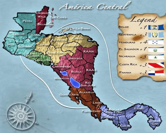
#5 has wrong positions of Colon and Tegucigapala 
-
the.killing.44

- Posts: 4724
- Joined: Thu Oct 23, 2008 7:43 pm
- Gender: Male
- Location: now tell me what got two gums and knows how to spit rhymes
- Contact:
Re: Official: Central America Competition - VOTE!
With a better text color, I would've voted for the one not placed in time. 
-
MaleAlphaThree

- Posts: 35
- Joined: Sun Jun 01, 2008 2:52 pm
- Gender: Male
- Location: Video games.
- Contact:
Re: Official: Central America Competition - VOTE!
Changed vote from #2 to #5. It just looks cleaner.
I don't know how you could change #3 to still make it distinct and yet not force blindness.
I don't know how you could change #3 to still make it distinct and yet not force blindness.

Re: Official: Central America Competition - VOTE!
How is 3 three so far down? The only issue with it is some slight illegibility...
-
whitestazn88
- Posts: 3128
- Joined: Mon Feb 05, 2007 2:59 pm
- Gender: Male
- Location: behind you
- Contact:
Re: Official: Central America Competition - VOTE!
i think the newest map that wasn't included is ok... but i don't like the island look, and its a little bit too bright. especially w/ the background
-
Thezzaruz

- Posts: 1093
- Joined: Mon Feb 04, 2008 2:10 pm
- Gender: Male
- Location: OTF most of the time.
- Contact:
Re: Official: Central America Competition - VOTE!
Agreed. I do like it when the continents are easy to distinguish but the overall idea/graphics was ace IMO. Best legend by far.The Neon Peon wrote:I am surprised I was the first to vote for #4. In my opinion, a simple color change will do for it, best graphics style of them all in my opinion.
And I hated #3.

Re: Official: Central America Competition - VOTE!
Congratulation to each participant, thanks for the amount of work.
I prefer #1 it could have been a bit lighter and name on territories but it's the cleanest for me.
I prefer #1 it could have been a bit lighter and name on territories but it's the cleanest for me.
De gueules à la tour d'argent ouverte, crénelée de trois pièces, sommée d'un donjon ajouré, crénelé de deux pièces
Gules an open tower silver, crenellated three parts, topped by a apertured turret, crenellated two parts
Gules an open tower silver, crenellated three parts, topped by a apertured turret, crenellated two parts
Re: Official: Central America Competition - VOTE!
I'm being asked when the final round drafts will be due. With the holidays coming up mapmakers are hoping they'll have ample time to work on it. What's say we let it go until after everybody has sobered up from new years... how does January 7th sound to everyone? It's another Wednesday, and we can say deadline is midnight GMT again.
Just because they have three weeks, that doesn't mean the rest of you shouldn't keep giving feedback over that time!
Just because they have three weeks, that doesn't mean the rest of you shouldn't keep giving feedback over that time!

Re: Official: Central America Competition - VOTE!
i am shocked #3 isnt running away with this... i find all the other ones rather bland.
also, theres a territory called colon
also, theres a territory called colon

-
e_i_pi
- Posts: 1775
- Joined: Tue Feb 12, 2008 2:19 pm
- Location: Corruption Capital of the world
- Contact:
Re: Official: Central America Competition - VOTE!
It's pronounced the same as Cologne you dorkdaydream wrote:also, theres a territory called colon
Re: Official: Central America Competition - VOTE!
i just realized that all the entries left out cuba and jamaica.... 

Re: Official: Central America Competition - VOTE!
With the exception of number 3, none of the projections would include either Cuba or Jamaica. They're off the map. And number 3 does include the tip of Cuba, where it should be for its projection.bryguy wrote:i just realized that all the entries left out cuba and jamaica....