Another great looking map oaktown!
Forgive me if this has already been addressed, but didnt the Ottoman empire still have some chunks of Northeast Africa at the turn of the century? Or is the idea that their hold on those areas was fleeting by then?
Not trying to nitpick - just curious!
Eastern Hemisphere [Quenched]
Moderator: Cartographers
Forum rules
Please read the Community Guidelines before posting.
Please read the Community Guidelines before posting.
-
lostatlimbo

- Posts: 1386
- Joined: Wed Mar 28, 2007 3:56 pm
- Location: Portland, OR
-
lostatlimbo
- Posts: 1386
- Joined: Wed Mar 28, 2007 3:56 pm
- Location: Portland, OR
Re: Eastern Hemisphere; Jury Summoned! [D, Gp, Gfx]
Also - the mountains on Australia might be confusing for some. It is clear that Australia and New Zealand connect, but the placement of those mountains suggest an impassable boundary.
Re: Eastern Hemisphere; Jury Summoned! [D, Gp, Gfx]
I havent been able to comment on this for a while (i dont know if i ever did originally... I might have, I know I meant to at one point or another) but all Ive got to say is "Wow!"
This looks very good, another great map oak
I do have some comments tho...
1) I dont really care for the mountains. Don't get me wrong, their great, but if I look at them straight on they look like canyons.
2) Netherland flag and France flag keeps getting me confused
3) I dont really understand the Naval Superiority thing. Can it be attacked by basically any country (GB, Neth, Germany, France, Italy)? Also the 4 in the to neutral (4) if held is hard to read
4) Does the flag over at portugal/spain go to portugal or spain?
5) Some of the attack dots (routes?) are hard to see, or hard to tell that the are there. Thats just my opinion
6) Its a bit annoying how some names (middle east, oceania, those type names) have stuff going through them, or behind them. Mainly the ones that annoy me are N. Africa, Middle East, and Oceania. Those are the only ones that has something actually going through a letter, the others have it going between letters, or not at all (except for So. Asia, but that one is less noticible)
once again, lookin great
This looks very good, another great map oak
I do have some comments tho...
1) I dont really care for the mountains. Don't get me wrong, their great, but if I look at them straight on they look like canyons.
2) Netherland flag and France flag keeps getting me confused
3) I dont really understand the Naval Superiority thing. Can it be attacked by basically any country (GB, Neth, Germany, France, Italy)? Also the 4 in the to neutral (4) if held is hard to read
4) Does the flag over at portugal/spain go to portugal or spain?
5) Some of the attack dots (routes?) are hard to see, or hard to tell that the are there. Thats just my opinion
6) Its a bit annoying how some names (middle east, oceania, those type names) have stuff going through them, or behind them. Mainly the ones that annoy me are N. Africa, Middle East, and Oceania. Those are the only ones that has something actually going through a letter, the others have it going between letters, or not at all (except for So. Asia, but that one is less noticible)
once again, lookin great
-
sailorseal
- Posts: 2735
- Joined: Sun May 25, 2008 1:49 pm
- Gender: Male
- Location: conquerclub.com
Re: Eastern Hemisphere; Jury Summoned! [D, Gp, Gfx]
I agree they just give me this weird feeling. The way they ripple makes it look like a wound stitched up. They give me the creeps but I do not think they should be Oak's top priority.bryguy wrote: 1) I dont really care for the mountains. Don't get me wrong, their great, but if I look at them straight on they look like canyons.
Re: Eastern Hemisphere; Jury Summoned! [D, Gp, Gfx]
sailorseal wrote:I agree they just give me this weird feeling. The way they ripple makes it look like a wound stitched up. They give me the creeps but I do not think they should be Oak's top priority.bryguy wrote: 1) I dont really care for the mountains. Don't get me wrong, their great, but if I look at them straight on they look like canyons.
Agreed. If needed, they could probably be fixed in FF.
I just put it first cause it was the first thing I noticed.
-
sailorseal
- Posts: 2735
- Joined: Sun May 25, 2008 1:49 pm
- Gender: Male
- Location: conquerclub.com
Re: Eastern Hemisphere; Jury Summoned! [D, Gp, Gfx]
I am glad for once someone agrees with me. I think with the Jury there should be a both option(Needs changes but should move to FF). Hopefully everyone else agrees with that...bryguy wrote:sailorseal wrote:I agree they just give me this weird feeling. The way they ripple makes it look like a wound stitched up. They give me the creeps but I do not think they should be Oak's top priority.bryguy wrote: 1) I dont really care for the mountains. Don't get me wrong, their great, but if I look at them straight on they look like canyons.
Agreed. If needed, they could probably be fixed in FF.
I just put it first cause it was the first thing I noticed.
Re: Eastern Hemisphere; New Empire! pg 28 [D, Gp]
Holy crap, that's a lot of comments. This map thread has had virtually no feedback since September, now everybody's a critic. 
I was going to quote everything and respond to each, but that would be a record post for me, and if you've followed my history of writing Foundry novels you'd know that this would be something of a feat. As Mr. Montoya said, "Let me explain... no, it is too much, let me sum up." What I'm doing is reading, making changes on the fly, and posting what I do. Down below I'll mention the most significant suggestions that I am opting not to implement, and those about which I am still on the fence.
Let's see, could there be anything else about this map that folks don't like? Anything at all?
Suggestions from the past 48 hours that I would argue against...
Creating more territories in Russia and splitting it into two regions. If this were a map of anything other than a very specific time in actual world history, I could see this change. But Russia was truly a behemoth at the dawn of the 20th century. This is a map about historical empires, and cutting the Russian Empire in two wouldn't make sense.
Increasing Japan's bonus to +3. While there are many ways to get a bonus on this map, there aren't a lot of easy starts; Japan is the easiest start, with for territories and easy expansion out into China. It is not subject to the bombardments of the other regions. On some maps a four territory, three border territory would rate a +3, but i would say not on this map.
Suggestions I'm still considering, but less than excited about.
Adding color to the legend. We went all over this three months ago, I presented some options, and they looked like crap. I could try again and probably make something acceptable, but it's not as if this is a fantasy world... Europe is Europe, Russia is Russia.
Explicitly stating that mountains are impassables. Haven't we all played enough CC maps to know that mountains are impassable borders?
- Click image to enlarge.
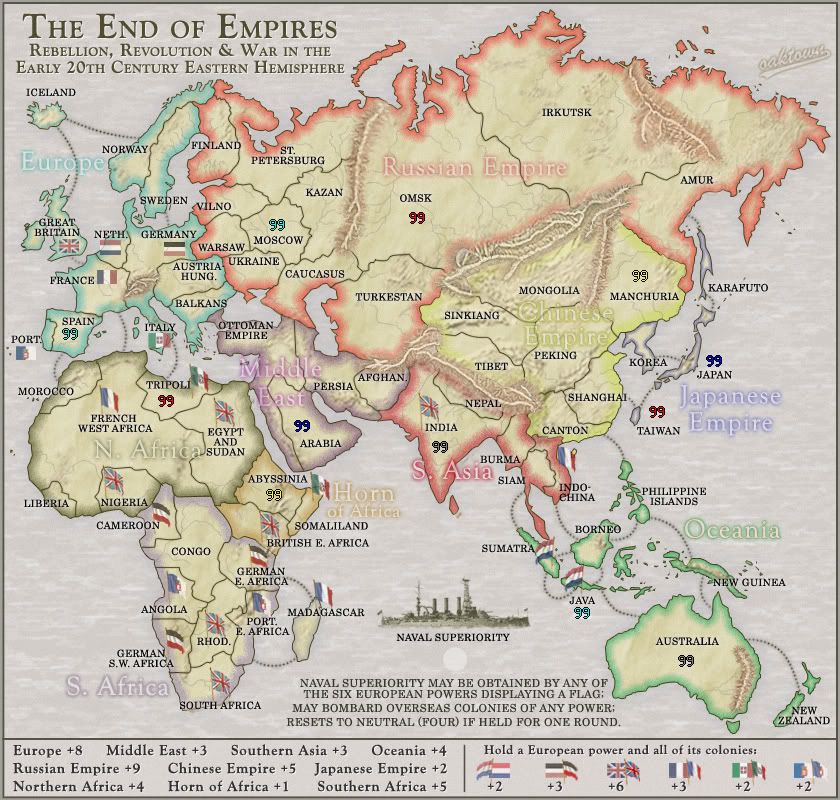
- • China glow made more yellow and more opaque. Glow brought in a few pixels along the northern and southern borders.
• South Asia a darker red, and the region title changed to "S. Asia" and moved out of the way.
• South Africa glow is more opaque, grungier, and given a hint of violet (was just grey); title made stronger and easier to read.
• Text already has a glow, but I've moved some text off of borders (eg. St. petersburg).
• Connected some sloppy borders in Scandinavia, Asia and Africa.
• Amur title and circle moved north and west to clarify that it is a single territory.
• Kept German S.W. Africa with periods, but removed a space to tighten it up.
• Autralia - NZ attack route redrawn so that it's not coming out of the mountains (interest catch, I hope this is a decent fix).
• Naval Superiority explanation ammdended for calrity, font is larger; "4" changed to "four"
• Attack route dots given a dark glow to help them stand out.
• Portugal changed to "PORT.", order of elements moved to make it distinct from Spain.
• Flip-flopped Sumatra name/circle.
• Flipped the Dutch colony flags to run right to left... there's no way you can mix them up with the french and/or german flags now.
• Oceania text moved off of the attack route, but other region titles look good to me... I like the effect of layering titles so long as it doesn't impede play.
Let's see, could there be anything else about this map that folks don't like? Anything at all?
ZeakCytho wrote:your mountains look like veins
Seriously, is there anything that you guys don't like about the graphics?samuelc812 wrote:The mountains do look like veins but it's suits the map IMO.
MrBenn wrote:The mountains...

bryguy wrote:I dont really care for the mountains. Don't get me wrong, their great, but if I look at them straight on they look like canyons.
What was that? Could somebody just tell me how you really feel?sailorseal wrote:The way they ripple makes it look like a wound stitched up. They give me the creeps but I do not think they should be Oak's top priority.
Really??WidowMakers wrote:First off the mountains are an important distinguishing feature that really helps the map out but at the same time I do not like how they look. Don’t get me wrong, I understand the purpose of them and I think that mountains need to be used but the implementation of them just does not feel right. Some of them just look like scars laid over the land (Eastern Russia and Australia). The mountains around China are very nice. I think they look good because they go from mountains to hills to flat land. The colors blend well and the entire image is integrated. The mountains I mentioned above just seen stuff on top of flat land. The ones in eastern Russia look good until the reddish bases don’t blend into the brown base of the map image. Same goes for the AU mountains too. I really think those should just be removed (I posted on that much earlier in the map development)
I would suggest that you take all names and colors and borders off of the map and try to make the mountains look integrated into the base image. Then once they look seamlessly integrated into the look, turn back on your other layers. That way colors and borders will not affect your mountain style.
Also it was mentioned earlier that there is no legend info explaining the mountains are impassable. I think that is needed as well.
Alright, I get the point. I will play around with them.lostatlimbo wrote:Also - the mountains..
Suggestions from the past 48 hours that I would argue against...
Creating more territories in Russia and splitting it into two regions. If this were a map of anything other than a very specific time in actual world history, I could see this change. But Russia was truly a behemoth at the dawn of the 20th century. This is a map about historical empires, and cutting the Russian Empire in two wouldn't make sense.
Increasing Japan's bonus to +3. While there are many ways to get a bonus on this map, there aren't a lot of easy starts; Japan is the easiest start, with for territories and easy expansion out into China. It is not subject to the bombardments of the other regions. On some maps a four territory, three border territory would rate a +3, but i would say not on this map.
Suggestions I'm still considering, but less than excited about.
Adding color to the legend. We went all over this three months ago, I presented some options, and they looked like crap. I could try again and probably make something acceptable, but it's not as if this is a fantasy world... Europe is Europe, Russia is Russia.
Explicitly stating that mountains are impassables. Haven't we all played enough CC maps to know that mountains are impassable borders?
-
the.killing.44

- Posts: 4724
- Joined: Thu Oct 23, 2008 7:43 pm
- Gender: Male
- Location: now tell me what got two gums and knows how to spit rhymes
- Contact:
Re: Eastern Hemisphere; Jury in, changes made [D, Gp, Gfx]
tbh, I kinda like the mountains. But what I'd do is either/both split up the ridges so there is some divider (like ---- --- -- -- instead of the current ----------- if you know what I mean), or make them a tad thicker.
.44
.44

Re: Eastern Hemisphere; New Empire! pg 28 [D, Gp]
It's a silly recurrent Map Foundry issue I never understood but were forced to apply... I hope you notoaktown wrote:Explicitly stating that mountains are impassables. Haven't we all played enough CC maps to know that mountains are impassable borders?
De gueules à la tour d'argent ouverte, crénelée de trois pièces, sommée d'un donjon ajouré, crénelé de deux pièces
Gules an open tower silver, crenellated three parts, topped by a apertured turret, crenellated two parts
Gules an open tower silver, crenellated three parts, topped by a apertured turret, crenellated two parts
-
sailorseal
- Posts: 2735
- Joined: Sun May 25, 2008 1:49 pm
- Gender: Male
- Location: conquerclub.com
Re: Eastern Hemisphere; Jury in, changes made [D, Gp, Gfx]
So now that you have made these changes can the jury re-vote?

Re: Eastern Hemisphere; New Empire! pg 28 [D, Gp]
Yes, we veterans might have, but what about the newbie who decides to give this map a go first time round because it "looks good" and they like the theme. Don't you think they deserve the same chance as everyone else has been given....and it would only be due process for you to follow the foundry standards and notate this on your map.oaktown wrote:....
Explicitly stating that mountains are impassables. Haven't we all played enough CC maps to know that mountains are impassable borders?
You see without the notation, any mountain range could be regarded as simply that....a geographical feature of the map and thus it might be considered simply as a border, and not as impassable.
That is why it is Foundry Standard.

* Pearl Harbour * Waterloo * Forbidden City * Jamaica * Pot Mosbi
Re: Eastern Hemisphere; New Empire! pg 28 [D, Gp]
Is it a Foundry standard?cairnswk wrote:You see without the notation, any mountain range could be regarded as simply that....a geographical feature of the map and thus it might be considered simply as a border, and not as impassable.
That is why it is Foundry Standard.
 Maps without notation re. impassable mountains include:
Africa
Age of Realms I
Age of Realms II
Age of Realms III
Alexander's Empire
Ancient Greece
Archipelago
Asia
Australia points out what a mountain range looks like, but does not say it is impassable
British Isles
Canada
I stopped looking after the first two rows of the map finder; most of the other maps in the first two rows don't have mountains at all. In fact, there are only two or three maps that I saw that do actually mention the mountains, vs. the 11 above that do not. I would say that the foundry standard is to NOT note the impassability of mountains on a map
As far as I can recall, nobody has ever come into the Foundry to complain about the play of the mountains in any of those maps - some of which have been around longer than I have.

Re: Eastern Hemisphere; Jury in, changes made [D, Gp, Gfx]
Mountains are one of the most obvious impassable objects; I'm not convinced you need to explain this on the legend.

PB: 2661 | He's blue... If he were green he would die | No mod would be stupid enough to do that
Re: Eastern Hemisphere; Jury in, changes made [D, Gp, Gfx]
^^ Then i stand corrected. But wow betied anyone! who asks me to explain this on any of my maps again. 
* Pearl Harbour * Waterloo * Forbidden City * Jamaica * Pot Mosbi
-
sailorseal
- Posts: 2735
- Joined: Sun May 25, 2008 1:49 pm
- Gender: Male
- Location: conquerclub.com
Re: Eastern Hemisphere; Jury in, changes made [D, Gp, Gfx]
is anyone going to answer?sailorseal wrote:So now that you have made these changes can the jury re-vote?
Re: Eastern Hemisphere; Jury in, changes made [D, Gp, Gfx]
There's no voting per se... when and if you think the map is ready to advance on the Forge you just give it your thumbs-up and your affirmative will be noted. Maybe we need to come up with a graphic for this - a third of a map stamp?sailorseal wrote:is anyone going to answer?sailorseal wrote:So now that you have made these changes can the jury re-vote?
Re: Eastern Hemisphere; Jury in, changes made [D, Gp, Gfx]
oaktown...speaking about the map stamp....this is becoming bureaucratic BS...why make more work for yourself when there already exists a tidy process? just forge the map or have someone do it for you.oaktown wrote:... Maybe we need to come up with a graphic for this - a third of a map stamp?
* Pearl Harbour * Waterloo * Forbidden City * Jamaica * Pot Mosbi
Re: Eastern Hemisphere; Jury in, changes made [D, Gp, Gfx]
It was intended as an experiment in group map-making, and I didn't want to subject anybody's else's map to a test process. Consider it jury duty beta.cairnswk wrote:oaktown...speaking about the map stamp....this is becoming bureaucratic BS...why make more work for yourself when there already exists a tidy process? just forge the map or have someone do it for you.oaktown wrote:... Maybe we need to come up with a graphic for this - a third of a map stamp?
And just to be clear, cairns, I wasn't trying to call you out for suggesting that noting mountains as impassables was foundry standard - I knew that some map had the notation and some didn't, and i was genuinely curious to see what the break-down was. In general I am in favor of giving more information than necessary in a legend, and I think it is good practice to include info about anything that may not be obvious to 98% of players. In this case I think we've reached a point where mountains as impassables have become a CC standard - it will now be up to me to make it clear that they are, in fact, mountains and not tree roots.
Re: Eastern Hemisphere; Jury in, changes made [D, Gp, Gfx]
sailorseal wrote:is anyone going to answer?sailorseal wrote:So now that you have made these changes can the jury re-vote?
I will!
but Im not on jury...
oh well, I still say this should be forged already. I cant see any major things that need fixing (maybe the mountains, but they aren't really high on my priority list) , most of what I see (if any) that needs fixing is just minor tweaks here or there, nothing big.
so yea, I say we get this thing forged
@--> Oak
lol now that you mention it, if I turn my head just right, and close one eye.... and maybe close the other eye... they look just like tree roots!

[/threadjack]

Re: Eastern Hemisphere; Jury in, changes made [D, Gp, Gfx]
Look like Mountains to me.oaktown wrote:it will now be up to me to make it clear that they are, in fact, mountains and not tree roots.
C.

Highest score : 2297
Re: Eastern Hemisphere; Jury in, changes made [D, Gp, Gfx]
Thanks yeti... and that new medal looks good on you.yeti_c wrote:Look like Mountains to me.oaktown wrote:it will now be up to me to make it clear that they are, in fact, mountains and not tree roots.
C.
-
Bootsmann Rommel
- Posts: 9
- Joined: Mon Dec 29, 2008 6:21 pm
- Location: Edmonton, Alberta.
Re: Eastern Hemisphere; Jury in, changes made [D, Gp, Gfx]
wow, looks like a awesome map, It is up there with WORLD 2.1. Hope to be playing it soon, and I would like to see more in Aisa possibly, maybe in the south????
Re: Eastern Hemisphere; Jury in, changes made [D, Gp, Gfx]
oaktown..i always thought they were mountains and never had any issue with them.oaktown wrote:...it will now be up to me to make it clear that they are, in fact, mountains and not tree roots.
* Pearl Harbour * Waterloo * Forbidden City * Jamaica * Pot Mosbi
Re: Eastern Hemisphere; Jury in, changes made [D, Gp, Gfx]
I love those tree roots
Great graphics as allways...
Great graphics as allways...
De gueules à la tour d'argent ouverte, crénelée de trois pièces, sommée d'un donjon ajouré, crénelé de deux pièces
Gules an open tower silver, crenellated three parts, topped by a apertured turret, crenellated two parts
Gules an open tower silver, crenellated three parts, topped by a apertured turret, crenellated two parts
Re: Eastern Hemisphere; Jury Summoned! [D, Gp, Gfx]
- Click image to enlarge.
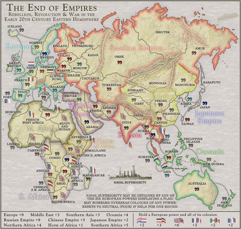
First, since we seem to be leaning against army circles (nobody complained when they were removed) the change requires rethinking where the army counts will go... you can't just drop a count on top of a mountain without a shadow for contrast. I've moved a lot of flags, borders, territory titles, and attack routes to better accommodate army counts sans-circles. I've stuck a lot of sample counts in there as examples.
Mountains... you either love them or hate them, with the exception of WM who actually came up with some suggestions.
The Australia range remains, but it is much less prominent I hope. The other ranges have had their highlights brought down and shadows brought up (love those dodge and burn tools) in hopes that they will contrast less with their surroundings. Also, I have added considerably more texture mountains to the landscape in more or less appropriate places. My hope is that everything blends together better now.WidowMakers wrote:First off the mountains are an important distinguishing feature that really helps the map out but at the same time I do not like how they look. Don’t get me wrong, I understand the purpose of them and I think that mountains need to be used but the implementation of them just does not feel right. Some of them just look like scars laid over the land (Eastern Russia and Australia). The mountains around China are very nice. I think they look good because they go from mountains to hills to flat land. The colors blend well and the entire image is integrated. The mountains I mentioned above just seen stuff on top of flat land. The ones in eastern Russia look good until the reddish bases don’t blend into the brown base of the map image. Same goes for the AU mountains too. I really think those should just be removed (I posted on that much earlier in the map development)
I would suggest that you take all names and colors and borders off of the map and try to make the mountains look integrated into the base image. Then once they look seamlessly integrated into the look, turn back on your other layers. That way colors and borders will not affect your mountain style.