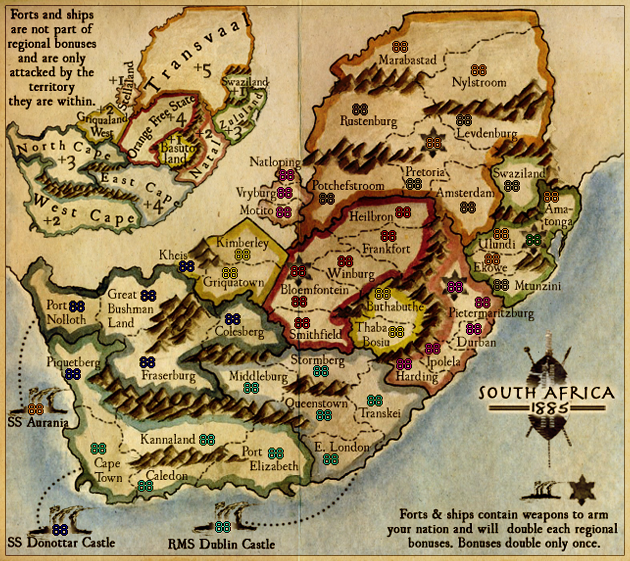
Nice update! I dig!
Nice touch with the shield in the bottom right. The Counter on Kheis (large) could be moved a tad to the right, Amatonga on the small too.
I like the coastlines but I think the western coast juts out a little abruptly, It should hug the side of the map a little longer up to about the mini map.
South Africa 1885
Moderator: Cartographers
Forum rules
Please read the Community Guidelines before posting.
Please read the Community Guidelines before posting.
-
The Bison King
- Posts: 1957
- Joined: Thu Aug 27, 2009 5:06 pm
- Location: the Mid-Westeros

-
Industrial Helix

- Posts: 3462
- Joined: Mon Jul 14, 2008 6:49 pm
- Gender: Female
- Location: Ohio
Re: S Africa 1885 - Another update p. 19 9/23
Don't get too concerned about the coordinates just yet, its not XML, just the numbers dropped on the psd file to gie an idea of how they're going to look on the map.
As for the coastline I'll make it a little more drawn out. As for darkening it... I'll see what I can do. Photoshop touch ups on the water color thing tend to be either really good or really bad and unconvincing.
As for the coastline I'll make it a little more drawn out. As for darkening it... I'll see what I can do. Photoshop touch ups on the water color thing tend to be either really good or really bad and unconvincing.
Sketchblog [Update 07/25/11]: http://indyhelixsketch.blogspot.com/
Living in Japan [Update 07/17/11]: http://mirrorcountryih.blogspot.com/
Russian Revolution map for ConquerClub [07/20/11]: http://www.conquerclub.com/forum/viewto ... 1&t=116575
Living in Japan [Update 07/17/11]: http://mirrorcountryih.blogspot.com/
Russian Revolution map for ConquerClub [07/20/11]: http://www.conquerclub.com/forum/viewto ... 1&t=116575
-
Victor Sullivan

- Posts: 6010
- Joined: Mon Feb 08, 2010 8:17 pm
- Gender: Male
- Location: Columbus, OH
- Contact:
Re: S Africa 1885 - Another update p. 19 9/23
This looks good!...except I can't quite ignore the strange white rectangle in the top-right hand corner... Otherwise it looks great! I think I'd like the blank canvas in the unplayable area more than a darkened area, but a test to see what it'd look like couldn't hurt 
-Sullaby
-Sullaby
Beckytheblondie: "Don't give us the dispatch, give us a mustache ride."
Scaling back on my CC involvement...
Scaling back on my CC involvement...
-
the.killing.44

- Posts: 4724
- Joined: Thu Oct 23, 2008 7:43 pm
- Gender: Male
- Location: now tell me what got two gums and knows how to spit rhymes
- Contact:
-
natty dread

- Posts: 12877
- Joined: Fri Feb 08, 2008 8:58 pm
- Location: just plain fucked
Re: S Africa 1885 - Another update p. 19 9/23
I think you could try making the paper look a bit older...

-
Victor Sullivan
- Posts: 6010
- Joined: Mon Feb 08, 2010 8:17 pm
- Gender: Male
- Location: Columbus, OH
- Contact:
Re: S Africa 1885 - Another update p. 19 9/23
Oo! Old skool, I like it. Good idea n-n-natty!natty_dread wrote:I think you could try making the paper look a bit older...
-S-S-S-Sully
Beckytheblondie: "Don't give us the dispatch, give us a mustache ride."
Scaling back on my CC involvement...
Scaling back on my CC involvement...
-
theBastard

- Posts: 994
- Joined: Sat Jan 09, 2010 9:05 am
Re: S Africa 1885 - Another update p. 19 9/23
the new look is nice. yes, the old look may helps.
-
Industrial Helix
- Posts: 3462
- Joined: Mon Jul 14, 2008 6:49 pm
- Gender: Female
- Location: Ohio
Re: S Africa 1885 - Another update p. 19 9/23
As in the white part or the actual paper as a whole?
Sketchblog [Update 07/25/11]: http://indyhelixsketch.blogspot.com/
Living in Japan [Update 07/17/11]: http://mirrorcountryih.blogspot.com/
Russian Revolution map for ConquerClub [07/20/11]: http://www.conquerclub.com/forum/viewto ... 1&t=116575
Living in Japan [Update 07/17/11]: http://mirrorcountryih.blogspot.com/
Russian Revolution map for ConquerClub [07/20/11]: http://www.conquerclub.com/forum/viewto ... 1&t=116575
-
Victor Sullivan
- Posts: 6010
- Joined: Mon Feb 08, 2010 8:17 pm
- Gender: Male
- Location: Columbus, OH
- Contact:
Re: S Africa 1885 - Another update p. 19 9/23
I think just the white part would be fine, but either could be good.
Beckytheblondie: "Don't give us the dispatch, give us a mustache ride."
Scaling back on my CC involvement...
Scaling back on my CC involvement...
-
theBastard
- Posts: 994
- Joined: Sat Jan 09, 2010 9:05 am
Re: S Africa 1885 - Another update p. 19 9/23
hm, maybe just white part and sea?Industrial Helix wrote:As in the white part or the actual paper as a whole?
-
porkenbeans

- Posts: 2546
- Joined: Mon Sep 10, 2007 4:06 pm
Re: S Africa 1885 - Another update p. 19 9/23
Here is one of my favorite textures for "old paper". Maybe you might want to play around with it.
- Click image to enlarge.


-
natty dread
- Posts: 12877
- Joined: Fri Feb 08, 2008 8:58 pm
- Location: just plain fucked
Re: S Africa 1885 - Another update p. 19 9/23
^ otherwise good but a bit too smudgy imo... I'd like this map to keep the clean look, while still making it look old.
There's tons of good old-paper-textures in deviantart for example.
There's tons of good old-paper-textures in deviantart for example.
-
porkenbeans
- Posts: 2546
- Joined: Mon Sep 10, 2007 4:06 pm
Re: S Africa 1885 - Another update p. 19 9/23
It can be made to be as "Smudgy" as you like.natty_dread wrote:^ otherwise good but a bit too smudgy imo... I'd like this map to keep the clean look, while still making it look old.
There's tons of good old-paper-textures in deviantart for example.
-
Industrial Helix
- Posts: 3462
- Joined: Mon Jul 14, 2008 6:49 pm
- Gender: Female
- Location: Ohio
Re: S Africa 1885 - Another update p. 19 9/23
I'll admit, it helped a little to give everything a more unified feel.
- Click image to enlarge.

- Click image to enlarge.

Sketchblog [Update 07/25/11]: http://indyhelixsketch.blogspot.com/
Living in Japan [Update 07/17/11]: http://mirrorcountryih.blogspot.com/
Russian Revolution map for ConquerClub [07/20/11]: http://www.conquerclub.com/forum/viewto ... 1&t=116575
Living in Japan [Update 07/17/11]: http://mirrorcountryih.blogspot.com/
Russian Revolution map for ConquerClub [07/20/11]: http://www.conquerclub.com/forum/viewto ... 1&t=116575
-
porkenbeans
- Posts: 2546
- Joined: Mon Sep 10, 2007 4:06 pm
Re: S Africa 1885 - Another update p. 19 9/23
Here is another one that I like.
With both- To get the border, I just reduced the image to 98%, Put a full size layer behind, and put a stroke on the reduced image.
It is all probably a little too dark for your taste, but the main idea is to "yellow" up the white. It may have started out white, but all old paper "yellow" with age.
- Click image to enlarge.
- Click image to enlarge.
It is all probably a little too dark for your taste, but the main idea is to "yellow" up the white. It may have started out white, but all old paper "yellow" with age.
-
Industrial Helix
- Posts: 3462
- Joined: Mon Jul 14, 2008 6:49 pm
- Gender: Female
- Location: Ohio
Re: S Africa 1885 - Another update p. 19 9/23
The border is nice and I'm unsure if I like the fold or not, but the color is too dark and too... brownish. My goal was to grunge things up, which I think I did reasonably well through applying light tones and dry brushing. But I don't want the map to be too old looking.
Sketchblog [Update 07/25/11]: http://indyhelixsketch.blogspot.com/
Living in Japan [Update 07/17/11]: http://mirrorcountryih.blogspot.com/
Russian Revolution map for ConquerClub [07/20/11]: http://www.conquerclub.com/forum/viewto ... 1&t=116575
Living in Japan [Update 07/17/11]: http://mirrorcountryih.blogspot.com/
Russian Revolution map for ConquerClub [07/20/11]: http://www.conquerclub.com/forum/viewto ... 1&t=116575
-
natty dread
- Posts: 12877
- Joined: Fri Feb 08, 2008 8:58 pm
- Location: just plain fucked
Re: S Africa 1885 - Another update p. 19 9/23
Well if you would do something similar what pork did, but put the paper layer below the bonus area colours, I think it would look fine. But then again I'm not sure you can do that since you used water colour... 
-
Industrial Helix
- Posts: 3462
- Joined: Mon Jul 14, 2008 6:49 pm
- Gender: Female
- Location: Ohio
Re: S Africa 1885 - Another update p. 19 9/23
Well, I'm not sure that it is necessary or even desirable. I'm of the opinion that the map is grungy enough and still maintains clarity.natty_dread wrote:Well if you would do something similar what pork did, but put the paper layer below the bonus area colours, I think it would look fine. But then again I'm not sure you can do that since you used water colour...
Sketchblog [Update 07/25/11]: http://indyhelixsketch.blogspot.com/
Living in Japan [Update 07/17/11]: http://mirrorcountryih.blogspot.com/
Russian Revolution map for ConquerClub [07/20/11]: http://www.conquerclub.com/forum/viewto ... 1&t=116575
Living in Japan [Update 07/17/11]: http://mirrorcountryih.blogspot.com/
Russian Revolution map for ConquerClub [07/20/11]: http://www.conquerclub.com/forum/viewto ... 1&t=116575
-
Victor Sullivan
- Posts: 6010
- Joined: Mon Feb 08, 2010 8:17 pm
- Gender: Male
- Location: Columbus, OH
- Contact:
Re: S Africa 1885 - Another update p. 19 9/23
I'm gonna have to agree with IH on this one. I think it looks fine now (without pork's inserted "old paper" back/foreground). I definitely have some issues with the crease in the center.Industrial Helix wrote:Well, I'm not sure that it is necessary or even desirable. I'm of the opinion that the map is grungy enough and still maintains clarity.natty_dread wrote:Well if you would do something similar what pork did, but put the paper layer below the bonus area colours, I think it would look fine. But then again I'm not sure you can do that since you used water colour...
-Sully
Beckytheblondie: "Don't give us the dispatch, give us a mustache ride."
Scaling back on my CC involvement...
Scaling back on my CC involvement...
-
porkenbeans
- Posts: 2546
- Joined: Mon Sep 10, 2007 4:06 pm
Re: S Africa 1885 - Another update p. 19 9/23
Yes, I realize that it is dark and grungy, but I was only trying to show how far you could take it. The main thrust off the suggestion, is that the white on the map needs to be "yellowed" to some extent, to successfully pull off the illusion, of an antique map from this period. How much you decide is just that, What YOU decide.
Also please take into account that I was forced to put these layers "over" everything, including the text. Anything that you can do to sell the illusion of an antique map, will help you out here, as it does have a pristine and modern feel, that is fighting against the illusion.
Creases, folds, tares, moldy discolorations, and especially knocking down the Whiteness, will help on this front. Most maps that are 125 years, old will have some degree of degradation.
-
The Bison King
- Posts: 1957
- Joined: Thu Aug 27, 2009 5:06 pm
- Location: the Mid-Westeros
Re: S Africa 1885 - Another update p. 19 9/23
Well I kind of like that this looks like an old map, when it was new.
-
porkenbeans
- Posts: 2546
- Joined: Mon Sep 10, 2007 4:06 pm
Re: S Africa 1885 - Another update p. 19 9/23
Yes, I like that idea in general, and have suggested the same thing on other maps. However, that requires that you have elements that all go directly to the period. In this case, among other things, you would need to do all of the labeling by hand. Which come to think of it, might be a very good idea. Take a look at the old map that was the inspiration for this one. It would really do this map good, if the text was just like that.The Bison King wrote:Well I kind of like that this looks like an old map, when it was new.
-
AndyDufresne

- Posts: 24932
- Joined: Fri Mar 03, 2006 8:22 pm
- Location: A Banana Palm in Zihuatanejo
- Contact:
Re: S Africa 1885 - Another update p. 19 9/23
I really like the water color feel IH has in his latest post. Perhaps if the non-playable land area was not as light as it is---color/intensity wise---and it was darker, it'd give a more cohesive feel. But I like what you've got going on up in this house.
--Andy
--Andy
-
the.killing.44
- Posts: 4724
- Joined: Thu Oct 23, 2008 7:43 pm
- Gender: Male
- Location: now tell me what got two gums and knows how to spit rhymes
- Contact:
Re: S Africa 1885 - Another update p. 19 9/23
Hey is that 1550 font? Solid choice.
I think your version is bascially done on the graphic s side.pork is too over the top per usual.
I think your version is bascially done on the graphic s side.pork is too over the top per usual.
-
Industrial Helix
- Posts: 3462
- Joined: Mon Jul 14, 2008 6:49 pm
- Gender: Female
- Location: Ohio
Re: S Africa 1885 - Another update p. 19 9/23
Yeah it is 1550, one of my left over choices from 13 Colonies. I was trying out new fonts for the painted map and this one was one of the first. It works I think.
I also think that the brownish tint to the non-playable map is too orangy. So that is now fixed.
I also think the old logo needs to go in all its lameness. Time to replace it with something a little more in line with the rest of the map.
I also aligned the text in the corners to the corners, as opposed to centered.
- Click image to enlarge.
- Click image to enlarge.

Sketchblog [Update 07/25/11]: http://indyhelixsketch.blogspot.com/
Living in Japan [Update 07/17/11]: http://mirrorcountryih.blogspot.com/
Russian Revolution map for ConquerClub [07/20/11]: http://www.conquerclub.com/forum/viewto ... 1&t=116575
Living in Japan [Update 07/17/11]: http://mirrorcountryih.blogspot.com/
Russian Revolution map for ConquerClub [07/20/11]: http://www.conquerclub.com/forum/viewto ... 1&t=116575