Arctic Map [Quenched]
Moderator: Cartographers
Forum rules
Please read the Community Guidelines before posting.
Please read the Community Guidelines before posting.
-
Bad Speler
- Posts: 1027
- Joined: Fri Jun 02, 2006 8:16 pm
- Gender: Male
- Location: Ottawa
- Contact:
-
DublinDoogey

- Posts: 329
- Joined: Tue Feb 28, 2006 7:03 pm
- Location: Wisconsin
-
Bad Speler
- Posts: 1027
- Joined: Fri Jun 02, 2006 8:16 pm
- Gender: Male
- Location: Ottawa
- Contact:
-
happysadfun

- Posts: 1251
- Joined: Mon Jul 10, 2006 9:06 pm
- Location: Haundin at DotSco, Being Sad that Mark Green Lost in Suburban Wisconsin
it's almost as bad as mine  which in my eyes is ok. but the textures are a little bit... ehh *moves side of hand in seesaw-like fashion* and it's tough determining which queen elizabeth islands are part of which country. and btw, murmansk is considered scandinavia by most people.
 Children, this is what happens to hockey players, druggies, and Hillary Clinton.
Rope. Tree. Hillary. Some assembly required.
-
Bad Speler
- Posts: 1027
- Joined: Fri Jun 02, 2006 8:16 pm
- Gender: Male
- Location: Ottawa
- Contact:

-
gavin_sidhu

- Posts: 1428
- Joined: Mon May 22, 2006 6:16 am
- Location: Brisbane, Australia
-
reverend_kyle

- Posts: 9250
- Joined: Tue Mar 21, 2006 4:08 pm
- Location: 1000 post club
- Contact:
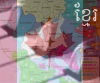
Really, the font is terrible. Also, I believe the texture could be more soft.
The borders, some are thinner than others, and they are blocky.
Terrible route lines.
You could change the colour scheme, near continents have alike colours. Those Aleutian islands are an example. Europe and N. Islands too. Anyway, the colours at the legend are pretty different from those on the map.
The green continent is very difficult to understand, I cant see the territories properly. Maybe you can merge some islands.
There is a gray island connected to Jaymyr, whats that?
And sincerely, why a so small map?? Even to the small version, it could be bigger.
I have little time now, but I can help with bonuses later.

-
Bad Speler
- Posts: 1027
- Joined: Fri Jun 02, 2006 8:16 pm
- Gender: Male
- Location: Ottawa
- Contact:
As with the map size, it is 600 pixels wide (the max), and 350 pixels in height (again following the guidelines). As with the font, it seems to be a concensus that its horrible, so I will change it. I will try to find a better texture, and colours. The reason that some of the colours on the legend is a bit different from those on the actual continent, is because those colours are hard to see on the blue background. The island attached to Taymyr is part of Nenets, I'll try to make that clearer.Marvaddin wrote:Really, the font is terrible. Also, I believe the texture could be more soft.
The borders, some are thinner than others, and they are blocky.
Terrible route lines.
You could change the colour scheme, near continents have alike colours. Those Aleutian islands are an example. Europe and N. Islands too. Anyway, the colours at the legend are pretty different from those on the map.
The green continent is very difficult to understand, I cant see the territories properly. Maybe you can merge some islands.
There is a gray island connected to Jaymyr, whats that?
And sincerely, why a so small map?? Even to the small version, it could be bigger.
I checked on Wikipedia, it does not say anything about murmansk being scandinavian. http://en.wikipedia.org/wiki/Scandinavia If you check near the bottom of the page, where it says "The Nordic Countries vs. Scandinavia," it lists the scandinavian areas. Apparently Iceland and Greenland are a part of scandinavia. Greenland, I know, is traditionally known as North American. I am stuck as to what to do with it, follow tradition, and keep it at it's current continent, or change it to Scandinavia.happysadfun wrote: and btw, murmansk is considered scandinavia by most people.
It looks like I have work to do.
Highest Score: 2532
Highest Position: 69 (a long time ago)
Highest Position: 69 (a long time ago)
-
Bad Speler
- Posts: 1027
- Joined: Fri Jun 02, 2006 8:16 pm
- Gender: Male
- Location: Ottawa
- Contact:
-
reverend_kyle
- Posts: 9250
- Joined: Tue Mar 21, 2006 4:08 pm
- Location: 1000 post club
- Contact:
-
Bad Speler
- Posts: 1027
- Joined: Fri Jun 02, 2006 8:16 pm
- Gender: Male
- Location: Ottawa
- Contact:
Arctic map
Here is an update.

Here are the changes I made:
P.S. Rev Kyle, you can borrow the colours on my map for your Antarctica map.

Here are the changes I made:
- I got rid of B.C. (it was too small), and added Nenets Island.
- Added Iceland to Scandinavia.
- Changed all Bonuses accordingly
- Change font finally...
- Changed texture.
- Changed colours, so that bordering continents have similar colours.
P.S. Rev Kyle, you can borrow the colours on my map for your Antarctica map.
Highest Score: 2532
Highest Position: 69 (a long time ago)
Highest Position: 69 (a long time ago)
-
gavin_sidhu
- Posts: 1428
- Joined: Mon May 22, 2006 6:16 am
- Location: Brisbane, Australia
...the texture in this edit is horendous. The font aint that much better. U should have added BC to the NW Territories because right now N America is very very linear. i also think N America is worth too much, 4 men for a 5 country continent with 2 borders? Africa in the classic has 6 countries, 3 borders and only 3 reinforcements.
Highest Score: 1843 Ranking (Australians): 3
-
reverend_kyle
- Posts: 9250
- Joined: Tue Mar 21, 2006 4:08 pm
- Location: 1000 post club
- Contact:
Re: Arctic map
I like the mostly blue thing i have going on..Bad Speler wrote:Here is an update.
Here are the changes I made:It looks a bit crowded, I might shrink the font size.
- I got rid of B.C. (it was too small), and added Nenets Island.
- Added Iceland to Scandinavia.
- Changed all Bonuses accordingly
- Change font finally...
- Changed texture.
- Changed colours, so that bordering continents have similar colours.
P.S. Rev Kyle, you can borrow the colours on my map for your Antarctica map.
oh, and I suggest you re draw somethings.. the non to scale ness of great britain.. scandinavia and stuff is driving me nuts.
DANCING MUSTARD FOR POOP IN '08!
-
Bad Speler
- Posts: 1027
- Joined: Fri Jun 02, 2006 8:16 pm
- Gender: Male
- Location: Ottawa
- Contact:
You missed the Aleutian Islands. With it, its 6 countries and 3 borders. I'll change the texture and font yet again.gavin_sidhu wrote:...the texture in this edit is horendous. The font aint that much better. U should have added BC to the NW Territories because right now N America is very very linear. i also think N America is worth too much, 4 men for a 5 country continent with 2 borders? Africa in the classic has 6 countries, 3 borders and only 3 reinforcements.
I basically traced it off a map, it should be up to scale.reverend kyle wrote:oh, and I suggest you re draw somethings.. the non to scale ness of great britain.. scandinavia and stuff is driving me nuts.
Highest Score: 2532
Highest Position: 69 (a long time ago)
Highest Position: 69 (a long time ago)
-
reverend_kyle
- Posts: 9250
- Joined: Tue Mar 21, 2006 4:08 pm
- Location: 1000 post club
- Contact:
-
D.IsleRealBrown

- Posts: 668
- Joined: Tue Jul 25, 2006 1:48 pm
- Location: Abroad


-
Bad Speler
- Posts: 1027
- Joined: Fri Jun 02, 2006 8:16 pm
- Gender: Male
- Location: Ottawa
- Contact:
-
D.IsleRealBrown
- Posts: 668
- Joined: Tue Jul 25, 2006 1:48 pm
- Location: Abroad


-
Bad Speler
- Posts: 1027
- Joined: Fri Jun 02, 2006 8:16 pm
- Gender: Male
- Location: Ottawa
- Contact:
Friend, you can use a bigger size, we have no maps here with that size, only classic (where names can be under armies, because everyone knows it). Anyway, I use 800x600 resolution, and I need scroll even with classic map, so there is no problem about this.
The font is now readable, but a simple and sad one. Of course, you can find a more beautiful one, and maybe having a bigger size, and changing borders colours from black to gray (for example) can help you.
The texture is even more heavy, maybe you can try something soft.
You still can think about positioning routes and names better. For example, there are routes in strange places, like Chutkotka to Alaska and Victoria to Nunavut. Using a better colour they will be visible, so no need to strange locations. See Madagan name... terrible, Moscow too. The bigger size will help a lot.
And exchange pink and one green continent would be good. The idea is, neighbour continents shouldnt have alike colours.
-
Bad Speler
- Posts: 1027
- Joined: Fri Jun 02, 2006 8:16 pm
- Gender: Male
- Location: Ottawa
- Contact:
600 pixels is the absolute max for small maps. I could expand it up and down, but I dont understand how it could help, without being able to expand left and right. Also now I have one person who is saying bordering continents should be similar in colour, and one person saying they shouldnt. I'll stick with the same colours for now, and might change it later.Marvaddin wrote:Friend, you can use a bigger size, we have no maps here with that size, only classic (where names can be under armies, because everyone knows it). Anyway, I use 800x600 resolution, and I need scroll even with classic map, so there is no problem about this.
The font is now readable, but a simple and sad one. Of course, you can find a more beautiful one, and maybe having a bigger size, and changing borders colours from black to gray (for example) can help you.
The texture is even more heavy, maybe you can try something soft.
You still can think about positioning routes and names better. For example, there are routes in strange places, like Chutkotka to Alaska and Victoria to Nunavut. Using a better colour they will be visible, so no need to strange locations. See Madagan name... terrible, Moscow too. The bigger size will help a lot.
And exchange pink and one green continent would be good. The idea is, neighbour continents shouldnt have alike colours.
Edit: And by the way, the classic map is smaller than mine. So is Asia and Space.
Highest Score: 2532
Highest Position: 69 (a long time ago)
Highest Position: 69 (a long time ago)