Sorry natty, I don't understand?natty_dread wrote:How about classic Risk-type territories? You know, instead of black/dark lines separating territories, separate them by differences in lightness, in a mosaic like thing...
The map is small enough, with few enough bonuses and territories, that you could probably pull it off... I think it could work for the map.
[Abandoned] - Portugal Gfx Revamp
Moderator: Cartographers
Forum rules
Please read the Community Guidelines before posting.
Please read the Community Guidelines before posting.
-
gimil

- Posts: 8599
- Joined: Sat Mar 03, 2007 12:42 pm
- Gender: Male
- Location: United Kingdom (Scotland)
Re: Portugal [REVAMP] update p.1
What do you know about map making, bitch?
Top Score:2403natty_dread wrote:I was wrong
-
Ace Rimmer

- Posts: 1911
- Joined: Mon Dec 01, 2008 1:22 pm
- Gender: Male
Re: Portugal [REVAMP] update p.1
thoughts:
- I like the softer look of this map.
- I like the idea of changing it to a north/south orientation, but if not I think the ocean above the date would be a good spot for a compass to show the orientation
- For Spain, what about a light copy of the Spanish flag, or maybe some of the physical terrain in a grayscale/washed out way?
- I like how Acores Oriental is not on top of the islands, you should move the other names off as well. I like having the army numbers in the sea with no circles and the lines connected to them, just like the current version.
- What are you going to do for the impassables you left off this version? For example, Setubal now borders Alcacer do Sal. I don't know the geography of Portugal, but I'd love to see some mountains or other physical terrain in there instead of the flat look.
- I don't mind the font on the terits, I'd consider changing the font for the title and the legend, I don't like that one so big and in all caps.
- You changed Alentejo from a +6 to a +8, and forgot Ilhas in the legend.
- My suggestion for a neutral would be a neutral 2 on Faro. A lot of action is around Algarve, and eh neutral would make that a slightly more difficult bonus to get. I don't know if making that bonus tougher to obtain will affect the game too much, but that would be my vote. Otherwise it will just be a throwaway neutral somewhere that is never taken. If you don't want to do a coded neutral, you could set up 4 starting positions and the unused positions in 2p/3p would start neutral. So 36 terits - 4 starting positions = 32 terits. 32/3 = 10 terits rounded down, plus the 1 starting position would yield 11 territories each in a 2p/3p game (with 14 neutrals in 2p and 3 neutrals in 3p). In 4p+ games there would be no coded neutrals.
-
gimil
- Posts: 8599
- Joined: Sat Mar 03, 2007 12:42 pm
- Gender: Male
- Location: United Kingdom (Scotland)
Re: Portugal [REVAMP] update p.1
Cheers rimmer.Ace Rimmer wrote:thoughts:
- I like the softer look of this map.
- I like the idea of changing it to a north/south orientation, but if not I think the ocean above the date would be a good spot for a compass to show the orientation
Still an area very much up for debate, thanks for your input
- For Spain, what about a light copy of the Spanish flag, or maybe some of the physical terrain in a grayscale/washed out way?
Since this map i very soft, adding textures, or flags or terrain leads to the opposite effect to what I want for the map (soft). I tried to reincorporate washed out images on the gery areas, like I did on the last Portugal but it didn't work. I want to do something in the spaces but nothing seems to be working, and I don't think this suggestion will work either, sorry.
- I like how Acores Oriental is not on top of the islands, you should move the other names off as well. I like having the army numbers in the sea with no circles and the lines connected to them, just like the current version.
Yes, it will look fine I think once army numbers have been dropped onto it.
- What are you going to do for the impassables you left off this version? For example, Setubal now borders Alcacer do Sal. I don't know the geography of Portugal, but I'd love to see some mountains or other physical terrain in there instead of the flat look.
The impassable were a total bitch to do last time. I intend to remaking rivers for impassable, when I find the motivation to start them!
- I don't mind the font on the terits, I'd consider changing the font for the title and the legend, I don't like that one so big and in all caps.
I have already went a picked a new font for the territories. Why don't you like the title/legends text? I love it, really adds to the soft vibrant feel of this map.
- You changed Alentejo from a +6 to a +8, and forgot Ilhas in the legend.
Fixed for next version.
- My suggestion for a neutral would be a neutral 2 on Faro. A lot of action is around Algarve, and eh neutral would make that a slightly more difficult bonus to get. I don't know if making that bonus tougher to obtain will affect the game too much, but that would be my vote. Otherwise it will just be a throwaway neutral somewhere that is never taken. If you don't want to do a coded neutral, you could set up 4 starting positions and the unused positions in 2p/3p would start neutral. So 36 terits - 4 starting positions = 32 terits. 32/3 = 10 terits rounded down, plus the 1 starting position would yield 11 territories each in a 2p/3p game (with 14 neutrals in 2p and 3 neutrals in 3p). In 4p+ games there would be no coded neutrals.
Adding a neutral to Faro is a perfect idea to both solve dropping the algarve bonus and 2-3 player games.
What do you know about map making, bitch?
Top Score:2403natty_dread wrote:I was wrong
-
koontz1973
- Posts: 6960
- Joined: Thu Jan 01, 2009 10:57 am
Re: Portugal [REVAMP] update p.1
No reason other than preference. It always seems strange to have them floating in nothing and not anchored .gimil wrote: Any particular reason for this other than personal preference? I think having the number between the islands is tidier.
Cheers for your feedback, Koontz.
They are army numbers, not navy numbers.

-
natty dread

- Posts: 12876
- Joined: Fri Feb 08, 2008 8:58 pm
- Location: just plain fucked
Re: Portugal [REVAMP] update p.1
This is the best image I could findgimil wrote:Sorry natty, I don't understand?natty_dread wrote:How about classic Risk-type territories? You know, instead of black/dark lines separating territories, separate them by differences in lightness, in a mosaic like thing...
The map is small enough, with few enough bonuses and territories, that you could probably pull it off... I think it could work for the map.
Last edited by natty dread on Fri Sep 09, 2011 12:51 pm, edited 1 time in total.

-
ManBungalow
- Posts: 3431
- Joined: Sun Jan 13, 2008 7:02 am
- Location: On a giant rock orbiting a star somewhere
Re: Portugal [REVAMP] update p.1
I approve of this, and already prefer the update.
However, I think you're missing some impassables in the very centre of the map around that blue bonus.
However, I think you're missing some impassables in the very centre of the map around that blue bonus.

-
gimil
- Posts: 8599
- Joined: Sat Mar 03, 2007 12:42 pm
- Gender: Male
- Location: United Kingdom (Scotland)
Re: Portugal [REVAMP] update p.1
Yes I am I intending on getting back to them at some pointManBungalow wrote:I approve of this, and already prefer the update.
However, I think you're missing some impassables in the very centre of the map around that blue bonus.
What do you know about map making, bitch?
Top Score:2403natty_dread wrote:I was wrong
-
gimil
- Posts: 8599
- Joined: Sat Mar 03, 2007 12:42 pm
- Gender: Male
- Location: United Kingdom (Scotland)
Re: Portugal [REVAMP] update p.1
Sorry natty, that look would move away from what I want from the map.natty_dread wrote:This is the best image I could findgimil wrote:Sorry natty, I don't understand?natty_dread wrote:How about classic Risk-type territories? You know, instead of black/dark lines separating territories, separate them by differences in lightness, in a mosaic like thing...
The map is small enough, with few enough bonuses and territories, that you could probably pull it off... I think it could work for the map.
What do you know about map making, bitch?
Top Score:2403natty_dread wrote:I was wrong
-
gimil
- Posts: 8599
- Joined: Sat Mar 03, 2007 12:42 pm
- Gender: Male
- Location: United Kingdom (Scotland)
Re: Portugal [REVAMP] ver. 2, p.3
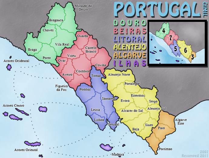
Update time!
Done:
-Changed Alentejo bonus back to 6
-Changed the territory font to something the fits inside more territories.
-Added the Ilhas to the minimap
TODO/Areas for discussion:
-More discussion on map orientation needed.
-What to do with dead space (if orientation changes this may not be an issue).
-Add impassables.
-Add a neutral to one of the Algarve terrs (is this 100% a good idea?).
- Click image to enlarge.
-Changed Alentejo bonus back to 6
-Changed the territory font to something the fits inside more territories.
-Added the Ilhas to the minimap
TODO/Areas for discussion:
-More discussion on map orientation needed.
-What to do with dead space (if orientation changes this may not be an issue).
-Add impassables.
-Add a neutral to one of the Algarve terrs (is this 100% a good idea?).
What do you know about map making, bitch?
Top Score:2403natty_dread wrote:I was wrong
-
Victor Sullivan

- Posts: 6010
- Joined: Mon Feb 08, 2010 8:17 pm
- Gender: Male
- Location: Columbus, OH
- Contact:
Re: Portugal [REVAMP] ver. 2, p.3
You're missing Ilhas' bonus on the minimap.
-Sully
-Sully
Beckytheblondie: "Don't give us the dispatch, give us a mustache ride."
Scaling back on my CC involvement...
Scaling back on my CC involvement...
-
gimil
- Posts: 8599
- Joined: Sat Mar 03, 2007 12:42 pm
- Gender: Male
- Location: United Kingdom (Scotland)
Re: Portugal [REVAMP] ver. 2, p.3
Cheers vicky! Has been updated and will be posted in the next draft.Victor Sullivan wrote:You're missing Ilhas' bonus on the minimap.
-Sully
What do you know about map making, bitch?
Top Score:2403natty_dread wrote:I was wrong
-
DiM

- Posts: 10415
- Joined: Wed Feb 14, 2007 6:20 pm
- Gender: Male
- Location: making maps for scooby snacks
Re: Portugal [REVAMP] v2, P.1&3
what's wrong with the font? some letters are smaller than others. the r,n,v,u,t are very small. disturbingly small.
“In the beginning God said, the four-dimensional divergence of an antisymmetric, second rank tensor equals zero, and there was light, and it was good. And on the seventh day he rested.”- Michio Kaku
-
gimil
- Posts: 8599
- Joined: Sat Mar 03, 2007 12:42 pm
- Gender: Male
- Location: United Kingdom (Scotland)
Re: Portugal [REVAMP] v2, P.1&3
Yeah I know. Its a bit quirky but I like it.DiM wrote:what's wrong with the font? some letters are smaller than others. the r,n,v,u,t are very small. disturbingly small.
What do you know about map making, bitch?
Top Score:2403natty_dread wrote:I was wrong
-
koontz1973
- Posts: 6960
- Joined: Thu Jan 01, 2009 10:57 am
Re: Portugal [REVAMP] v2, P.1&3
Glad it is you. Cannot think of a new map maker getting away with a font like that.gimil wrote:Yeah I know. Its a bit quirky but I like it.DiM wrote:what's wrong with the font? some letters are smaller than others. the r,n,v,u,t are very small. disturbingly small.
It is very nice but it plays games with the eyes.
-
koontz1973
- Posts: 6960
- Joined: Thu Jan 01, 2009 10:57 am
Re: Portugal [REVAMP] v2, P.1&3
Orientation, why not try it and see if you like it. If you do not then end of subject, if you think it might work, post a draft for us to look at.
Dead space - you have the skills, why not give it a nice land look.
About the neutral, I bloody hate them, please do not add one. Let the luck of the drop be enough.
Dead space - you have the skills, why not give it a nice land look.
About the neutral, I bloody hate them, please do not add one. Let the luck of the drop be enough.
-
gimil
- Posts: 8599
- Joined: Sat Mar 03, 2007 12:42 pm
- Gender: Male
- Location: United Kingdom (Scotland)
Re: Portugal [REVAMP] v2, P.1&3
Really? Is it that bad?koontz1973 wrote:Glad it is you. Cannot think of a new map maker getting away with a font like that.gimil wrote:Yeah I know. Its a bit quirky but I like it.DiM wrote:what's wrong with the font? some letters are smaller than others. the r,n,v,u,t are very small. disturbingly small.
It is very nice but it plays games with the eyes.
Does anyone else think is also?
What do you know about map making, bitch?
Top Score:2403natty_dread wrote:I was wrong
-
gimil
- Posts: 8599
- Joined: Sat Mar 03, 2007 12:42 pm
- Gender: Male
- Location: United Kingdom (Scotland)
Re: Portugal [REVAMP] v2, P.1&3
The thing is 'just trying' it is alot of work in itself. I don't want to go through it that just to see, I need to be sure it is a good investment of my (limited) time. I don't mind doing it if there is a decent consensus.koontz1973 wrote:Orientation, why not try it and see if you like it. If you do not then end of subject, if you think it might work, post a draft for us to look at.
Dead space - you have the skills, why not give it a nice land look.
About the neutral, I bloody hate them, please do not add one. Let the luck of the drop be enough.
What do you know about map making, bitch?
Top Score:2403natty_dread wrote:I was wrong
-
natty dread
- Posts: 12876
- Joined: Fri Feb 08, 2008 8:58 pm
- Location: just plain fucked
Re: Portugal [REVAMP] v2, P.1&3
One thing I don't like about the visual style of this map is the high brightness of the ocean. It's disturbing somehow, I think the map would look loads better with a darker ocean. Maybe bring it on the same level of luminosity as the neutral land area.
And yeah, that font must go... territory names need to be written with a clear, easy-to-read font, not something that looks like leetspeak.
And yeah, that font must go... territory names need to be written with a clear, easy-to-read font, not something that looks like leetspeak.
-
gimil
- Posts: 8599
- Joined: Sat Mar 03, 2007 12:42 pm
- Gender: Male
- Location: United Kingdom (Scotland)
Re: Portugal [REVAMP] v2, P.1&3
I shall play with the saturation and tones to see what I can come up with.natty_dread wrote:One thing I don't like about the visual style of this map is the high brightness of the ocean. It's disturbing somehow, I think the map would look loads better with a darker ocean. Maybe bring it on the same level of luminosity as the neutral land area.
Yeah, people ain't digging this font. I shall have to find another.And yeah, that font must go... territory names need to be written with a clear, easy-to-read font, not something that looks like leetspeak.
What do you know about map making, bitch?
Top Score:2403natty_dread wrote:I was wrong
-
gimil
- Posts: 8599
- Joined: Sat Mar 03, 2007 12:42 pm
- Gender: Male
- Location: United Kingdom (Scotland)
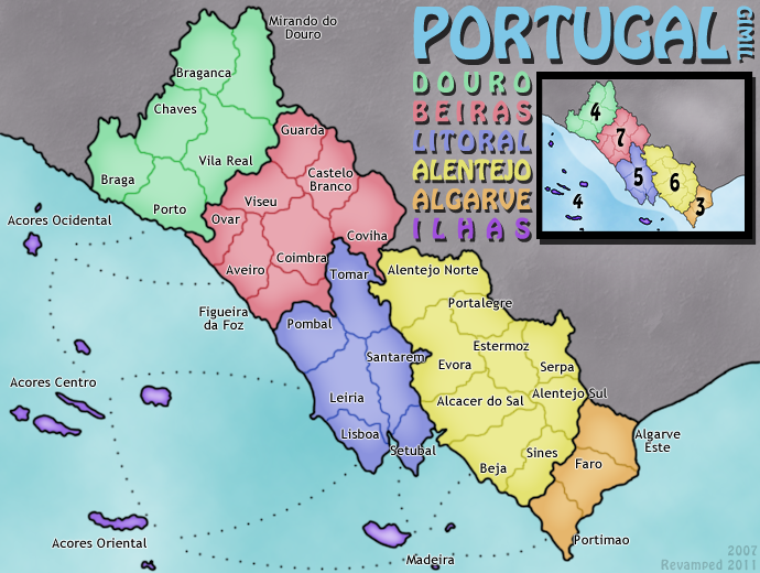
Re: Portugal [REVAMP] v3, P.1&3
Here you are:
Done:
-Changed tone of the ocean
-Tried another, less quirky font.
TODO/Areas for discussion:
-More discussion on map orientation needed.
-What to do with dead space (if orientation changes this may not be an issue).
-Add impassables.
-Add a neutral to one of the Algarve terrs (is this 100% a good idea?).
- Click image to enlarge.
-Changed tone of the ocean
-Tried another, less quirky font.
TODO/Areas for discussion:
-More discussion on map orientation needed.
-What to do with dead space (if orientation changes this may not be an issue).
-Add impassables.
-Add a neutral to one of the Algarve terrs (is this 100% a good idea?).
What do you know about map making, bitch?
Top Score:2403natty_dread wrote:I was wrong

Re: Portugal [REVAMP] v3, P.1&3
gimil, i'd like to see more of an north south RL orientation.gimil wrote:...
-More discussion on map orientation needed.
...

* Pearl Harbour * Waterloo * Forbidden City * Jamaica * Pot Mosbi
-
gimil
- Posts: 8599
- Joined: Sat Mar 03, 2007 12:42 pm
- Gender: Male
- Location: United Kingdom (Scotland)
Re: Portugal [REVAMP] v3, P.1&3
Yes this does seem to be the idea people are leaning towards. I think I shall incorporate it into my next update and see how it goes.cairnswk wrote:gimil, i'd like to see more of an north south RL orientation.gimil wrote:...
-More discussion on map orientation needed.
...
What do you know about map making, bitch?
Top Score:2403natty_dread wrote:I was wrong
-
ManBungalow
- Posts: 3431
- Joined: Sun Jan 13, 2008 7:02 am
- Location: On a giant rock orbiting a star somewhere
Re: Portugal [REVAMP] v3, P.1&3
I approve of the diagonal orientation. The long, thin shape of the country (even with the islands adding some width to the map) translates better to a CC map better in the slanted position. Put a compass on there and job's a good one. Also, the current version is true to how the map already is. You could change it all, but I'm sure some people would just throw a fit.
-
gimil
- Posts: 8599
- Joined: Sat Mar 03, 2007 12:42 pm
- Gender: Male
- Location: United Kingdom (Scotland)
Re: Portugal [REVAMP] v3, P.1&3
Suddenly the issue once again, becomes unresolvedManBungalow wrote:I approve of the diagonal orientation. The long, thin shape of the country (even with the islands adding some width to the map) translates better to a CC map better in the slanted position. Put a compass on there and job's a good one. Also, the current version is true to how the map already is. You could change it all, but I'm sure some people would just throw a fit.
What do you know about map making, bitch?
Top Score:2403natty_dread wrote:I was wrong
-
ManBungalow
- Posts: 3431
- Joined: Sun Jan 13, 2008 7:02 am
- Location: On a giant rock orbiting a star somewhere
Re: Portugal [REVAMP] v3, P.1&3
Indeed. Just a welcome back to the thankless battle that is the Map Foundry.