
Portugal [Quenched]
Moderator: Cartographers
Forum rules
Please read the Community Guidelines before posting.
Please read the Community Guidelines before posting.


this map is really nice
the first thing i noticed is that your continent colours are exactly the same ones that i used for my map below
i think its a coincidence, since even before i had used those colours you already used them, while this is the first time im looking at this map
are you sure you want the continents to glow in the centre?
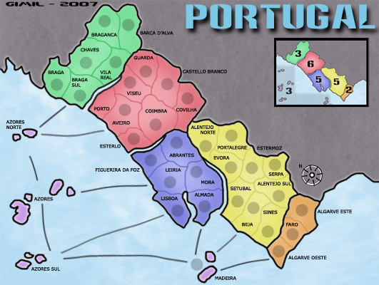
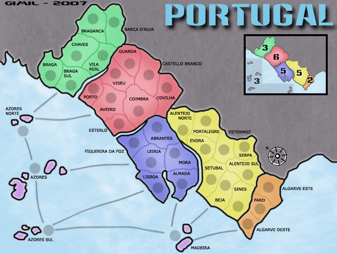
and maybe instead of explaining the bonus for the islands you could draw a translucent grey shape over them and put the 3 there. its much better
andy is right 5 is too many for blue
and maybe you want to lower red's bonus, it has 8 continents while yellow has 9. surely yellow deserves a better bonus
maybe you could add some background image or something, maybe even a flag or something to represent portugal
keep up the good work
the first thing i noticed is that your continent colours are exactly the same ones that i used for my map below
i think its a coincidence, since even before i had used those colours you already used them, while this is the first time im looking at this map
are you sure you want the continents to glow in the centre?
and maybe instead of explaining the bonus for the islands you could draw a translucent grey shape over them and put the 3 there. its much better
andy is right 5 is too many for blue
and maybe you want to lower red's bonus, it has 8 continents while yellow has 9. surely yellow deserves a better bonus
maybe you could add some background image or something, maybe even a flag or something to represent portugal
keep up the good work
Gain the upper hand
-
gimil

- Posts: 8599
- Joined: Sat Mar 03, 2007 12:42 pm
- Gender: Male
- Location: United Kingdom (Scotland)
Yes lol and its had no complaints till now so shhhhhhhhhh lolhaoala wrote: are you sure you want the continents to glow in the centre?
Ill see waht i can do although i dont see it as to much of a problemhaoala wrote: and maybe instead of explaining the bonus for the islands you could draw a translucent grey shape over them and put the 3 there. its much better
Were working on ithaoala wrote: andy is right 5 is too many for blue

It only takes 3 terrs to hold yellow. but there more sea connections goign in to try and balance out teh game.haoala wrote: and maybe you want to lower red's bonus, it has 8 continents while yellow has 9. surely yellow deserves a better bonus
I tried the flag but the color are to strong. Maby if someone can give me a picture and suggest how i use it then i will.haoala wrote: maybe you could add some background image or something, maybe even a flag or something to represent portugal
-
gimil
- Posts: 8599
- Joined: Sat Mar 03, 2007 12:42 pm
- Gender: Male
- Location: United Kingdom (Scotland)
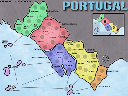
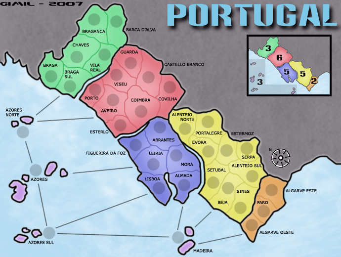
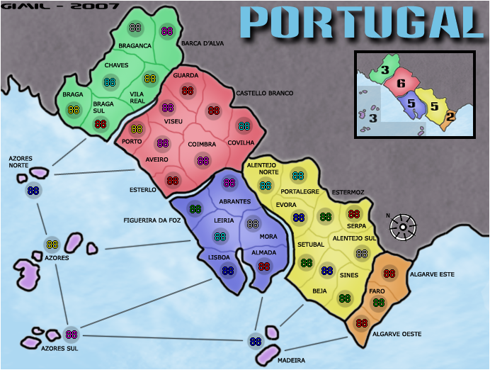
Now DiM can you please do teh calculations for me

I havent put a small with army circles.teh reason for this is for making the small image i resize teh large then do the tweeks it needs, however once i dont the XML test for the small i realised the army circles had been resized to somethngi rediculuse like 18px for ill sort that out for tommorow

Before I got to haoala's post, I was going to suggest replacing the "All four islands..." text with connection lines on the inset map to match the lines between Azores Norte/Azores and Azores Sul/Madeira.
Haoala's suggestion may be better. I think the grey highlight region would look good with a rounded, free-flowing shape.
Haoala's suggestion may be better. I think the grey highlight region would look good with a rounded, free-flowing shape.
I mean that the grey highlight area might look better if it looked more like a puddle, instead of having sharp 90-degree corners and straight edges.gimil wrote:what do you mean?Sparqs wrote: Haoala's suggestion may be better. I think the grey highlight region would look good with a rounded, free-flowing shape.
What difference does it make who's providing the feedback. Let me add to the rolling eyes.
Two quick little things. Could you perhaps make the sea connections with a bit of a curve to them? The sharp straight lines kind of clash a bit, especially with the soft colours you have throughout the map. Also, perhaps move your name over the right a few pixels to take it off the edge of the map.
Two quick little things. Could you perhaps make the sea connections with a bit of a curve to them? The sharp straight lines kind of clash a bit, especially with the soft colours you have throughout the map. Also, perhaps move your name over the right a few pixels to take it off the edge of the map.
-
Ruben Cassar
- Posts: 2160
- Joined: Thu Nov 16, 2006 6:04 am
- Gender: Male
- Location: Civitas Invicta, Melita, Evropa
-
Ruben Cassar
- Posts: 2160
- Joined: Thu Nov 16, 2006 6:04 am
- Gender: Male
- Location: Civitas Invicta, Melita, Evropa
-
gimil
- Posts: 8599
- Joined: Sat Mar 03, 2007 12:42 pm
- Gender: Male
- Location: United Kingdom (Scotland)
1. i need to move my sin a few pixals to teh right.
2. KEYOGI thinks the sea connections need to be curved rather than straight. (personlly i dont feel theres a problem but ill see what i can do)
3. i need to update the bonuses
ive been meaning to get round to it ive jsut ben busy and excited with the enw map im doing. and it also seem andy doesnt bother giving my map feedback even thou he is in charge here.
2. KEYOGI thinks the sea connections need to be curved rather than straight. (personlly i dont feel theres a problem but ill see what i can do)
3. i need to update the bonuses
ive been meaning to get round to it ive jsut ben busy and excited with the enw map im doing. and it also seem andy doesnt bother giving my map feedback even thou he is in charge here.
What do you know about map making, bitch?
Top Score:2403natty_dread wrote:I was wrong
-
MR. Nate

- Posts: 951
- Joined: Tue Dec 19, 2006 10:59 am
- Gender: Male
- Location: Locked in the warehouse.
I love a good geographical map as much as anyone, but this one bores me a bit. Visually, the gray in Spain is brutal. I don't know what color it should be, but gray is just . . . boring. Perhaps that is saying something on your opinion of Spain, I don't know, but I need to get sucked in.
For instance, Brazil's non-playing areas is green, Great Lakes has brown, but it's textured like the rest of the map. US of Apocalypse has navy blue . . . and feels overwhelmed. Your map feels unnecessarily dreary because it has a cloud over the top half of the board.
Other than that, the way that the borders inside bonus areas are drawn makes them feel fake to me, but it seems like the curvy, smooth feel is what you're going for.
For instance, Brazil's non-playing areas is green, Great Lakes has brown, but it's textured like the rest of the map. US of Apocalypse has navy blue . . . and feels overwhelmed. Your map feels unnecessarily dreary because it has a cloud over the top half of the board.
Other than that, the way that the borders inside bonus areas are drawn makes them feel fake to me, but it seems like the curvy, smooth feel is what you're going for.
AAFitz wrote:There will always be cheaters, abusive players, terrible players, and worse. But we have every right to crush them.
End the Flame Wars.MeDeFe wrote:This is a forum on the internet, what do you expect?
-
Ruben Cassar
- Posts: 2160
- Joined: Thu Nov 16, 2006 6:04 am
- Gender: Male
- Location: Civitas Invicta, Melita, Evropa
Don't bother with the grey area. It's just one person's opinion. I think it's fine. Grey is a neutral colour, if you use another colour the map may become too busy and some other colours like the ones used for the name Portugal would contrast badly with it.
The updates you need to do seem pretty basic. Only a few minutes job. Finish this map and then focus on the new one. Andy hasn't been seen in the foundry for some time and Keyogi is away. It's not that Andy doesn't care it's just that he seems to have very limited time at the moment. Make the small updates so that when he comes he can final forge your map.
The updates you need to do seem pretty basic. Only a few minutes job. Finish this map and then focus on the new one. Andy hasn't been seen in the foundry for some time and Keyogi is away. It's not that Andy doesn't care it's just that he seems to have very limited time at the moment. Make the small updates so that when he comes he can final forge your map.


-
Ruben Cassar
- Posts: 2160
- Joined: Thu Nov 16, 2006 6:04 am
- Gender: Male
- Location: Civitas Invicta, Melita, Evropa