
As for the sea, the contrast with the white is way too bright on the eyes. The North sea is probably a bit more dark greeny blue - so you might be able to aadd a slight gradient like that to the colour where it gets deeper. That might help to add a bit of variation to the palette?
Flanders 1302V15[Beta] major changes! P19
Moderator: Cartographers
Forum rules
Please read the Community Guidelines before posting.
Please read the Community Guidelines before posting.
Re: Flanders 1302- V12 [D] [Gp] 01/17/2010
The edges of some of the shield need to be tidied up a little bit - they look like you've tried to add some sort of drop shadow, but it just looks a bit wrong 
As for the sea, the contrast with the white is way too bright on the eyes. The North sea is probably a bit more dark greeny blue - so you might be able to aadd a slight gradient like that to the colour where it gets deeper. That might help to add a bit of variation to the palette?
As for the sea, the contrast with the white is way too bright on the eyes. The North sea is probably a bit more dark greeny blue - so you might be able to aadd a slight gradient like that to the colour where it gets deeper. That might help to add a bit of variation to the palette?

PB: 2661 | He's blue... If he were green he would die | No mod would be stupid enough to do that
-
DubWarrior

- Posts: 173
- Joined: Sun May 03, 2009 6:09 am
- Gender: Male
- Location: Belgium
Re: Flanders 1302- V12 [D] [Gp] 01/17/2010
I agree with you on the color, so I tried some greeny and sandy shore...I like the look of it, specially with the yellow titles. but maybe it's a bit massive and heavy? some lighter piece in the top of it would be nice i guess?MrBenn wrote:The edges of some of the shield need to be tidied up a little bit - they look like you've tried to add some sort of drop shadow, but it just looks a bit wrong
As for the sea, the contrast with the white is way too bright on the eyes. The North sea is probably a bit more dark greeny blue - so you might be able to aadd a slight gradient like that to the colour where it gets deeper. That might help to add a bit of variation to the palette?
I also changed the color of the searoutes to yellow, i think it fits fine.


Re: Flanders 1302- V12.1 [D] [Gp] 01/21/2010
That does look better, I might move the color a tiny bit more towards blue and see what it looks like. Shields look better, maybe a little more work there to smooth the edges a little bit? Perhaps a black border instead of white on the smaller shields? The shields in the legend can all be the same size as the ones on the map itself since you have room. In the legend too the shield for Aalst looks different with 2 white lines on the sides of the shield, it doesn't match the one on the map.


Re: Flanders 1302- V12.1 [D] [Gp] 01/21/2010
Why are 2 different continents (that are attached) the same colour?
C.
C.

Highest score : 2297
-
DubWarrior
- Posts: 173
- Joined: Sun May 03, 2009 6:09 am
- Gender: Male
- Location: Belgium
Re: Flanders 1302- V12.1 [D] [Gp] 01/21/2010
Rijks-vlaanderen en Artesië aren't connected, so I didn't expect problems there?
Re: Flanders 1302- V12.1 [D] [Gp] 01/21/2010
I was thinking Kroon - and BrabantDubWarrior wrote:Rijks-vlaanderen en Artesië aren't connected, so I didn't expect problems there?
C.
Highest score : 2297

Re: Flanders 1302- V12.1 [D] [Gp] 01/21/2010
Just switch colours between Henegouwen and Brabant + Ostervant
so you never have two alike colours next to each other
so you never have two alike colours next to each other
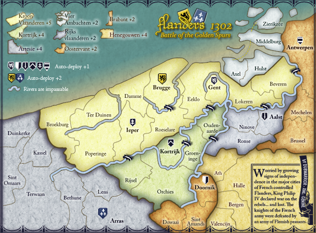
De gueules à la tour d'argent ouverte, crénelée de trois pièces, sommée d'un donjon ajouré, crénelé de deux pièces
Gules an open tower silver, crenellated three parts, topped by a apertured turret, crenellated two parts
Gules an open tower silver, crenellated three parts, topped by a apertured turret, crenellated two parts
-
DubWarrior
- Posts: 173
- Joined: Sun May 03, 2009 6:09 am
- Gender: Male
- Location: Belgium
Re: Flanders 1302- V12.2 [D] [Gp] 01/25/2010
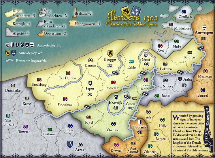
Hi, back with some other small changes, so here's V12.2.
Amongst the changes, larger and cleaned-up shield for the bonus and changes in the colors of Brabant, Oostervant en Henegouwen.
I switched the colors of Brabant with Henegouwen but for some reason it looks too heavy in the top. So I replaced the reds on the map for some more brown-orange.
Amongst the changes, larger and cleaned-up shield for the bonus and changes in the colors of Brabant, Oostervant en Henegouwen.
I switched the colors of Brabant with Henegouwen but for some reason it looks too heavy in the top. So I replaced the reds on the map for some more brown-orange.
-
AndyDufresne

- Posts: 24932
- Joined: Fri Mar 03, 2006 8:22 pm
- Location: A Banana Palm in Zihuatanejo
- Contact:
Re: Flanders 1302- V12.1 [D] [Gp] 01/21/2010
Nice color swap and alteration, I like it. 
--Andy
--Andy
Re: Flanders 1302- V12.1 [D] [Gp] 01/21/2010
very very minor things
maybe move border between Antwerpen and Middelburg left
and move Antwerpen name up
so the A isn't over any border
and also flip the bridge between Antwerpen and Beveren
from up-left down-right
to down-left up-right
just to keep you busy
maybe move border between Antwerpen and Middelburg left
and move Antwerpen name up
so the A isn't over any border
and also flip the bridge between Antwerpen and Beveren
from up-left down-right
to down-left up-right
just to keep you busy
De gueules à la tour d'argent ouverte, crénelée de trois pièces, sommée d'un donjon ajouré, crénelé de deux pièces
Gules an open tower silver, crenellated three parts, topped by a apertured turret, crenellated two parts
Gules an open tower silver, crenellated three parts, topped by a apertured turret, crenellated two parts
-
SirSebstar

- Posts: 6969
- Joined: Fri Oct 27, 2006 7:51 am
- Location: SirSebstar is BACK. Highscore: Colonel Score: 2919 21/03/2011
Re: Flanders 1302- V12.1 [D] [Gp] 01/21/2010
i dont like autodeploy in such a huge quantity. it means that whomever begins has a really good shot in this map.
I do hope all or most autpodeploys start as a neutral, then i am okay with it.
otherwise this is another map of the, i go first so i win type
I do hope all or most autpodeploys start as a neutral, then i am okay with it.
otherwise this is another map of the, i go first so i win type
-
DubWarrior
- Posts: 173
- Joined: Sun May 03, 2009 6:09 am
- Gender: Male
- Location: Belgium
-
captainwalrus
- Posts: 1018
- Joined: Sun Nov 11, 2007 3:19 pm
- Location: Finnmark
Re: Flanders 1302- V12.1 [D] [Gp] 01/21/2010
I am not really liking how the rivers end sort of abruptly. Maybe try to make them taper off?
~ CaptainWalrus
-
DubWarrior
- Posts: 173
- Joined: Sun May 03, 2009 6:09 am
- Gender: Male
- Location: Belgium
Re: Flanders 1302V12." [D][Gp] AWAITING GRAPHIC STAMP 01/21/2010
Hi,
Back with some other small changes...
I enlarged the text for in the legend, because it was too small in the small mapsize. I moved the antwerpen-border to left and moved some names. I turned the bridge near antwerp.
Since I noticed we graphicaly discussed everything (colors, border, legend, sea, rivers, shields...) I would like to start with closing the graphic discussion.
@CaptainWalrus: we already discussed the ends of the rivers, but I tried to make them taper off.
this is the result:

Personaly, I don't like them this way...they look more like a worm to me they also make things look more complicated. I think the map offers enough other details to sketch some realistic or historical background. So I'm not realy in need of more complicated options. well, I guess.
I started working on the XML, with the XML wizard. It was great, so I saved the XML, and posted it in front of the topic.
Does someone knows how I can link the imagefile and the XMLfile to eachother so you see the map with the numbers actualy ON it in the post?
cheers!
Back with some other small changes...
I enlarged the text for in the legend, because it was too small in the small mapsize. I moved the antwerpen-border to left and moved some names. I turned the bridge near antwerp.
Since I noticed we graphicaly discussed everything (colors, border, legend, sea, rivers, shields...) I would like to start with closing the graphic discussion.
@CaptainWalrus: we already discussed the ends of the rivers, but I tried to make them taper off.
this is the result:
Personaly, I don't like them this way...they look more like a worm to me
I started working on the XML, with the XML wizard. It was great, so I saved the XML, and posted it in front of the topic.
Does someone knows how I can link the imagefile and the XMLfile to eachother so you see the map with the numbers actualy ON it in the post?
cheers!
-
DubWarrior
- Posts: 173
- Joined: Sun May 03, 2009 6:09 am
- Gender: Male
- Location: Belgium
Re: Flanders 1302V12." [D][Gp] AWAITING GRAPHIC STAMP 01/21/2010
screenshots of the XML, 'cause I don't know how to post them so that both are linked?
Re: Flanders 1302V12." [D][Gp] AWAITING GRAPHIC STAMP 01/21/2010
Graphically, I think you're very nearly at the finishing line!
I've just run a couple of colourblind pallet checks, and the new colour configuration looks pretty good to me.
The only tiny niggly thing I can see is that the shadows on the bridges aren't all in the same direction (a side-effect of rotating the bridge near Antwerpen).
That's pretty much it for graphics, unless one of the other CAs has anything to offer = wait and see what happens at your next review
PB: 2661 | He's blue... If he were green he would die | No mod would be stupid enough to do that
Re: Flanders 1302V12." [D][Gp] AWAITING GRAPHIC STAMP 01/21/2010
Sorry we didn't review sooner, time's been at a premium to get together between myself and thenobodies.
MrBenn is right, a few tweaks and you'll be on your way.
MrBenn is right, a few tweaks and you'll be on your way.
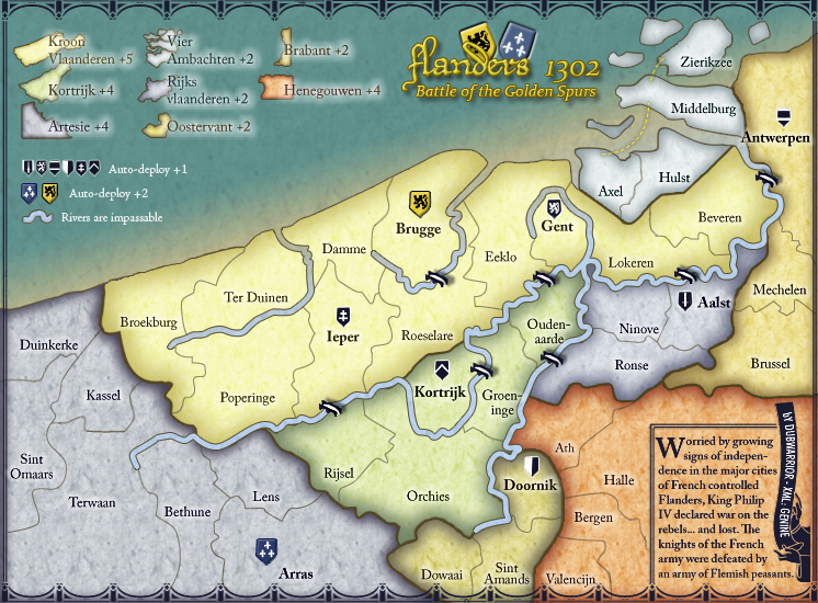
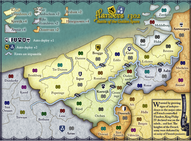
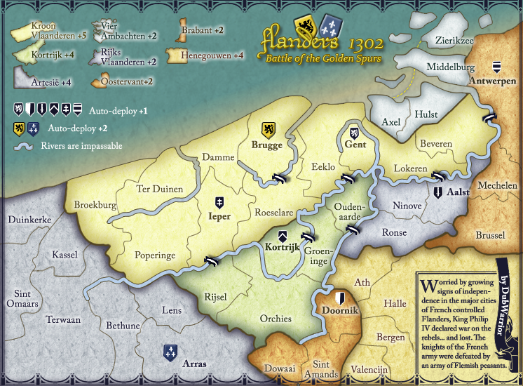
- Broekburg, Axels and Zierikzee, coast a bit pixelous. (large and small map)
- Brabant, the thick continent border with Hanegouwen looks pixelous. (large and small map)
- The texture on the small map is a little more noticeable, and looks better, can you make it match on the large?
- The test in the story in the bottom corner is difficult to read especially the last line. "an army of Flemish paesants", specially in the small version, but I can read all the other text without problems.
- On the small version there's a small rectangle on one border (ath/doornik)
- Try putting your sea connectors under the land rather then on top. (large and small map)
- And the bridge shadow that MrBenn mentioned. (large and small map)
-
DubWarrior
- Posts: 173
- Joined: Sun May 03, 2009 6:09 am
- Gender: Male
- Location: Belgium
Re: Flanders 1302V12.3 [D][Gp] AWAITING GRAPHIC STAMP 01/30/2010
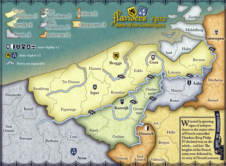
Hi, tnx for the fast reply! so I did a fast update...
I did the corrections you suggested. I also changed a little in the signature and text beneath (since I will do the XML myself )
)
I worked a bit longer on the small map, I also cleaned up some pixels and the shields, who looked kinda blurry when scaled.
SMALL
BIG

I did the corrections you suggested. I also changed a little in the signature and text beneath (since I will do the XML myself
I worked a bit longer on the small map, I also cleaned up some pixels and the shields, who looked kinda blurry when scaled.
SMALL
BIG
Re: Flanders 1302V12.4 [D][Gp] AWAITING GRAPHIC STAMP 01/21/2010
Looks very good! My only question now would be, are you just scaling the large image down to the small? This is the best way to do it, but I think you're still losing a bit of legibility in the transfer, especially in the bottom corner of the map. Your name down there is ok, but I can barely make out "2010" Does your software have anti-aliasing for text? The text in the bottom corner, especially on the larger "W" is pixelaided on both maps.
-
DubWarrior
- Posts: 173
- Joined: Sun May 03, 2009 6:09 am
- Gender: Male
- Location: Belgium
Re: Flanders 1302V12.4 [D][Gp] AWAITING GRAPHIC STAMP 01/21/2010
Yes I scale down in photoshop. I import the text from Illustrator on the large map, making the vector to pixles en scale down to a small map.
Now that I'm thinking on it, I guess the best way is making a cleaner text on the small map would be this way:
scaling down the vector text in illustrator to the size of the small map, importing it in photoshop and save it...this way i don't scale down the pixels of the text, but scale the vector...always a better idea, I think?
cheers,
Dub
Re: Flanders 1302V12.4 [D][Gp] AWAITING GRAPHIC STAMP 01/21/2010
I'm not sure of what you're saying is the best way.... help me out here Foundry!
I just know the ways I've done it in the past is to have separate large and small psd's. Work the large to a point of near ready, then scale each major layer 1-by-1 to the desired small size and recreate text layers. In this process some layers must be completely redone, borders and outlines being the most common. You do end up making 2 almost separate maps of the exact same thing, but will cause less headaches for you down the road.
I just know the ways I've done it in the past is to have separate large and small psd's. Work the large to a point of near ready, then scale each major layer 1-by-1 to the desired small size and recreate text layers. In this process some layers must be completely redone, borders and outlines being the most common. You do end up making 2 almost separate maps of the exact same thing, but will cause less headaches for you down the road.
-
DubWarrior
- Posts: 173
- Joined: Sun May 03, 2009 6:09 am
- Gender: Male
- Location: Belgium
Re: Flanders 1302V12.4 [D][Gp] AWAITING GRAPHIC STAMP 01/21/2010
Well, that's already a bit like what i did with the shields and the texture...I needed to remake these things because, once scaled down it was a complete different thing But in this case it's only the textlayer that's left?
-
Industrial Helix

- Posts: 3462
- Joined: Mon Jul 14, 2008 6:49 pm
- Gender: Female
- Location: Ohio
Re: Flanders 1302V12.4 [D][Gp] AWAITING GRAPHIC STAMP 01/21/2010
Yeah, i can see what Red is talking about with the text. It's all pixely, even in the large version I think. I'd say, and you might hate me for this, but just import the thing from Illustrator and then do the text in Photoshop. And I don't really see any reason why the text needs to be smaller on the small version, you've got the room so why make people squint.
Sketchblog [Update 07/25/11]: http://indyhelixsketch.blogspot.com/
Living in Japan [Update 07/17/11]: http://mirrorcountryih.blogspot.com/
Russian Revolution map for ConquerClub [07/20/11]: http://www.conquerclub.com/forum/viewto ... 1&t=116575
Living in Japan [Update 07/17/11]: http://mirrorcountryih.blogspot.com/
Russian Revolution map for ConquerClub [07/20/11]: http://www.conquerclub.com/forum/viewto ... 1&t=116575
Re: Flanders 1302V12.4 [D][Gp] AWAITING GRAPHIC STAMP 01/21/2010
Well.... it's the biggest thing that's for sure. You can see it in the shields too, especially on the small map. Ever so slightly you can see it in the text too, but it isn't too noticeable.DubWarrior wrote:Well, that's already a bit like what i did with the shields and the texture...I needed to remake these things because, once scaled down it was a complete different thing
I'm with Helix, scaling the image in Illustrator without the text in the bottom corner, at least, and then doing a text layer in PS in the correct spot.
-
DubWarrior
- Posts: 173
- Joined: Sun May 03, 2009 6:09 am
- Gender: Male
- Location: Belgium
Re: Flanders 1302V13 [D][Gp] AWAITING GRAPHIC STAMP 02/07/2010
Well I tried different things, and I come up with these two...

what do you think?
what do you think?