[Official] Brazil REVAMP [Quenched]
Moderator: Cartographers
Forum rules
Please read the Community Guidelines before posting.
Please read the Community Guidelines before posting.
-
LED ZEPPELINER
- Posts: 1088
- Joined: Tue Nov 25, 2008 10:09 pm
Re: [Official] Brazil REVAMP (Borders Again? pg-6) [I, GP]
i really like this revamp, the old graphics were a little lacking, but these graphics are stunning 


-
captainwalrus
- Posts: 1018
- Joined: Sun Nov 11, 2007 3:19 pm
- Location: Finnmark
Re: [Official] Brazil REVAMP (Borders Again? pg-6) [I, GP]
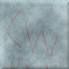
What are the non crossing borders supposed to be? They don't really look like anything now.
~ CaptainWalrus

Re: [Official] Brazil REVAMP (Borders Again? pg-6) [I, GP]
Just think lines. They are not supposed to represent anything.captainwalrus wrote:What are the non crossing borders supposed to be? They don't really look like anything now.

-
happy2seeyou

- Posts: 4022
- Joined: Mon Jan 22, 2007 2:59 pm
- Gender: Female
- Location: A state that is in the shape of a mitten!
- Contact:
Re: [Official] Brazil REVAMP (Borders Again? pg-6) [I, GP]
I hardly ever support map revamps, but I really like this newer version of Brazil. Good job!

Re: [Official] Brazil REVAMP (Borders Again? pg-6) [I, GP]
happy2seeyou wrote:I hardly ever support map revamps, but I really like this newer version of Brazil. Good job!
who doesnt like a map that improves the brazil map?
1) Some places the borders go past where they are supposed to, and at others for some reason they seem pixely
2) Some names are a little hard to read
3) I dont really care for how the Non-Crossing Borders and mini-map take up mostly vertical space. Have you thought of putting them in a box maybe? or maybe moving the Non-Crossing Borders into the lower left corner between the mini-map and the outer border?
I cant think of anything else than that, its a great map!
-
happy2seeyou
- Posts: 4022
- Joined: Mon Jan 22, 2007 2:59 pm
- Gender: Female
- Location: A state that is in the shape of a mitten!
- Contact:
Re: [Official] Brazil REVAMP (Borders Again? pg-6) [I, GP]
Maybe I like it so much because I have had bad luck on that map. Not sure, but I might play it more now.

Re: [Official] Brazil REVAMP (Borders Again? pg-6) [I, GP]
Hey, how is this discuss going? Nobody asked anything to me...
But ok...I saw while reading the post that was a discuss about the territory names...so, exist in Brasil some projects of creations of new states, that are important regions...so I searched and found a map with some of the "new" states, in north and northeast areas...still have more, but only this ones is enough...
Well, as I dont know how the discuss is going I ll post my opinions...
1- I love the news versions of the map! They are really good!!! The colors, the design! They are really beautiful! A kind of stereotype, but really good!!! \o/...but, in the second one, the rotation confused me...its strange to look it...you feel lost...
2 - That more 2 things strange to me...well, do all maps here in CC have to be in English? Because It's easy to read...it isnt really a problem, but seens that is wrote wrong without the accents marks...as its strange Brasil wroted with "z"...
Here is the link:
1 - http://2.bp.blogspot.com/_e2htP96KjIg/S ... stados.jpg

Re: [Official] Brazil REVAMP (Borders Again? pg-6) [I, GP]
I just have 1 request to make this map much better looking...
BOLDER COLORS PLEASE!!
Then it will be very nice looking
BOLDER COLORS PLEASE!!
Then it will be very nice looking
Highest Rank: 26 Highest Score: 3480

Re: [Official] Brazil REVAMP (Borders Again? pg-6) [I, GP]
Incandenza wrote:I'm of the opinion that even should RJ end his exile from the foundry, he should shutter this project and move on. Marvaddin has turned this whole process into a farce, and oaktown's 100% right about the abuse of power going on here. If marv's totally okay with having his country represented by the bar-none ugliest map on this site, if he's so up his own ass about his artistic genius that he can't see that RJ is producing a map that makes the original look like cave paintings, then let the revamp as a whole die.

Re: [Official] Brazil REVAMP (Borders Again? pg-6) [I, GP]
Believe me, I don't want this to die. It's just on hold for a bit longer.
Re: [Official] Brazil REVAMP (Borders Again? pg-6) [I, GP]
Well, ok...ask me for everything u wanna know about Brasil, I ll try to help ^^
Re: [Official] Brazil REVAMP (Borders Again? pg-6) [I, GP]
So, nothing yet? 
Re: [Official] Brazil REVAMP (Borders Again? pg-6) [I, GP]
ha.. no. not yet. I'm pretty busy at work. I should have some downtime in March - I plan on picking this up then.nature wrote:So, nothing yet?
Re: [Official] Brazil REVAMP (Borders Again? pg-6) [I, GP]
- Click image to enlarge.

Here's some points:
1) Do you like the yellow/brown square border around the map?
2) Do you like all the trees in the background?
3) Do you like the non-crossing border? It was pink before, now it's a greenish/yellowish hue.
4) Is the legend too big? Should there be a text legend instead of the minimap?
5) Is the font style okay on the map? It's very plain I know, but I couldn't find anything else I'm happy with.
6) Overall colors okay - for colorblind folks?
Thanks
-
the.killing.44

- Posts: 4724
- Joined: Thu Oct 23, 2008 7:43 pm
- Gender: Male
- Location: now tell me what got two gums and knows how to spit rhymes
- Contact:
Re: [Official] Brazil REVAMP (Borders Again? pg-6) [I, GP]
1) Do you like the yellow/brown square border around the map?
I think it's too precise in comparison to the rest of the map … maybe a tiny bit of blur?
2) Do you like all the trees in the background?
Yep, they look nice.
3) Do you like the non-crossing border? It was pink before, now it's a greenish/yellowish hue.
Better than before.
4) Is the legend too big? Should there be a text legend instead of the minimap?
No, I think it's fine as is.
5) Is the font style okay on the map? It's very plain I know, but I couldn't find anything else I'm happy with.
I like it.
6) Overall colors okay - for colorblind folks?

Could you move Porto Velho and Alagoas's army circles more into the territory?
Looks really great,
.44
I think it's too precise in comparison to the rest of the map … maybe a tiny bit of blur?
2) Do you like all the trees in the background?
Yep, they look nice.
3) Do you like the non-crossing border? It was pink before, now it's a greenish/yellowish hue.
Better than before.
4) Is the legend too big? Should there be a text legend instead of the minimap?
No, I think it's fine as is.
5) Is the font style okay on the map? It's very plain I know, but I couldn't find anything else I'm happy with.
I like it.
6) Overall colors okay - for colorblind folks?
Could you move Porto Velho and Alagoas's army circles more into the territory?
Looks really great,
.44

Re: [Official] Brazil REVAMP (Feb Update pg. 1&10) [I, GP]
looks great to me
-
The Neon Peon

- Posts: 2342
- Joined: Sat Jun 14, 2008 12:49 pm
- Gender: Male
Re: [Official] Brazil REVAMP (Feb Update pg. 1&10) [I, GP]
Put me down for the same responses as .44
Was planning to answer but then realized I was just paraphrasing him lengthily.
Was planning to answer but then realized I was just paraphrasing him lengthily.

Re: [Official] Brazil REVAMP (Feb Update pg. 1&10) [I, GP]
For colorblind checking see Vischeck web site where you can simulate colour-blind results.
In this case North West and Central North are the same for deuteranope (a form of red/green color deficit) people.
In this case North West and Central North are the same for deuteranope (a form of red/green color deficit) people.
De gueules à la tour d'argent ouverte, crénelée de trois pièces, sommée d'un donjon ajouré, crénelé de deux pièces
Gules an open tower silver, crenellated three parts, topped by a apertured turret, crenellated two parts
Gules an open tower silver, crenellated three parts, topped by a apertured turret, crenellated two parts

Re: [Official] Brazil REVAMP (Feb Update pg. 1&10) [I, GP]
A small tweak of the red/green regions should help the colourblind issues - make one a little darker, and the other a little lighter.
I think the colourblind issue should be the only legitimate concern from my perspective...

I think the colourblind issue should be the only legitimate concern from my perspective...

PB: 2661 | He's blue... If he were green he would die | No mod would be stupid enough to do that
Re: [Official] Brazil REVAMP (Feb Update pg. 1&10) [I, GP]
1) Do you like the yellow/brown square border around the map?
So the border looks too precise. I like it, but I guess I'll try something a bit different.
Yes I'll see about fixing the color blind thing. Thanks all.


So the border looks too precise. I like it, but I guess I'll try something a bit different.
Yep.Could you move Porto Velho and Alagoas's army circles more into the territory?
Yes I'll see about fixing the color blind thing. Thanks all.
Re: [Official] Brazil REVAMP (Feb Update pg. 1&10) [I, GP]
Yehhhhhhhh! Finally!!!
So I'll answer too ^^
1) Do you like the yellow/brown square border around the map?
Yeah! I liked very much.
2) Do you like all the trees in the background?
Yeah! Very much. I love they =D
3) Do you like the non-crossing border? It was pink before, now it's a greenish/yellowish hue.
Yeah, its much better.
4) Is the legend too big? Should there be a text legend instead of the minimap?
No, I think its ok.
5) Is the font style okay on the map? It's very plain I know, but I couldn't find anything else I'm happy with.
It isnt bad, but the font you used on the minimap looked better for me.
6) Overall colors okay - for colorblind folks?
I dont know...
Just more things I saw:
- Thanks for fixing the accent marks, its very better now...
- 2 territories are with their names wrong: its not "Foz do Lguaçu", is "Foz do Iguaçu" and its not "Triaângulo", its "Triângulo".
- I think the territory names are too small...
And thanks for your amazing job!
Re: [Official] Brazil REVAMP (Feb Update pg. 1&10) [I, GP]
nature wrote:
Just more things I saw:
- Thanks for fixing the accent marks, its very better now...
- 2 territories are with their names wrong: its not "Foz do Lguaçu", is "Foz do Iguaçu" and its not "Triaângulo", its "Triângulo".
- I think the territory names are too small...
And thanks for your amazing job!
I'll fix the type-o's - thanks.
I'll play around with the type-face and size a little more.
-
thenobodies80

- Posts: 5400
- Joined: Wed Sep 05, 2007 4:30 am
- Gender: Male
- Location: Milan

Re: [Official] Brazil REVAMP (Feb Update pg. 1&10) [I, GP]
Its looking really nice, but i think you should move the legend more to the corner and extend the border so that it goes around the legend.

Re: [Official] Brazil REVAMP (Feb Update pg. 1&10) [I, GP]
not sure I understand. If you mean move the legend to the right corner, and extend the map borders so it's not the "floating" map, then I can't do that. It wouldn't be right since this is the map that was voted for.Kaplowitz wrote:Its looking really nice, but i think you should move the legend more to the corner and extend the border so that it goes around the legend.