Yep.gimil wrote:Pep im assuming this is the large map your currently working on?
[Official] Germany Revamp
Moderator: Cartographers
Forum rules
Please read the Community Guidelines before posting.
Please read the Community Guidelines before posting.
-
pepperonibread

- Posts: 954
- Joined: Sun Jan 28, 2007 4:33 pm
- Location: The Former Confederacy
Re: [Official] Germany REVAMP - Back on Track/New Update Pg. 1&8
-
MeDeFe

- Posts: 7831
- Joined: Thu Apr 06, 2006 2:48 am
- Location: Follow the trail of holes in other people's arguments.
Re: [Official] Germany REVAMP - Back on Track/New Update Pg. 1&8
There are mountains north of Münster? I'll have to go check, I always thought this place was almost as flat as the Netherlands.
saxitoxin wrote:Your position is more complex than the federal tax code. As soon as I think I understand it, I find another index of cross-references, exceptions and amendments I have to apply.
Timminz wrote:Yo mama is so classless, she could be a Marxist utopia.
-
pepperonibread
- Posts: 954
- Joined: Sun Jan 28, 2007 4:33 pm
- Location: The Former Confederacy
Re: [Official] Germany REVAMP - Back on Track/New Update Pg. 1&8
MeDeFe wrote:There are mountains north of Münster? I'll have to go check, I always thought this place was almost as flat as the Netherlands.
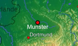
Definitely not the alps, but I think this is good enough knowing we need to keep the map's gameplay the same.
And an update should come sometime this weekend guys.
-
pepperonibread
- Posts: 954
- Joined: Sun Jan 28, 2007 4:33 pm
- Location: The Former Confederacy
Re: [Official] Germany REVAMP - Back on Track/New Update Pg. 1&8
Alright guys, new update:
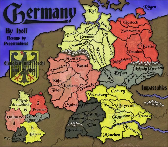

Changes:
-Most people didn't like the flag, so I replaced it with the german arms and motto.
-I kept the mini-map, but the continent names are now inside it instead of around the rest of the map. I think this is easier to understand, and a few people didn't like the previous arrangement anyway.
-The mountains are flattened a bit, to make them less pointy and at odd angles.
-On the right, I added a small legend showing the two kinds of impassables, rivers and mountains. A bit obvious, but someone suggested it and I think it fits the space nicely.
-Replaced the Pfalz territory with Mainz.
-I stretched the title slightly because there's more room now.
-The yellow army numbers have been replaced with all different colors, like cairns suggested.
To do:
-I'm still toying with the coat of arms, so comments on this would be good.
-Edbeard suggested making the continent colors' order match that of the german flag, similar to the mexico map (http://www.conquerclub.com/forum/viewto ... &sk=t&sd=a). I didn't get around to doing this, but expect something on it next update.
-Comments?
Changes:
-Most people didn't like the flag, so I replaced it with the german arms and motto.
-I kept the mini-map, but the continent names are now inside it instead of around the rest of the map. I think this is easier to understand, and a few people didn't like the previous arrangement anyway.
-The mountains are flattened a bit, to make them less pointy and at odd angles.
-On the right, I added a small legend showing the two kinds of impassables, rivers and mountains. A bit obvious, but someone suggested it and I think it fits the space nicely.
-Replaced the Pfalz territory with Mainz.
-I stretched the title slightly because there's more room now.
-The yellow army numbers have been replaced with all different colors, like cairns suggested.
To do:
-I'm still toying with the coat of arms, so comments on this would be good.
-Edbeard suggested making the continent colors' order match that of the german flag, similar to the mexico map (http://www.conquerclub.com/forum/viewto ... &sk=t&sd=a). I didn't get around to doing this, but expect something on it next update.
-Comments?
Last edited by pepperonibread on Sat Jul 12, 2008 12:08 am, edited 2 times in total.
Re: [Official] Germany REVAMP - New Update July 3 Pgs. 1&9
all the changes are good
The only thing I was looking forward to seeing was the continent colour change though
The only thing I was looking forward to seeing was the continent colour change though

Re: [Official] Germany REVAMP - New Update July 3 Pgs. 1&9 [Gp]
The motto is a little hard to read. I think I like it better with just the symbol without the motto overtop of it. The rest of the map is  delicious.
--lanyards
delicious.--lanyards

WANT AN ADVANTAGE WHILE WORKING TOWARDS MEDALS?
https://www.conquerclub.com/forum/viewt ... 9&t=226714
-
pepperonibread
- Posts: 954
- Joined: Sun Jan 28, 2007 4:33 pm
- Location: The Former Confederacy
Re: [Official] Germany REVAMP - New Update July 3 Pgs. 1&9 [Gp]
Thanks lanyardslanyards wrote:The motto is a little hard to read. I think I like it better with just the symbol without the motto overtop of it. The rest of the map is
--lanyards
 I'll try and work with this.
Re: [Official] Germany REVAMP - New Update July 3 Pgs. 1&9 [Gp]
I think the whole crest needs work. It just doesn't have the same elegant feel that the rest of the map has.
Also, considering the significant changes for the better you're making, maybe make your signature the same size as Hoff's?
Also, considering the significant changes for the better you're making, maybe make your signature the same size as Hoff's?
-
pepperonibread
- Posts: 954
- Joined: Sun Jan 28, 2007 4:33 pm
- Location: The Former Confederacy
Re: [Official] Germany REVAMP - New Update July 3 Pgs. 1&9 [Gp]
I'd have to agree to an extent, I'm still trying to get it to "fit" with the rest of the map.ZeakCytho wrote:I think the whole crest needs work. It just doesn't have the same elegant feel that the rest of the map has.
Also, considering the significant changes for the better you're making, maybe make your signature the same size as Hoff's?
As for my sig, that's ok, I think I graphically like it how it is now. Maybe a bit bigger tho

-
AndyDufresne

- Posts: 24919
- Joined: Fri Mar 03, 2006 8:22 pm
- Location: A Banana Palm in Zihuatanejo
- Contact:
Re: [Official] Germany REVAMP - New Update July 3 Pgs. 1&9 [Gp]
I've always endorsed small, out of the way signatures.
Over all it is looking good. Consider adding another mountain near Munster and Kassel, so it doesn't appear that Munster and Gott. have a route. (Maybe even slightly nudge the mountain on the left end, so it is more flush against the playable area border, if that makes sense.)
Perhaps consider adding a line under "Impassables."
I'm not sure if it is just me, but in the Baden and Sachsen continents (and perhaps even Nord and Bayern too)...the background image seems more difficult to see when compared to Preu and Rhein continents.
--Andy
Over all it is looking good. Consider adding another mountain near Munster and Kassel, so it doesn't appear that Munster and Gott. have a route. (Maybe even slightly nudge the mountain on the left end, so it is more flush against the playable area border, if that makes sense.)
Perhaps consider adding a line under "Impassables."
I'm not sure if it is just me, but in the Baden and Sachsen continents (and perhaps even Nord and Bayern too)...the background image seems more difficult to see when compared to Preu and Rhein continents.
--Andy
-
pepperonibread
- Posts: 954
- Joined: Sun Jan 28, 2007 4:33 pm
- Location: The Former Confederacy
Re: [Official] Germany REVAMP - New Update July 3 Pgs. 1&9 [Gp]
Graphics look good and are much improved over the original (actually I like your "older" new version better than your "newer" new version, but both look good). If you are trying to keep the gameplay the same though there should be a connection between Leipzig and Magdeburg (A very important area in gameplay).
-
pepperonibread
- Posts: 954
- Joined: Sun Jan 28, 2007 4:33 pm
- Location: The Former Confederacy
Re: [Official] Germany REVAMP - New Update July 3 Pgs. 1&9 [Gp]
Whoops, added a few too many mountains there. Nice catchbob3603 wrote:Graphics look good and are much improved over the original (actually I like your "older" new version better than your "newer" new version, but both look good). If you are trying to keep the gameplay the same though there should be a connection between Leipzig and Magdeburg (A very important area in gameplay).
-
pepperonibread
- Posts: 954
- Joined: Sun Jan 28, 2007 4:33 pm
- Location: The Former Confederacy
Re: [Official] Germany REVAMP - New Update July 3 Pgs. 1&9 [Gp]
New update, got ed's color changes in this time:
Large:

Large w/ Army #'s:
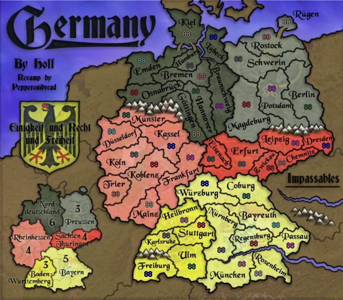
Changes:
-Rearranged which continents have which colors so as to resemble the German flag: black at the top, red in the middle, and yellow at the bottom.
-Added a line under the word "Impassables".
-Edited borders/mountains so Leipzig connects to Magdeburg (this preserves the gameplay of the original map). This also gave a bit more room for the Leipzig army number.
-Put a few effects on the coat of arms and made the motto above it a bit more readable. I'm liking this a lot better now.
To-do:
-I'm not yet sure how much I like the new colors, though maybe I'm just not used to them yet. Comments on this would be appreciated, if there's no consensus I may put up a poll.
-Anything else?
Large:
Large w/ Army #'s:
Changes:
-Rearranged which continents have which colors so as to resemble the German flag: black at the top, red in the middle, and yellow at the bottom.
-Added a line under the word "Impassables".
-Edited borders/mountains so Leipzig connects to Magdeburg (this preserves the gameplay of the original map). This also gave a bit more room for the Leipzig army number.
-Put a few effects on the coat of arms and made the motto above it a bit more readable. I'm liking this a lot better now.
To-do:
-I'm not yet sure how much I like the new colors, though maybe I'm just not used to them yet. Comments on this would be appreciated, if there's no consensus I may put up a poll.
-Anything else?
Last edited by pepperonibread on Sat Jul 12, 2008 12:07 am, edited 2 times in total.
Re: [Official] Germany REVAMP - New Update 7/9 Pg. 10 [Gp]
I like the colors better when you had them intermixed, I think it looks much better.
Re: [Official] Germany REVAMP - New Update 7/9 Pg. 10 [Gp]
I'd prefer the darker red on the left side so they all match up (or all the dark on the right side. don't matter)

Re: [Official] Germany REVAMP - New Update 7/9 Pg. 10 [Gp]
OOC - what does the motto mean?
C.
C.

Highest score : 2297

Re: [Official] Germany REVAMP - New Update 7/9 Pg. 10 [Gp]
The colours are really good; a nice homage to the flag which I'm sure will nevertheless be lost on most people 
Your mountains are gorgeous... so nice that you could do with a couple more:
Your mountains are gorgeous... so nice that you could do with a couple more:
- Add one to the left of the Freiburg/Karlsruhe border, or shift the left-most one up a few pixels
- Add a small moutnain to the left of the Munster/Osnabruck range
- Add another to the right of the Dresden/Berlin range

PB: 2661 | He's blue... If he were green he would die | No mod would be stupid enough to do that
-
Mr. Squirrel

- Posts: 157
- Joined: Fri Nov 02, 2007 3:18 pm
- Location: up a tree
Re: [Official] Germany REVAMP - New Update 7/9 Pg. 10 [Gp]
I always liked the original germany map, but this one is fantastic. This really blew me away when I saw it.
I tried to find something to comment about, but being unaware of German style/geography. I have nothing to nitpick. And even if I did know about germany, there is probably nothing I could find wrong with this map.
I tried to find something to comment about, but being unaware of German style/geography. I have nothing to nitpick. And even if I did know about germany, there is probably nothing I could find wrong with this map.
Re: [Official] Germany REVAMP - New Update 7/9 Pg. 10 [Gp]
I like the new continent color arrangement, but agree with Ed that putting all the bolder colors on one side may look better. On the other hand, it could make the map feel quite imbalanced - give it a try, and if it looks bad we'll tell you
-
pepperonibread
- Posts: 954
- Joined: Sun Jan 28, 2007 4:33 pm
- Location: The Former Confederacy
Re: [Official] Germany REVAMP - New Update 7/9 Pg. 10 [Gp]
Hmm, well I guess we'll see what others have to say, the new colors seem to be growing on me...bob3603 wrote:I like the colors better when you had them intermixed, I think it looks much better.
edbeard wrote:I'd prefer the darker red on the left side so they all match up (or all the dark on the right side. don't matter)
I'll try this, though it may make the map feel imbalanced, like Zeak said. I actually arranged the colors how they are currently so they would balance out. I'll definitely see how it looks though.ZeakCytho wrote:I like the new continent color arrangement, but agree with Ed that putting all the bolder colors on one side may look better. On the other hand, it could make the map feel quite imbalanced - give it a try, and if it looks bad we'll tell you
http://en.wikipedia.org/wiki/Germanyyeti_c wrote: OOC - what does the motto mean?
C.
"Einigkeit und Recht und Freiheit"
"Unity and Justice and Freedom"
This all sounds good, expect to see it soon.MrBenn wrote:The colours are really good; a nice homage to the flag which I'm sure will nevertheless be lost on most people
Your mountains are gorgeous... so nice that you could do with a couple more:
* Add one to the left of the Freiburg/Karlsruhe border, or shift the left-most one up a few pixels
* Add a small moutnain to the left of the Munster/Osnabruck range
* Add another to the right of the Dresden/Berlin range
That should help to make it absolutely obvious that those regions don't border
Thanks, glad you like the mapMr. Squirrel wrote:I always liked the original germany map, but this one is fantastic. This really blew me away when I saw it.
I tried to find something to comment about, but being unaware of German style/geography. I have nothing to nitpick. And even if I did know about germany, there is probably nothing I could find wrong with this map.

Re: [Official] Germany REVAMP - New Update 7/9 Pg. 10 [Gp]
I actually think they'll look better as is, but giving us both options (as suggested above) would be optimal.edbeard wrote:I'd prefer the darker red on the left side so they all match up (or all the dark on the right side. don't matter)
L


Re: [Official] Germany REVAMP - New Update 7/9 Pg. 10 [Gp]
the latest mix of colours is the most successful yet, with a nice equilibrium between top and bottom, left and right regarding saturated and paler territories.
the motto over the eagle is hard to read and i think it spoils the latter when put in that position.
kiel still looks like it's on an island with denmark rather than being part of the mainland. since the water between kiel and lübeck is a canal, how about making it look artificial? try drawing the canal straight (alternatively in two straight sections with a kink in the middle) and narrow with constant width, maybe with blue instead of black borders.
http://maps.nrcan.gc.ca/topo101/symbols_hydro_e.php
the ideal is to have kiel appear as part of the mainland, with the canal clearly impassable but not sticking out like a sore thumb.
ian.
the motto over the eagle is hard to read and i think it spoils the latter when put in that position.
kiel still looks like it's on an island with denmark rather than being part of the mainland. since the water between kiel and lübeck is a canal, how about making it look artificial? try drawing the canal straight (alternatively in two straight sections with a kink in the middle) and narrow with constant width, maybe with blue instead of black borders.
http://maps.nrcan.gc.ca/topo101/symbols_hydro_e.php
the ideal is to have kiel appear as part of the mainland, with the canal clearly impassable but not sticking out like a sore thumb.
ian.
-
gimil

- Posts: 8599
- Joined: Sat Mar 03, 2007 12:42 pm
- Gender: Male
- Location: United Kingdom (Scotland)
Re: [Official] Germany REVAMP - New Update 7/10 Pg. 10 [Gp]
Everything looks pretty sharp pep im impressed with your work (as usual). But I dont much like the mountains, there style is a little more Cartoon like that this map demands.
What do you know about map making, bitch?
Top Score:2403natty_dread wrote:I was wrong
Re: [Official] Germany REVAMP - New Update 7/10 Pg. 10 [Gp]
I don't really dislike the mountains as they are now, but I don't love them either. Experimenting with more styles could be good.gimil wrote:Everything looks pretty sharp pep im impressed with your work (as usual). But I dont much like the mountains, there style is a little more Cartoon like that this map demands.