Thanks guys for all the comments

As Kabanellas wrote, a plastic effect is what I was after – the smooth surfaces, bright colours and rather reflective.
I think adding a texturized surface would be to move away from that and probably calls for a different lightning as well.
That being said, I kinda agree with what gimil wrote. I think it could improve the map to bring some more life into it.
I''ll try to add some kind of texture to it and tweak the lightning, and then we can compare. I'm in no rush with this map
and happy to try it out.
I'll probably look into the title face again. The current one is in a late 19th century style, and even though it's beautiful it doesn't go that well with the graphical style.

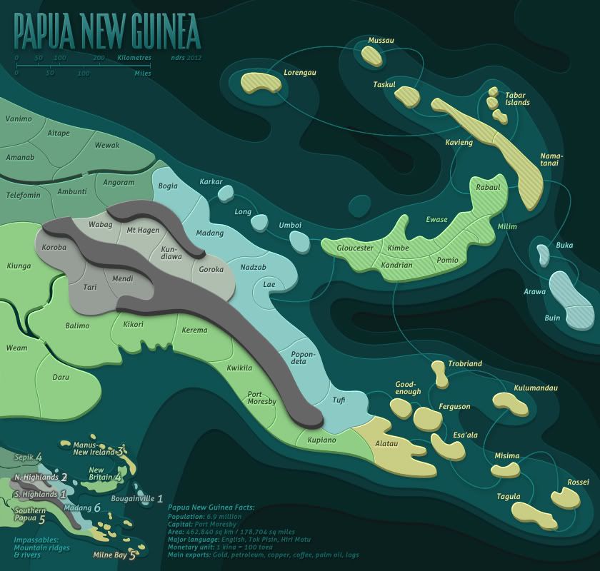
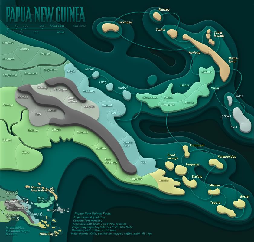
DiM wrote:i find it disturbing that some terits have diagonal lines and some don't. i think you should find 3 more pastel colour and use those for the terits with diagonal lines.
also the lines are very pixelated.
PS: i liked the leaves in the title.
koontz1973 wrote:gimil wrote:Out of curiosity why do some regions have stripes whether others are plain?
It was to keep the colours down. I already asked.
I'll see what I can do about the stripes. If I can find a couple of colours that doesn't make the map all tutti-frutti I'd be happy to change them!