[Vacation until Dec] Knights & Warlocks - V15 - page 1&12
Moderator: Cartographers
Forum rules
Please read the Community Guidelines before posting.
Please read the Community Guidelines before posting.
-
natty dread

- Posts: 12876
- Joined: Fri Feb 08, 2008 8:58 pm
- Location: just plain fucked
Re: Knights & Warlocks [24.Dec.11] - V12 - page 1&7
Only a 10% difference? I'd prefer at least 15 or 20...

-
DiM

- Posts: 10415
- Joined: Wed Feb 14, 2007 6:20 pm
- Gender: Male
- Location: making maps for scooby snacks
Re: Knights & Warlocks [24.Dec.11] - V12 - page 1&7
natty_dread wrote:Only a 10% difference? I'd prefer at least 15 or 20...
i would too, but i also prefer legibility and nicer, less cluttered images. i tried going for 800px wide, then bumped it up to 850 and still wasn't pleased. so i settled for 900px.
the guidelines say:
my large map is 11.11% larger than the small map so i'm within the guidelines.The 'large' map must be noticeably larger than the 'small' map; 9% larger is required but 33.3% (1/3) is recommended.
“In the beginning God said, the four-dimensional divergence of an antisymmetric, second rank tensor equals zero, and there was light, and it was good. And on the seventh day he rested.”- Michio Kaku
-
gimil

- Posts: 8599
- Joined: Sat Mar 03, 2007 12:42 pm
- Gender: Male
- Location: United Kingdom (Scotland)
Re: Knights & Warlocks [24.Dec.11] - V12 - page 1&7
f*ck your video 
I don't recall anyone asking you to change your legends border to be dark...we asked that the pixalation be fixed
I don't recall anyone asking you to change your legends border to be dark...we asked that the pixalation be fixed
What do you know about map making, bitch?
Top Score:2403natty_dread wrote:I was wrong
-
DiM
- Posts: 10415
- Joined: Wed Feb 14, 2007 6:20 pm
- Gender: Male
- Location: making maps for scooby snacks
Re: Knights & Warlocks [24.Dec.11] - V12 - page 1&7
buzz off.gimil wrote:f*ck your video
I don't recall anyone asking you to change your legends border to be dark...we asked that the pixalation be fixed
pixElation fixed
“In the beginning God said, the four-dimensional divergence of an antisymmetric, second rank tensor equals zero, and there was light, and it was good. And on the seventh day he rested.”- Michio Kaku

Re: Knights & Warlocks [24.Dec.11] - V12 - page 1&7
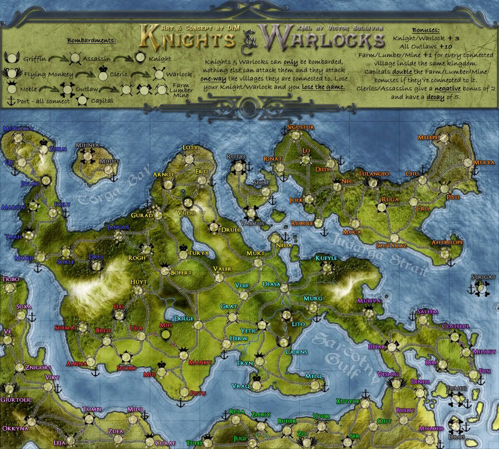
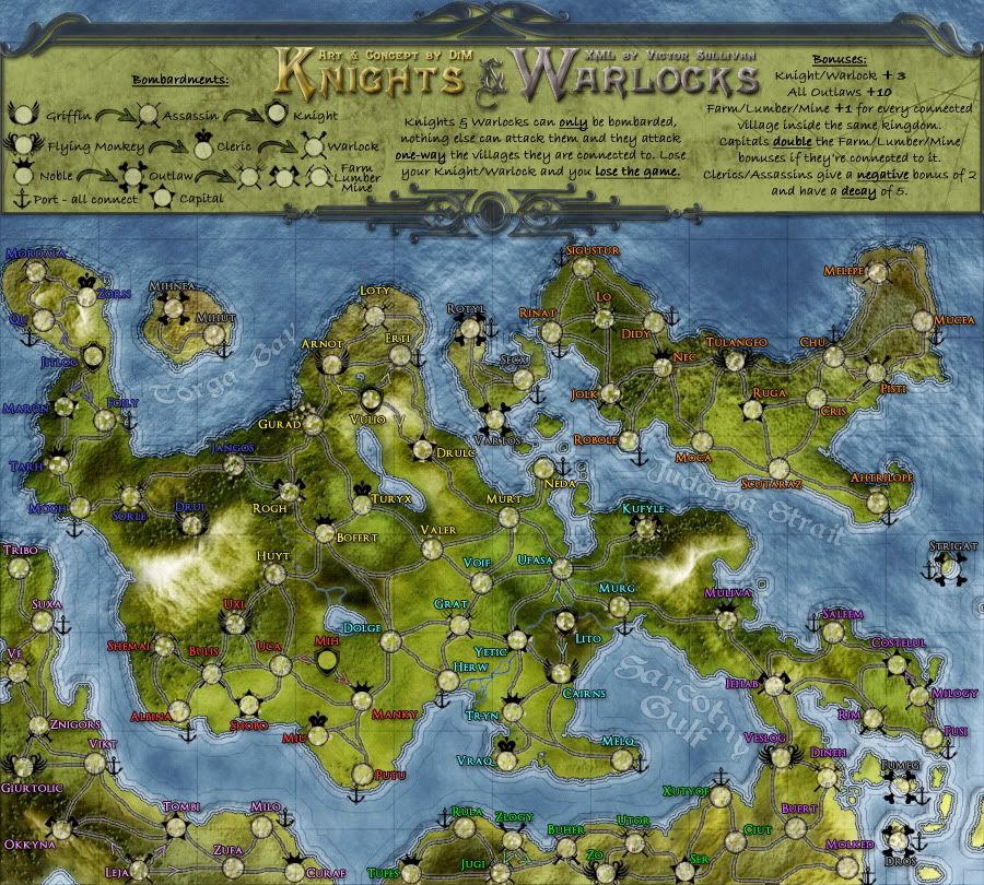
maybe i'm just missing something or just really stupid but what is the meaning of the different color in the names of regions?
there's no continent bonus now is there?
P.S. you should use assault instead of attack
there's no continent bonus now is there?
P.S. you should use assault instead of attack
- Click image to enlarge.

-
DiM
- Posts: 10415
- Joined: Wed Feb 14, 2007 6:20 pm
- Gender: Male
- Location: making maps for scooby snacks
Re: Knights & Warlocks [24.Dec.11] - V12 - page 1&7
no continent bonus but the colours delimit the area of influence for each kingdom and thus the farm/lumber/mine bonus which i forgot to mention in the legend and i'll fix right away.zimmah wrote:maybe i'm just missing something or just really stupid but what is the meaning of the different color in the names of regions?
there's no continent bonus now is there?
that's absurd. there's no copyright on attack. screw hasbro.zimmah wrote:P.S. you should use assault instead of attack
“In the beginning God said, the four-dimensional divergence of an antisymmetric, second rank tensor equals zero, and there was light, and it was good. And on the seventh day he rested.”- Michio Kaku
-
DiM
- Posts: 10415
- Joined: Wed Feb 14, 2007 6:20 pm
- Gender: Male
- Location: making maps for scooby snacks
Re: Knights & Warlocks [24.Dec.11] - V12 - page 1&7
V13:
*fixed wording in legend.
large:
small:
*fixed wording in legend.
large:
- Click image to enlarge.
- Click image to enlarge.

Last edited by DiM on Wed Dec 28, 2011 8:17 pm, edited 1 time in total.
“In the beginning God said, the four-dimensional divergence of an antisymmetric, second rank tensor equals zero, and there was light, and it was good. And on the seventh day he rested.”- Michio Kaku
-
AndyDufresne

- Posts: 24919
- Joined: Fri Mar 03, 2006 8:22 pm
- Location: A Banana Palm in Zihuatanejo
- Contact:
Re: Knights & Warlocks [27.Dec.11] - V13 - page 1&8
You should also underline/highlight the 'Double' part of the farm/lumber/mine bonus description?
Otherwise, this looks great.
--Andy
Otherwise, this looks great.
--Andy
-
gimil
- Posts: 8599
- Joined: Sat Mar 03, 2007 12:42 pm
- Gender: Male
- Location: United Kingdom (Scotland)
Re: Knights & Warlocks [27.Dec.11] - V13 - page 1&8
I really really really don't like the dark glass DiM  . I feel it doesn't work on this map. Everything else is nicely saturated in colour...the glass just doesn't feel right. I much preferred the older...litter glass.`
What do you know about map making, bitch?
Top Score:2403natty_dread wrote:I was wrong
-
DiM
- Posts: 10415
- Joined: Wed Feb 14, 2007 6:20 pm
- Gender: Male
- Location: making maps for scooby snacks
Re: Knights & Warlocks [27.Dec.11] - V13 - page 1&8
thanks andy. i updated the images in my previous post.AndyDufresne wrote:You should also underline/highlight the 'Double' part of the farm/lumber/mine bonus description?
Otherwise, this looks great.
--Andy
“In the beginning God said, the four-dimensional divergence of an antisymmetric, second rank tensor equals zero, and there was light, and it was good. And on the seventh day he rested.”- Michio Kaku
-
DiM
- Posts: 10415
- Joined: Wed Feb 14, 2007 6:20 pm
- Gender: Male
- Location: making maps for scooby snacks
Re: Knights & Warlocks [27.Dec.11] - V13 - page 1&8
sorry mate, you're in a minority here.gimil wrote:I really really really don't like the dark glass DiM
it's not such a big issue, i'm sure you'll enjoy the map even with the darker glass.
“In the beginning God said, the four-dimensional divergence of an antisymmetric, second rank tensor equals zero, and there was light, and it was good. And on the seventh day he rested.”- Michio Kaku
-
gimil
- Posts: 8599
- Joined: Sat Mar 03, 2007 12:42 pm
- Gender: Male
- Location: United Kingdom (Scotland)
Re: Knights & Warlocks [27.Dec.11] - V13 - page 1&8
I think your a doucheDiM wrote:sorry mate, you're in a minority here.gimil wrote:I really really really don't like the dark glass DiM
it's not such a big issue, i'm sure you'll enjoy the map even with the darker glass.
What do you know about map making, bitch?
Top Score:2403natty_dread wrote:I was wrong
-
DiM
- Posts: 10415
- Joined: Wed Feb 14, 2007 6:20 pm
- Gender: Male
- Location: making maps for scooby snacks
Re: Knights & Warlocks [27.Dec.11] - V13 - page 1&8
i love you toogimil wrote:I think your a doucheDiM wrote:sorry mate, you're in a minority here.gimil wrote:I really really really don't like the dark glass DiM
it's not such a big issue, i'm sure you'll enjoy the map even with the darker glass.
“In the beginning God said, the four-dimensional divergence of an antisymmetric, second rank tensor equals zero, and there was light, and it was good. And on the seventh day he rested.”- Michio Kaku
-
lostatlimbo

- Posts: 1386
- Joined: Wed Mar 28, 2007 3:56 pm
- Location: Portland, OR
Re: Knights & Warlocks [27.Dec.11] - V13 - page 1&8
What do you think about his douche? You didn't finish your sentence. You're leaving me hanging.gimil wrote:I think your a douche :geek:DiM wrote:sorry mate, you're in a minority here.gimil wrote:I really really really don't like the dark glass DiM :(. I feel it doesn't work on this map. Everything else is nicely saturated in colour...the glass just doesn't feel right. I much preferred the older...litter glass.`
it's not such a big issue, i'm sure you'll enjoy the map even with the darker glass. :mrgreen:
-
gimil
- Posts: 8599
- Joined: Sat Mar 03, 2007 12:42 pm
- Gender: Male
- Location: United Kingdom (Scotland)
Re: Knights & Warlocks [27.Dec.11] - V13 - page 1&8
[Stickied]
I have 48 hours to find a clan that can support my desire to change the dark glass
I have 48 hours to find a clan that can support my desire to change the dark glass
What do you know about map making, bitch?
Top Score:2403natty_dread wrote:I was wrong
-
DiM
- Posts: 10415
- Joined: Wed Feb 14, 2007 6:20 pm
- Gender: Male
- Location: making maps for scooby snacks
Re: Knights & Warlocks [27.Dec.11] - V13 - page 1&8
dang, i recently quit my clan. i'd better look for one to support my dark glassgimil wrote:[Stickied]
I have 48 hours to find a clan that can support my desire to change the dark glass
“In the beginning God said, the four-dimensional divergence of an antisymmetric, second rank tensor equals zero, and there was light, and it was good. And on the seventh day he rested.”- Michio Kaku
-
koontz1973
- Posts: 6960
- Joined: Thu Jan 01, 2009 10:57 am
Re: Knights & Warlocks [27.Dec.11] - V13 - page 1&8
Without being in a clan can I express my opinion towards the darker glasses. But I seem to be noticing that the title in gold and silver has its lighting coming down from the top but the legend border itself seems to be coming from the top right. Is it my imagination or has this been over looked?
The symbol that you have used for the and in the title looks different to the rest of the border. I know it is the same as the rest of the title but as you have used the same colouring as the border it sits out of place. Can I suggest you change it to a different colour scheme all together or make it like the border.
One other thing DiM, is it possible for you to move the top part of the border down a couple of pixels as it looks like the border is off the map. I am sure you did not draw it this way, but it just seems to end abruptly.
Great map and look forward to playing it.

-
DiM
- Posts: 10415
- Joined: Wed Feb 14, 2007 6:20 pm
- Gender: Male
- Location: making maps for scooby snacks
Re: Knights & Warlocks [27.Dec.11] - V13 - page 1&8
it's just your imagination. both elements have the same light source.koontz1973 wrote:Without being in a clan can I express my opinion towards the darker glasses. But I seem to be noticing that the title in gold and silver has its lighting coming down from the top but the legend border itself seems to be coming from the top right. Is it my imagination or has this been over looked?
done.koontz1973 wrote:The symbol that you have used for the and in the title looks different to the rest of the border. I know it is the same as the rest of the title but as you have used the same colouring as the border it sits out of place. Can I suggest you change it to a different colour scheme all together or make it like the border.
donekoontz1973 wrote:One other thing DiM, is it possible for you to move the top part of the border down a couple of pixels as it looks like the border is off the map. I am sure you did not draw it this way, but it just seems to end abruptly.
thanks.koontz1973 wrote:Great map and look forward to playing it.
“In the beginning God said, the four-dimensional divergence of an antisymmetric, second rank tensor equals zero, and there was light, and it was good. And on the seventh day he rested.”- Michio Kaku
-
DiM
- Posts: 10415
- Joined: Wed Feb 14, 2007 6:20 pm
- Gender: Male
- Location: making maps for scooby snacks
Re: Knights & Warlocks [24.Dec.11] - V12 - page 1&7
V14:
*fixed & in the legend
*moved the legend top border
large:
small:
*fixed & in the legend
*moved the legend top border
large:
- Click image to enlarge.

- Click image to enlarge.
“In the beginning God said, the four-dimensional divergence of an antisymmetric, second rank tensor equals zero, and there was light, and it was good. And on the seventh day he rested.”- Michio Kaku
-
koontz1973
- Posts: 6960
- Joined: Thu Jan 01, 2009 10:57 am
-
Victor Sullivan

- Posts: 6010
- Joined: Mon Feb 08, 2010 8:17 pm
- Gender: Male
- Location: Columbus, OH
- Contact:
Re: Knights & Warlocks [30.Dec.11] - V14 - page 1&8
Well, hot damn. I better get my ass in gear!
-Sully
-Sully
Beckytheblondie: "Don't give us the dispatch, give us a mustache ride."
Scaling back on my CC involvement...
Scaling back on my CC involvement...
-
gimil
- Posts: 8599
- Joined: Sat Mar 03, 2007 12:42 pm
- Gender: Male
- Location: United Kingdom (Scotland)
Re: Knights & Warlocks [30.Dec.11] - V14 - page 1&8
Here you go big guy.

You know the drill...this isn't a final seal of approval. If any more graphical concerns are raised you will be expected to address them
You know the drill...this isn't a final seal of approval. If any more graphical concerns are raised you will be expected to address them
What do you know about map making, bitch?
Top Score:2403natty_dread wrote:I was wrong
-
DiM
- Posts: 10415
- Joined: Wed Feb 14, 2007 6:20 pm
- Gender: Male
- Location: making maps for scooby snacks
Re: Knights & Warlocks [30.Dec.11] - V14 - page 1&8
woo hoogimil wrote:Here you go big guy.
You know the drill...this isn't a final seal of approval. If any more graphical concerns are raised you will be expected to address them
“In the beginning God said, the four-dimensional divergence of an antisymmetric, second rank tensor equals zero, and there was light, and it was good. And on the seventh day he rested.”- Michio Kaku
-
Victor Sullivan
- Posts: 6010
- Joined: Mon Feb 08, 2010 8:17 pm
- Gender: Male
- Location: Columbus, OH
- Contact:
Re: Knights & Warlocks [30.Dec.11] - V14 - page 1&8
Hm, do you suppose there's any way to improve the readability of the blue text? It is a bit dark, though not unreadable.
Anywho, working on the XML. Safari "unexpectedly quit" while I was in the wizard the other day. Now that I've had sufficient time to mourn, I'm getting back to business! It will take a while, however.
-Sully
Anywho, working on the XML. Safari "unexpectedly quit" while I was in the wizard the other day. Now that I've had sufficient time to mourn, I'm getting back to business! It will take a while, however.
-Sully
Beckytheblondie: "Don't give us the dispatch, give us a mustache ride."
Scaling back on my CC involvement...
Scaling back on my CC involvement...
-
DiM
- Posts: 10415
- Joined: Wed Feb 14, 2007 6:20 pm
- Gender: Male
- Location: making maps for scooby snacks
Re: Knights & Warlocks [30.Dec.11] - V14 - page 1&8
is it an issue? i'm not too keen on changing it, considering i've been tweaking it for a while and the general consensus was that all is well. i'm afraid that if i tweak it for you then the people that are happy now might start complaining and demand another change. and so on and so forth.Victor Sullivan wrote:Hm, do you suppose there's any way to improve the readability of the blue text? It is a bit dark, though not unreadable.
“In the beginning God said, the four-dimensional divergence of an antisymmetric, second rank tensor equals zero, and there was light, and it was good. And on the seventh day he rested.”- Michio Kaku