Battle of Waterloo [Quenched]
Moderator: Cartographers
I'd flip the second horse in the legends... also I'd put a stroke on the blue red words as they're a bit unreadable otherwise...
Also - some of the flags point both ways I think you should choose 1 direction for each side...
C.
Also - some of the flags point both ways I think you should choose 1 direction for each side...
C.

Highest score : 2297
-

 yeti_c
- Posts: 9624
- Joined: Thu Jan 04, 2007 9:02 am


cairnswk wrote:hecter wrote:Think we could maybe change the name? 'Cause I live right by the city of Waterloo, and that map looks nothing like it.
Just for you Hecter i will add "Battle of"
Yay! Thank you
-

 hecter
- Posts: 14632
- Joined: Tue Jan 09, 2007 6:27 pm
- Location: Tying somebody up on the third floor


cairnswk wrote:oaktown wrote:The horses can remain as is.
GoodMy initial concern was that the blue and red of those elements isn't in keeping with the color of the rest of the map, as you have softer colors throughout the rest of the image. But I recognize that perhaps that's intentional, as it's important that the two sides not be confused... it's a matter of individual preference and totally your call.
I also left it as red and blue as these are more the traditional colours that one might expect to see on a gameboard representing French and British.
I realise they don't quite fit with the rest of the colour scheme, but they do stand out and i think that is important.This might look bad - and if so just say so and I'll leave it alone - but what if the red horse were flipped horizontally so it looks as if they are engaging in the battle and not running away?
I appreciate the use of letters to go with the color scheme - very user friendly.
Flip...done! Not a prob. Please F5 to see the changes. Thanks for commenting on colours also.
wow, thats a big map, I noticed more maps are becoming larger, is this preparing us for 4 on 4 team games or quads? Thought lack was implementing that?

-

 Blitzaholic
- Posts: 23050
- Joined: Wed Aug 09, 2006 11:57 pm
- Location: Apocalyptic Area


Blitzaholic wrote:wow, thats a big map, I noticed more maps are becoming larger, is this preparing us for 4 on 4 team games or quads? Thought lack was implementing that?
Blitzaholic...i have no idea about 4x4 team games or quads or what Lack's plans are for those implementations.
This map is large simply because you cannot do justice to playing REAL history unless you maintain most of the historical aspects that made the war what it was/became.
I think it would be ludacrous to make a map of the Battle of Waterloo and not have artillery and cavalry and infantry; nor have a good number of territories available to "battle" over. Making this map with 36 territories or less in the style of Classic would not do the Battle justice.

* Pearl Harbour * Waterloo * Forbidden City * Jamaica * Pot Mosbi
-

 cairnswk
- Posts: 11510
- Joined: Sat Feb 03, 2007 8:32 pm
- Location: Australia


Version 18 Updates
Changes:
* Re-arranged the Alton Square terts A03 and A04
* added stroke to red and blue in legend
* added brick wall to separate la Haye Sainte from N04, N06
* fixes flags and horses orientation
Small
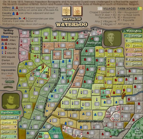
Large
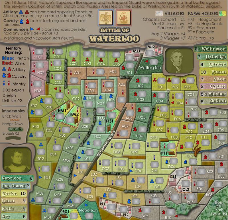
Changes:
* Re-arranged the Alton Square terts A03 and A04
* added stroke to red and blue in legend
* added brick wall to separate la Haye Sainte from N04, N06
* fixes flags and horses orientation
Small

Large


* Pearl Harbour * Waterloo * Forbidden City * Jamaica * Pot Mosbi
-

 cairnswk
- Posts: 11510
- Joined: Sat Feb 03, 2007 8:32 pm
- Location: Australia


Coleman wrote:Oh, you had more than one update on that page...
I think both then.
Thanks Coleman...do you have any other comments on this map...good, bad or indifferent?

* Pearl Harbour * Waterloo * Forbidden City * Jamaica * Pot Mosbi
-

 cairnswk
- Posts: 11510
- Joined: Sat Feb 03, 2007 8:32 pm
- Location: Australia


Showing pink and brown squares in the towns example part of the legend and a brown funky square (not sure what else to call it) in the farm house part of the legend would help me identify them more.
Also your bottom right light is broken in your red artillery at the top legend (the red circle is significantly darker than the other two) this is in both sizes of the map.
Also your bottom right light is broken in your red artillery at the top legend (the red circle is significantly darker than the other two) this is in both sizes of the map.
-

 Coleman
- Posts: 5402
- Joined: Tue Jan 02, 2007 10:36 pm
- Location: Midwest


Coleman wrote:Showing pink and brown squares in the towns example part of the legend and a brown funky square (not sure what else to call it) in the farm house part of the legend would help me identify them more.
Also your bottom right light is broken in your red artillery at the top legend (the red circle is significantly darker than the other two) this is in both sizes of the map.
Thanks..i'll check it out and post an update.

* Pearl Harbour * Waterloo * Forbidden City * Jamaica * Pot Mosbi
-

 cairnswk
- Posts: 11510
- Joined: Sat Feb 03, 2007 8:32 pm
- Location: Australia


Coleman wrote:Beyond nitpicking I like the map and everything you've done since I last took a good hard look at it has fixed all the concerns I had at that time.
Thanks for your input!
Coleman wrote:Showing pink and brown squares in the towns example part of the legend and a brown funky square (not sure what else to call it) in the farm house part of the legend would help me identify them more.
Also your bottom right light is broken in your red artillery at the top legend (the red circle is significantly darker than the other two) this is in both sizes of the map.
All fixed in Version 19 below, plus small tweaks to some terts and the legend centering
Small

Large


* Pearl Harbour * Waterloo * Forbidden City * Jamaica * Pot Mosbi
-

 cairnswk
- Posts: 11510
- Joined: Sat Feb 03, 2007 8:32 pm
- Location: Australia


yeti_c wrote:I still think that all the flags should be flipped... in both legend and map...
C.
How about the flags in the legend get flipped to <| |>
and the flags on the map follow the same presentation as the legend....meaning
French would be <|
Allies would be |>

* Pearl Harbour * Waterloo * Forbidden City * Jamaica * Pot Mosbi
-

 cairnswk
- Posts: 11510
- Joined: Sat Feb 03, 2007 8:32 pm
- Location: Australia


cairnswk wrote:yeti_c wrote:I still think that all the flags should be flipped... in both legend and map...
C.
How about the flags in the legend get flipped to <| |>
and the flags on the map follow the same presentation as the legend....meaning
French would be <|
Allies would be |>
Aye that's it...
C.

Highest score : 2297
-

 yeti_c
- Posts: 9624
- Joined: Thu Jan 04, 2007 9:02 am


yeti_c wrote:cairnswk wrote:yeti_c wrote:I still think that all the flags should be flipped... in both legend and map...
C.
How about the flags in the legend get flipped to <| |>
and the flags on the map follow the same presentation as the legend....meaning
French would be <|
Allies would be |>
Aye that's it...
C.
Yeti_C...i am not going to go with the suggestion above....reason:
Someone made a request for the horses to be facing each other from the two opposing sides and i did that in the legend and on the map.
The flags also face that same way, and thus are consistent with the horses.

* Pearl Harbour * Waterloo * Forbidden City * Jamaica * Pot Mosbi
-

 cairnswk
- Posts: 11510
- Joined: Sat Feb 03, 2007 8:32 pm
- Location: Australia


cairnswk wrote:yeti_c wrote:cairnswk wrote:yeti_c wrote:I still think that all the flags should be flipped... in both legend and map...
C.
How about the flags in the legend get flipped to <| |>
and the flags on the map follow the same presentation as the legend....meaning
French would be <|
Allies would be |>
Aye that's it...
C.
Yeti_C...i am not going to go with the suggestion above....reason:
Someone made a request for the horses to be facing each other from the two opposing sides and i did that in the legend and on the map.
The flags also face that same way, and thus are consistent with the horses.
Booo...
I just think that if you were riding into war your flag would be flowing along behind you... Also the two flags pointing at each other in the legend looks silly...
C.

Highest score : 2297
-

 yeti_c
- Posts: 9624
- Joined: Thu Jan 04, 2007 9:02 am


yeti_c wrote:cairnswk wrote:yeti_c wrote:cairnswk wrote:yeti_c wrote:I still think that all the flags should be flipped... in both legend and map...
C.
How about the flags in the legend get flipped to <| |>
and the flags on the map follow the same presentation as the legend....meaning
French would be <|
Allies would be |>
Aye that's it...
C.
Yeti_C...i am not going to go with the suggestion above....reason:
Someone made a request for the horses to be facing each other from the two opposing sides and i did that in the legend and on the map.
The flags also face that same way, and thus are consistent with the horses.
Booo...
I just think that if you were riding into war your flag would be flowing along behind you... Also the two flags pointing at each other in the legend looks silly...
C.
Booo...to your booo too too LOL
so what are you after...reality or consistency....cox if i change the flag orientation then i really thinnk the horses should change for consistency, and then they'll look as though there not facing each other.

* Pearl Harbour * Waterloo * Forbidden City * Jamaica * Pot Mosbi
-

 cairnswk
- Posts: 11510
- Joined: Sat Feb 03, 2007 8:32 pm
- Location: Australia


cairnswk wrote:yeti_c wrote:cairnswk wrote:yeti_c wrote:cairnswk wrote:yeti_c wrote:I still think that all the flags should be flipped... in both legend and map...
C.
How about the flags in the legend get flipped to <| |>
and the flags on the map follow the same presentation as the legend....meaning
French would be <|
Allies would be |>
Aye that's it...
C.
Yeti_C...i am not going to go with the suggestion above....reason:
Someone made a request for the horses to be facing each other from the two opposing sides and i did that in the legend and on the map.
The flags also face that same way, and thus are consistent with the horses.
Booo...
I just think that if you were riding into war your flag would be flowing along behind you... Also the two flags pointing at each other in the legend looks silly...
C.
Booo...to your booo too too LOL
so what are you after...reality or consistency....cox if i change the flag orientation then i really thinnk the horses should change for consistency, and then they'll look as though there not facing each other.
Both - the horses should face each other - flags facing each other is wrong...
Like I say - as you ride into battle your flag flows behind you...
C.

Highest score : 2297
-

 yeti_c
- Posts: 9624
- Joined: Thu Jan 04, 2007 9:02 am


yeti_c wrote:Both - the horses should face each other - flags facing each other is wrong...
Like I say - as you ride into battle your flag flows behind you...
C.
OK...ill do that then...you have a strong argument.....
Last edited by cairnswk on Thu Dec 06, 2007 9:23 am, edited 1 time in total.

* Pearl Harbour * Waterloo * Forbidden City * Jamaica * Pot Mosbi
-

 cairnswk
- Posts: 11510
- Joined: Sat Feb 03, 2007 8:32 pm
- Location: Australia


cairnswk wrote:[quote="yeti_c
Both - the horses should face each other - flags facing each other is wrong...
Like I say - as you ride into battle your flag flows behind you...
C.
OK...ill do that then...you have a strong argument.....
YAYAYYAYAY!!!
C.

Highest score : 2297
-

 yeti_c
- Posts: 9624
- Joined: Thu Jan 04, 2007 9:02 am


Who is online
Users browsing this forum: No registered users


