Conquer Club

American Civil War [Quenched]

Care to peruse completed maps? Take a stroll through the Atlas.

Moderator: Cartographers

Forum rules
Please read the Community Guidelines before posting.

Postby Elijah S on Sun Nov 18, 2007 3:29 pm

qwert wrote:
elijah
Qwert and Spiesr -
The rivers looked good to me but I added the same texture used in the ocean to give them a subtle difference.
If you could give me some specific reason you don't like them, I'd have something to go by, otherwise I think we should move on...

Visualy these river is very low,and like i say before you must show more diferent style of river,and people can se who style is good.


As I've said, you give me nothing to work with here... You say the rivers don't look good, but what specifically is it you don't like???
Are they too blue?
Too wide?
Too narrow?
Need to contrast the states more?
Need another texture?

How can I improve something that looks good to me if I don't know what looks bad to you?
Sergeant 1st Class Elijah S
 
Posts: 672
Joined: Wed May 09, 2007 6:24 pm

Postby serious_conq on Sun Nov 18, 2007 3:43 pm

The map: its okay, however Kansas standing out must be fun :)

The legend: A bit confusing actually. Maybe you should put all 'continent bonusses', Chamberlain, Sherman, Grant, Lee, Jackson and Beauregard together on top of the legend. At first look, personally, the south part gave no bonusses :roll: so I think that would be a point of improvement.
User avatar
Corporal serious_conq
 
Posts: 77
Joined: Tue Jun 19, 2007 6:04 am

Postby gimil on Sun Nov 18, 2007 3:45 pm

Hate to be an ass but this map is nowhere near ready for FF, the grahpics are in needs of alot more work. But i suppose thats the foundrys fault for not giving feedback.

Heres a list of the graphical issues i see:


1. The rivers are very untidy and unpleasing. There color isnt all to nice either. May i suggest that you redraw the rivers so that there alot smoother and change the color to match with the sea.

2. The boarders and inconsistant. There are diffirent sizes in areas and some parts looked blurred while others arnt. Again i suggest redawing all of them making sure you sue the same size brush tool at all times. And if you want them blurred use a blur filter rather than the blur tool, this will ensure a consistantancy.

3. The boarders at hte coast are horrible there to thick and dont hug the coastline to well, theres areas of hte sea visable between the black boarder and the land. Again id advise redrawing then much thinner and tidier.

Those are the major problems i see, now for the nit picking.


1. The sherman continent color is a little to bright, could you tone it down a little?

2. On the legends chamberlain is a little duller that the continent color could these be matched up please?

3. Im not really liking the font at hte moment, well no really the font bu how its presented, its a tad to strong, bold and blurred. Id like to advise that you sharpen the font a little and reduce the boldness slightly.

4. I dont personally feel that your map needs army circles i think it would look fine without them. But thats jsut personal preference.

5. I feel the bridges look untidy like they have been drawn by a child. Id like to see these redrawn.

6. Could all the information in the legends be moved a few pixals to the left? It seems a little to clsoe to hte right hand boarder.

Sorry to seem so negative, i like hte theme and the colors etc of this map. I jsut feel that graphically its not ready for final forge. I understand that my post may seem frustrating to you at this stage so if you need any help PM me and ill gladly help you out. Kep up the good work and hopefully we will have this map done in no time.
Last edited by gimil on Sun Nov 18, 2007 6:42 pm, edited 1 time in total.
What do you know about map making, bitch?

natty_dread wrote:I was wrong


Top Score:2403
User avatar
Corporal 1st Class gimil
 
Posts: 8599
Joined: Sat Mar 03, 2007 12:42 pm
Location: United Kingdom (Scotland)

Postby Qwert on Sun Nov 18, 2007 6:02 pm

As I've said, you give me nothing to work with here... You say the rivers don't look good, but what specifically is it you don't like???
Are they too blue?
Too wide?
Too narrow?
Need to contrast the states more?
Need another texture?

How can I improve something that looks good to me if I don't know what looks bad to you?

Its these for you looks good?Try to experiment with blue colours and textures,and show more diferent styles and let people see.
I can not say what is good if i dont see.
Image
NEW REVOLUTION-NEW RANKS PRESS THESE LINK viewtopic.php?f=471&t=47578&start=0
User avatar
Major Qwert
SoC Training Adviser
 
Posts: 9262
Joined: Tue Nov 07, 2006 5:07 pm
Location: VOJVODINA

Postby Elijah S on Sun Nov 18, 2007 8:17 pm

qwert wrote:
As I've said, you give me nothing to work with here... You say the rivers don't look good, but what specifically is it you don't like???
Are they too blue?
Too wide?
Too narrow?
Need to contrast the states more?
Need another texture?

How can I improve something that looks good to me if I don't know what looks bad to you?

Its these for you looks good?Try to experiment with blue colours and textures,and show more diferent styles and let people see.
I can not say what is good if i dont see.


I'm not asking what you think is good. I'm asking what you think is bad that would warrant changing it.
But! Never fear! Gimil has popped in now that this map's in FF and put in his two cents...
Last edited by Elijah S on Sun Nov 18, 2007 9:03 pm, edited 1 time in total.
Sergeant 1st Class Elijah S
 
Posts: 672
Joined: Wed May 09, 2007 6:24 pm

Postby gimil on Sun Nov 18, 2007 8:55 pm

Elijah S wrote:
I'm not asking what you think is good. I'm asking what you think is bad that would warrant changing it.
But! Never fear! Gimil has popped in now that this map's in FF and put in his two cents...


I know mate and im sorry for that if i was around more in the last few weeks i would of thought givin it earlier, but to be honest with a number of untidy areas in this map it shouldnt of been FF'ed anyway. I dont know how the community never caught onto these facts earlier. Its not far off FF quality but it still needs a little work. and like i said im willing to help you out in anyway possible, even if you want me to do these updates myself. I dont want you losing motivation over me coming in this late in the game.

again my apologies
What do you know about map making, bitch?

natty_dread wrote:I was wrong


Top Score:2403
User avatar
Corporal 1st Class gimil
 
Posts: 8599
Joined: Sat Mar 03, 2007 12:42 pm
Location: United Kingdom (Scotland)

Mason Dickson Line

Postby ThrowinStones on Sun Nov 18, 2007 10:00 pm

You should create the MAson Dickson line...
Cook ThrowinStones
 
Posts: 6
Joined: Fri Sep 28, 2007 7:56 pm

Postby Elijah S on Sun Nov 18, 2007 10:00 pm

gimil wrote:
Elijah S wrote:
I'm not asking what you think is good. I'm asking what you think is bad that would warrant changing it.
But! Never fear! Gimil has popped in now that this map's in FF and put in his two cents...


I know mate and im sorry for that if i was around more in the last few weeks i would of thought givin it earlier, but to be honest with a number of untidy areas in this map it shouldnt of been FF'ed anyway. I dont know how the community never caught onto these facts earlier. Its not far off FF quality but it still needs a little work. and like i said im willing to help you out in anyway possible, even if you want me to do these updates myself. I dont want you losing motivation over me coming in this late in the game.

again my apologies


Gimil, I really appreciate this last post.
It's hard not to get discouraged after the many (and I mean MANY) hours I've put into this...

While I could take issue with a couple of your points, and maybe the general tone that it doesn't deserve to be in FF, I realize there are some valid issues in your previous post.
I think it's important to say here that the borders and rivers have been little more than supreme pains in the ass for a while now, and that these have been improved upon with practically every revision I've done.

The problem with the borders are:
When I first began this project, it being my first attempt at maps, I set the dpi at 72... I know, I know... next time I'll go much higher.
Secondly, there are some angles on the board that just don't seem to rasterize well. -i.e.- the borders between Kentucky and Tennessee, and between Virginia and N. Carolina.
The rest of them have been tweeked to an acceptable level, in my opinion.
I don't think it's necessary to redraw all of the borders...

The rivers are not smoothe like other CC maps, but follow the true geographical paths of the Ohio and Mississippi Rivers...
This seems to really disturb a few people, and while I'm fine with them as they are, if redrawing them is the only option that will quiet the masses, than so be it.

I feel somewhat limited with Photoshop, as it offers only one vector-based function. -The pen tool. And it doesn't rasterize well in all areas.
The same is true of PS fonts... anything with a serif (which I think fits the era depicted) seems to blur considerably with flattening into .jpg or any kind of enlargement.

If it's possible to have PS do some kind of extrapolation which will increase the dpi I'd love to learn this trick!

The working file is in over 80 layers and still pretty editable, and at this point I don't actually have any aversion to letting someone take a crack at the bigger issues... (the borders mainly)

Basically, I think this is a great map with features that will make the gameplay pretty damned fun, but if it needs to sit in FF for a while in order to fine-tune some graphics, I'd prefer to not rush and make it the best it can be.
Sergeant 1st Class Elijah S
 
Posts: 672
Joined: Wed May 09, 2007 6:24 pm

Postby gimil on Sun Nov 18, 2007 10:42 pm

Boarders are extreamly difficult no draw if you dont know how, like i said im willing to do a quick tidy fix for you if your willing.
What do you know about map making, bitch?

natty_dread wrote:I was wrong


Top Score:2403
User avatar
Corporal 1st Class gimil
 
Posts: 8599
Joined: Sat Mar 03, 2007 12:42 pm
Location: United Kingdom (Scotland)

Postby yamahafazer on Mon Nov 19, 2007 3:30 am

OooooK.

1. Thanks for the change to the sea... it looks like a sea now. :)

2. I can see why so meny don't like your river... the main things that stand out for me with it is: 1. it dosen't tail of at the end... getting progresively narower and narower untill it's gone... but just ends abruply. 2. when it gets to the see it has two places that it enters the see(or seems to have) creating an island in "Louisiana". 3. the blue just seems a little too bright.

3. I can't see what all the fuss is about with the borders myself... there borders aren't they??? But I can see gimil's point with the borders between the sea and land.

That's all I can see right now.. keep up the work :wink:
Image
User avatar
Private 1st Class yamahafazer
 
Posts: 211
Joined: Fri Aug 24, 2007 9:56 am

Postby reverend_kyle on Mon Nov 19, 2007 3:35 am

About the river Elijah, I personally don't have a problem with it now, but I can see what the others are saying. If you could actually get it to continue with the same gradient as the ocean I think that would help it look more natural which is the problem.


Also, there seems to be some blue near the north between the U.S. and canada that could use a touch up.
DANCING MUSTARD FOR POOP IN '08!
User avatar
Sergeant reverend_kyle
 
Posts: 9250
Joined: Tue Mar 21, 2006 4:08 pm
Location: 1000 post club

Postby yamahafazer on Mon Nov 19, 2007 3:42 am

Where are the examples of the two choices on the poll??
Image
User avatar
Private 1st Class yamahafazer
 
Posts: 211
Joined: Fri Aug 24, 2007 9:56 am

Postby gimil on Mon Nov 19, 2007 5:04 am

Am i just getting progressivly stupider? Cant anyone see the less than impressive looking boarders? Where are the more experienced artists to back me up here? what has happened to the foundry the last few wekks that i havent been active?
What do you know about map making, bitch?

natty_dread wrote:I was wrong


Top Score:2403
User avatar
Corporal 1st Class gimil
 
Posts: 8599
Joined: Sat Mar 03, 2007 12:42 pm
Location: United Kingdom (Scotland)

Postby Qwert on Mon Nov 19, 2007 10:14 am

Gimil, I really appreciate this last post.
It's hard not to get discouraged after the many (and I mean MANY) hours I've put into this...

While I could take issue with a couple of your points, and maybe the general tone that it doesn't deserve to be in FF, I realize there are some valid issues in your previous post.
I think it's important to say here that the borders and rivers have been little more than supreme pains in the ass for a while now, and that these have been improved upon with practically every revision I've done.

The problem with the borders are:
When I first began this project, it being my first attempt at maps, I set the dpi at 72... I know, I know... next time I'll go much higher.
Secondly, there are some angles on the board that just don't seem to rasterize well. -i.e.- the borders between Kentucky and Tennessee, and between Virginia and N. Carolina.
The rest of them have been tweeked to an acceptable level, in my opinion.
I don't think it's necessary to redraw all of the borders...

The rivers are not smoothe like other CC maps, but follow the true geographical paths of the Ohio and Mississippi Rivers...
This seems to really disturb a few people, and while I'm fine with them as they are, if redrawing them is the only option that will quiet the masses, than so be it.

I feel somewhat limited with Photoshop, as it offers only one vector-based function. -The pen tool. And it doesn't rasterize well in all areas.
The same is true of PS fonts... anything with a serif (which I think fits the era depicted) seems to blur considerably with flattening into .jpg or any kind of enlargement.

If it's possible to have PS do some kind of extrapolation which will increase the dpi I'd love to learn this trick!

The working file is in over 80 layers and still pretty editable, and at this point I don't actually have any aversion to letting someone take a crack at the bigger issues... (the borders mainly)

Basically, I think this is a great map with features that will make the gameplay pretty damned fun, but if it needs to sit in FF for a while in order to fine-tune some graphics, I'd prefer to not rush and make it the best it can be.

Do you know how many hours i put on mine maps.
working file with 80 layers is not so big,and i have files with over 200 layers.
I work 6 month to map go in final forge,and you work only 2 month,so please there is no need for rush.
Image
NEW REVOLUTION-NEW RANKS PRESS THESE LINK viewtopic.php?f=471&t=47578&start=0
User avatar
Major Qwert
SoC Training Adviser
 
Posts: 9262
Joined: Tue Nov 07, 2006 5:07 pm
Location: VOJVODINA

Postby Qwert on Mon Nov 19, 2007 10:20 am

gimil Posted: 19 Nov 2007 10:04 Post subject:

--------------------------------------------------------------------------------

Am i just getting progressivly stupider? Cant anyone see the less than impressive looking boarders? Where are the more experienced artists to back me up here? what has happened to the foundry the last few wekks that i havent been active?

I realy dont know what hepend,i dont se Andy to put hes feedback like he put far before,and quenched maps(5-6maps)still after 5-6 days not in games.
Image
NEW REVOLUTION-NEW RANKS PRESS THESE LINK viewtopic.php?f=471&t=47578&start=0
User avatar
Major Qwert
SoC Training Adviser
 
Posts: 9262
Joined: Tue Nov 07, 2006 5:07 pm
Location: VOJVODINA

Postby Elijah S on Mon Nov 19, 2007 12:54 pm

This map being in FF doesn't mean that all work has been done...

I've noted the recent complaints and will take care of things, but in the meantime, if some of you could attempt to exhibit a degree of respect, I'd appreciate it.

In short, trying to appease everyone has become a lesson in futility and I need to get away from this for a few days.
So if you post a comment and don't get an immediate response bear with me...
Last edited by Elijah S on Mon Nov 19, 2007 10:50 pm, edited 1 time in total.
Sergeant 1st Class Elijah S
 
Posts: 672
Joined: Wed May 09, 2007 6:24 pm

Postby gimil on Mon Nov 19, 2007 3:19 pm

NO one is showing disrespect, its construuctive critisim which you will need to learn to handle within the foundry.
What do you know about map making, bitch?

natty_dread wrote:I was wrong


Top Score:2403
User avatar
Corporal 1st Class gimil
 
Posts: 8599
Joined: Sat Mar 03, 2007 12:42 pm
Location: United Kingdom (Scotland)

Re: Updates

Postby yeti_c on Mon Nov 19, 2007 5:06 pm

Elijah S wrote:Andew B, Yeti-c -
The blurry type has been a concern of mine too, and something I've been trying to sharpen.
In this version I've approached that in a couple ways.
I changed the black font in Lee and Sherman's states to white, which also leaves only the neutrals with black font and seems to work better.
In the legend I've enlarged the type and aligned the generals to the left margin.
I think any burriness now would be with the "In addition to other bonuses" lines, which I'm addressing.


I like the white as neutrals only - this makes it a bit more obvious that these territories are different (i.e. without bonus) -> Are they to be Neutral as well? I don't think they should be - as most of them are "out of the way" so they would just be ignored...

C.
Image
Highest score : 2297
User avatar
Lieutenant yeti_c
 
Posts: 9624
Joined: Thu Jan 04, 2007 9:02 am

Re: Updates

Postby Elijah S on Mon Nov 19, 2007 11:15 pm

yeti_c wrote:
Elijah S wrote:Andew B, Yeti-c -
The blurry type has been a concern of mine too, and something I've been trying to sharpen.
In this version I've approached that in a couple ways.
I changed the black font in Lee and Sherman's states to white, which also leaves only the neutrals with black font and seems to work better.
In the legend I've enlarged the type and aligned the generals to the left margin.
I think any burriness now would be with the "In addition to other bonuses" lines, which I'm addressing.


I like the white as neutrals only - this makes it a bit more obvious that these territories are different (i.e. without bonus) -> Are they to be Neutral as well? I don't think they should be - as most of them are "out of the way" so they would just be ignored...

C.


Do you mean the black font, or are you suggesting the neutrals be white and all others be black?
Sergeant 1st Class Elijah S
 
Posts: 672
Joined: Wed May 09, 2007 6:24 pm

Postby Elijah S on Mon Nov 19, 2007 11:31 pm

Here's a list of things I'll be working on over the next several days...

1) The borders.
I don't plan to redraw all of them, but will take another shot at the ones I think need improvement.

2) The rivers.
Looking at several other maps, the one thing I've noticed is that most of the rivers have some kind of black outline... I'll try that.

3) The fonts.
In the large map in particular, this was enlarged from a smaller file and I think I can eliminate the fuzz by placing new fonts in the large map.
I'll also try to go with a different font style and perhaps lessen the bold effect.

The "border" in the ocean, near the states, is actually not a border, but a filter effect which I like.
I'm not planning to change the width, but will touch up the small areas where there's blue inside the black area.

Some of the other suggestions (i.e.- gimils) are easy changes and I'll address those as well.

In a reply to gimil about not being able to take constructive criticism... take a few minutes sometime and read this thread... I feel like I've taken things pretty damned well.
Where I take issue is with phrases like "how did this make it to FF" and "looks like they were drawn by a child."
I think sometimes constructive criticism is overshadowed by the tone one chooses to take...

At any rate, you can trust that NO one wants this map to be as fine-tuned as I do; and when it's done I know it will be one CC will be proud of.
Sergeant 1st Class Elijah S
 
Posts: 672
Joined: Wed May 09, 2007 6:24 pm

Postby gimil on Mon Nov 19, 2007 11:49 pm

in reply to constructive critisim,

I apologies for sayin this ive jsut been a little pushy over hte last 24 hours.

I still stand by my comment though that this map isnt ready for FF and that because it still has some major graphic issues to be solved.
What do you know about map making, bitch?

natty_dread wrote:I was wrong


Top Score:2403
User avatar
Corporal 1st Class gimil
 
Posts: 8599
Joined: Sat Mar 03, 2007 12:42 pm
Location: United Kingdom (Scotland)

Postby reverend_kyle on Tue Nov 20, 2007 1:32 am

Let gimil redraw your borders, he really does do a wonderful job.
DANCING MUSTARD FOR POOP IN '08!
User avatar
Sergeant reverend_kyle
 
Posts: 9250
Joined: Tue Mar 21, 2006 4:08 pm
Location: 1000 post club

Re: Updates

Postby DiM on Tue Nov 20, 2007 7:30 am

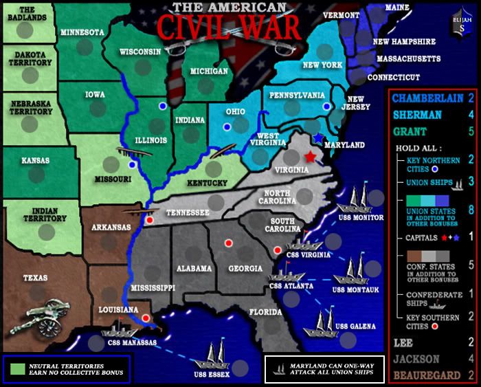
Elijah S wrote:large version 700px wide x 463px high
Image


after reading this threadin the map foundry and seeing how the pudget sound got FF and this map also got FF when clearly they don't deserve it, i am going to go ahead and post my thoughts.

feel free to ignore them or treat them as constructive criticism. i really don't care much about the foundry lately so it doesn't bother me if you ignore me.

so here goes.
i'm talking about the version above.

if i saw this image in a new thread in map ideas i'd say it is a decent first draft. not a great one just a decent one. i've seen drafts better than this. i really did. this is horrible.

sorry for being so darn brutal, again feel free to ignore me. but how the heck can this be compared to any of the recently quenched maps?
it reminds me of the old canada map. it has the same graphic style. very sloppy, no artistic value, no crispness, inconsistency, poor choice of colors, etc.

it has UGLY written all over it with big bold letters.

look at the borders the textures, the lighting. the overall blurriness. god it is awful.

the ships and the cannon look absolutely ridiculous, the legend is dull, the title is lost in a sea of uglyness and it doesn't stand out at all.

to be honest i can't find a single thing that i like on this map. not even one.

it has the feeling of a first draft.

my sincere advice is to put it on vacation go learn photoshop and then completely redo the map.

as it is now it's uglier than all the maps done this year and even some of the maps done more that a year and a half ago are better than this.
look at the hong kong map or the africa map. they are superior in almost every aspect.

i have nothing against you elijah and please don't take my comments personally but look at your map above then look at these maps. all of them made more than a year ago when we didn't even have the foundry process we have now and yet they look so much better. look at them for a few minutes analyze the images and if after you've analyzed them you sincerely think this map is FF material then take a look at the maps quenched this year. if you still don't see a huge quality difference then i can't do anything.

Africa. april 2006
Image
Ancient Greece. may 2006
Image
Hong Kong. sept 2006
Image
“In the beginning God said, the four-dimensional divergence of an antisymmetric, second rank tensor equals zero, and there was light, and it was good. And on the seventh day he rested.”- Michio Kaku
User avatar
Major DiM
 
Posts: 10415
Joined: Wed Feb 14, 2007 6:20 pm
Location: making maps for scooby snacks

Postby Rictus on Tue Nov 20, 2007 8:07 am

I answered A for the poll, but would actually prefer all red - the trouble with red white and blue is that the blue blends too close to the sea colour, IMO, but I don't really like the light blue at all!

I disagree with Dim comments also - I don't think it's significantly worse than the Hong Kong map myself. But I'm worried that games are pleasing to play rather than pleasing to look at, to be honest, so I'm probably not best placed to comment.
Corporal Rictus
 
Posts: 205
Joined: Mon Sep 17, 2007 7:13 am

Postby yamahafazer on Tue Nov 20, 2007 8:22 am

I think seeing all the feed back... what I would do if it was me doing this map... is keep it the way it is play wise and all that... but starting from scrach on everything else.... do it with a much higher dpi... better quality grafics for the ships and canon etc... get it to a stage that you think looks at lest 2x as good an the curent one... post it and see what everyone thinks...

But definatly keep going... gameplay wise this is a very good map so please don't give up... lets face it... evet the Scotland map has been restarted!!! also the Iraq one has started again on the grafics... why dont you go and have a look at how they are restarting on the look of it now they have the basic game play done and try to do the same.... :wink:
Image
User avatar
Private 1st Class yamahafazer
 
Posts: 211
Joined: Fri Aug 24, 2007 9:56 am

PreviousNext

Return to The Atlas

Who is online

Users browsing this forum: No registered users