Conquer Club

American Civil War [Quenched]

Care to peruse completed maps? Take a stroll through the Atlas.

Moderator: Cartographers

Forum rules
Please read the Community Guidelines before posting.

Re: new texture

Postby Unit_2 on Wed Oct 10, 2007 2:46 pm

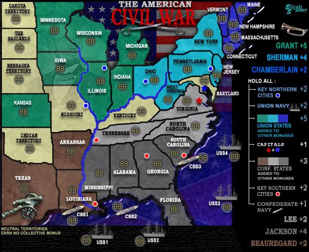
Elijah S wrote:I've been looking for a texture that would give this map a more antiquated feel and I think this does it...

I also put a faint portrait of Lincoln in there... I think it adds something to the map.

Comments welcome...

Image


you need to change the color of the "PA" area to something other then 1860's New Jersey :roll:

though the text is good.
User avatar
Cook Unit_2
 
Posts: 1834
Joined: Sun Jan 14, 2007 12:59 pm
Location: Pennsylvania, U.S.A, North America, Earth, Milky Way, Universe.

Postby Herakilla on Wed Oct 10, 2007 2:57 pm

how can people vote for sandstone?! it looks unprofessional!
Come join us in Live Chat!
User avatar
Lieutenant Herakilla
 
Posts: 4283
Joined: Fri Jun 09, 2006 8:33 pm
Location: Wandering the world, spreading Conquerism

Postby Coleman on Wed Oct 10, 2007 2:58 pm

Herakilla wrote:how can people vote for sandstone?! it looks unprofessional!
I dunno, tell all your friends. I voted for marble too.
Warning: You may be reading a really old topic.
User avatar
Sergeant Coleman
 
Posts: 5402
Joined: Tue Jan 02, 2007 10:36 pm
Location: Midwest

Postby Aerial Attack on Wed Oct 10, 2007 3:15 pm

4 to 5. Apparently my vote was the swing vote. As I said, I think I'd like the marble better if it was a bit lighter and didn't obscure as much.

Officially consider my vote changed [pending a lightening].
User avatar
Sergeant Aerial Attack
 
Posts: 1132
Joined: Mon Jun 04, 2007 7:59 pm
Location: Generation One: The Clan

Postby Elijah S on Wed Oct 10, 2007 3:23 pm

Aerial
-Maryland, while adjacent to DC, was considered a "border state" (states which were Considered Union but were also "slave states").
Just to keep things someone uncomplicated, the neutral and border states were grouped together under the term "neutral".
-Both Delaware and Rhode Island were left out of the map due to size restraints, and I don't think gameplay should be affected by this.
-I see what you're saying about the Legend number sizes and rivers being smoothe and jagged. These issues will both be addressed as well as more precise placement of the key cities.

I really prefer the marbled texture and will try some different marbeling in future revisions.
The effect can be taken off of the flag and opacity adjusted to reduce the "dirty" appearance.
It think there may be some give and take on this, as I want the map to look crisp, yet have a feel for the era represented.

Unit 2
-Are you suggesting that the color of the states grouped with Pennsylvania should be changed?

Again, everyone's feedback is important and appreciated. -Elijah
Sergeant 1st Class Elijah S
 
Posts: 672
Joined: Wed May 09, 2007 6:24 pm

Postby Frigidus on Wed Oct 10, 2007 8:44 pm

Herakilla wrote:how can people vote for sandstone?! it looks unprofessional!


I personally like the sandstone texture. I think that it almost gives the map the look of being on parchment, makes it more like a literal map. The marble one looks nice too, I'm not sure why there were complaints in the first place, but the sandstone looks even better.
User avatar
Sergeant Frigidus
 
Posts: 1638
Joined: Thu Aug 30, 2007 1:15 pm
Location: Illinois, USA

Postby Unit_2 on Wed Oct 10, 2007 9:02 pm

Elijah S wrote:Aerial
-Maryland, while adjacent to DC, was considered a "border state" (states which were Considered Union but were also "slave states").
Just to keep things someone uncomplicated, the neutral and border states were grouped together under the term "neutral".
-Both Delaware and Rhode Island were left out of the map due to size restraints, and I don't think gameplay should be affected by this.
-I see what you're saying about the Legend number sizes and rivers being smoothe and jagged. These issues will both be addressed as well as more precise placement of the key cities.

I really prefer the marbled texture and will try some different marbeling in future revisions.
The effect can be taken off of the flag and opacity adjusted to reduce the "dirty" appearance.
It think there may be some give and take on this, as I want the map to look crisp, yet have a feel for the era represented.

Unit 2
-Are you suggesting that the color of the states grouped with Pennsylvania should be changed?

Again, everyone's feedback is important and appreciated. -Elijah


yeah, its too bright it don't go with the MA region, try to make the PA region darker and also try to darken the MA area.
User avatar
Cook Unit_2
 
Posts: 1834
Joined: Sun Jan 14, 2007 12:59 pm
Location: Pennsylvania, U.S.A, North America, Earth, Milky Way, Universe.

Postby yamahafazer on Sat Oct 13, 2007 5:47 am

Maybe try a mix of the two textures to add interest and veriaty rather than just going for one.
User avatar
Private 1st Class yamahafazer
 
Posts: 211
Joined: Fri Aug 24, 2007 9:56 am

New revision

Postby Elijah S on Mon Oct 15, 2007 1:43 am

Image

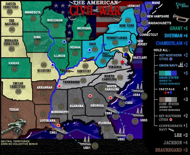
Okay, the texture poll ended at a deadlock, so I combined the two textures and I'm pleased with this one.

Notable changes in this revision:
-New, larger swords are now positioned directly behind the title.
-The ships and bridges have been redrawn and repositioned.
-The sea attack lines have been redone.
-More margin has been given to the right side of the Legend.
Sergeant 1st Class Elijah S
 
Posts: 672
Joined: Wed May 09, 2007 6:24 pm

Postby Elijah S on Mon Oct 15, 2007 2:31 am

Okay... before anyone else brings it to my attention... my swords look like a fricken big pair of scissors...

***memo to self- Fix the fricken big pair of scissors behind the title***
Sergeant 1st Class Elijah S
 
Posts: 672
Joined: Wed May 09, 2007 6:24 pm

Postby cairnswk on Mon Oct 15, 2007 5:58 am

Elijah, looking good....two things, the size of text font on ships varies, is that deliberate?
Also, did someone ask for the swords to move behind the title....i think they were better underneath IMHO. :)
Image
* Pearl Harbour * Waterloo * Forbidden City * Jamaica * Pot Mosbi
User avatar
Private cairnswk
 
Posts: 11510
Joined: Sat Feb 03, 2007 8:32 pm
Location: Australia

Postby cairnswk on Mon Oct 15, 2007 6:01 am

Poll Results

Which of the two maps below do you prefer.
Map A 50% [ 10 ]
Map B 50% [ 10 ]

Total Votes : 20
Image
* Pearl Harbour * Waterloo * Forbidden City * Jamaica * Pot Mosbi
User avatar
Private cairnswk
 
Posts: 11510
Joined: Sat Feb 03, 2007 8:32 pm
Location: Australia

Postby Elijah S on Mon Oct 15, 2007 8:13 pm

The font sizes were an oversight... corrected for the next revision.
The swords behind the title were suggested by Andy and I like the look...
I've also gone back and made the swords look like swords and not scissors... lol

What I'm trying to focus on now is gameplay... the positioning of the sea-attacks and placement of bridges...
Any input on that will be appreciated.

cairnswk wrote:Elijah, looking good....two things, the size of text font on ships varies, is that deliberate?
Also, did someone ask for the swords to move behind the title....i think they were better underneath IMHO. :)
Sergeant 1st Class Elijah S
 
Posts: 672
Joined: Wed May 09, 2007 6:24 pm

Latest upgrade

Postby Suzy1 on Tue Oct 16, 2007 1:17 am

Great job on combining the 2 textures. It gives the map a look of authenticity. The boats blend much better since you changed them and I love the Abe image...I am still anticipating playing it. Good luck :wink:
Corporal 1st Class Suzy1
 
Posts: 269
Joined: Sat May 12, 2007 3:25 am

Postby yamahafazer on Tue Oct 16, 2007 8:17 am

Elijah S wrote:placement of bridges...


Might you want one on "Louisiana" to make it 100% clear that its not two different teritorys?
User avatar
Private 1st Class yamahafazer
 
Posts: 211
Joined: Fri Aug 24, 2007 9:56 am

10th Revision

Postby Elijah S on Sun Oct 21, 2007 10:02 pm

Image

Notable changes in this revision:
-Maryland has been changed from nuetral to being a Union state.
-The swords have been "un"embossed and made to look like swords again.
-The ships and bridges have been redrawn and repositioned; An attack line has been drawn from Maryland to USS4; A third bridge has been added to make it clear that Louisiana and Mississippi can attack each other.
-The bugle has been made a little smaller.

With this revision I've taken all the suggestions that were previously unaddressed and either made changes or decided that the graphics and/or gameplay would not benefit from it.

Maryland becoming a Union state seemed to make both geographic and gameplay sense; So, although the argument could be made that it was in fact nuetral, I agreed that the Union capital should fall within the borders of a Union state.

The attack line from Maryland to one of the union ships also seemed to be something that would provide a means for the Union fleet to possibly be owned by a northern general, enhancing gameplay.

The graphics have been polished to the point that I'm very pleased and think that placing much more time on them would only serve to compromise my own style and preferences. -Personally, I like this map and, while it's been a culmination of a lot of input and perspectives, I think it captures the era well and that the gameplay should be intiguing and lively. -Elijah
Sergeant 1st Class Elijah S
 
Posts: 672
Joined: Wed May 09, 2007 6:24 pm

Postby DiM on Sun Oct 21, 2007 10:26 pm

i think it's the first time i look at this map so sorry if i;m posting something that's already been said

1. the various images (cannon, trumpet, swords) look like they have a poor quality. very blurry and pixely.
2. the plastic wrap on the water looks awful
3. the bevel on the ships is too abrupt.
4. the edges of the land look really strange. there seems to be a blue-ish thing o the outside. and they look very jagged. as if someone very poorly cut the land from the sea.
5. the land is casting shadow on the sea but it's casting it in all directions.
6. the blackness of the legend and the texture on the bottom look a bit out of place
“In the beginning God said, the four-dimensional divergence of an antisymmetric, second rank tensor equals zero, and there was light, and it was good. And on the seventh day he rested.”- Michio Kaku
User avatar
Major DiM
 
Posts: 10415
Joined: Wed Feb 14, 2007 6:20 pm
Location: making maps for scooby snacks

Postby Coleman on Mon Oct 22, 2007 4:32 am

DiM wrote:i think it's the first time i look at this map so sorry if i;m posting something that's already been said

1. the various images (cannon, trumpet, swords) look like they have a poor quality. very blurry and pixely.
2. the plastic wrap on the water looks awful
3. the bevel on the ships is too abrupt.
4. the edges of the land look really strange. there seems to be a blue-ish thing o the outside. and they look very jagged. as if someone very poorly cut the land from the sea.
5. the land is casting shadow on the sea but it's casting it in all directions.
6. the blackness of the legend and the texture on the bottom look a bit out of place


1) I like the swords. The cannon and trumpet might look better if they swap places, but I can't be sure.
2) No idea what you are talking about here.
3) It's consistent, I'm sorry you don't like bevel. I think they look good.
4) Very expertly cut the land from the sea you mean? Jagged like it really is? I don't see how this needs to be changed.
5) It's floating above, at least that's the effect it gives me, and I like it. Sort of an abstract realism.
6) How so? Elaborate please.

I think most of your complaints are about the abruptness of all the style choices made. Abruptness is kind of a theme here though, and I don't want to see this needlessly smoothed out.
Warning: You may be reading a really old topic.
User avatar
Sergeant Coleman
 
Posts: 5402
Joined: Tue Jan 02, 2007 10:36 pm
Location: Midwest

Postby yamahafazer on Tue Oct 23, 2007 3:29 am

DiM wrote:i think it's the first time i look at this map so sorry if i;m posting something that's already been said

1. the various images (cannon, trumpet, swords) look like they have a poor quality. very blurry and pixely.
2. the plastic wrap on the water looks awful
3. the bevel on the ships is too abrupt.
4. the edges of the land look really strange. there seems to be a blue-ish thing o the outside. and they look very jagged. as if someone very poorly cut the land from the sea.
5. the land is casting shadow on the sea but it's casting it in all directions.
6. the blackness of the legend and the texture on the bottom look a bit out of place


The only one here that I think might do with a little work done on is No. 1... they do look a bit pixely...
Image
User avatar
Private 1st Class yamahafazer
 
Posts: 211
Joined: Fri Aug 24, 2007 9:56 am

Postby mibi on Tue Oct 23, 2007 2:01 pm

what are the yellow territories, i cant figure it out.
User avatar
Captain mibi
 
Posts: 3350
Joined: Thu Mar 01, 2007 8:19 pm
Location: The Great State of Vermont

Postby Coleman on Tue Oct 23, 2007 2:04 pm

They are neutral to the conflict. Bottom Left Corner. Maybe giving them a square like the ones on the right have will make this clearer.
Warning: You may be reading a really old topic.
User avatar
Sergeant Coleman
 
Posts: 5402
Joined: Tue Jan 02, 2007 10:36 pm
Location: Midwest

Postby mibi on Tue Oct 23, 2007 2:37 pm

Coleman wrote:They are neutral to the conflict. Bottom Left Corner. Maybe giving them a square like the ones on the right have will make this clearer.


ah, i didnt see that little thing, and the color was brighter than everything else so i thought they were important or something.
User avatar
Captain mibi
 
Posts: 3350
Joined: Thu Mar 01, 2007 8:19 pm
Location: The Great State of Vermont

Postby Elijah S on Tue Oct 23, 2007 3:35 pm

Sorry for this delayed reply... I'm in so cal and it's kindof hectic out here lately...

I've already tuned the yellow states down a notch, but I can bring them down a little more.
I'll also play with putting some kind of border around where it states the yellows are nuetrals.

I don't see this pixelation issue with the icons, but I'll see if I can tweek that too.

Thx for the comments. -Elijah
Sergeant 1st Class Elijah S
 
Posts: 672
Joined: Wed May 09, 2007 6:24 pm

Postby Rictus on Wed Oct 24, 2007 7:42 am

I'd move the statement about neutral territories to sit in the rest of the legend on the right, just to avoid confusion. But that's a very small nit to pick in what looks to me to be a almost-ready map - good work.

I'll chuck this idea in even though it's ill thought out and probably impossible to implement - In the game 'North and South' for the Amiga 500 (yes, I'm showing my age, shut up), there were two territories - one bordering Mexico and on bordering Canada, where, if you left an army there for too long, it would be attacked by angry Indians or Mexicans who would wipe out you army. It meant that when you won the territory, you had to move people out of it again quickly. I was wondering if the programming would enable you to have a territory that 'drained' one army per round from that territory - perhaps down to a minimum of one. Could create an interesting dynamic. But maybe this isn't the right map for that, as it's clearly pretty well balanced as it stands.
Corporal Rictus
 
Posts: 205
Joined: Mon Sep 17, 2007 7:13 am

Postby Elijah S on Thu Oct 25, 2007 1:23 am

Image

Image

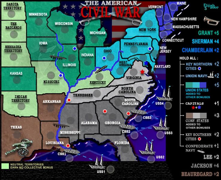
Notable changes in this revision:
-The Neutral States color has been changed to light green, providing a better blend with the overall color scheme and placing less emphasis on them.
-A color block has been placed beside the phrase stating that Neutral States earn no collective bonus.
-The overall image has been lightened a bit.
-The army numbers have been turned off to get ready for Final Forge and the writing of the xml.

Once more, thanks to everyone who has provided input on this project. I think the result is an intiguing map that will be fun and challenging to play!

It seems to me that the vast majority of opinion here in the foundry comes from other mapmakers, and while we're graphic artists, we're also CC players who enjoy lively gameplay... so hats off to all of you who enjoy the satisfaction of sweeping the board in an escalating cards game!

I was originally planning to write the script myself, but with time restraints (my boss wants me to get back to work! Go figure... lol) I'd gladly let someone else do it.
There's plenty of room at the top right corner for another name! Any takers?
Sergeant 1st Class Elijah S
 
Posts: 672
Joined: Wed May 09, 2007 6:24 pm

PreviousNext

Return to The Atlas

Who is online

Users browsing this forum: No registered users