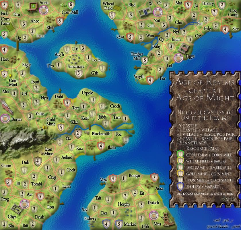
Conquer Club

Age of Realms: Age of Might [Quenched]

Care to peruse completed maps? Take a stroll through the Atlas.

Moderator: Cartographers

Forum rules
Please read the Community Guidelines before posting.

what bonus scheme do you want?

leave it as it is
32
47%
version A
5
7%
version B
6
9%
version C
25
37%
 
Total votes : 68

Postby DiM on Fri Oct 12, 2007 12:05 pm

Telvannia wrote:
DiM wrote:
Telvannia wrote:1. black glow, it does not seem as visable as any of the others.


make it thicker? make it another color?

up to you, but i have never liked a black glow, because it think it does not work, but that is me :)


it was originally grey but i think grey is not that visible.
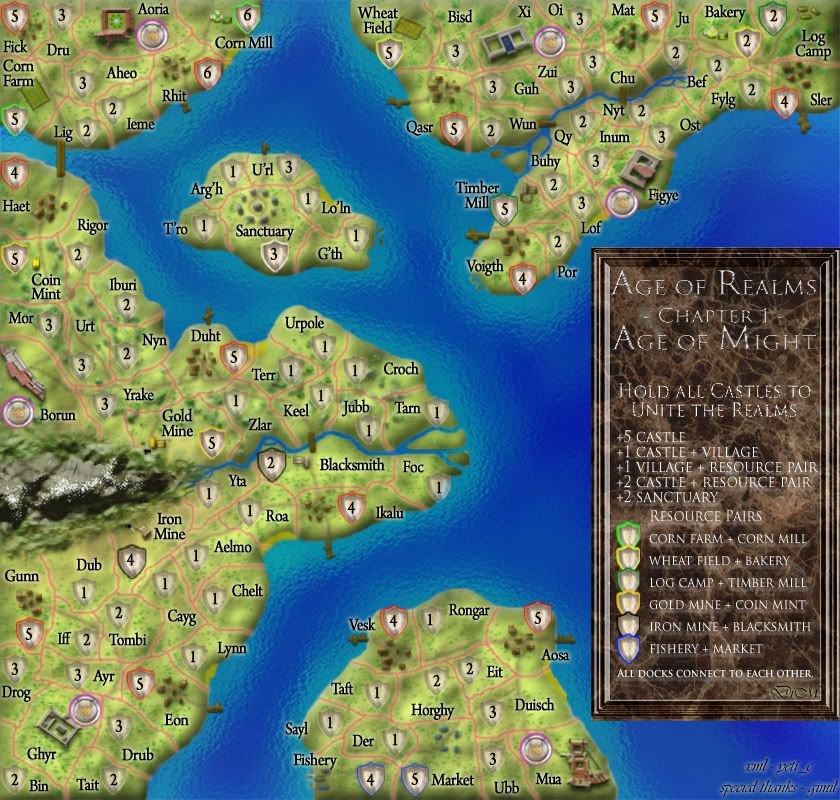
Telvannia wrote:
DiM wrote:
Telvannia wrote:4.i think the sanctuary and castle shields should be a lot more different to the normal shields.


why? i'd rather have them like this or people will start asking why is that different? i don't see anything in the legend on this matter. i'm confused.

Maybe only castles need to be different because they are the important territoties that you have to hold, does not need to be anything drastic, maybe just a different style of shield, so they stand out.


ok i'll see what i can do about the castles.

Telvannia wrote:
DiM wrote:
Telvannia wrote:5.legend again, if it is engraved you would not get as fancy writing style.


yeah and on AoM if it was a really old treasure map that withstood centuries of bad weather and stuff it would surely have a really crappy and hard to see handwriting. but people need to understand what the legend says and thus more readable and carefully drawn fonts have to be used.

i dont think i explained what i meant very well, i personally i thin the title looks out of place, because it is so curly, because that would be nearly impossible to carve, so maybe if it simpler,
also along that vein, i think the bonuses should be in roman numerals all Is and Vs.


hmm i understand what you mean but i don't think it's a problem. yes it is harder to make swift curves then it is to make straight lines but not impossible. look at famous statues look at cathedrals or even go to your local cemetery and look at some fancy tombstones. you'll surely see intricate designs and fonts and stuff.

as for the roman numerals. i will try it and see how it looks but first i want more opinions on this. will people be confused?


Telvannia wrote:
DiM wrote:i think this is enough. pretty soon i'll have too add big red arrows pointing at various terits and writing "LOOK HERE" :lol:
:)
i like this idea...

do it :lol:


sure it will be on the final update when it's quenched. :lol:
“In the beginning God said, the four-dimensional divergence of an antisymmetric, second rank tensor equals zero, and there was light, and it was good. And on the seventh day he rested.”- Michio Kaku
User avatar
Major DiM
 
Posts: 10415
Joined: Wed Feb 14, 2007 6:20 pm
Location: making maps for scooby snacks

Postby Coleman on Fri Oct 12, 2007 12:46 pm

DiM wrote:
Coleman wrote:My thought on the size.

I know you feel it is cluttered, but right now I am not getting the OMG WTF! feel that recently quenched pearl harbor gives me. Your map is conducted in a sane way that feels a bit more obvious to me.


i agree but i have the same feeling on this map as i have on the supermax one. the small version is somewhat of less quality than the large.
I can't argue with that. Unfortunately lifting size constraints isn't something I'm authorized to do. The best I can say right now is that if people want to play the 'true' map, with the best quality they should play the large ones, otherwise they are going to just have to deal with their choice in using the small map.

It may be worthwhile to see a demonstration of what you would do if we gave you the 660 and how it would differ from the 630. However, I fully understand if you don't want to do that since we probably can't let you anyway and it would be extra labor on your part.
Warning: You may be reading a really old topic.
User avatar
Sergeant Coleman
 
Posts: 5402
Joined: Tue Jan 02, 2007 10:36 pm
Location: Midwest

Postby DiM on Fri Oct 12, 2007 1:05 pm

Coleman wrote:
DiM wrote:
Coleman wrote:My thought on the size.

I know you feel it is cluttered, but right now I am not getting the OMG WTF! feel that recently quenched pearl harbor gives me. Your map is conducted in a sane way that feels a bit more obvious to me.


i agree but i have the same feeling on this map as i have on the supermax one. the small version is somewhat of less quality than the large.
I can't argue with that. Unfortunately lifting size constraints isn't something I'm authorized to do. The best I can say right now is that if people want to play the 'true' map, with the best quality they should play the large ones, otherwise they are going to just have to deal with their choice in using the small map.


well in case in the future the size restrictions are lifted or enhanced i can always come back and revamp this map.

Coleman wrote:It may be worthwhile to see a demonstration of what you would do if we gave you the 660 and how it would differ from the 630. However, I fully understand if you don't want to do that since we probably can't let you anyway and it would be extra labor on your part.


the only difference is that it would get rid of the cluttering and allow more of the landscape to be seen. the army shields wouldn't be so tight, i could put longer names and stuff.
“In the beginning God said, the four-dimensional divergence of an antisymmetric, second rank tensor equals zero, and there was light, and it was good. And on the seventh day he rested.”- Michio Kaku
User avatar
Major DiM
 
Posts: 10415
Joined: Wed Feb 14, 2007 6:20 pm
Location: making maps for scooby snacks

Postby Coleman on Fri Oct 12, 2007 1:18 pm

Well the three of us (maybe even with lack) can have a fireside chat on the constraints and what giving you 30 extra pixels would mean. I know you pulled past examples of size restriction breaking. There is a lot of 'chaos theory/butterfly effect/baby out with the bathwater' type fears/theories about allowing small exceptions to the guidelines so chances aren't very good an exception will be made here, but I can promise you I will make sure it is discussed. Forcing a chat is about the best I can do. :(
Warning: You may be reading a really old topic.
User avatar
Sergeant Coleman
 
Posts: 5402
Joined: Tue Jan 02, 2007 10:36 pm
Location: Midwest

Postby DiM on Fri Oct 12, 2007 1:51 pm

Coleman wrote:Well the three of us (maybe even with lack) can have a fireside chat on the constraints and what giving you 30 extra pixels would mean. I know you pulled past examples of size restriction breaking. There is a lot of 'chaos theory/butterfly effect/baby out with the bathwater' type fears/theories about allowing small exceptions to the guidelines so chances aren't very good an exception will be made here, but I can promise you I will make sure it is discussed. Forcing a chat is about the best I can do. :(


i'll be more than glad to have a talk on the size restriction issue but not to get me 30 extra px.
that would only further enhance the problem of some maps being allowed more than others. i'd like to participate in a talk with more map makers you cairnswk andy and lack to perhaps reach a consensus after we all express our points of view.
“In the beginning God said, the four-dimensional divergence of an antisymmetric, second rank tensor equals zero, and there was light, and it was good. And on the seventh day he rested.”- Michio Kaku
User avatar
Major DiM
 
Posts: 10415
Joined: Wed Feb 14, 2007 6:20 pm
Location: making maps for scooby snacks

Postby Coleman on Fri Oct 12, 2007 2:12 pm

I'm not against a big open chat but we can't lift the guidelines for everyone with the way the site is set up right now.

We can bend them on a case by case basis (maybe) but to elaborate further is difficult since I'd have to speak from lack/andy's point of view and I just am not those people, so it would be wrong of me to do so. Plus it would lead us way off topic.

I'd like to allow this map to have 30 more px on the small map, but the process needed to make that seem like a fair thing to do without setting a precedent is sketchy.

I wouldn't mind posting my exact thoughts on the whole size issue in foundry revamp. I'm not much for keeping them behind the scenes, but doing so here would detract from your map's progress.
Last edited by Coleman on Fri Oct 12, 2007 3:45 pm, edited 1 time in total.
Warning: You may be reading a really old topic.
User avatar
Sergeant Coleman
 
Posts: 5402
Joined: Tue Jan 02, 2007 10:36 pm
Location: Midwest

Postby DiM on Fri Oct 12, 2007 3:39 pm

Coleman wrote:I'm not against a big open chat but we can't lift the guidelines for everyone with the way the site is set up right now.

We can bend them on a case by case basis (maybe) but to elaborate further is difficult since I'd have to speak from lack/andy's point of view and I just am not those people, so it would be wrong of me to do so. Plus it would lead us way off topic.

I'd like to allow this map to have 30 more px on the small map, but the process needed to make that seem like a fair thing to do without setting a precedent is sketchy.

I wouldn't mind posting my exact thoughts on the whole size issue in foundry revamp. I'm not much for keeping them behind the scenes, but doing so here would detract from your map's progress.


yeah you're right.
as much as i'd like those 30 extra px i refuse them unless all maps are allowed. if i did accept them i'd just turn into the people that are favoured around here and i don't want that. anyway, back on topic now.
please comment on the graphics gameplay and anything else you see fit.

cheers.
“In the beginning God said, the four-dimensional divergence of an antisymmetric, second rank tensor equals zero, and there was light, and it was good. And on the seventh day he rested.”- Michio Kaku
User avatar
Major DiM
 
Posts: 10415
Joined: Wed Feb 14, 2007 6:20 pm
Location: making maps for scooby snacks

Postby DiM on Sat Oct 13, 2007 12:52 pm

V22
DONE:
* new castle shields
* moved some shields around to take them off the edge.
* changed title in the legend

TO-DO:
* xml (in FF)

NOTES:
* i need comments. what else should i do on the graphics? are they finished? what do you think about the gameplay? are the bonuses ok? the neutrals ok?

V22
Image
“In the beginning God said, the four-dimensional divergence of an antisymmetric, second rank tensor equals zero, and there was light, and it was good. And on the seventh day he rested.”- Michio Kaku
User avatar
Major DiM
 
Posts: 10415
Joined: Wed Feb 14, 2007 6:20 pm
Location: making maps for scooby snacks

Postby asl80 on Sat Oct 13, 2007 1:47 pm

sorry dim - still not happy with the legend (its still really out of place)
out of time for suggestions now, but just quickly, maybe place it all within a scroll like border/page, or create another island like rest of the map and place the words within that.
At the moment it's way too bold. Looking at the image as a whole, your eyes a drawn either to the legend, or to the landscape, i.e. they don't seem to exist on the same page (Maybe that's a little too drastic a characterisation but that's my general feeling)

otherwise - the rest looks brilliant
Lieutenant asl80
 
Posts: 208
Joined: Wed Jun 27, 2007 10:07 am

Postby DiM on Sat Oct 13, 2007 2:04 pm

asl80 wrote:sorry dim - still not happy with the legend (its still really out of place)
out of time for suggestions now, but just quickly, maybe place it all within a scroll like border/page, or create another island like rest of the map and place the words within that.
At the moment it's way too bold. Looking at the image as a whole, your eyes a drawn either to the legend, or to the landscape, i.e. they don't seem to exist on the same page (Maybe that's a little too drastic a characterisation but that's my general feeling)

otherwise - the rest looks brilliant


scroll torn page that's just the stuff i want to get away from. i've seen scrolls used as legends in may maps and i want mine to be unique.

having it as text on an island sound interesting but i'm not sure i can do it. the landscape is made from several layers and by accident i merged some layers because the file was getting too big and now i can't edit all the layers. and to start everything again just for the legend doesn't sound good.
“In the beginning God said, the four-dimensional divergence of an antisymmetric, second rank tensor equals zero, and there was light, and it was good. And on the seventh day he rested.”- Michio Kaku
User avatar
Major DiM
 
Posts: 10415
Joined: Wed Feb 14, 2007 6:20 pm
Location: making maps for scooby snacks

Postby mibi on Sat Oct 13, 2007 3:29 pm

I think the legend works, its just got some bad feng shui with those dagger sharp corners.
User avatar
Captain mibi
 
Posts: 3350
Joined: Thu Mar 01, 2007 8:19 pm
Location: The Great State of Vermont

Postby DiM on Sat Oct 13, 2007 3:38 pm

mibi wrote:I think the legend works, its just got some bad feng shui with those dagger sharp corners.


so round the corners? :?
anybody else wants this?

PS: if i round them i'll only do it slightly. i can't turn the rectangle into an oval or i won't be able to fit the text.
“In the beginning God said, the four-dimensional divergence of an antisymmetric, second rank tensor equals zero, and there was light, and it was good. And on the seventh day he rested.”- Michio Kaku
User avatar
Major DiM
 
Posts: 10415
Joined: Wed Feb 14, 2007 6:20 pm
Location: making maps for scooby snacks

Postby unriggable on Sat Oct 13, 2007 7:11 pm

The southernmost island is too easy to take & hold with only two docks. Add more.
Image
User avatar
Cook unriggable
 
Posts: 8037
Joined: Thu Feb 08, 2007 9:49 pm

Postby gimil on Sat Oct 13, 2007 8:17 pm

unriggable wrote:The southernmost island is too easy to take & hold with only two docks. Add more.


easy to take? with 30 neutrls? are you being funny?
What do you know about map making, bitch?

natty_dread wrote:I was wrong


Top Score:2403
User avatar
Corporal 1st Class gimil
 
Posts: 8599
Joined: Sat Mar 03, 2007 12:42 pm
Location: United Kingdom (Scotland)

Postby Telvannia on Sun Oct 14, 2007 3:24 am

DiM wrote:
mibi wrote:I think the legend works, its just got some bad feng shui with those dagger sharp corners.


so round the corners? :?
anybody else wants this?

PS: if i round them i'll only do it slightly. i can't turn the rectangle into an oval or i won't be able to fit the text.


dont round them that would look stupid, no one rounds stone tablet corners, try instead adding four more sides to the tablet, they only need to be very short sides, but make it look more like this:

Image

hardly a work of art, but i dont have the time to replicate unnecessarily, he is hardly going to copy and paste mine into his map. :)
User avatar
Sergeant 1st Class Telvannia
 
Posts: 1331
Joined: Mon Apr 24, 2006 7:19 am

Postby DiM on Sun Oct 14, 2007 4:33 am

gimil wrote:
unriggable wrote:The southernmost island is too easy to take & hold with only two docks. Add more.


easy to take? with 30 neutrls? are you being funny?


gimil is right. 30 neutrals is hardly an easy task to overcome. plus you need to hold all castles to win not hold everything. so in theory a guy that plans well and makes a good run at the right time can breach the defences and head for the castle for the win.

sitting in a corner building up is not a solution.
“In the beginning God said, the four-dimensional divergence of an antisymmetric, second rank tensor equals zero, and there was light, and it was good. And on the seventh day he rested.”- Michio Kaku
User avatar
Major DiM
 
Posts: 10415
Joined: Wed Feb 14, 2007 6:20 pm
Location: making maps for scooby snacks

Postby DiM on Sun Oct 14, 2007 4:34 am

Telvannia wrote:
DiM wrote:
mibi wrote:I think the legend works, its just got some bad feng shui with those dagger sharp corners.


so round the corners? :?
anybody else wants this?

PS: if i round them i'll only do it slightly. i can't turn the rectangle into an oval or i won't be able to fit the text.


dont round them that would look stupid, no one rounds stone tablet corners, try instead adding four more sides to the tablet, they only need to be very short sides, but make it look more like this:

Image

hardly a work of art, but i dont have the time to replicate unnecessarily, he is hardly going to copy and paste mine into his map. :)


this sounds better i'll do it and see what it looks like.
“In the beginning God said, the four-dimensional divergence of an antisymmetric, second rank tensor equals zero, and there was light, and it was good. And on the seventh day he rested.”- Michio Kaku
User avatar
Major DiM
 
Posts: 10415
Joined: Wed Feb 14, 2007 6:20 pm
Location: making maps for scooby snacks

Postby DiM on Sun Oct 14, 2007 4:04 pm

i wasn't much of a fan of the cut corners as telvannia suggested. the rounded ones that mibi proposed looked bad and so i managed to come up with this version below. to be honest i like the simple one i have in version 22 but since i have no other feedback here's a new legend variation.

Image
“In the beginning God said, the four-dimensional divergence of an antisymmetric, second rank tensor equals zero, and there was light, and it was good. And on the seventh day he rested.”- Michio Kaku
User avatar
Major DiM
 
Posts: 10415
Joined: Wed Feb 14, 2007 6:20 pm
Location: making maps for scooby snacks

Postby unriggable on Sun Oct 14, 2007 4:11 pm

gimil wrote:
unriggable wrote:The southernmost island is too easy to take & hold with only two docks. Add more.


easy to take? with 30 neutrls? are you being funny?


All you need to do is take the two ports and fortify them well and then you're in good shape.
Image
User avatar
Cook unriggable
 
Posts: 8037
Joined: Thu Feb 08, 2007 9:49 pm

Postby DiM on Sun Oct 14, 2007 4:27 pm

unriggable wrote:
gimil wrote:
unriggable wrote:The southernmost island is too easy to take & hold with only two docks. Add more.


easy to take? with 30 neutrls? are you being funny?


All you need to do is take the two ports and fortify them well and then you're in good shape.


that's valid for any of the other groups. just take the borders and fortify heavy. :roll:

i can add more docks if people think it's necessary. i have nothing against it. in fact i like lots of movement options. i don't like enclosed maps where you have just a few attack routes.

i could put another dock in Sayl and another one in Ieme (top left island)
then perhaps remove the Chu - Nyt or Wun - Qy bridge and the Sler dock and each group would have exactly 3 entry points.

Aoria would have Lig, Ieme and Rhit
Xi would have Qasr, Ju and Wun/Chu
Figye would have Voigth Ju and Wun/Chu
Borun would have Haet, Duht and Keel
Ghyr would have Eon, Ikalu and Blacksmith
Mua would have Aosa, Sayl and Vesk.

thoughts on this plan?
“In the beginning God said, the four-dimensional divergence of an antisymmetric, second rank tensor equals zero, and there was light, and it was good. And on the seventh day he rested.”- Michio Kaku
User avatar
Major DiM
 
Posts: 10415
Joined: Wed Feb 14, 2007 6:20 pm
Location: making maps for scooby snacks

Postby Coleman on Sun Oct 14, 2007 8:38 pm

I like v22's legend best so far.
Warning: You may be reading a really old topic.
User avatar
Sergeant Coleman
 
Posts: 5402
Joined: Tue Jan 02, 2007 10:36 pm
Location: Midwest

Postby Telvannia on Mon Oct 15, 2007 1:22 am

im still voting for my legend idea :lol:


you could make the corner cuts at more of an angle and see how that looks.
User avatar
Sergeant 1st Class Telvannia
 
Posts: 1331
Joined: Mon Apr 24, 2006 7:19 am

Postby yeti_c on Mon Oct 15, 2007 3:14 am

Coleman wrote:I like v22's legend best so far.


I concur...

Also - don't change the ports etc... if you're not careful your map will then turn symettrical - some variation is good... and remember if that island is the most desirable - it will be the most fought over!!!

C.
Image
Highest score : 2297
User avatar
Lieutenant yeti_c
 
Posts: 9624
Joined: Thu Jan 04, 2007 9:02 am

Postby DiM on Mon Oct 15, 2007 4:46 am

yeti_c wrote:
Coleman wrote:I like v22's legend best so far.


I concur...

Also - don't change the ports etc... if you're not careful your map will then turn symettrical - some variation is good... and remember if that island is the most desirable - it will be the most fought over!!!

C.


good thinking yeti_c sometimes the place that looks the best to start with is actually the worst since everybody will want it. like australia on classic. i've seen people battle over it like madmen. i even managed to hold europe in round 3 because 3 other guys we're kicking eachother over australia.
“In the beginning God said, the four-dimensional divergence of an antisymmetric, second rank tensor equals zero, and there was light, and it was good. And on the seventh day he rested.”- Michio Kaku
User avatar
Major DiM
 
Posts: 10415
Joined: Wed Feb 14, 2007 6:20 pm
Location: making maps for scooby snacks

Postby DiM on Mon Oct 15, 2007 4:50 am

Telvannia wrote:im still voting for my legend idea :lol:


you could make the corner cuts at more of an angle and see how that looks.


what angle?

i did a 45 angle cut on each corner. not too much but enough to not interfere with the text and i didn't quite like it because somehow it doesn't look like a real plaque of engraved granite. i also searched the net for similar plaques to see the design and i could only find oval and rectangular with simple margins or intricate floral designs. because oval isn't suited for my text and intricate margin design fraws too much attention i think the simple V22 is the most appropriate.
“In the beginning God said, the four-dimensional divergence of an antisymmetric, second rank tensor equals zero, and there was light, and it was good. And on the seventh day he rested.”- Michio Kaku
User avatar
Major DiM
 
Posts: 10415
Joined: Wed Feb 14, 2007 6:20 pm
Location: making maps for scooby snacks

PreviousNext

Return to The Atlas

Who is online

Users browsing this forum: No registered users