changes:
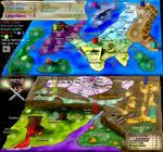
1. Water routes in the north. I changed the one going to F de N, but more importantly I gave on last go to the 'ceara to wherever the hell I sent it' route. I think it looks better and I hope I'm done with that damn thing.
2. Rivers. I think they have depth now and look much better. Hopefully others feel the same way. (You better or I'll hate you forever).
3a. Mountains. I moved them east starting from somewhere south of the La Rioja label. I'm going to remove those mountains that jump out by the Tucuman label.
3b. Mountain tops. I did it just in the south. How do you think it looks (especially cairns sine he asked for it)? Should I put it on all the mountains or perhaps keep doing so but with lesser intensity until some point where it fades out? (actually that sounds like too much work!)
BTW. I know I missed a couple tops and I can see the weird black line so I'll fix that later. I just want to know if cairns or others like how it looks.
BTW. I know I missed a couple tops and I can see the weird black line so I'll fix that later. I just want to know if cairns or others like how it looks.
BTW. I know I missed a couple tops and I can see the weird black line so I'll fix that later. I just want to know if cairns or others like how it looks.
4. Cartographer names. They're still a shade of red, but this darkened version fits a lot better I hope.
5. Legend. Cut down the text size by 2.5 or so points.
6. Shading. I quite liked how it was, but I cut it down quite a bit. So, mibi and rk how do you this? As for the yellow region being next to the orange, well I think they are quite easily distinguished, but if many others bring this up I guess I'll have to rethink it.
7. Switched the location of Santa Cruz label and the army circle so it's more uniform with other label and circle locations in the area.
8. Moved Japura label down so it doesn't mask the river border.