
i will just throw out there that I PREFER the sharp and so called 'pixelated' borders to the softer ones used on the eastern front map. i just finished my first game on the eastern front map and the soft borders look a little 'cheap' to me.
the borders on the iwo jima map are thin and crisp.... thin and crisp... is there something inherently wrong with those adjectives? perhaps a mod can append the how-to-make-a-map thread to include "Maps with borders that are thin and crisp are not allowed and will be deemed "pixelated"."
personally i think a major fault of the foundry is the too-many-cooks scenario in regards to graphics. everyone wants to put their little finishing touches and the maps development grinds to a halt and the product is sometimes substandard, as in eastern front, in my opinion.
These borders are thin and crisp, and there is nothing inherently wrong with that. If it doesn't work with your sense of style i suggest you get over it, and yourselves.
WWII Operation Iwo Jima [Quenched]
Moderator: Cartographers
Forum rules
Please read the Community Guidelines before posting.
Please read the Community Guidelines before posting.
KEYOGI wrote:Regardless of your opinion of me mibi it is still an issue that has been raised in the past and been addressed when needed.
Or you could get over yourself.mibi wrote:These borders are thin and crisp, and there is nothing inherently wrong with that. If it doesn't work with your sense of style i suggest you get over it, and yourselves.
Now, when different things are expected from different maps, cartographers cry foul because of their equal right privileges. Keeping the foundry expectations consistent is how we keep moving forwards, however it seems a few are intent on going backwards.
If you feel so hard done by and need to bitch in every thread about the state of the foundry, go create a new topic in the main forum and stop haunting peoples threads.
i guess keeping foundry expectations consistent doesn't take into account individuals personal style. if these borders are enough to keep revising the map then i can think of about 10-15 maps that will never see the light of play.KEYOGI wrote:KEYOGI wrote:Regardless of your opinion of me mibi it is still an issue that has been raised in the past and been addressed when needed.Or you could get over yourself.mibi wrote:These borders are thin and crisp, and there is nothing inherently wrong with that. If it doesn't work with your sense of style i suggest you get over it, and yourselves.
Now, when different things are expected from different maps, cartographers cry foul because of their equal right privileges. Keeping the foundry expectations consistent is how we keep moving forwards, however it seems a few are intent on going backwards.
If you feel so hard done by and need to bitch in every thread about the state of the foundry, go create a new topic in the main forum and stop haunting peoples threads.
but really, im not worried about the foundry, in due time all maps will either be created by cairns or revamped by windowmakers, and then keyogi, you can have that homogenizing consistency that you so desire.
-
WidowMakers
- Posts: 2774
- Joined: Mon Nov 20, 2006 9:25 am
- Gender: Male
- Location: Detroit, MI
Based on this map I found on wikipediaqwert wrote:Can someon show me where is problem with borders,i realy dont understand these issue.
WidowMakers Posted: 27 Aug 2007 10:12 Post subject:
--------------------------------------------------------------------------------
I just noticed something about the legend and I can't seem to find anything about it. It has two colors for the background. The top and majority of the middle is colored like the paper and the sides and bottom are light purple.
It almost looks like you forgot to fill in the rest of the legend. Or maybe I am just missing something.
Yep,these suposte to be like in original.

The entire legend should be the same color, a light tan. Yours is both light purple and tan. I was just suggesting it look like this map.

-
WidowMakers
- Posts: 2774
- Joined: Mon Nov 20, 2006 9:25 am
- Gender: Male
- Location: Detroit, MI
what do you mean "homogenizing consistency"? Just because I make and revamp maps, does not mean they all look the same.mibi wrote:i guess keeping foundry expectations consistent doesn't take into account individuals personal style. if these borders are enough to keep revising the map then i can think of about 10-15 maps that will never see the light of play.KEYOGI wrote:KEYOGI wrote:Regardless of your opinion of me mibi it is still an issue that has been raised in the past and been addressed when needed.Or you could get over yourself.mibi wrote:These borders are thin and crisp, and there is nothing inherently wrong with that. If it doesn't work with your sense of style i suggest you get over it, and yourselves.
Now, when different things are expected from different maps, cartographers cry foul because of their equal right privileges. Keeping the foundry expectations consistent is how we keep moving forwards, however it seems a few are intent on going backwards.
If you feel so hard done by and need to bitch in every thread about the state of the foundry, go create a new topic in the main forum and stop haunting peoples threads.
but really, im not worried about the foundry, in due time all maps will either be created by cairns or revamped by windowmakers, and then keyogi, you can have that homogenizing consistency that you so desire.
So could you explain how my maps look the same please.
Why even bother brining Cairns and I into this. We tend to have a different view on the process. There are many things that I have disagreed with Andy and Keyogi on for my maps (posted and PM). I have chosen to listen and most of the time, fix the "issue". I might not really agree, but they are in charge. That is why I cleaned up my borders and adjusted little things for them when they asked.
Is that not easier than 20 pages of flame wars in the foundry?
WM

Yeah but if someone deviats of a said style Keyogi throws a hippy fit and starts swinging his weight around!!! Nobody in friggin 20 pages has mentioned borders (as in eastren map ) and then keyogi "oh the borders"... I like the boders how they are...They arent blurred, they aint in your face. they are crisp and its obvious its Qwert's style!!
Keyogi's style is the other way (which im not saying is wrong either)...Can you guys see where im coming from?
And on a closing note evertime the debate heats hope there's a personal vendatta and take it to the flame wars... Its a interent gaming site for christ sake's. How can you have a personal vendetta!!!
[img]http://img801.imageshack.us/img801/9761/41922610151374166770386.jpg[/mg]
-
Qwert

- SoC Training Adviser
- Posts: 9262
- Joined: Tue Nov 07, 2006 5:07 pm
- Location: VOJVODINA
- Contact:
These is yours opinion,and i prefer these present look.widow
The entire legend should be the same color, a light tan. Yours is both light purple and tan. I was just suggesting it look like this map.
AndyDufresne
If qwert could do similar to what he did on his previous map, I think it would be top notch.
--Andy
Its these a new rule,because if i understand all mine next map who dont have any conection with WWII EASTERN or WWII Western Front must have borders same like in Eastern Front? Or these rule is same for all map authors?These mean that only 1 style is apply here?KEYOGI
Regardless of your opinion of me mibi it is still an issue that has been raised in the past and been addressed when needed.
qwert, I'm referring to your territory borders, the continent ones seem to be ok. Remember the blur you did to the borders in Eastern Front? Could you do that again for your territory borders in this map.
I agree with these,it will be very helpful if Keyogi show where is problem on map.Coleman
However, since Andy also sees the problem, and Widow Makers can see the problem, I'm sure it exists. Any argument that Keyogi is the only one who sees the problem isn't realistic. Andy says qwert has fixed it before, but I think he needed red circles to show him where to apply the effect. Could one of you that sees the problem help him by pointing these areas of pixelation out graphically? Visual aids are very very helpful.
KEYOGI Posted: 28 Aug 2007 21:59 Post subject:
--------------------------------------------------------------------------------
Regardless of your opinion of me mibi it is still an issue that has been raised in the past and been addressed when needed.
I must say that i dont get any complaining with borders,except from andy,and i explane why i create borders to be in these style.But its look that he dont read mine explanation and dont reply ever.

-
AndyDufresne

- Posts: 24919
- Joined: Fri Mar 03, 2006 8:22 pm
- Location: A Banana Palm in Zihuatanejo
- Contact:
Regarding the circled red lines, I think the issue mostly is on the large map. Comparing the borders on the large and the small, the country divisions on the large seem to be more jagged and edgy.
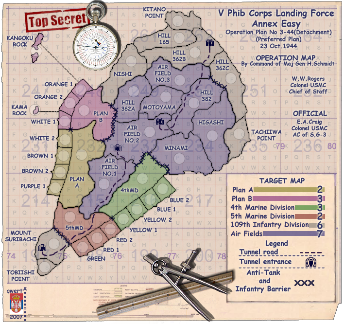
Take a look at Plan B. I think it's lines look pretty near perfect. But comparing those internal lines to the other areas, all other areas seem a jagged. See if you can replicate the Plan B internal lines like those between "Plan B // Orange 1 // Orange 2 // White 1". Do you see what I mean?
--Andy
Take a look at Plan B. I think it's lines look pretty near perfect. But comparing those internal lines to the other areas, all other areas seem a jagged. See if you can replicate the Plan B internal lines like those between "Plan B // Orange 1 // Orange 2 // White 1". Do you see what I mean?
--Andy
i agree. the legend looks strange with the blocky purple and paper colours, i think it should be one colour or the otherWidowMakers wrote:I just noticed something about the legend and I can't seem to find anything about it. It has two colors for the background. The top and majority of the middle is colored like the paper and the sides and bottom are light purple.
-
Qwert
- SoC Training Adviser
- Posts: 9262
- Joined: Tue Nov 07, 2006 5:07 pm
- Location: VOJVODINA
- Contact:
t.e.c Posted: 30 Aug 2007 10:40 Post subject:
--------------------------------------------------------------------------------
WidowMakers wrote:
I just noticed something about the legend and I can't seem to find anything about it. It has two colors for the background. The top and majority of the middle is colored like the paper and the sides and bottom are light purple.
i agree. the legend looks strange with the blocky purple and paper colours, i think it should be one colour or the other
These is combination of two original colours,and if you start insist i will put these in vote poll.
AndyDufresne Posted: 30 Aug 2007 02:14 Post subject:
--------------------------------------------------------------------------------
Regarding the circled red lines, I think the issue mostly is on the large map. Comparing the borders on the large and the small, the country divisions on the large seem to be more jagged and edgy.
Take a look at Plan B. I think it's lines look pretty near perfect. But comparing those internal lines to the other areas, all other areas seem a jagged. See if you can replicate the Plan B internal lines like those between "Plan B // Orange 1 // Orange 2 // White 1". Do you see what I mean?
--Andy
Its look that i have two problems.
1.I dont se diference,maybe i have problems with mine eye.
2.Maybe mine program tool have problems,because he present same thing when i draw.
For me is look good,maybe give that filing that borders is not same,but they are same dimension and style.
-
AndyDufresne
- Posts: 24919
- Joined: Fri Mar 03, 2006 8:22 pm
- Location: A Banana Palm in Zihuatanejo
- Contact:
Hm, well perhaps my eyes are too good, because I can see a difference. Plan B has lines that don't seem as ridged, they almost look slightly wider, perhaps that's what I'm seeing. Regardless, I like Plan B's lines. 
--Andy
--Andy
Last edited by AndyDufresne on Thu Aug 30, 2007 9:32 pm, edited 1 time in total.
-
WidowMakers
- Posts: 2774
- Joined: Mon Nov 20, 2006 9:25 am
- Gender: Male
- Location: Detroit, MI
I know you may like your present look but it is not what you said you wanted. You said you wanted to make it look like the actual map. Well the actual map has a legend with ONE color (see below) not two colors like yours.qwert wrote:These is yours opinion,and i prefer these present look.widow
The entire legend should be the same color, a light tan. Yours is both light purple and tan. I was just suggesting it look like this map.

I think the legend looks better with only one color (like the real map)


-
Qwert
- SoC Training Adviser
- Posts: 9262
- Joined: Tue Nov 07, 2006 5:07 pm
- Location: VOJVODINA
- Contact:
Andy i put map in magnifying and belive me or not all borders is same(i draw all borders with same photoshop tool-pencil)AndyDufresne
Zookeeper & Foundry Foreman
Hm, well perhaps my eyes are too good, because I can see a difference. Plan B has lines that don't seem as ridged, they almost look slightly wider, perhaps that's what I'm seeing. Regardless, I like Plan B's lines.
--Andy
Last edited by AndyDufresne on 31 Aug 2007 02:32; edited 1 time in total
But if you dont belive me i can show you enlarge part of Plan B,and some other terittoy what you say,these i can do if you still dont belive.
Back to top
_________________WidowMakers
qwert wrote:
Quote:
widow
The entire legend should be the same color, a light tan. Yours is both light purple and tan. I was just suggesting it look like this map.
These is yours opinion,and i prefer these present look.
I know you may like your present look but it is not what you said you wanted. You said you wanted to make it look like the actual map. Well the actual map has a legend with ONE color (see below) not two colors like yours.
I think the legend looks better with only one color (like the real map)
Ok i will put original colours in bonus box
-
AndyDufresne
- Posts: 24919
- Joined: Fri Mar 03, 2006 8:22 pm
- Location: A Banana Palm in Zihuatanejo
- Contact:

-
Qwert
- SoC Training Adviser
- Posts: 9262
- Joined: Tue Nov 07, 2006 5:07 pm
- Location: VOJVODINA
- Contact:
well like WW says,i put bonus box with original colours and here is new update.
small;

large;
small;
large;
Maybe give that filing,but they are same like others Terittory borders.AndyDufresne Posted: 31 Aug 2007 19:52 Post subject:
--------------------------------------------------------------------------------
No, I see the difference between internal countries and the continent borders, it just appears to me Plan B's lines, internally are different than those in other areas.
-
AndyDufresne
- Posts: 24919
- Joined: Fri Mar 03, 2006 8:22 pm
- Location: A Banana Palm in Zihuatanejo
- Contact:
Qwert, I went and used Photoshop and the Blur tool set to 50% strength, and blurred the borders of Plan A. Do you see the difference, and how it looks similar to that of Plan B? Compare the new look of borders in Plan A to that of those in Blue, Gray, and Green regions?
I think a simple blur would solve the problem on the large map...and it would just take a couple of minutes to fix.
--Andy
I think a simple blur would solve the problem on the large map...and it would just take a couple of minutes to fix.
--Andy
andy i am sorry to say this but there are a few mistakes you made:AndyDufresne wrote:Qwert, I went and used Photoshop and the Blur tool set to 50% strength, and blurred the borders of Plan A. Do you see the difference, and how it looks similar to that of Plan B? Compare the new look of borders in Plan A to that of those in Blue, Gray, and Green regions?
I think a simple blur would solve the problem on the large map...and it would just take a couple of minutes to fix.
--Andy
you blurred it with the background color in it wich you create an effect wich will not be beautifull when doing this with other color backgrounds
the difference you saw between them (that one did look darker becauseof the background) is still there
i don't like the new borders you made
if you need an example why it is the bakcground, just simply look to the font of my china map each bonus zone has a totaly different font, and they all look like gray but they aren't gray they are green-gray red-gray even brown (without gray) and more


-
AndyDufresne
- Posts: 24919
- Joined: Fri Mar 03, 2006 8:22 pm
- Location: A Banana Palm in Zihuatanejo
- Contact: