a very nice touch. but it's LED not LCDWidowMakers wrote:
2) I made the text in the legend feel more like a LCD panel and LCD.
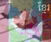
RAIL USA [Quenched]
Moderator: Cartographers
Forum rules
Please read the Community Guidelines before posting.
Please read the Community Guidelines before posting.
-
DiM

- Posts: 10415
- Joined: Wed Feb 14, 2007 6:20 pm
- Gender: Male
- Location: making maps for scooby snacks
“In the beginning God said, the four-dimensional divergence of an antisymmetric, second rank tensor equals zero, and there was light, and it was good. And on the seventh day he rested.”- Michio Kaku

-
unriggable

- Posts: 8036
- Joined: Thu Feb 08, 2007 9:49 pm


WM....thanks for the head on the butterfly....i feel whole again now! 
The legend board looks great. Very impressive. Is has a very artdeco feel about it.
I agree with Keyogi that the background needs to be darkened...there is still too much light drawing my eyes away from the map itself.
And that Chicago station bonus is kewl where it is.
Excellent work.
The legend board looks great. Very impressive. Is has a very artdeco feel about it.
I agree with Keyogi that the background needs to be darkened...there is still too much light drawing my eyes away from the map itself.
And that Chicago station bonus is kewl where it is.
Excellent work.
Last edited by cairnswk on Tue Aug 07, 2007 12:23 pm, edited 1 time in total.

* Pearl Harbour * Waterloo * Forbidden City * Jamaica * Pot Mosbi
Current Version
WidowMakers wrote:VERSION 14
Here are the updates.
1) I changed the order of the names in the legend to correspond to the layout of the map (thanks onbekende)
2) I made the text in the legend feel more like a LCD panel and LCD.
3) The underlined 3 letters of the service line was hard to make look good on the new legend so I edited the text to say "First three letters" Instead of "3 underlined letters"
4) Fixed CairnsWK sig so the butterfly has a head
NOTE: I know there are some stray blue glows behind the map. I will fix this next time.

* Pearl Harbour * Waterloo * Forbidden City * Jamaica * Pot Mosbi

Awesome
Looking Good... I only wish it was a little easier to see the country Border...also when i look close i can see very little texture in the map - Kind of wish i saw more... Not a big deal at all though Great Job guys
-
AndyDufresne

- Posts: 24919
- Joined: Fri Mar 03, 2006 8:22 pm
- Location: A Banana Palm in Zihuatanejo
- Contact:
Regarding the Chicago Bonus placement, I think it is alright in its current spot, as it is located near the other main legend.
Though it might look interesting if it was hanging from the top legend, similar to how one of the names was a few updates ago, there might not be ample room there though.
--Andy
Though it might look interesting if it was hanging from the top legend, similar to how one of the names was a few updates ago, there might not be ample room there though.
--Andy
-
WidowMakers
- Posts: 2774
- Joined: Mon Nov 20, 2006 9:25 am
- Gender: Male
- Location: Detroit, MI
-
MR. Nate

- Posts: 951
- Joined: Tue Dec 19, 2006 10:59 am
- Gender: Male
- Location: Locked in the warehouse.
Yeah, it doesn't make sense to have all the bonuses except one at the top, and just Chicago by itself.WidowMakers wrote:I actually would rather have the Chicago bonus in the legend with LCD text rather than how it is now.Keredrex wrote:you should put the Chicago Bonus Icon on the bottom .. Right under Crescent On top of the legend but slightly hanging off of it
AAFitz wrote:There will always be cheaters, abusive players, terrible players, and worse. But we have every right to crush them.
End the Flame Wars.MeDeFe wrote:This is a forum on the internet, what do you expect?
-
WidowMakers
- Posts: 2774
- Joined: Mon Nov 20, 2006 9:25 am
- Gender: Male
- Location: Detroit, MI


-
Bad Speler
- Posts: 1027
- Joined: Fri Jun 02, 2006 8:16 pm
- Gender: Male
- Location: Ottawa
- Contact:

B by far (the contrast is perfect)
C feels WAY too dark
(I could be convinced an inbetween would be good, but C I don't like)
question: How will the stations like PDX, SAC, SLC and OMA show up in the XML?
they are unique in that they share two service lines but only have 1 station
I guess breaking the mold and calling it PDX might make sense. just wondering if it will be something like PDX COA/PIO . that looks weird how I did it but just curious
-
WidowMakers
- Posts: 2774
- Joined: Mon Nov 20, 2006 9:25 am
- Gender: Male
- Location: Detroit, MI
I have gone in between B and C. I hope everyone is happy. I too liked B more than C but this version is OK too. I just think C was too dark.edbeard wrote:B by far (the contrast is perfect)
C feels WAY too dark
(I could be convinced an inbetween would be good, but C I don't like)
Based on this issue, I moved the text around in the station area. It now reads the station letters then the service letters. CairnsWK will need to talk about this (he has all of the XML done, he just needs coordinates). He might have figured out a better way to express them.edbeard wrote:question: How will the stations like PDX, SAC, SLC and OMA show up in the XML?
they are unique in that they share two service lines but only have 1 station
I guess breaking the mold and calling it PDX might make sense. just wondering if it will be something like PDX COA/PIO . that looks weird how I did it but just curious
VERSION 16
I there are no more problems on this I can make the large version next.


-
gimil

- Posts: 8599
- Joined: Sat Mar 03, 2007 12:42 pm
- Gender: Male
- Location: United Kingdom (Scotland)
just under the ELP station there is a bit of the background which looks like part of the outer glow and there is a light spot under the sas station can htese be taken out as there making the area look a little untidy.
What do you know about map making, bitch?
Top Score:2403natty_dread wrote:I was wrong
-
WidowMakers
- Posts: 2774
- Joined: Mon Nov 20, 2006 9:25 am
- Gender: Male
- Location: Detroit, MI
Those just happen to be in the background. I can remove them if it is found to be an issue.gimil wrote:just under the ELP station there is a bit of the background which looks like part of the outer glow and there is a light spot under the sas station can htese be taken out as there making the area look a little untidy.
Thanks
edbeard....i had answered the xml question back on about P8 or 9 on 16 July.edbeard wrote:B by far (the contrast is perfect)
C feels WAY too dark
(I could be convinced an inbetween would be good, but C I don't like)
question: How will the stations like PDX, SAC, SLC and OMA show up in the XML?
they are unique in that they share two service lines but only have 1 station
I guess breaking the mold and calling it PDX might make sense. just wondering if it will be something like PDX COA/PIO . that looks weird how I did it but just curious
Below is that post, and it hasn't changed, i am simply awaiting the final posting of coordinates for the small map and then the large and I'll be able to do the army shadows.
cairnswk wrote: Have at look at this XML below for NOL....you'll see that New Orleans is identified by
1. NOL New Orleans CIT (CIT is the yellow service)
2. NOL New Orleans SUN (SUN is the tan service)
3. NOL New Orleans CRE (CRE is the light blue service)
<country>
<name>NOL New Orleans CIT</name>
<borders>
<border>SAS San Antonio SUN</border>
<border>SAS San Antonio TEX</border>
<border>MEM Memphis CIT</border>
<border>ATL Atlanta CRE</border>
<border>ORL Orlando SUN</border>
<border>ORL Orlando SIL</border>
<border>NOL New Orleans SUN</border>
<border>NOL New Orleans CRE</border>
</borders>
<coordinates>
<smallx>348</smallx>
<smally>429</smally>
<largex>450</largex>
<largey>547</largey>
</coordinates>
</country>
* Pearl Harbour * Waterloo * Forbidden City * Jamaica * Pot Mosbi