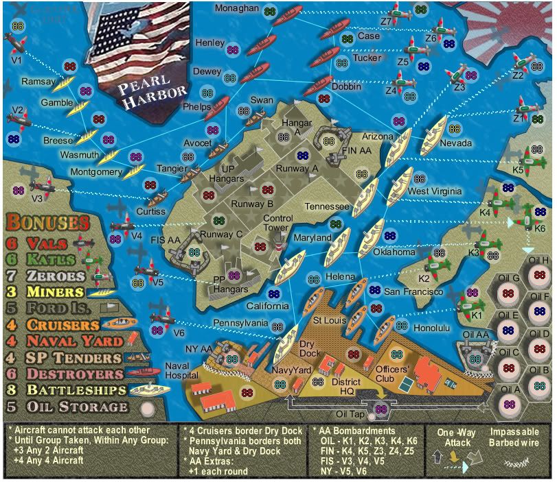
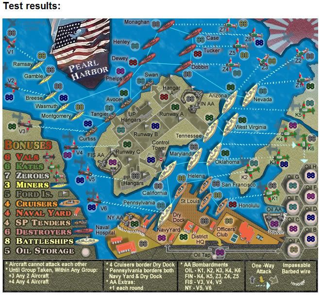
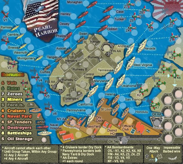
It's Ford island... not Fort I think?!onbekende wrote:oil good
planes attack 1 thing at a time, and I still want Fort Is. going as a real fort, with people wanting to have it but with not so many attack routes into it
C.
Moderator: Cartographers
I don't think either of these things need to be changed.cairnswk wrote:OK...back to topic...
Two things for discussion...
* does anyone agree with Geoster about the planes being able to attack further from their initial path, and being able to attack Ford Island also.
* Unit_2 says the oil drums need to be made smaller.
Thanks for bringing these things up now Keyogi....KEYOGI wrote:I don't think either of these things need to be changed.cairnswk wrote:OK...back to topic...
Two things for discussion...
* does anyone agree with Geoster about the planes being able to attack further from their initial path, and being able to attack Ford Island also.
* Unit_2 says the oil drums need to be made smaller.
*OK...i've dulled the red of the Vals so that doesn't clash so muchLegend is still perhaps a little messy. The bright red of Vals is clashing pretty badly and I'm not convinced the font is ideal. The rest of the map's looking pretty neat though.
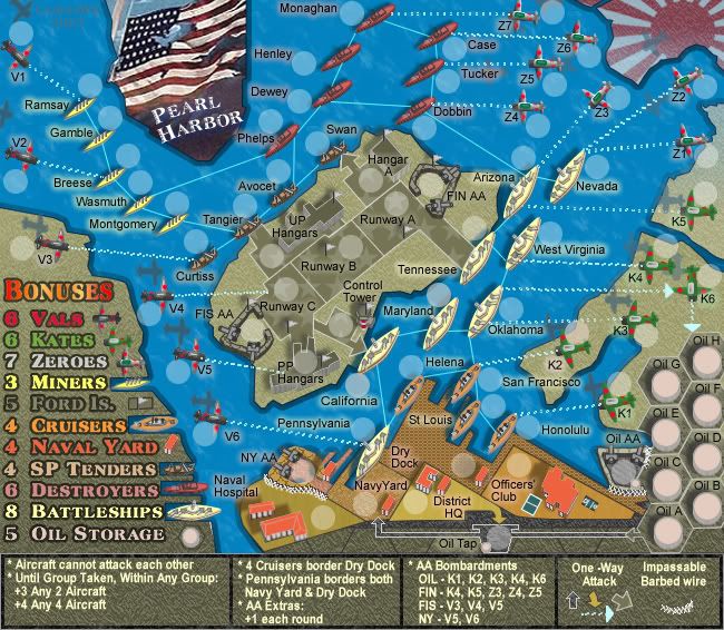


Yes Keyogi, the font is bolded but it looks worse when normal. It is a strong font by itself.KEYOGI wrote:The red in the legend is a bit better, but still not great. It's the red and green combo, always hard to get it right.
Is the legend font bolded at all?

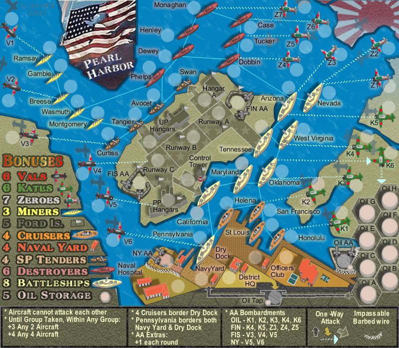

Keyogi...what is bothering you about it please?KEYOGI wrote:Hmm... I'm still unsure on the legend, it's probably the last major sticking point for me. See what others say about it... if nobody else mentions it, just choose which version you like the best.

Okies...thanks...we'll see if there is any other reaction.KEYOGI wrote:I think it's mainly the font, maybe it was the font all along. I understand why you want to keep the font and I'm not going to push the issue. I'd rather see what others have to say about it, if anything at all.

* 2 is noted for fixing next version.DiM wrote:1. the legend is fine.
2. the airplane shade in front of Z2 is actually the shade of Z1 so it should have the same tilt as Z1.
3. where's the butterfly?


