WWII Pearl Harbor - [Quenched]
Moderator: Cartographers
Forum rules
Please read the Community Guidelines before posting.
Please read the Community Guidelines before posting.
- steveontrial
- Posts: 4
- Joined: Sun Jun 03, 2007 9:34 pm
- Location: United States
I think that this map looks busy when you first see it. I'm sure many new players will take a look and think "I'll come back to that later." And I think that's fine. The first time I saw Siege! I was overwhelmed. I decided to play other maps first and get a feel for CC. After a little time I came back to Siege! and it made much more sense to me. I think Siege! is a great map! I wouldn't make it any less complex if I could.
The same issues apply to AoM. In fact, I can't understand how anyone could play AoM without BOB (the Greasemonkey UI enhancement). I doubt I'd enjoy playing it as much if I had to work out my opponents' bonuses by hand every time I started a new turn. But again, I wouldn't make AoM any less complex.
I am all for making maps as clear and understandable as possible, but not to the detriment of game play or even graphics. I think it is good to have maps at different levels of complexity. And I think that after playing this map for a little while, the brain will naturally filter out the details that don't affect game play.
So, in reference to this beautiful Pearl Harbor map, I'd hate to see any sacrifice made in order to appeal to some lower common denominator. I vote: Keep the shadows - they add depth and appeal. I think that lines for the ships and big dots for the planes look good and that the differentiation helps the eye to see the "continents" of the planes and ships.
Mmmm...the Cartographers choice lies with A.cairnswk wrote:Mmmm...what to chose?
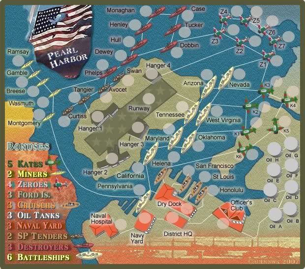
Since there is a tied poll in the results...8 votes for A and 8 votes for E, I have chosen to continue on the development with version 21 as below...Choice A.

* Pearl Harbour * Waterloo * Forbidden City * Jamaica * Pot Mosbi
No yeti_c...i would not want to confuse people anymore than the situatrion already....it will have an arrow end on it... and that's it.yeti_c wrote:Also one of those lines is a Ship to Plane one-way line - shouldn't that be different again?
C.

* Pearl Harbour * Waterloo * Forbidden City * Jamaica * Pot Mosbi
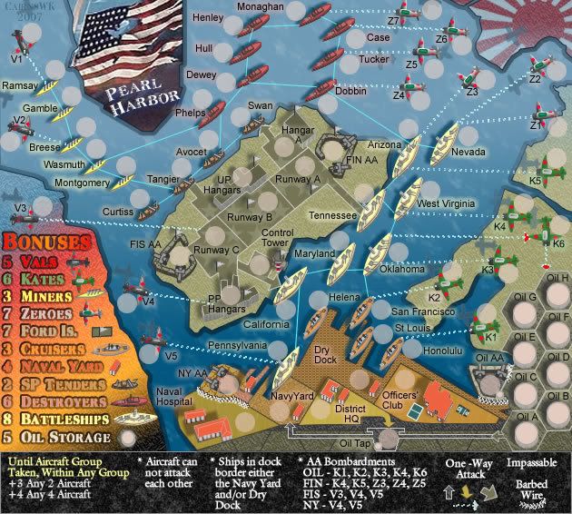
V24 Updates
OK here's a small update:
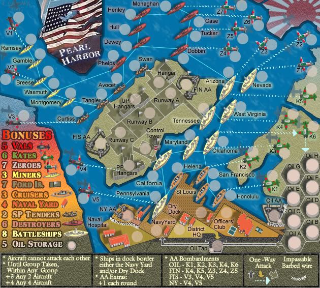
* hulmey's "fireworks show" in the destructions has been toned down to the same background as the bottom section of the map.
* the gradient has been removed from the water background to lessen the colours that the eye has to take in.
* colour change to the destructions text to make it warmer.
* hulmey's "fireworks show" in the destructions has been toned down to the same background as the bottom section of the map.
* the gradient has been removed from the water background to lessen the colours that the eye has to take in.
* colour change to the destructions text to make it warmer.


* Pearl Harbour * Waterloo * Forbidden City * Jamaica * Pot Mosbi
While I prefer the dots to the current style of dashed lines, I think that overall it's a fine choice. The solid vs dashed lines define the continents nicely. The updated arrowheads, above, look good.
I just want to make a quick comment on this:
So in this case, had the votes come 2 for A vs 14 for E, I think A would still be the right choice for you, because you are the director. I would hope that one clear explanation of your reasoning would be sufficient to satisfy even those who disagree with your decision.
Pardon me for any thread-hijacking. I'll certainly take this elsewhere if it becomes a discussion, but I want to smooth the way for my own directorial freedom on upcoming projects.
That is all.
:)
I just want to make a quick comment on this:
I just checked and there are 19,000 active users on the site (made a move in last 30 days). Rectally-derived number: 50% truly active (discounting barely-actives & new recruits who haven't fallen off the list yet) = (just for the sake of argument ) 10,000 players. 26 people voted in the poll. I'd say:cairnswk wrote:Mmmm...the Cartographers choice lies with A.cairnswk wrote:Mmmm...what to chose?
Since there is a tied poll in the results...8 votes for A and 8 votes for E, I have chosen to continue on the development with version 21 as below...Choice A.
- The margin of error for overall player opinion is very high.
- The power of the people is very low.
So in this case, had the votes come 2 for A vs 14 for E, I think A would still be the right choice for you, because you are the director. I would hope that one clear explanation of your reasoning would be sufficient to satisfy even those who disagree with your decision.
Pardon me for any thread-hijacking. I'll certainly take this elsewhere if it becomes a discussion, but I want to smooth the way for my own directorial freedom on upcoming projects.
That is all.
:)
Sparqs..thank you for that wonderful statistical insight!Sparqs wrote:While I prefer the dots to the current style of dashed lines, I think that overall it's a fine choice. The solid vs dashed lines define the continents nicely. The updated arrowheads, above, look good.
I just want to make a quick comment on this:I just checked and there are 19,000 active users on the site (made a move in last 30 days). Rectally-derived number: 50% truly active (discounting barely-actives & new recruits who haven't fallen off the list yet) = (just for the sake of argument ) 10,000 players. 26 people voted in the poll. I'd say:cairnswk wrote:Mmmm...the Cartographers choice lies with A.cairnswk wrote:Mmmm...what to chose?
Since there is a tied poll in the results...8 votes for A and 8 votes for E, I have chosen to continue on the development with version 21 as below...Choice A.What I mean by that is, I don't think that these polls should be considered votes in an election. They are more like audience-reaction indicators at a movie test-screening. Useful information for directors, but no reason to let one audience's reaction compromise their vision.
- The margin of error for overall player opinion is very high.
- The power of the people is very low.
So in this case, had the votes come 2 for A vs 14 for E, I think A would still be the right choice for you, because you are the director. I would hope that one clear explanation of your reasoning would be sufficient to satisfy even those who disagree with your decision.
Pardon me for any thread-hijacking. I'll certainly take this elsewhere if it becomes a discussion, but I want to smooth the way for my own directorial freedom on upcoming projects.
That is all.
I am afraid from my experience in other map creations, if someone puts something to the vote, and the direction the voters decide to take is different from the directors intentions, then the producer is obligued to move with the direction of the majority say-so voters. If 19000 other users registered or otherwise decide not to vote, that is their problem, and they have no recourse as far as I am concerned if they don't take the time to articulate their choices like you did so very well in Valley of the Kings. Having said that, don't think for one minute that I am going to follow everything that you offer.
This decision is based on the simple fact that there was no majority rule, but an even split decision, and as director, i can have the option of choosing the direction of the map. Several version have been offered to be voted on, there was a directional preference for two maps, and i have chosen as the cartographer to go with this version.
Thanks once again for your comments.

* Pearl Harbour * Waterloo * Forbidden City * Jamaica * Pot Mosbi
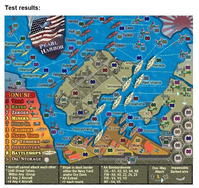
Army Testing V25SX
I thought I'd post this image showing the XML army placement on the small version to show what this would look like if there were no changes made to any lines etc.
It's not too bad, better than I thought it would be actually.
Having done this, yes the XML is ready.
It's not too bad, better than I thought it would be actually.
Having done this, yes the XML is ready.


* Pearl Harbour * Waterloo * Forbidden City * Jamaica * Pot Mosbi
jesus christ this one hell of a complex map with all those army cicles.... Im really thinking you should remove some of the complications....
While im a keen follower of this map i think you should remove the oil tap and the orange-ness to the matter.
But good job and keep it up
While im a keen follower of this map i think you should remove the oil tap and the orange-ness to the matter.
But good job and keep it up
[img]http://img801.imageshack.us/img801/9761/41922610151374166770386.jpg[/mg]
- Ruben Cassar
- Posts: 2160
- Joined: Thu Nov 16, 2006 6:04 am
- Gender: Male
- Location: Civitas Invicta, Melita, Evropa
Honestly I can barely make out the difference between a 'continent' and another.
I really think you should reduce the number of territories in this one and simplify it a bit because I cannot see myself playing this one even though I like the theme and it's visually stunning. It's way too busy.
However this is your map and at the end of your day it's your call.
I really think you should reduce the number of territories in this one and simplify it a bit because I cannot see myself playing this one even though I like the theme and it's visually stunning. It's way too busy.
However this is your map and at the end of your day it's your call.
- DiM
- Posts: 10415
- Joined: Wed Feb 14, 2007 6:20 pm
- Gender: Male
- Location: making maps for scooby snacks
i agree the map looks somewhat cluttered, not complicated, just cluttered. but the graphics are so crisp and nicely done i can clearly see what is what and where i need to attack. i don't think you should simplify it.
on a side note about the polls. yes very few people vote. most votes in the foundry are around 100-120 but that's only when polls are run for a long time.
yes they represent a very small percentage of the total players but we have to consider among those 100 vote most of them come from map makers and map foundry experienced readers. so they know what they are voting.
i'd always consider more accurate a poll made between the top 50 experienced map foundry users than a poll done between 10000 people that never entered the foundry. why? because the other users have no idea how the foundry works they don't know the process of designing the gameplay. they just see a new map and say yes or no.
also if the poll says something the map maker can decide to go otherwise because it is his map. however he has to somehow justify.
“In the beginning God said, the four-dimensional divergence of an antisymmetric, second rank tensor equals zero, and there was light, and it was good. And on the seventh day he rested.”- Michio Kaku
I just wanted to show this....i am aware that the attack lines are not the most popular way of doing a map, and this was also expressed in Battle For Australia. However, I have spent several days experimenting with this map, and have "gridded" it and also given it (below) a standard RISK tert expression.
I can honestly say, that this way looks like SHITE, and its because its on open water and has 3D figures. This looks very cluttered and adds even more lines to the map. I definitely prefer the attack lines for a map like this.
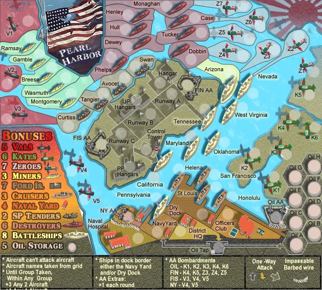
I can honestly say, that this way looks like SHITE, and its because its on open water and has 3D figures. This looks very cluttered and adds even more lines to the map. I definitely prefer the attack lines for a map like this.


* Pearl Harbour * Waterloo * Forbidden City * Jamaica * Pot Mosbi

