Conquer Club

MapStarter: Pi-School New LG and SM map & XML V.28d

Maps that may be nearing the end of production. Finalize maps here, while testing.

Moderator: Cartographers

Forum rules
Please read the Community Guidelines before posting.

Re: MapStarter: Pi-School

Postby iancanton on Sun Sep 17, 2017 4:51 pm

at the moment, the map image is too large. given that there are only 42 regions, the use of space needs to be much more efficient, so that the large and small images are no more than 800 and 600 pixels wide respectively. u can subsequently increase the width by 5% if necessary.

with how many neutrals will each number and "." start?

ian. :)
Image
User avatar
Brigadier iancanton
Foundry Foreman
Foundry Foreman
 
Posts: 2431
Joined: Fri Jun 01, 2007 5:40 am
Location: europe

Re: MapStarter: Pi-School

Postby HitRed on Sun Sep 17, 2017 6:44 pm

iancanton wrote:at the moment, the map image is too large. given that there are only 42 regions, the use of space needs to be much more efficient, so that the large and small images are no more than 800 and 600 pixels wide respectively. u can subsequently increase the width by 5% if necessary.

with how many neutrals will each number and "." start?

ian. :)


STARTING NEUTALS
Being a conquest style map all the Number Buttons, ".", Display Numbers and -/+X will start neutal 3. See TRANFORMING NEUTALS below for the starting neutrals of Function Keys, On/AC, = and Off.

TRANSFORMING NEUTRALS
I want a game that changes midway though.
FUNCTION KEYS would start Neutral 10 and random (0,-1,- 2) per turn. So, they would 'open up' as time goes on.
The ON/AC button would start Neutral 15 and random (0,-1,- 2) per turn. Opening next
The = button would start Neutral 20 and random (0,-1,- 2) per turn. Opening later.
The OFF button (being the most powerful) would start 30 and random (0,-1,- 2) per turn. Opening last
They could be 'opened up' faster if they were attacked.

I have emailed EBConquer on the map size. He has volunteered to design updated art.
User avatar
Major HitRed
 
Posts: 4879
Joined: Fri Jun 26, 2015 12:16 pm

Re: MapStarter: Pi-School (Capture Pi)

Postby HitRed on Tue Sep 19, 2017 1:21 pm

Updated Mascots

Size and design will be more consistent. Flat solid black icons on shields colored with the CC player color codes.

Tarantula
Stag
Hawk
Gorilla
Octopus
Rhino
Scorpion
Orca OR Shark
User avatar
Major HitRed
 
Posts: 4879
Joined: Fri Jun 26, 2015 12:16 pm

Re: MapStarter: Pi-School (Capture Pi)

Postby iancanton on Wed Sep 20, 2017 4:17 pm

a couple of spelling mistakes to correct: Composit is missing an e, while 1's has an unwanted apostrophe.

to help those who might not know the difference between function keys and math symbols, will they be colour-coded in the legend?

ian. :)
Image
User avatar
Brigadier iancanton
Foundry Foreman
Foundry Foreman
 
Posts: 2431
Joined: Fri Jun 01, 2007 5:40 am
Location: europe

Re: MapStarter: Pi-School (Capture Pi)

Postby HitRed on Wed Sep 20, 2017 4:54 pm

iancanton wrote:a couple of spelling mistakes to correct: Composit is missing an e, while 1's has an unwanted apostrophe.

to help those who might not know the difference between function keys and math symbols, will they be colour-coded in the legend?

ian. :)


Composite now corrected in game thread.
1s now corrected in game thread.

Recognition
-/+X buttons would be white with green text.
Functions would be peach with gray text.

All of these changes will show in the update art. Designer is currently working on it.

Hitred
User avatar
Major HitRed
 
Posts: 4879
Joined: Fri Jun 26, 2015 12:16 pm

Re: MapStarter: Pi-School (Capture Pi)

Postby t-o-m on Fri Sep 22, 2017 1:29 pm

Hi HitRed! Nice to see another map in development :)

It's an interesting conceptual map and looks like a fun one to play!

I have some points for your consideration. I've not read the thread so apologies if they come up elsewhere.

  • I know what Pi is, you know what Pi is – most people know what Pi is. But there will be some people who don't know that Pi = 3.14159... and therefore they will not understand any reference you make to 'Pi' in the instructions. To make this clearer, you could try highlighting any instance of the word 'Pi', and also write somewhere Pi = 3.14159... // think of the player as extremely stupid who will need absolutely everything explained to him/her
  • Leading on from that last point, what could be really nice is a little description of what Pi is and why it's special – perhaps adding a post-it note to the map, or something like that. I think it would add some flavour to the map and build upon the theme. If you look at Cuban Missile Crisis, you'll see a little description which gives background to the map. I think this could add a little special touch to your map :)
  • The instructional text on the map is really quite large, I think it could come down to almost half size, and that means the lined paper could also become smaller. I understand the way you've designed it currently is to keep the scale between the paper and calculator appropriate, so I think you'll need to play around a little to make it work
  • I would put 'bonuses' first on the list, or after 'First player to capture Pi wins'. This is because people playing the map for the first time will want to know what their objective is (i.e. which regions to hold for more deploy) rather than what attacks where – that comes second. People need to know where to attack before they need to know how to attack
  • Consider knocking the ruled blue lines on the paper into grey... see how it looks. Just that there is a lot going on and you want to make it as simple as possible for the player to take in all the information
  • Maybe rotate the Pi symbol in the upper-left corner so that it looks as though it's printed on the paper?
  • Perhaps instead of the more-than symbol ">" in the instructions, I would use an arrow. Since ">" is a mathematical symbol and you're talking maths, the meaning could be confused. Although it is nice that you've used a mathematical symbol to communicate the attacks... it was probably intentional and is a nice touch. It might not be so confusing
  • "Even > Even Pi Numbers" looks as though it's in a heavier font-weight to the rest of the instructions?
  • One bonus is for "All Pi numbers & "." – this is referring to the Pi numbers on the keypad, I'm assuming? Not referring to the pi numbers on the calculator display? I think you need some clearer terminology as "capturing pi" is a victory objective - it uses the same terminology but refers to something different
  • The 'keypad' should be highlighted in green, like I suggested in Pi. Again, think of the players as idiot... everything needs to be crystal clear. Many players on CC are young and there are many whose first language is not English - so the instructions should be as clear/intuitive as can be
  • The map has a very interesting way of connecting each 'region', but even after examining the map for about 10 minutes, I'm not fully sure I understand some parts of it. E.g. how do you attack Utility, Alt-L and Off? Everyone starts at the high school logos, then goes onto the keypad... do the regions attack their neighbours? There isn't any mention of this and it doesn't feel intuitive as there is no graphical border between each key. If you can attack your neighbour (e.g. 4 can attack 1), can you attack diagonally? (e.g. can 4 attack 8?) I think this part is crucial to explain, perhaps with a mini-graphic example somewhere. Wait, are Alt-L etc. 'function keys'?
  • Another little comment about terminology - the map refers to "keypad numbers" and "Number keys" as though they're two separate things... but I think they're the same? Terminology should be consistent :)
    • To clear up the terminology issues, perhaps examine all the terminology you're using. I can see:
      • Pi Numbers
      • HS logos
      • Keypad Numbers
      • Number keys
      • Math Symbols
      • Pi
      • Non-Pi Keypad numbers
      • Function keys
  • "***Number Keys and Math Symbols can attack each other" goes over two lines, which is the only instance of this happening - I would try to keep it over one line like everything else

Hope you don't mind those nitpicky comments! They're in the interest of making the map as good as it can be. I'd really like to play this :D

Tom
User avatar
Major t-o-m
 
Posts: 2918
Joined: Sat Mar 22, 2008 2:22 pm

Re: MapStarter: Pi-School (Capture Pi)

Postby HitRed on Fri Sep 22, 2017 8:30 pm

t-o-m wrote:Hi HitRed! Nice to see another map in development :)

It's an interesting conceptual map and looks like a fun one to play!

I have some points for your consideration. I've not read the thread so apologies if they come up elsewhere.

  • I know what Pi is, you know what Pi is – most people know what Pi is. But there will be some people who don't know that Pi = 3.14159... and therefore they will not understand any reference you make to 'Pi' in the instructions. To make this clearer, you could try highlighting any instance of the word 'Pi', and also write somewhere Pi = 3.14159... // think of the player as extremely stupid who will need absolutely everything explained to him/her
  • Leading on from that last point, what could be really nice is a little description of what Pi is and why it's special – perhaps adding a post-it note to the map, or something like that. I think it would add some flavour to the map and build upon the theme. If you look at Cuban Missile Crisis, you'll see a little description which gives background to the map. I think this could add a little special touch to your map :)
  • The instructional text on the map is really quite large, I think it could come down to almost half size, and that means the lined paper could also become smaller. I understand the way you've designed it currently is to keep the scale between the paper and calculator appropriate, so I think you'll need to play around a little to make it work
  • I would put 'bonuses' first on the list, or after 'First player to capture Pi wins'. This is because people playing the map for the first time will want to know what their objective is (i.e. which regions to hold for more deploy) rather than what attacks where – that comes second. People need to know where to attack before they need to know how to attack
  • Consider knocking the ruled blue lines on the paper into grey... see how it looks. Just that there is a lot going on and you want to make it as simple as possible for the player to take in all the information
  • Maybe rotate the Pi symbol in the upper-left corner so that it looks as though it's printed on the paper?
  • Perhaps instead of the more-than symbol ">" in the instructions, I would use an arrow. Since ">" is a mathematical symbol and you're talking maths, the meaning could be confused. Although it is nice that you've used a mathematical symbol to communicate the attacks... it was probably intentional and is a nice touch. It might not be so confusing
  • "Even > Even Pi Numbers" looks as though it's in a heavier font-weight to the rest of the instructions?
  • One bonus is for "All Pi numbers & "." – this is referring to the Pi numbers on the keypad, I'm assuming? Not referring to the pi numbers on the calculator display? I think you need some clearer terminology as "capturing pi" is a victory objective - it uses the same terminology but refers to something different
  • The 'keypad' should be highlighted in green, like I suggested in Pi. Again, think of the players as idiot... everything needs to be crystal clear. Many players on CC are young and there are many whose first language is not English - so the instructions should be as clear/intuitive as can be
  • The map has a very interesting way of connecting each 'region', but even after examining the map for about 10 minutes, I'm not fully sure I understand some parts of it. E.g. how do you attack Utility, Alt-L and Off? Everyone starts at the high school logos, then goes onto the keypad... do the regions attack their neighbours? There isn't any mention of this and it doesn't feel intuitive as there is no graphical border between each key. If you can attack your neighbour (e.g. 4 can attack 1), can you attack diagonally? (e.g. can 4 attack 8?) I think this part is crucial to explain, perhaps with a mini-graphic example somewhere. Wait, are Alt-L etc. 'function keys'?
  • Another little comment about terminology - the map refers to "keypad numbers" and "Number keys" as though they're two separate things... but I think they're the same? Terminology should be consistent :)
    • To clear up the terminology issues, perhaps examine all the terminology you're using. I can see:
      • Pi Numbers
      • HS logos
      • Keypad Numbers
      • Number keys
      • Math Symbols
      • Pi
      • Non-Pi Keypad numbers
      • Function keys
  • "***Number Keys and Math Symbols can attack each other" goes over two lines, which is the only instance of this happening - I would try to keep it over one line like everything else

Hope you don't mind those nitpicky comments! They're in the interest of making the map as good as it can be. I'd really like to play this :D

Tom


Tom, it's refreshing to see a thought-out and in-depth response. :D

I have just reworked the game instructions and would like you to review it again. To see if it is more clear.

The new designer is working on version 4 art. The current art (version 3) is quite old.

Point by point.

1) Agreed, after showing Pi is 3.14159265 we will only use 3.14159265 IN THE DISPLAY in the instructions.
2) Agreed, we will add a brief statement about Pi on the map. Maybe even a circle with radius. Depends on room.
3) Yes, the calculator will become bigger and the text area reduced.
4) Moved VICTORY CONDITION up to the top.
5) The designer will make the final call on the gray or blue lines. I understand your point.
6) Again, the designer will make the final call on the placement of the Pi symbol.
7) This is a good point. I was trying to save space. Maybe an arrow image (like bow and arrow) would be better. We'll talk it over.
8 ) The new version 4 of the art should correct the Even > Even font issue.
9) *Clapping* Yes, this was confusing. Beyond the game name, "Capture Pi" has been removed. 3.14159265 IN THE DISPLAY is now being used.
10) Keyboard will know longer be used. Green buttons will take its place. Green will also be green in color. Same with Peach, Red, Yellowish Gold and Blue.
11) Regions and their interplay are now better explained. Version 4 of the map will visually make understanding gameplay much easier. Words like FUNCTION have been removed.
12) All the text on the map will be updated in version 4. Please disregard map 3 in details.

I think your comments have been great. =D>

Thanks and have a wonderful weekend,

HitRed
User avatar
Major HitRed
 
Posts: 4879
Joined: Fri Jun 26, 2015 12:16 pm

Re: MapStarter: Pi-School (Capture Pi)

Postby t-o-m on Sun Sep 24, 2017 4:25 pm

Fab! Glad to hear it's coming along, I'm looking forward to seeing Version 4!
User avatar
Major t-o-m
 
Posts: 2918
Joined: Sat Mar 22, 2008 2:22 pm

Re: MapStarter: Pi-School (Capture Pi)

Postby riskllama on Sun Sep 24, 2017 8:28 pm

yes - nice to see some progress here, HR.
Image
User avatar
Lieutenant riskllama
 
Posts: 8907
Joined: Thu Jan 30, 2014 9:50 pm
Location: deep inside Queen Charlotte.

Re: MapStarter: Pi-School (Capture Pi)

Postby Thorthoth on Mon Sep 25, 2017 12:21 am

HitRed seems to one of those players that have been 'snatched' by alien pods.

The old HitRed was a basically good-natured B-list GC personality.
The new HitRed is a circular ratio-obsessed game designer with an unfortunate hyper-sensitive foe/ban streak.
making new maps is good, but making ones that nobody really wants... not so much.
THORTHOTHORTHOTHORTHOTHORTHOTHORTHOTHORTHOTHORTHOTHORTHOTHORTHOTH
Click image to enlarge.
image
User avatar
Corporal Thorthoth
 
Posts: 3273
Joined: Mon Dec 26, 2011 1:36 pm
Location: My pyramid in Asgard, beside the glaciated Nile.

Re: MapStarter: Pi-School (Capture Pi) Pi.V1.4 Art

Postby HitRed on Wed Oct 18, 2017 9:33 am

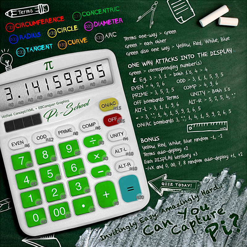
Image
Pi.V1.4 art

Pi-School has been graphically revamped by our new designer, EBConquer. Very skilled and nice to work with.
User avatar
Major HitRed
 
Posts: 4879
Joined: Fri Jun 26, 2015 12:16 pm

Re: MapStarter: Pi-School (Capture Pi)

Postby riskllama on Wed Oct 18, 2017 10:50 am

nice work, you guys - keep after it... ;) ;)
Image
User avatar
Lieutenant riskllama
 
Posts: 8907
Joined: Thu Jan 30, 2014 9:50 pm
Location: deep inside Queen Charlotte.

Re: MapStarter: Pi-School (Capture Pi)

Postby IcePack on Wed Oct 18, 2017 4:10 pm

I’ll donate 314 credits to the cause
Image

fac vitam incredibilem memento vivere
Knowledge Weighs Nothing, Carry All You Can
User avatar
Major IcePack
Multi Hunter
Multi Hunter
 
Posts: 16631
Joined: Wed Aug 04, 2010 6:42 pm
Location: California

Re: MapStarter: Pi-School (Capture Pi)

Postby Thorthoth on Wed Oct 18, 2017 4:18 pm

IcePack wrote:I’ll donate 314 credits to the cause

What are those 314 credits going to do? Is HR holding the map hostage until he gets more pay?
THORTHOTHORTHOTHORTHOTHORTHOTHORTHOTHORTHOTHORTHOTHORTHOTHORTHOTH
Click image to enlarge.
image
User avatar
Corporal Thorthoth
 
Posts: 3273
Joined: Mon Dec 26, 2011 1:36 pm
Location: My pyramid in Asgard, beside the glaciated Nile.

Re: MapStarter: Pi-School (Capture Pi)

Postby IcePack on Wed Oct 18, 2017 4:43 pm

Thorthoth wrote:
IcePack wrote:I’ll donate 314 credits to the cause

What are those 314 credits going to do? Is HR holding the map hostage until he gets more pay?


They’ll go to HR. He is not holding it hostage, it’s part of the map maker program people can donate to a map maker to encourage them to continue etc
Image

fac vitam incredibilem memento vivere
Knowledge Weighs Nothing, Carry All You Can
User avatar
Major IcePack
Multi Hunter
Multi Hunter
 
Posts: 16631
Joined: Wed Aug 04, 2010 6:42 pm
Location: California

Re: MapStarter: Pi-School (Capture Pi)

Postby Mad777 on Wed Oct 18, 2017 5:27 pm

I like the new design, good job!
".....Under Phucumol treatment....."
https://youtu.be/zlusWzDY4qw
User avatar
Lieutenant Mad777
 
Posts: 9822
Joined: Thu Jun 18, 2009 9:21 am

Re: MapStarter: Pi-School (Capture Pi)

Postby PunkRocker on Sat Oct 21, 2017 12:11 pm

Updated graphics look GREAT! way to stick with it HR and crew! Miss ya cow buddy! stop by and see us sometime
User avatar
Sergeant 1st Class PunkRocker
 
Posts: 54
Joined: Mon Nov 14, 2016 9:13 pm
Location: the bottom

Re: MapStarter: Pi-School (Capture Pi)

Postby mcshanester29 on Sat Oct 21, 2017 8:20 pm

I really like this map a lot and can't wait to see it in play. I will donate 100 credits as well!
User avatar
Private mcshanester29
 
Posts: 8662
Joined: Tue Sep 07, 2010 3:09 pm
Location: ID, USA

Re: MapStarter: Pi-School (Capture Pi)

Postby HitRed on Mon Oct 23, 2017 10:36 pm

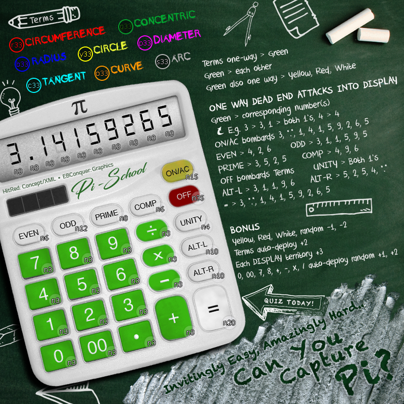
Image
Pi V1.5 art

Corrected "=" button color to white for consistency.
Removed the word Blue from text.
Changed Pi symbol to black to match display numbers.
User avatar
Major HitRed
 
Posts: 4879
Joined: Fri Jun 26, 2015 12:16 pm

Re: MapStarter: Pi-School (Capture Pi)

Postby DJENRE on Tue Oct 24, 2017 9:21 am

The new design is much nicer than the previous one. Good work. Keep going
Last edited by DJENRE on Fri Oct 27, 2017 12:51 pm, edited 1 time in total.
BIG PRIZES! CSOP Hold'em
YOU LIKE MONOPOLY? PLAY IT on CC => CONQUEROPOLY
YOU'RE A MEDAL HUNTER? HUNT ALL THE MEDALS YOU NEED HERE!
BIG TRIBE TOURNAMENT VI NATIONS 2018
Image
User avatar
Corporal 1st Class DJENRE
 
Posts: 2057
Joined: Thu Jul 30, 2009 1:59 am
Location: ✪ ✪ ✪ ✪ ✪ ✪ ✪ ✪ ✪ ✪ ✪ ✪ ✪ ✪ ✪ ✪ ✪ ✪ ✪ ✪ ✪ ✪ ✪ ✪ ✪ ✪ ✪ ✪ ✪ ✪

Re: MapStarter: Pi-School (Capture Pi)

Postby iancanton on Wed Oct 25, 2017 5:15 pm

the shadows on v1.5 make the three-dimensional effect much more convincing.

in the legend, replace "/" by "÷" to be consistent with the keypad.

the map has attracted a total of 1,484 credits now.

time to advance to the main foundry workshop. onward and upward!

Image

ian. :)
Image
User avatar
Brigadier iancanton
Foundry Foreman
Foundry Foreman
 
Posts: 2431
Joined: Fri Jun 01, 2007 5:40 am
Location: europe

Re: MapStarter: Pi-School (Capture Pi)

Postby LiveLoveTeach on Wed Oct 25, 2017 6:42 pm

I like the new graphics for it... EB, it's fantastic, as always :D

One thing I noticed is that you have it saying "Invitingly Easy, Amazingly Hard.." --> I'd make that into an actual ellipsis by adding an extra "." at the end... but it's a small thing that probably won't be noticed by many/most.
User avatar
Major LiveLoveTeach
 
Posts: 375
Joined: Tue Oct 27, 2015 8:35 am

Re: MapStarter: Pi-School (Capture Pi)

Postby EBConquer on Wed Oct 25, 2017 11:26 pm

Awesome... main foundry workshop!! HitRed is a pleasure to work w/ too. Very organized and exactly what we need to spearhead this operation. I'm more or less the gfx facilitator.

Thanks and i think that's a good idea w/ finishing the ellipsis and putting in the "÷" sign. Does any one think we should put in somewhere that ">" means "attack(s)". Or is it pretty obvious?

Cheers and congrats, HitRed!
Image
User avatar
Colonel EBConquer
 
Posts: 973
Joined: Sun Dec 05, 2010 1:11 am
Location: San Diego

Re: MapStarter: Pi-School (Capture Pi)

Postby HitRed on Thu Oct 26, 2017 12:11 am

Thanks EBConquer for all your insight and skills. It's a great looking map!

Explaining ">" is a good idea. Best to help the newest members of CC.

Really happy!

HitRed
Last edited by HitRed on Thu Oct 26, 2017 9:05 am, edited 1 time in total.
User avatar
Major HitRed
 
Posts: 4879
Joined: Fri Jun 26, 2015 12:16 pm

PreviousNext

Return to Beta Maps

Who is online

Users browsing this forum: No registered users