Conquer Club

Age of Merchants - [Quenched]

Care to peruse completed maps? Take a stroll through the Atlas.

Moderator: Cartographers

Forum rules
Please read the Community Guidelines before posting.

Postby DiM on Sat Jun 02, 2007 12:31 pm

Ruben Cassar wrote:Hmm I think a new player just selects a map according to the map theme's appeal irrespective of what the gameplay is. A map should be understandable to all the community. At least that's my opinion.


let's say a new player comes and wants to create his first game. he sees AoM and clicks on it. the first thing he'll notice is the lack of a continent bonus legend. this tells him there's no bonus for holding continents and it's his first clue on discovering this map has a different gameplay. he then proceeds in reading the legend. he will either like it and play it or dislike it and join classic.

i really don't see the problem.


also since you're colour blind i recommend getting greasemonkey and roberts mods scrip. it has colour blind aid. but i'm sure you already have it otherwise you would not be able to play.
“In the beginning God said, the four-dimensional divergence of an antisymmetric, second rank tensor equals zero, and there was light, and it was good. And on the seventh day he rested.”- Michio Kaku
User avatar
Major DiM
 
Posts: 10415
Joined: Wed Feb 14, 2007 6:20 pm
Location: making maps for scooby snacks

Postby Ruben Cassar on Sat Jun 02, 2007 12:38 pm

This post is for Dim.

I did not say that you ignored any suggestions.

I did not say that you did not respect someone or that you insulted anyone.

I just came now, that's true. I could not understand the map and I posted the comments. If it upsets you ignore my comments and move on. However I thought that a map can be optimised even when it reaches final forge status. In fact some maps were in final forge status for ages (not a few days) and people continued to request them to make changes, some of which had even been discussed before.

Good luck, I hope other people understand it at least. I don't, so I won't be playing it. Time for quenching I guess.
ImageImageImageImageImage
User avatar
Colonel Ruben Cassar
 
Posts: 2160
Joined: Thu Nov 16, 2006 6:04 am
Location: Civitas Invicta, Melita, Evropa

Postby Ruben Cassar on Sat Jun 02, 2007 12:40 pm

DiM wrote:also since you're colour blind i recommend getting greasemonkey and roberts mods scrip. it has colour blind aid. but i'm sure you already have it otherwise you would not be able to play.


Read well, understand and then post. Check my previous post (2 places up not last one).
ImageImageImageImageImage
User avatar
Colonel Ruben Cassar
 
Posts: 2160
Joined: Thu Nov 16, 2006 6:04 am
Location: Civitas Invicta, Melita, Evropa

Postby DiM on Sat Jun 02, 2007 12:56 pm

Ruben Cassar wrote:This post is for Dim.

I did not say that you ignored any suggestions.

I did not say that you did not respect someone or that you insulted anyone.

I just came now, that's true. I could not understand the map and I posted the comments. If it upsets you ignore my comments and move on. However I thought that a map can be optimised even when it reaches final forge status. In fact some maps were in final forge status for ages (not a few days) and people continued to request them to make changes, some of which had even been discussed before.

Good luck, I hope other people understand it at least. I don't, so I won't be playing it. Time for quenching I guess.


crap. i did not say you did say that :P
i just wanted to say something that was for you and teya. some parts for you and some for teya.

for you was the part about coming after 55 pages and talking about something that's been discussed ages ago.

i agree maps can and will be improved in final forge and even after quenching. if at some point in time a mistake is found i'll be glad to rectify it even if the map is up for live play.

but asking to change something that's already been agreed on seems rather wrong. let's say i change the font and put color on all continents and rewrite the legend. you'll be satisfied and then someone else will come after 2 weeks and say he wants it the way it was before and so on.

throughout the thread i listened to reason and made lots of compromises. i changed almost everything on the map many times. number of continents, font, territories, legend, coloring, various drawings, icons, names. everything has been changed until the majority approved each and every issue. i'm well aware it's not humanly possible to please everybody and i don't expect all the people to play and like my map. i just did this work to give something to the community. if a single person will post here and tell me they love the map i'll be glad. at least i'll have the satisfaction of providing some fun for somebody. i don't love all the maps and i bet there's not a single person on this site that can honestly say he loves them all. it's clear each of us have favorite maps as well as maps we hate. that's a normal thing and i respect it. i have learned that sometimes compromising is needed and i have accepted the fact that not everybody can be pleased and i want people to learn the same lessons as i did.
“In the beginning God said, the four-dimensional divergence of an antisymmetric, second rank tensor equals zero, and there was light, and it was good. And on the seventh day he rested.”- Michio Kaku
User avatar
Major DiM
 
Posts: 10415
Joined: Wed Feb 14, 2007 6:20 pm
Location: making maps for scooby snacks

Postby Teya on Sat Jun 02, 2007 7:57 pm

Im not entirely sure how you can justify telling people like guiscard in his roman empire thread that his small map is too cramped and hard to read when you have exactly the same issue and you dont care.

As for coming in on page 55, like it would have made any difference if we came in earlier.... since everything that was brought up had previously been brought up.

It just goes to show that Andy will Forge and quench anything if you bitch and winge enough. :roll:
User avatar
Sergeant 1st Class Teya
 
Posts: 411
Joined: Tue Oct 17, 2006 5:25 am

Postby DiM on Sun Jun 03, 2007 4:16 am

Teya wrote:Im not entirely sure how you can justify telling people like guiscard in his roman empire thread that his small map is too cramped and hard to read when you have exactly the same issue and you dont care.

As for coming in on page 55, like it would have made any difference if we came in earlier.... since everything that was brought up had previously been brought up.

It just goes to show that Andy will Forge and quench anything if you bitch and winge enough. :roll:


first of all stop insulting people. with the above post you insulted me by calling me a whiner and a bitcher and andy for suggesting (twice) he's not doing his job properly.

second, i urge you to read what i said in guiscard's thread. i said that if he respects the 350px limit for the small his map will be crowded because he also has to increase the font size. i provided an image to support my theory and detailed my opinion. however it was only a preemptive suggestion and as keyogi said in that thread the small map can be made a bit bigger to avoid cramping. so my point was valid and a solution has been found. case closed.
about my map being cramped. if i remember correctly you've been saying this a lot. never in this thread have you provided something good. you only came from time to time to say this map is cramped. like the time you said army numbers don't fit when in fact on the previous page there was an image with the army numbers and they all fitted nicely. :wink:

i understand you don't like this map. it's crystal clear. but i always responded to your posts and provided good reasoning. you have to understand that this map has a new concept that needs a rather large legend. do you have any suggestions to improve the legend? no. you've been around while it was discussed and posted nothing helpful. and yes it would have been helpful if you had posted earlier while various things were in the middle of the discussion.

and as you said "everything that was brought up had previously been brought up". what does this mean? it means this map has been thoroughly debated, things have been proposed and modified until the majority was happy with the result. is it normal to come after so much time and ask for major changes? no. definitely not. you've had your chance to participate in the debates, you've had your time to make a valid point and say what you don't like and how it can be improved. i've always been more than willing to implement what i've been asked as you can see by the number of updates (which is actually larger than 74 because i haven't updated the title in a while).
“In the beginning God said, the four-dimensional divergence of an antisymmetric, second rank tensor equals zero, and there was light, and it was good. And on the seventh day he rested.”- Michio Kaku
User avatar
Major DiM
 
Posts: 10415
Joined: Wed Feb 14, 2007 6:20 pm
Location: making maps for scooby snacks

Postby Teya on Sun Jun 03, 2007 6:14 am

DiM, I seem to recall you doing a fair bit of bitching and whinging when Andy didnt quench your map 2 days after it being final forged.

And Im sure Andy can stick up for himself, so I'll insult him all I like. Besides, I know Im not the only person in the foundry that thinks Andy isnt doing as well as he used to.
User avatar
Sergeant 1st Class Teya
 
Posts: 411
Joined: Tue Oct 17, 2006 5:25 am

Postby yeti_c on Sun Jun 03, 2007 6:20 am

What's with the insults and the negativity?

I thought the Map Foundry was meant for "Constuctive Criticism".

C.
Image
Highest score : 2297
User avatar
Lieutenant yeti_c
 
Posts: 9624
Joined: Thu Jan 04, 2007 9:02 am

Postby DiM on Sun Jun 03, 2007 6:27 am

Teya wrote:DiM, I seem to recall you doing a fair bit of bitching and whinging when Andy didnt quench your map 2 days after it being final forged.

And Im sure Andy can stick up for himself, so I'll insult him all I like. Besides, I know Im not the only person in the foundry that thinks Andy isnt doing as well as he used to.


i never had a map final forged before. and in that message it said it's going to be quenched in 2 days if there are no further comments. since there were none i expected it to be quenched. after andy explained that's only a figure of speech and it takes longer i calmed and patiently waited. as you can see it's been over 2 weeks since the forging and i haven't said a thing.

and about andy please make a thread and slap him there. i don't think my thread is an appropriate place to do it.
“In the beginning God said, the four-dimensional divergence of an antisymmetric, second rank tensor equals zero, and there was light, and it was good. And on the seventh day he rested.”- Michio Kaku
User avatar
Major DiM
 
Posts: 10415
Joined: Wed Feb 14, 2007 6:20 pm
Location: making maps for scooby snacks

Postby DiM on Sun Jun 03, 2007 6:30 am

yeti_c wrote:What's with the insults and the negativity?

I thought the Map Foundry was meant for "Constuctive Criticism".

C.


don't know why but today i've been getting a lot of that. in a recent game i've been accused of cheating, forming a secret alliance and i've been cursed all because i was from the same country with another player.

oh and also threatened with report.


*goes to the cheating and abuse forum to have fun*
“In the beginning God said, the four-dimensional divergence of an antisymmetric, second rank tensor equals zero, and there was light, and it was good. And on the seventh day he rested.”- Michio Kaku
User avatar
Major DiM
 
Posts: 10415
Joined: Wed Feb 14, 2007 6:20 pm
Location: making maps for scooby snacks

Postby AndyDufresne on Sun Jun 03, 2007 4:10 pm

The more people mention the text, the more I remember my early difficulties when I first spoke about it(I had trouble distinguishing r's particularly from n's I think it was).

Hm, Dim, do you think a way we could remedy the situation at hand again, bring back those images you had with the other versions of the text people voted on? Perhaps we could all get a look at them, once again, as they were a while ago. Or if that is too much trouble to reproduce all those, maybe 2 alternate options with text that is still stylized, yet with slightly more clarity?


--Andy
User avatar
Corporal 1st Class AndyDufresne
 
Posts: 24935
Joined: Fri Mar 03, 2006 8:22 pm
Location: A Banana Palm in Zihuatanejo

Postby fireedud on Sun Jun 03, 2007 4:31 pm

I love this map and I can't wait to play it!!!!!!
Cook fireedud
 
Posts: 1704
Joined: Fri Mar 02, 2007 10:06 pm

Postby DiM on Sun Jun 03, 2007 5:25 pm

Last edited by DiM on Wed Jun 06, 2007 7:23 am, edited 1 time in total.
“In the beginning God said, the four-dimensional divergence of an antisymmetric, second rank tensor equals zero, and there was light, and it was good. And on the seventh day he rested.”- Michio Kaku
User avatar
Major DiM
 
Posts: 10415
Joined: Wed Feb 14, 2007 6:20 pm
Location: making maps for scooby snacks

Postby DiM on Sun Jun 03, 2007 5:35 pm

AndyDufresne wrote:The more people mention the text, the more I remember my early difficulties when I first spoke about it(I had trouble distinguishing r's particularly from n's I think it was).

Hm, Dim, do you think a way we could remedy the situation at hand again, bring back those images you had with the other versions of the text people voted on? Perhaps we could all get a look at them, once again, as they were a while ago. Or if that is too much trouble to reproduce all those, maybe 2 alternate options with text that is still stylized, yet with slightly more clarity?


--Andy


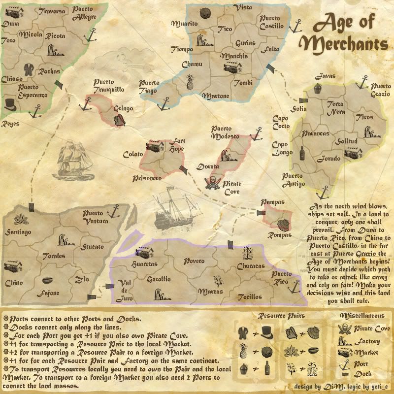
look above this post. i hope this one is more readable.
“In the beginning God said, the four-dimensional divergence of an antisymmetric, second rank tensor equals zero, and there was light, and it was good. And on the seventh day he rested.”- Michio Kaku
User avatar
Major DiM
 
Posts: 10415
Joined: Wed Feb 14, 2007 6:20 pm
Location: making maps for scooby snacks

Postby DiM on Sun Jun 03, 2007 5:36 pm

fireedud wrote:I love this map and I can't wait to play it!!!!!!


i'm glad you like it.
hopefully the above updates will please everybody.
“In the beginning God said, the four-dimensional divergence of an antisymmetric, second rank tensor equals zero, and there was light, and it was good. And on the seventh day he rested.”- Michio Kaku
User avatar
Major DiM
 
Posts: 10415
Joined: Wed Feb 14, 2007 6:20 pm
Location: making maps for scooby snacks

Postby Ruben Cassar on Sun Jun 03, 2007 5:44 pm

This text is a LOT more readable than the one before! Makes a huge difference.
ImageImageImageImageImage
User avatar
Colonel Ruben Cassar
 
Posts: 2160
Joined: Thu Nov 16, 2006 6:04 am
Location: Civitas Invicta, Melita, Evropa

Postby DiM on Sun Jun 03, 2007 5:48 pm

Ruben Cassar wrote:This text is a LOT more readable than the one before! Makes a huge difference.


i know it's a lot more readable and hopefully this will be final. but i actually would have preferred a more unreadable text with smudges and stains on it. it would have been very hard to read but boy it would have had such an authentic feeling. :D

anyway i'm glad you like it. :P
“In the beginning God said, the four-dimensional divergence of an antisymmetric, second rank tensor equals zero, and there was light, and it was good. And on the seventh day he rested.”- Michio Kaku
User avatar
Major DiM
 
Posts: 10415
Joined: Wed Feb 14, 2007 6:20 pm
Location: making maps for scooby snacks

Postby edbeard on Sun Jun 03, 2007 6:00 pm

It's definitely more readable, but is not not another cursive selection? I liked the feel of the map with the cursive. It used to have an old parchment feel, but now it looks like a map created on a computer.
User avatar
Lieutenant edbeard
 
Posts: 2501
Joined: Thu Mar 29, 2007 12:41 am

Postby DiM on Mon Jun 04, 2007 5:52 am

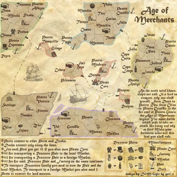
yes edbeard you're right. i also wanted the map to have something cursive and with a sort of ugly washed up cursive font. with areas where it's barely visible because the ink was smudged. but it's totally impractical. it has a nice authentic look but it's barely readable. and some compromises have to be made to playability.

i left the title and the small story for comparison reasons.

Image
“In the beginning God said, the four-dimensional divergence of an antisymmetric, second rank tensor equals zero, and there was light, and it was good. And on the seventh day he rested.”- Michio Kaku
User avatar
Major DiM
 
Posts: 10415
Joined: Wed Feb 14, 2007 6:20 pm
Location: making maps for scooby snacks

Postby DiM on Tue Jun 05, 2007 8:19 pm

Last edited by DiM on Wed Jun 06, 2007 7:23 am, edited 1 time in total.
“In the beginning God said, the four-dimensional divergence of an antisymmetric, second rank tensor equals zero, and there was light, and it was good. And on the seventh day he rested.”- Michio Kaku
User avatar
Major DiM
 
Posts: 10415
Joined: Wed Feb 14, 2007 6:20 pm
Location: making maps for scooby snacks

Postby Wisse on Wed Jun 06, 2007 5:53 am

make the font bigger so you can read it better
make the dark map a little bit lighter i think this is too dark
[this was for the dark map you made]


*if aleady discussed than ignore this message*
Image Image
User avatar
Sergeant Wisse
 
Posts: 4448
Joined: Fri Oct 13, 2006 2:59 pm
Location: The netherlands, gelderland, epe

Postby DiM on Wed Jun 06, 2007 7:21 am

Wisse wrote:make the font bigger so you can read it better


i'm not very keen on increasing the font size because in some parts it's already at maximum and it won't fit if i increase it (the legend, the story and some territories). the only bit that can be increased are the title (but it's already visible) and some territories (but i don't want to make some territory names bigger and some smaller)


Wisse wrote:make the dark map a little bit lighter i think this is too dark
[this was for the dark map you made]


*if aleady discussed than ignore this message*


the dark map is my vision on how an old map would look. it's not something to be used on CC because it's very impractical.
“In the beginning God said, the four-dimensional divergence of an antisymmetric, second rank tensor equals zero, and there was light, and it was good. And on the seventh day he rested.”- Michio Kaku
User avatar
Major DiM
 
Posts: 10415
Joined: Wed Feb 14, 2007 6:20 pm
Location: making maps for scooby snacks

Postby yeti_c on Wed Jun 06, 2007 8:03 am

Don't increase the font size... it's already too big - but sacrifices have to be made for readability... any bigger is rubbish.

Map colour is fine.

C.
Image
Highest score : 2297
User avatar
Lieutenant yeti_c
 
Posts: 9624
Joined: Thu Jan 04, 2007 9:02 am

Postby fireedud on Wed Jun 06, 2007 2:53 pm

I liked the dark map and the feel to it, maybe you can make the actual map darker.
Cook fireedud
 
Posts: 1704
Joined: Fri Mar 02, 2007 10:06 pm

Postby DiM on Wed Jun 06, 2007 4:11 pm

fireedud wrote:I liked the dark map and the feel to it, maybe you can make the actual map darker.


yes the dark one has a nice feel but it's not practical. the current map used to be lighter and darker until it reached this stage where people agreed it's a nice compromise between feeling and playability.
“In the beginning God said, the four-dimensional divergence of an antisymmetric, second rank tensor equals zero, and there was light, and it was good. And on the seventh day he rested.”- Michio Kaku
User avatar
Major DiM
 
Posts: 10415
Joined: Wed Feb 14, 2007 6:20 pm
Location: making maps for scooby snacks

PreviousNext

Return to The Atlas

Who is online

Users browsing this forum: No registered users