not in the new version. in the old one.cairnswk wrote:You're joking right?!DiM wrote: that bottom part sure looks like a train
WWII Pearl Harbor - [Quenched]
Moderator: Cartographers
Forum rules
Please read the Community Guidelines before posting.
Please read the Community Guidelines before posting.
- DiM
- Posts: 10415
- Joined: Wed Feb 14, 2007 6:20 pm
- Gender: Male
- Location: making maps for scooby snacks
Re: V5 Update
“In the beginning God said, the four-dimensional divergence of an antisymmetric, second rank tensor equals zero, and there was light, and it was good. And on the seventh day he rested.”- Michio Kaku
hulmey...thanks for sropping in again...look, i reall don't know what to say to you, but you seem to have a pet aversion to attack lines.hulmey wrote:I think you could alot better than this without all the confusing lines that go with the map. Maybe you could try something along the lines of mibi's D-day so that you can cut out all the confusing lines going all over the place.
I have examined mibi's D-Day and that map and my pearl harbor are about like chalk and cheses. d-Day takes place on 3/4 of the map which is land which is why there is able to be no attack lines but rather chunks of land bordering each other.
much of this map takes place at sea once again like battle for australia, and short of designing hexagons all over the place and odd shapes i'd rather see attach lines which I don't think are confusing, and so far neihter has anyone else who has posted this forum or seen this map....certainly again you are the only person to say against it.
OK so you don't like diagrams either. Sometimes a diagram portrays the desired effect better than a map, and honestly I don't really see the difference in many curcumstance. The fact that you recognise the 3-D part of the building i think is a success to start with. And yes they would look lopsided if they are angled in different ways to remove the conformity from the design....but these buildings have all had the sameIm not sure why it is but your maps all look like diagrams as well. Take note bottom right hand corner!!! The buildings there are i suppose meant to be 3-D but fail and look lopsided.
angle of perspective applied to them. I think they work a treat.

* Pearl Harbour * Waterloo * Forbidden City * Jamaica * Pot Mosbi
Re: V5 Update
I still question which eye you're viewing that through LOLDiM wrote:not in the new version. in the old one.cairnswk wrote:You're joking right?!DiM wrote: that bottom part sure looks like a train

* Pearl Harbour * Waterloo * Forbidden City * Jamaica * Pot Mosbi
- DiM
- Posts: 10415
- Joined: Wed Feb 14, 2007 6:20 pm
- Gender: Male
- Location: making maps for scooby snacks
Re: V5 Update
through my fourthcairnswk wrote:I still question which eye you're viewing that through LOLDiM wrote:not in the new version. in the old one.cairnswk wrote:You're joking right?!DiM wrote: that bottom part sure looks like a train

“In the beginning God said, the four-dimensional divergence of an antisymmetric, second rank tensor equals zero, and there was light, and it was good. And on the seventh day he rested.”- Michio Kaku
Re: V5 Update
ooohhhh...that's surely a devilDiM wrote:through my fourthcairnswk wrote:I still question which eye you're viewing that through LOLDiM wrote:not in the new version. in the old one.cairnswk wrote:You're joking right?!DiM wrote: that bottom part sure looks like a train


* Pearl Harbour * Waterloo * Forbidden City * Jamaica * Pot Mosbi
im sure intead of having all those lines connecting the airplanes you could come up with something genius. Off the top of my head you could add a note in the legend (planes attack each other to the right only for example).
Theres not point having 3d buildings when the maps in 2d......Everything should be 2d or 3d not a mixture of both!!!
Hope you dont take my sropping in AGAIN , in a negative way. things cant be all rosy and great from the beginning. Your not mibi lol
Theres not point having 3d buildings when the maps in 2d......Everything should be 2d or 3d not a mixture of both!!!
Hope you dont take my sropping in AGAIN , in a negative way. things cant be all rosy and great from the beginning. Your not mibi lol
[img]http://img801.imageshack.us/img801/9761/41922610151374166770386.jpg[/mg]
Prob with that Humley is that it might look good, but as I found out with the Valley Of the Kings map when I tried to do that and have the concept of attacking through space, it didn't quite work like WM's King of the Mountains, potential players couldn't follow the map, and there was a request to simplify it so that people could understand it. so let me think on it, and if I come up with anything ingenius, then i'll let you know.hulmey wrote:im sure intead of having all those lines connecting the airplanes you could come up with something genius. Off the top of my head you could add a note in the legend (planes attack each other to the right only for example).
Contraire! Hulmey....i beleive 3D images can look good on 2D background and indeed one of the most popular maps...Tamriel i think it is does this very well. I have also opted for 3d Mountains in my CCC map and that turned out quite well also. Once again, it doesn't have to be so black and white with everything....mixing in grey areas does create new ideas and designs.Theres not point having 3d buildings when the maps in 2d......Everything should be 2d or 3d not a mixture of both!!!
Oh i'm well aware that i'm not mibi....Hope you dont take my sropping in AGAIN , in a negative way. things cant be all rosy and great from the beginning. Your not mibi lol
I don't exactly expect things to be rosy from the start, and I don't at all mind you sropping in...afterall that what the forum is about.

* Pearl Harbour * Waterloo * Forbidden City * Jamaica * Pot Mosbi
Just a quick look over the visuals as that's all I have time for at the moment. The uniform texture over the map seems to be clashing with the visual style you have going here. You've got 3D ships, planes and buildings and a uniform texture slapped over the terrain and water. Perhaps consider trying to add some depth to the landscape. I'd start by mixing up the textures for a start and perhaps see if you can make it appear that the land is higher than the water.
It's just my personal opinion, but I find the perspective of the buildings and ships to be a bit strange. The planes are ok because they can tilt in flight and appear more or less top-down anyway, but you've got a 2D landscape with some sort of attempt at 3D isometric perspective and it just doesn't sit right with me.
Another little thing is the ships around the Naval Yard docks appear to be half in water, half on the dock. It just looks a little odd.
no-one said u were going insane hulmey...LOL..just that everything is in the eye of the beholder.....and everyone doesn't always see the same things....and you and keyogi might be adverse to new ideas being tested.hulmey wrote:There you go, im not going insane then.

* Pearl Harbour * Waterloo * Forbidden City * Jamaica * Pot Mosbi
It's not the idea I have a problem with, it's the perspective. Officers club is a prime example. Perhaps you need to look at the following link cairns? http://en.wikipedia.org/wiki/Isometric_projection
Thanks Keyogi....i wasn't exactly looking for the isometric perspective on this one...still i have been been exploring and 'xperimenting with other types...and this one appears to fit into the foreshortening category of perspective. i think hpwever, i was trying to achieve axonmetric project...but fell quite short. I will muck around some more with this one.KEYOGI wrote:It's not the idea I have a problem with, it's the perspective. Officers club is a prime example. Perhaps you need to look at the following link cairns? http://en.wikipedia.org/wiki/Isometric_projection

* Pearl Harbour * Waterloo * Forbidden City * Jamaica * Pot Mosbi
Progress Report
Current Work in Progress
WWII -Battle of Australia....working large and small versions and fixing army shadow positions. Xml is almost finished with enutral territoriy starting positions.
Valley of the Kings is currently being coded with xml by HighCommander540
Favourable feedback is reported from Cairns Coral Coast.
And this map - Pearl Harbor - I am exploring the perspective of axonmetrics to get the buildings and ships right so they don't look so distorted. Hops to have something posted later this week. The poll thus far is encouraging for this map.

* Pearl Harbour * Waterloo * Forbidden City * Jamaica * Pot Mosbi
V7 Update 29 May 07
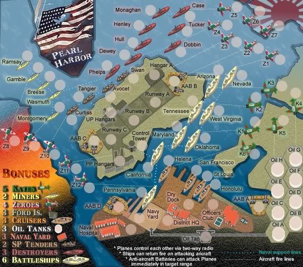
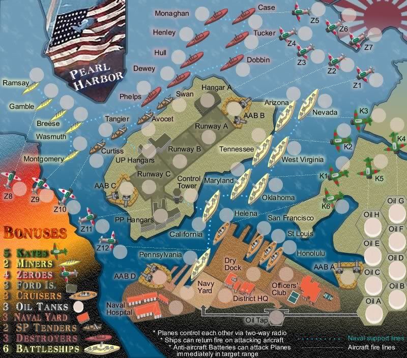
V7 Changes as below:
BONUSES ARE YET TO BE ADJUSTED AS IS THE LEGEND.
* Total of 72 Terts on 11 continents (groupings)
* Addition of 5 more japanese aircraft on the left side of the map
* Runway on Ford Island split into three terts
* Addition of three anti-aircraft batteries - 2 on Ford Island and 1 near the oil tanks
* Removal of picture to allow space for "game play directions"
* Addition of 1 way Oil tap to Naval Yard and return one way attack route from HQ
To address some other issues raised previously to this:
Hulmey....i have changed the hard line attack routes to tracer type fire lines...while I realise this does not alleviate the lines all over the place, it is a good compromise and not so-in-your-face
Keyogi...All the buildings have been redone.
These are now on what is called Axonometric angles, in that the background map is flat, and the 3D buildings are raised striaght-up from the ground regardless of the angle they are on the ground. This is not isometric view. I hope this looks better.
Any feedback appreciated.


* Pearl Harbour * Waterloo * Forbidden City * Jamaica * Pot Mosbi
Thanks yeti_c for dropping in...
OK...can do in the next versionyeti_c wrote:I would just call the AAB's AA - as more people will understand that...
I wanted use that as the form of being able to attack each other....any other suggestions?I'm not sure what you mean by "planes communicate via 2-way radio".
C.

* Pearl Harbour * Waterloo * Forbidden City * Jamaica * Pot Mosbi
OK... sorry for short reply - ran out of time...
The new '3D' looks a lot better...
Some of your lines look a bit jumpy - can you smooth them out (especially the plane attack lines?
So if the AA can attack the planes? Can the Ships attack the planes?
If not then I would consider making the Ships a bigger bonus - as they will be harder to hold?
C.
The new '3D' looks a lot better...
Some of your lines look a bit jumpy - can you smooth them out (especially the plane attack lines?
So if the AA can attack the planes? Can the Ships attack the planes?
If not then I would consider making the Ships a bigger bonus - as they will be harder to hold?
C.

Highest score : 2297
OK can fix lines...yeti_c wrote:OK... sorry for short reply - ran out of time...
The new '3D' looks a lot better...
Some of your lines look a bit jumpy - can you smooth them out (especially the plane attack lines?
So if the AA can attack the planes? Can the Ships attack the planes?
If not then I would consider making the Ships a bigger bonus - as they will be harder to hold?
C.
Yes ships with direct lines can attack planes...does that need to be put into the "gameplay directions"

* Pearl Harbour * Waterloo * Forbidden City * Jamaica * Pot Mosbi
That's fine as is...
I guess the real question about this map is...
Do you make it like standard Risk (like at the moment) where all your territories attack each other along border or attack lines?
Or do you focus the game play so that planes attack ships and ships attack planes? (Like Pearl Harbour?)
Also make the AA ranged attacks against the planes... so they can shoot the planes down but not capture them...?
C.

Highest score : 2297
OK....the range attacks i can understand...does this merely reduce the number of armies that the opponent has or does it render them useless.yeti_c wrote:That's fine as is...
I guess the real question about this map is...
Do you make it like standard Risk (like at the moment) where all your territories attack each other along border or attack lines?
Or do you focus the game play so that planes attack ships and ships attack planes? (Like Pearl Harbour?)
Also make the AA ranged attacks against the planes... so they can shoot the planes down but not capture them...?
C.
Also, I kind of think that this should be all about Pearl Harbor for game play, but I am not sure what is going to be best.
Any enhancements there?

* Pearl Harbour * Waterloo * Forbidden City * Jamaica * Pot Mosbi
Feedback required.
Any Feedback on the below???


* Pearl Harbour * Waterloo * Forbidden City * Jamaica * Pot Mosbi
do you mean planes "contact" each other via two way radio? the control thing doesn't make sense. If I was looking at this map for the first time, I would wonder, is every plane able to attack each other? I'm fairly sure that is what you mean, but saying "control" or "contact" doesn't exactly make things clear. Maybe I'm confused on this because the more I think about it, the more I believe they would have way too many borders, so maybe you only mean planes can attack each other in their own squadron? Either way this need clarification.
I don't understand why you need to say ships can return fire on attacking aircraft? Why wouldn't they be able to. I'm not sure that you need an explanation of attacking lines at all. Why would they be any different from any attacking line on any map?
Of course you need to explain how the batteries work, and that all aircraft can attack each other, but other than that, the rest is just clutter and/or only serves to confuse.
I'd get rid of the naval support lines and aircraft attack lines description in the bottom right. Everyone should know these are attack lines. Like I said before, being too specific can be confusing. Since you call it aircraft attack lines, then people wonder well can ships attack too? Just remove those.
Thanks edbeard...that's great feedback....it's good to hear it from the other viewers point of view. i'll remove those suggestions in the next version.edbeard wrote:do you mean planes "contact" each other via two way radio? the control thing doesn't make sense. If I was looking at this map for the first time, I would wonder, is every plane able to attack each other? I'm fairly sure that is what you mean, but saying "control" or "contact" doesn't exactly make things clear. Maybe I'm confused on this because the more I think about it, the more I believe they would have way too many borders, so maybe you only mean planes can attack each other in their own squadron? Either way this need clarification.
I don't understand why you need to say ships can return fire on attacking aircraft? Why wouldn't they be able to. I'm not sure that you need an explanation of attacking lines at all. Why would they be any different from any attacking line on any map?
Of course you need to explain how the batteries work, and that all aircraft can attack each other, but other than that, the rest is just clutter and/or only serves to confuse.
I'd get rid of the naval support lines and aircraft attack lines description in the bottom right. Everyone should know these are attack lines. Like I said before, being too specific can be confusing. Since you call it aircraft attack lines, then people wonder well can ships attack too? Just remove those.

* Pearl Harbour * Waterloo * Forbidden City * Jamaica * Pot Mosbi
Thanks Keyogi....yes I am working on a version 8 update with adjustments to things and will include the legend in this.KEYOGI wrote:The map is looking good cairns. An area for improvement might be in the legend. I find some of the text a bit unpleasant, in particular the Bonuses title and Kates.

* Pearl Harbour * Waterloo * Forbidden City * Jamaica * Pot Mosbi