Updates 12/22/13 - Gaming Interface, Speed Autos, Maps Page
Moderator: Community Team
Re: Updates 12/22/13 - Gaming Interface, Speed Autos, Maps P
Here is another one you can add to your bugmas present list live chat don't work with iphone.
Merry Xmas boohohoho
Merry Xmas boohohoho
-
 codierose
- Posts: 1561
- Joined: Sun Jul 27, 2008 5:50 pm
- Location: RANDOMBULLSHIT.ORG


Re: Updates 12/22/13 - Gaming Interface, Speed Autos, Maps P
iAmCaffeine wrote:Thanks for breaking clickies, enforcing us to use the shit site ones.
a temporary fix for clickies can be found here: viewtopic.php?f=527&t=104488&start=375#p4376167
we are working on a more permanent solution.
-

 bigWham
- Webmaster

- Posts: 2867
- Joined: Mon Aug 26, 2013 12:08 pm


Re: Updates 12/22/13 - Gaming Interface, Speed Autos, Maps P
codierose wrote:Here is another one you can add to your bugmas present list live chat don't work with iphone.
Merry Xmas boohohoho
nothing about live chat was touched with this update. please report bugs to the bugs forum so we can make sure they are dealt with.
-

 bigWham
- Webmaster

- Posts: 2867
- Joined: Mon Aug 26, 2013 12:08 pm


Re: Updates 12/22/13 - Gaming Interface, Speed Autos, Maps P
Thank you sir merry Xmas
-
 codierose
- Posts: 1561
- Joined: Sun Jul 27, 2008 5:50 pm
- Location: RANDOMBULLSHIT.ORG


Re: Updates 12/22/13 - Gaming Interface, Speed Autos, Maps P
bigWham wrote:the log file shouldn't start at top unless you have put it there in the new interface. please post a screenshot.
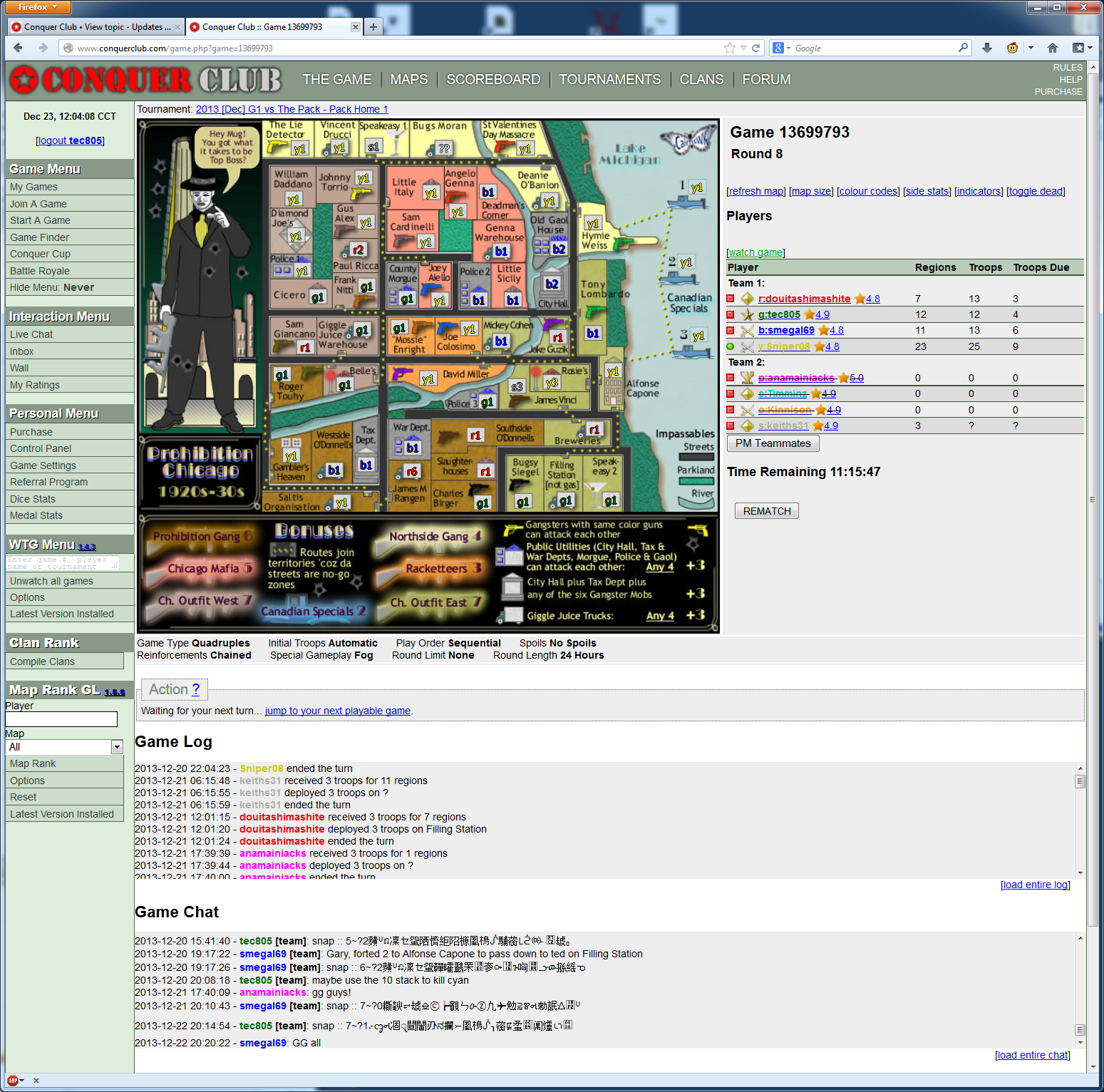
New interface disabled log file starts at the top:
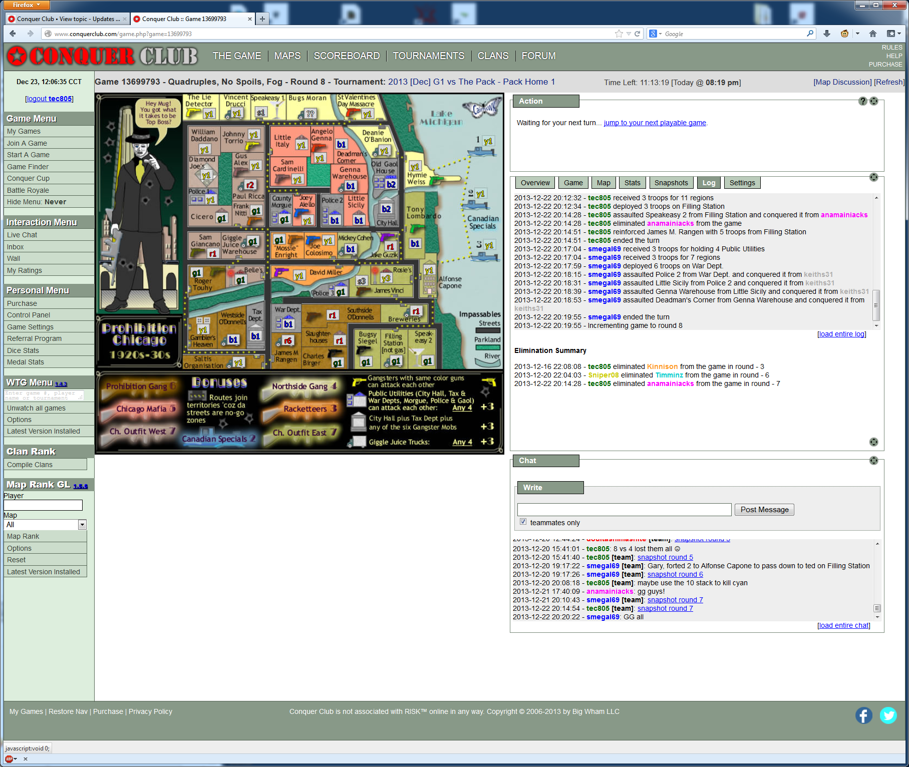
New interface enabled log file shows correctly but I now need to click a tab to switch between stats/log/stats? My RSI tells me more clicks for the same information = bad.
I run a 30" for my main monitor to see as much as possible without scrolling and clicking. How do I enable all of these to be shown at the same time?
Edit: War game (only kind I have) - so no sneaking a peek at our super secret chat!
Last edited by tec805 on Mon Dec 23, 2013 12:39 pm, edited 1 time in total.
-

 tec805
- Posts: 525
- Joined: Thu Aug 05, 2010 1:55 am
- Location: ☀ Southern California, where the sunshine's shining ☀


Re: Updates 12/22/13 - Gaming Interface, Speed Autos, Maps P
You do realise you have just lifted the fog for that game
-
 codierose
- Posts: 1561
- Joined: Sun Jul 27, 2008 5:50 pm
- Location: RANDOMBULLSHIT.ORG


Re: Updates 12/22/13 - Gaming Interface, Speed Autos, Maps P
bigWham wrote:tec805 wrote:☹
Is anyone else having the log file start at the top instead of the bottom? First thing I do is always look at the log, annoying to need to scroll...
Disabled Clickable Maps, built-in clickies are really rough, had to revert to using the buttons (gasp!). It felt so primitive... I think I shall go to bed and hopefully dream of candy canes and nice clickies...
the log file shouldn't start at top unless you have put it there in the new interface. please post a screenshot.
I posted in bug forums about this.
kuma32478 wrote:Every time I click attack or any type of move, I constantly have to refresh the browser. I am on IE 9 on Window's Vista and it's a pain. All new features are disabled.
Same here on IE. It did not happen on Firefox last night.
-
 chapcrap
- Posts: 9686
- Joined: Sun Feb 03, 2008 12:46 am
- Location: Kansas City


Re: Updates 12/22/13 - Gaming Interface, Speed Autos, Maps P
So far I see three issues:
1) Invite system: Cannot invite friends (Somewhat fixed)
2) Clickable Maps
3) Layout of CC on Mobile Devices
1) Invite system: Cannot invite friends (Somewhat fixed)
2) Clickable Maps
3) Layout of CC on Mobile Devices
-

 Jdsizzleslice
- Posts: 3576
- Joined: Fri Dec 09, 2011 9:55 pm


 3
3


 2
2
Re: Updates 12/22/13 - Gaming Interface, Speed Autos, Maps P
tec805 wrote:bigWham wrote:the log file shouldn't start at top unless you have put it there in the new interface. please post a screenshot.
New interface disabled log file starts at the top:
New interface enabled log file shows correctly but I now need to click a tab to switch between stats/log/stats? My RSI tells me more clicks for the same information = bad.
I run a 30" for my main monitor to see as much as possible without scrolling and clicking. How do I enable all of these to be shown at the same time?
Edit: War game (only kind I have) - so no sneaking a peek at our super secret chat!
ok, so now we know what "log starts on top" means, this has been fixed.
as far as the need to click to switch between panels in the new interface - that is not necessary. you can detach the panels and then move them to different parts of the screen.
-

 bigWham
- Webmaster

- Posts: 2867
- Joined: Mon Aug 26, 2013 12:08 pm


Re: Updates 12/22/13 - Gaming Interface, Speed Autos, Maps P
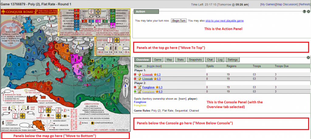
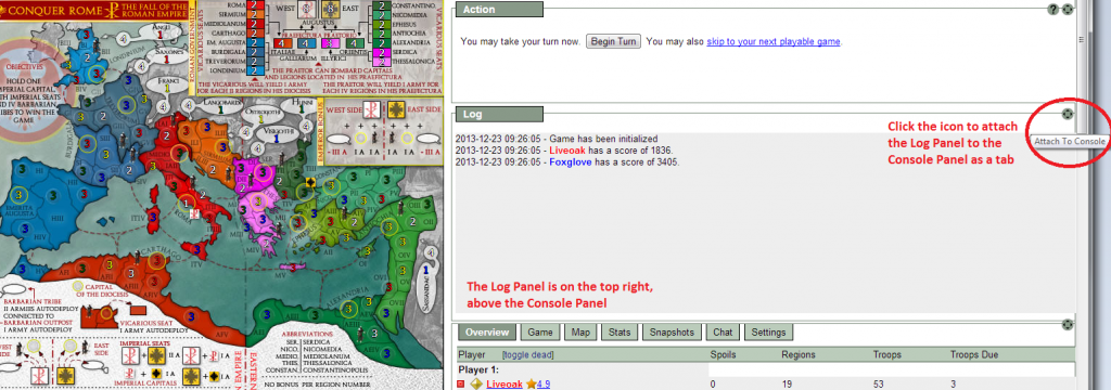
Hey everyone - it can take some clicking to get the new Panel Interface adjusted to your liking, so I've put together a few screenshots to show the different options available. You can keep all of the data contained in the tabs (default), or you can detach as many of the panels as you like and adjust them in various spots on the page.
1. Overview - this image shows the names of the primary panels and placeholders for the possible positioning of the panels.
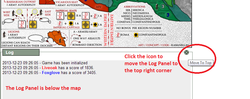
2. Panels - Panels are positioned as tabs in the Console Panel by default. You can click the icon to move the panel - each click moves it to a new location. The following screenshots show how to move the Log Panel into all of the possible positions, but you can move any or all tabs that you would like.
The first click will detach the panel and place it below the Console Panel.
The second click will move the panel below the map.
The third click on the icon will move the panel to the top right corner of the UI.
The fourth click will reattach the panel as a tab inside the Console Panel.
3. The Action Panel - the Action Panel can be moved into all of the positions of the other panels, but it has the additional option of being able to float the bottom of your screen. It is positioned above the Console Panel by default.
Click the icon to float the Action Panel.
Clicking the move icon while the Action Panel is floating will attach it to the Console Panel as a tab. Once it is a tab, you can move it out and into the same positions as any other panel.
4. Turn On The Panels! - go to your Game Settings to turn on the new panel system.
-
 Foxglove
- Posts: 1308
- Joined: Sun Dec 16, 2007 1:05 pm


Re: Updates 12/22/13 - Gaming Interface, Speed Autos, Maps P
Thank you for actually explaining a how to foxglove. This should have done way before this change was implemented and should be clearly explained somewhere so that people know how to use the site interface even if they have not stumbled upon your post here.
Last edited by Jippd on Mon Dec 23, 2013 4:06 pm, edited 2 times in total.

-

 Jippd
Jippd
- Posts: 1384
- Joined: Sun Aug 03, 2008 9:05 pm


Re: Updates 12/22/13 - Gaming Interface, Speed Autos, Maps P
Jippd wrote:Thank you for actually explaining a how to foxglove. This should have done way before this change was implemented and should be clearly explained somewhere so that people know how to use the site interface even if they have not stumbled upon your post here.
Help has been put into Q&A: http://www.conquerclub.com/forum/viewtopic.php?f=57&t=200172
I have also put a link in the OP.
-

 bigWham
- Webmaster

- Posts: 2867
- Joined: Mon Aug 26, 2013 12:08 pm


Re: Updates 12/22/13 - Gaming Interface, Speed Autos, Maps P
this new format is crap crap I have no side bar to join games Tech live chat see menus I can't go to my games I'm going to lose because I can't enter
-
 4*general
- Posts: 7
- Joined: Fri Apr 01, 2011 11:00 am
- Location: indiana


Re: Updates 12/22/13 - Gaming Interface, Speed Autos, Maps P
Will snap to panel be fixed so it will not take duplicate snaps?
Will teammates be able to view snaps posted to the panel?
Bob used to have an option for detailed map inspect or just map inspect. I want the symbols, but I don't want it to list all of the territory names as well. This is helpful because I use a floating action bar. If there are maps that have lots of connections for certain territories when I mouse over some territories the floating action bar will fill up with text and block out my ability to play.

-

 Jippd
Jippd
- Posts: 1384
- Joined: Sun Aug 03, 2008 9:05 pm


Re: Updates 12/22/13 - Gaming Interface, Speed Autos, Maps P
This is what happens when you try to create a cheap knock-off of something, as we've seen with the homepage and will no doubt see again in the next update. Thrilling.

-

 iAmCaffeine
- Posts: 11699
- Joined: Mon Apr 01, 2013 5:38 pm


Re: Updates 12/22/13 - Gaming Interface, Speed Autos, Maps P
Jippd wrote:Will snap to panel be fixed so it will not take duplicate snaps?
Will teammates be able to view snaps posted to the panel?
Bob used to have an option for detailed map inspect or just map inspect. I want the symbols, but I don't want it to list all of the territory names as well. This is helpful because I use a floating action bar. If there are maps that have lots of connections for certain territories when I mouse over some territories the floating action bar will fill up with text and block out my ability to play.
Snapshots will receive a complete overhaul in the not too distant future, and the map inspect feature can also be looked at.
There is a *lot* of programming behind all this functionality, many 1000s of lines of code all interacting with each other, so it requires some time to get it smooth, whereupon we can start adding to it. Until now the site provided no snapshots, map inspect, or any of these other features, so now that we do we are committed to maintaining and enhancing them.
-

 bigWham
- Webmaster

- Posts: 2867
- Joined: Mon Aug 26, 2013 12:08 pm


Re: Updates 12/22/13 - Gaming Interface, Speed Autos, Maps P
bigWham wrote:Jippd wrote:Will snap to panel be fixed so it will not take duplicate snaps?
Will teammates be able to view snaps posted to the panel?
Bob used to have an option for detailed map inspect or just map inspect. I want the symbols, but I don't want it to list all of the territory names as well. This is helpful because I use a floating action bar. If there are maps that have lots of connections for certain territories when I mouse over some territories the floating action bar will fill up with text and block out my ability to play.
Snapshots will receive a complete overhaul in the not too distant future, and the map inspect feature can also be looked at.
There is a *lot* of programming behind all this functionality, many 1000s of lines of code all interacting with each other, so it requires some time to get it smooth, whereupon we can start adding to it. Until now the site provided no snapshots, map inspect, or any of these other features, so now that we do we are committed to maintaining and enhancing them.
Well, the majority are more than happy to wait for the update to be smoothed out before release, rather than endure more bugs.

-

 iAmCaffeine
- Posts: 11699
- Joined: Mon Apr 01, 2013 5:38 pm


Re: Updates 12/22/13 - Gaming Interface, Speed Autos, Maps P
iAmCaffeine wrote:bigWham wrote:Jippd wrote:Will snap to panel be fixed so it will not take duplicate snaps?
Will teammates be able to view snaps posted to the panel?
Bob used to have an option for detailed map inspect or just map inspect. I want the symbols, but I don't want it to list all of the territory names as well. This is helpful because I use a floating action bar. If there are maps that have lots of connections for certain territories when I mouse over some territories the floating action bar will fill up with text and block out my ability to play.
Snapshots will receive a complete overhaul in the not too distant future, and the map inspect feature can also be looked at.
There is a *lot* of programming behind all this functionality, many 1000s of lines of code all interacting with each other, so it requires some time to get it smooth, whereupon we can start adding to it. Until now the site provided no snapshots, map inspect, or any of these other features, so now that we do we are committed to maintaining and enhancing them.
Well, the majority are more than happy to wait for the update to be smoothed out before release, rather than endure more bugs.
we could have tested for 3 months, or 3 years, and we would not have avoided many of these issues. we may have reduced the number of them, possibly, but it would have taken way more time, and the meantime everything else would have been held up. there are simply way too many use cases to ever be sure that you have covered everything perfectly. we have a beta team of 50+ people involved in testing and none of these issues arose. if you think you can help please contact IcePack.
-

 bigWham
- Webmaster

- Posts: 2867
- Joined: Mon Aug 26, 2013 12:08 pm


Re: Updates 12/22/13 - Gaming Interface, Speed Autos, Maps P
To avoid some confusion that was happening when people were triggering the feature inadvertently, the setting to hide the left nav has been moved to the Game Settings page, and now only applies to Game Pages.
-

 bigWham
- Webmaster

- Posts: 2867
- Joined: Mon Aug 26, 2013 12:08 pm


Re: Updates 12/22/13 - Gaming Interface, Speed Autos, Maps P
we have a beta team of 50+ people involved in testing and none of these issues arose.
If none of these issues arose then there is clearly something wrong with the beta testing system surely?

-

 iAmCaffeine
- Posts: 11699
- Joined: Mon Apr 01, 2013 5:38 pm


Re: Updates 12/22/13 - Gaming Interface, Speed Autos, Maps P
jetsetwilly wrote:BGtheBrain wrote:Not sure I agree with the "low % of players use clickies" statement entirely.
At the very least, Id think it would fall into the Pareto principle.
yes, maybe the thousands of freemiums who play 4 games at a time dont use them, but Id think many clan members and the like use it.
I really wish this site would announce "Upcoming Updates" and then update 24 hours later, instead of changing stuff and fixing later.
with that being said, its always good to see how quickly the site is moving along.
Good work, but clickies is crucial. I also like Bob, but from what Ive tried out so far, the site version is decent.
Why is not possible to include the owners off the add ons in the beta site ? They could have an update ready to roll out alongside the main CC changes every time.
I've sent an invitation to the beta testing group to every major add-on developer. Anyone who didn't receive an invite to the group simply needs to PM IcePack and request to be added.
Barney Rubble wrote:bigWham wrote:jltile1 wrote:This really sucks playing on a I pad most of the time, the auto and assault button are right next to eachother. Most people are right handed and all that is on the very left of the screen. I can only imagine taking a turn from a phone and miss clicking. All these changes in a short amount of time I personally don't like them. Changed my whole game up. I think CC is trying to do to much to fast.
CC was never designed for an ipad. this update was intended to improve, but not perfect, the tablet/mobile experience. everyone that tested it reported that it has improved the experience.
try the following, if you have not: hide the left nav in game, move the console to the bottom of the map, and float the action panel. if this is not improving the experience over what it had been there is an issue somewhere with what you are experiencing.
Funny you say CC wasn't really designed for the Ipad and yet I have been here since 2010 and have always had a very smooth slick running gameplay and screen !! Now.........??I like others appreciate everyones effort to enhance the site but it does seem too much too soon.
I hate to harp on the chat option but Bedrock speed games are a very social place and having to click back and forth all the time is a bothersome little feature for sure
Merry Christmas All !!
BR
CC isn't designed to be played on mobile/tablets. You may have been playing on your ipad for a while, but that doesn't change what it was designed to do.
Godd wrote:has anyone ever thought about Beta testing updates for the site before issuing the updates?
I have not had the site working properly for over a month on my end at least.
I have to enter through the forums to sign in due to home page wont load properly and now the game play itself is messed up.
It has to refresh every play and sometimes does not move the correct number of armies wanted. In forts it dbls the amount moved if available.
It was blamed on me using a older version of explorer but my new version (explorer 8 on work computer) does the same as my older one at home
I don't know but I am losing confidence in the site
We do beta test updates. We tested this update for 3 weeks before releasing it. If you are unsatisfied with the testing job, please join the beta testers group and help us improve it.
iAmCaffeine wrote:we have a beta team of 50+ people involved in testing and none of these issues arose.
If none of these issues arose then there is clearly something wrong with the beta testing system surely?
As I've stated a few times before, if you think you can be of service to the Beta Testers, please send a PM to IcePack.
-
 blakebowling
- Posts: 5093
- Joined: Wed Jan 23, 2008 12:09 pm
- Location: 127.0.0.1


Re: Updates 12/22/13 - Gaming Interface, Speed Autos, Maps P
Free member on a cell phone.... ads are blocking the menu on the left side. Blocks my games join game & game finder
-

 SaviorShot
- Posts: 258
- Joined: Fri Aug 27, 2010 7:32 pm


Re: Updates 12/22/13 - Gaming Interface, Speed Autos, Maps P
SaviorShot wrote:Free member on a cell phone.... ads are blocking the menu on the left side. Blocks my games join game & game finder
this has been fixed on the my games page... will work through other areas where it may happen. does not appear to be an issue on game pages.
-

 bigWham
- Webmaster

- Posts: 2867
- Joined: Mon Aug 26, 2013 12:08 pm


Re: Updates 12/22/13 - Gaming Interface, Speed Autos, Maps P
The new interface sucks and Bob was 1,000 times better. Sorry guys I know you meant well but it didn't work.
-
 davsweeney
- Posts: 20
- Joined: Thu Jun 18, 2009 10:09 pm
- Location: Bloomington, IL


Re: Updates 12/22/13 - Gaming Interface, Speed Autos, Maps P
Who wrote and tested this update? Obama Care Web Programmers? Took a very playable game site to near devastation... TOTALLY SUCKS! How Long to repair the damage? Why no General Announcements on whats happening?
-

 ArkieDog
- Posts: 31
- Joined: Wed Jul 02, 2008 12:30 am
- Location: Little Rock, Arkansas


Return to Announcement Archives
Who is online
Users browsing this forum: No registered users

