Conquer Club

[Abandoned] Xiangqi

Abandoned and Vacationed maps. The final resting place, unless you recycle.

Moderator: Cartographers

Forum rules
Please read the Community Guidelines before posting.

[Abandoned] Xiangqi

Postby koontz1973 on Sat Sep 28, 2013 1:51 am

Image

Map Name:Xiangqi
Mapmaker(s):koontz1973
Number of Territories:90
Special Features:Conditional borders, bombardments, auto deploys.
What Makes This Map Worthy of Being Made:1v1 map for the strategist in all of us.

Map Image:
Click image to enlarge.
image


show: Image with Starting positions and current neutrals

show: Game play ideas


show: old images
Last edited by RedBaron0 on Mon Jul 14, 2014 9:37 pm, edited 6 times in total.
Reason: removed the approval thing, it's no longer needed.
Image
User avatar
Lieutenant koontz1973
 
Posts: 6960
Joined: Thu Jan 01, 2009 10:57 am

Re: Xiangqi [28/9] [P1] [V1]

Postby Lancelot du Lac on Sat Sep 28, 2013 2:04 pm

I don't know the chinese chess. Can we say : Chiness ?

I like very much this idea's game play. Again , very good work Koontz !
User avatar
General Lancelot du Lac
 
Posts: 271
Joined: Thu Sep 30, 2010 9:14 am

Re: Xiangqi [28/9] [P1] [V1]

Postby koontz1973 on Sun Sep 29, 2013 1:28 am

Thanks Lance for the look in. I do not normally post straight away but this needs promoting. :)
Image
User avatar
Lieutenant koontz1973
 
Posts: 6960
Joined: Thu Jan 01, 2009 10:57 am

Re: Xiangqi [28/9] [P1] [V1]

Postby Armandolas on Sun Sep 29, 2013 7:04 pm

what is stratagy? :D
User avatar
Colonel Armandolas
 
Posts: 1761
Joined: Fri Jun 06, 2008 6:32 am
Location: Lisbon

Re: Xiangqi [28/9] [P1] [V1]

Postby koontz1973 on Mon Sep 30, 2013 12:59 am

Armandolas wrote:what is stratagy? :D

Stratagy is strategy. :oops:

Will fix. Thanks for that.

Edit: Fixed spelling and added a couple of things. Still version one and in OP as well.
Click image to enlarge.
image
Image
User avatar
Lieutenant koontz1973
 
Posts: 6960
Joined: Thu Jan 01, 2009 10:57 am

Re: Xiangqi [28/9] [P1] [V1]

Postby generalhead on Tue Oct 01, 2013 7:41 am

I love the game play. The movement of the different pieces remind me of chess. I am a huge fan of chess. I am also a huge fan of anything oriental. I am a little confused on where the territories lye. Are the territories where all of the lines cross at the horizontal and vertical? The name Xiangoi is a little hard to read. I just checked the Google images for this game. I want to play.
Sergeant generalhead
 
Posts: 806
Joined: Mon Apr 26, 2010 10:09 pm

Re: Xiangqi [28/9] [P1] [V1]

Postby generalhead on Tue Oct 01, 2013 7:49 am

I don't know if it would be beneficial but might make them stand out more to put a black highlight on one castle and a red highlight on the other. I like the faces on the board. The background of the legend is a little gloomy, I don't know if you could lighten it with color or ad some oriental theme to it. Just suggestions.
Sergeant generalhead
 
Posts: 806
Joined: Mon Apr 26, 2010 10:09 pm

Re: Xiangqi [28/9] [P1] [V1]

Postby Trephining on Tue Oct 01, 2013 8:04 am

"Horse provide special movement on same side of river." That isn't easy to understand.
User avatar
Corporal 1st Class Trephining
 
Posts: 54
Joined: Mon Oct 19, 2009 7:04 pm

Re: Xiangqi [28/9] [P1] [V1]

Postby Armandolas on Tue Oct 01, 2013 9:04 am

I like the wooden effect on the main board and i also like the leather look on the borders .I just dont think wood and leather can match in a board, even more if u try to stick leather to wood with a cloth line :)
Maybe u can add some depth to the border, giving the impression the leather is covering the wood, so its higher

Assuming its a folding board the the depth of river leather should me lowered witch brings "trouble" to the border leather that needs to be folded too

Illl try to comment gameplay when i have more time to study it
cheers
User avatar
Colonel Armandolas
 
Posts: 1761
Joined: Fri Jun 06, 2008 6:32 am
Location: Lisbon

Re: Xiangqi [28/9] [P1] [V1]

Postby koontz1973 on Tue Oct 01, 2013 12:20 pm

generalhead wrote:I love the game play. The movement of the different pieces remind me of chess. I am a huge fan of chess. I am also a huge fan of anything oriental. I am a little confused on where the territories lye. Are the territories where all of the lines cross at the horizontal and vertical? The name Xiangoi is a little hard to read. I just checked the Google images for this game. I want to play.

generalhead wrote:I don't know if it would be beneficial but might make them stand out more to put a black highlight on one castle and a red highlight on the other. I like the faces on the board. The background of the legend is a little gloomy, I don't know if you could lighten it with color or ad some oriental theme to it. Just suggestions.

Thanbks GH, glad to have you around provinding these little insights. I will add the neutrals back into the image today to make it more clearer on how the map will work. You are right that the background is gloomy and can work that easily.
generalhead wrote:I don't know if it would be beneficial but might make them stand out more to put a black highlight on one castle and a red highlight on the other. I like the faces on the board. The background of the legend is a little gloomy, I don't know if you could lighten it with color or ad some oriental theme to it. Just suggestions.

Not sure on putting the glows onto the pieces but these are no way the finished ones. I am working on new pieces and need to get them finished. Will puit that onto the back burner till the new ones are in place.
Trephining wrote:"Horse provide special movement on same side of river." That isn't easy to understand.

This is a wordy legend I know and need to simplify it a lot. I am sending a PM to another map maker who does great legends and hope to get his advice. ;) But I will make sure it is a lot clearer next time around. Expect that tomorrow.
Armandolas wrote:I like the wooden effect on the main board and i also like the leather look on the borders .I just dont think wood and leather can match in a board, even more if u try to stick leather to wood with a cloth line :)
Maybe u can add some depth to the border, giving the impression the leather is covering the wood, so its higher

Assuming its a folding board the the depth of river leather should me lowered witch brings "trouble" to the border leather that needs to be folded too

Illl try to comment gameplay when i have more time to study it
cheers

Side pieces would fall of it the border was higher, but I get your ideas and can work on that easily. I chose leather/wood as that is what my backgammon and chess sets are. Will remove the lines as none of my ones have it.
Folding or not, what would you think is best. I chose a straight board as it is easier to do and all of the images I found, none really looked like they folded.


Guys, thanks for the look in. You have all brought some great ideas to the thread and I hope to bring them out in the next version. Hope you come back. :D
Image
User avatar
Lieutenant koontz1973
 
Posts: 6960
Joined: Thu Jan 01, 2009 10:57 am

Re: Xiangqi [28/9] [P1] [V1]

Postby Teflon Kris on Wed Oct 02, 2013 6:51 am

Great concept for a 1 v 1 map =D> :-)

I will have a proper look and maybe some suggestions soon ;-)

Nice graphics, especially for this stage =D>
User avatar
Sergeant 1st Class Teflon Kris
 
Posts: 4236
Joined: Sun Jul 13, 2008 4:39 pm
Location: Lancashire, United Kingdom

Re: Xiangqi [28/9] [P1] [V1]

Postby koontz1973 on Fri Oct 04, 2013 11:34 pm

Teflon Kris wrote:Great concept for a 1 v 1 map =D> :-)
I will have a proper look and maybe some suggestions soon ;-)
Nice graphics, especially for this stage =D>

Thanks for the vote of confidence Teflon.

Lets repost this after the data loss.

I believe I got most of the above suggestions. I only kept the title as it is as I do like the font. Most things on the board are changed and well as the legend.
Click image to enlarge.
image


I am still working no new game pieces. But here is the new one that I keep coming back to. It is very similar to the current one but with some important changes. Again, it is not finished.
Image

show: starting neutrals and positions map
Image
User avatar
Lieutenant koontz1973
 
Posts: 6960
Joined: Thu Jan 01, 2009 10:57 am

Re: Xiangqi [5/10] [P1] [V2]

Postby ViperOverLord on Sat Oct 05, 2013 1:31 am

"Plus 1 AD. Hold general and both advisers to leave castle." -- Took me a while to figure out that means auto deploy. Not sure you want to abbreviate it.

The adviser and general symbols are too much alike, I think.

Why's the elephant a top hat?

I'd consider a starker contrast for the graphic on the castle. Dark Shading, bricks, whatever have you.

What attacks an adviser can make are not stated.

"Chariots attack all regions in a straight line." - If that is meant to be everyone on the straight line; I'd change it to "Chariots can attack all regions along a straight line."

"Holding an elephant allows you to attack diagonally on the same side of the river. Both must be held to attack enemy pieces" -- The way that reads; both elephants must be held to attack enemy pieces on the side of the river. I don't know if you possibly mean to mean that they can attack across the river if you hold both elephants. If that's the case then I would write it like, "Holding an elephant allows you to attack diagonally. Both must be held to attack enemy pieces" If not, then I question why it would be requisite to hold both elephants to attack an enemy upon your side of the river?

"Hold a horse allows you to move like a Y on your side of the river." - A Y maneuver is a bit vague. Perhaps the Y-Shape should be outlined and then you could put something like the Horse attacks along its Y-axis.

Cannons: Again, I'd avoid the AD abbreviation.

Soldiers: "Can only attack towards the river. Hold any two to cross the river." - Again, I'm not excited about the hold two to do something formula. Perhaps consider some invention; such as a bridge builder piece or creating soldier regiments; two to three parts to a piece. Own the full piece to cross the river.

For the language, I'd get rid of the "only" and put something like soldiers attack soldiers across the river or soldiers attack any soldier (if they can attack soldiers upon their side of the river).

Lastly, I'd separate the deploy bonuses from the description of moves and put them in a separate color.
User avatar
Major ViperOverLord
 
Posts: 2477
Joined: Sun Apr 19, 2009 3:19 pm
Location: California

Re: Xiangqi [5/10] [P1] [V2]

Postby generalhead on Sat Oct 05, 2013 5:37 am

I like the new border on the board.
I like a lot of the ViperOverLords suggestions. Especially the one with the highlighted castles. And the movements of the pieces could be made a little more clear.
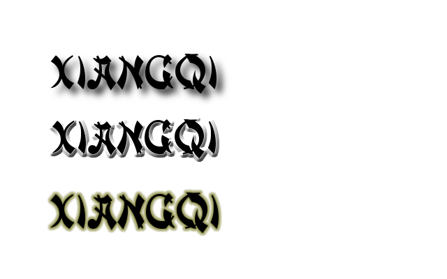
As far as the title it doesn't look very oriental. It also looks a little messy. I downloaded this font that looks a little more oriental. It would be nice for the title to stand out a little more too. This one is called deng thick.
Click image to enlarge.
image
Last edited by generalhead on Sat Oct 05, 2013 5:55 am, edited 1 time in total.
Sergeant generalhead
 
Posts: 806
Joined: Mon Apr 26, 2010 10:09 pm

Re: Xiangqi [5/10] [P1] [V2]

Postby generalhead on Sat Oct 05, 2013 5:43 am

Can I see the next draft without the faces on the board. I do like the faces but it might be a little distracting; taking away from the simpleness of the board.
Last edited by generalhead on Sat Oct 05, 2013 6:02 am, edited 1 time in total.
Sergeant generalhead
 
Posts: 806
Joined: Mon Apr 26, 2010 10:09 pm

Re: Xiangqi [5/10] [P1] [V2]

Postby generalhead on Sat Oct 05, 2013 5:54 am

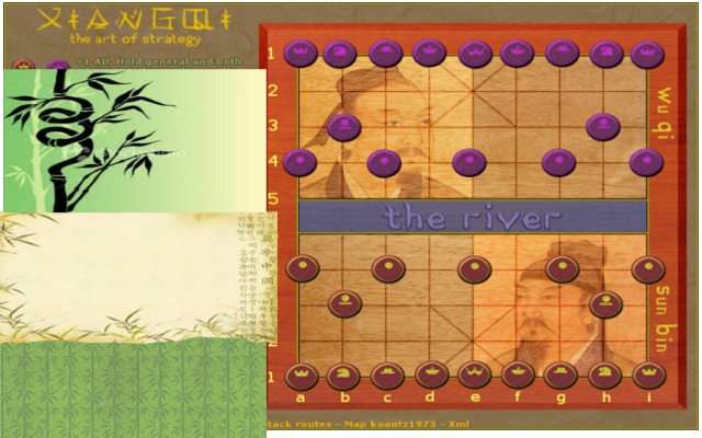
Maybe an oriental background might look cool too?
Click image to enlarge.
image
Sergeant generalhead
 
Posts: 806
Joined: Mon Apr 26, 2010 10:09 pm

Re: Xiangqi [5/10] [P1] [V2]

Postby Armandolas on Sat Oct 05, 2013 5:56 am

the faces look nice, maybe just lower their visibility help
oriental look is nice too if very faded
User avatar
Colonel Armandolas
 
Posts: 1761
Joined: Fri Jun 06, 2008 6:32 am
Location: Lisbon

Re: Xiangqi [5/10] [P1] [V2]

Postby koontz1973 on Sat Oct 05, 2013 6:11 am

Guys, all great ideas and am working on Vipers ideas right now. Will incorperate some others as well. Expect a new map today. Generalhead, I will post the map without faces and a lower opacity to see which one everyone likes. But I am really liking that bamboo motif you got on the top paper so will be trying to get that in.
Image
User avatar
Lieutenant koontz1973
 
Posts: 6960
Joined: Thu Jan 01, 2009 10:57 am

Re: Xiangqi [5/10] [P1] [V2]

Postby koontz1973 on Sat Oct 05, 2013 9:28 am

Double post I know and apologise for that. Here is version 3.

ViperOverLord wrote:"Plus 1 AD. Hold general and both advisers to leave castle." -- Took me a while to figure out that means auto deploy. Not sure you want to abbreviate it.

Dealt with. All abbreviation are now gone. Bonuses, whilst not in another colour are the first part of each after the name.
ViperOverLord wrote:The adviser and general symbols are too much alike, I think.

New pieces, larger and better detailed. Should stop all confusion. Also, the three in the centre are the only ones so no one should of needed too much help. But I hope the new pieces help.
ViperOverLord wrote:Why's the elephant a top hat?

Forgot to give him legs. :oops:
ViperOverLord wrote:I'd consider a starker contrast for the graphic on the castle. Dark Shading, bricks, whatever have you.

As above with new pieces, hope you like.
ViperOverLord wrote:What attacks an adviser can make are not stated.

Is it clear now with the bottom part of the legend?
ViperOverLord wrote:"Chariots attack all regions in a straight line." - If that is meant to be everyone on the straight line; I'd change it to "Chariots can attack all regions along a straight line."

Your wording. It does work so thanks.
ViperOverLord wrote:"Holding an elephant allows you to attack diagonally on the same side of the river. Both must be held to attack enemy pieces" -- The way that reads; both elephants must be held to attack enemy pieces on the side of the river. I don't know if you possibly mean to mean that they can attack across the river if you hold both elephants. If that's the case then I would write it like, "Holding an elephant allows you to attack diagonally. Both must be held to attack enemy pieces" If not, then I question why it would be requisite to hold both elephants to attack an enemy upon your side of the river?

Is it clearer now?
ViperOverLord wrote:"Hold a horse allows you to move like a Y on your side of the river." - A Y maneuver is a bit vague. Perhaps the Y-Shape should be outlined and then you could put something like the Horse attacks along its Y-axis.

y-axis was not the intention. In the original game, the horse moves the same as the knight in chess but it is discribed differently as you can block in xiangqi. I cannot add the blocking element to the map. :(
ViperOverLord wrote:Soldiers: "Can only attack towards the river. Hold any two to cross the river." - Again, I'm not excited about the hold two to do something formula. Perhaps consider some invention; such as a bridge builder piece or creating soldier regiments; two to three parts to a piece. Own the full piece to cross the river.

The building aspect of what you suggests seems promising but it would then add a whole new piece to the map and do just the same as what I have now. Hold an engineer and soldier is the same as 2 soldiers, no? As another piece is not in the game, I would only consider this if a lot wanted it so I will keep this one on the back burner for now.
ViperOverLord wrote:For the language, I'd get rid of the "only" and put something like soldiers attack soldiers across the river or soldiers attack any soldier (if they can attack soldiers upon their side of the river).

Again, this is my wording causing confusion. Lets see if anyone has any ideas.
The whole idea is that soldiers can only attack in one direction only. So they cannot go left, right or backwards. So once you take it on your side, it will help with the advance, but attacking the enemy soldiers it becomes a barrier to going towards the enemy general. So of like a trap.
ViperOverLord wrote:Lastly, I'd separate the deploy bonuses from the description of moves and put them in a separate color.

I did try this, but it did not work. I will have another go with another colour next week. Anyone with a suggestion for the colour?
generalhead wrote:As far as the title it doesn't look very oriental.

Changed to another font.
generalhead wrote:Can I see the next draft without the faces on the board. I do like the faces but it might be a little distracting; taking away from the simpleness of the board.

They are reduced a lot. Board looks bland without them now so will keep them on.
generalhead wrote:Maybe an oriental background might look cool too?

Added, do you like?
Armandolas wrote:the faces look nice, maybe just lower their visibility help
oriental look is nice too if very faded

Done.
Image
Image
User avatar
Lieutenant koontz1973
 
Posts: 6960
Joined: Thu Jan 01, 2009 10:57 am

Re: Xiangqi [2 player map] [5/10] [P1/2] [V3]

Postby generalhead on Sat Oct 05, 2013 10:31 am

The new pieces are beautiful.
The new heading is Awesome, but it might look better standing out a little more.
The background looks great.
Simple is not always bad, I would still like to see a version without the faces (sorry to keep mentioning this)
Might look good to see the names of the pieces stand out a little

With the castle movement is it suppose to say as well as inside the Palace?

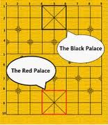
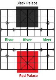
When we were mentioning about the castles with the highlights, what we meant were the palaces with highlights so they stand out
kind of like this>>>>>
Click image to enlarge.
image

Click image to enlarge.
image

Click image to enlarge.
image


Looking awesome buddy.
I am so excited to play this.
Image
Sergeant generalhead
 
Posts: 806
Joined: Mon Apr 26, 2010 10:09 pm

Re: Xiangqi [2 player map] [5/10] [P1/2] [V3]

Postby koontz1973 on Sat Oct 05, 2013 11:00 am

generalhead wrote:The new pieces are beautiful.

generalhead wrote:The background looks great.

Thanks
generalhead wrote:The new heading is Awesome, but it might look better standing out a little more.

Hows this?
generalhead wrote:Simple is not always bad, I would still like to see a version without the faces (sorry to keep mentioning this)
Might look good to see the names of the pieces stand out a little

Done.
generalhead wrote:With the castle movement is it suppose to say as well as inside the Palace?

No but changed the wording anyway. It should be all good now.
generalhead wrote:When we were mentioning about the castles with the highlights, what we meant were the palaces with highlights so they stand out

Done.
Image
Image
User avatar
Lieutenant koontz1973
 
Posts: 6960
Joined: Thu Jan 01, 2009 10:57 am

Re: Xiangqi [2 player map] [5/10] [P1/2] [V4]

Postby DearCyrus on Sat Oct 05, 2013 4:22 pm

I like the new version much better. Simple but elegant. That fits nicely with an Oriental theme.
User avatar
Corporal 1st Class DearCyrus
 
Posts: 183
Joined: Tue Mar 05, 2013 7:10 pm

Re: Xiangqi [2 player map] [5/10] [P1/2] [V4]

Postby generalhead on Sat Oct 05, 2013 6:58 pm

Image Love, Love, Love it!!!! ImageLets move it on!!!!
Sergeant generalhead
 
Posts: 806
Joined: Mon Apr 26, 2010 10:09 pm

Re: Xiangqi [2 player map] [5/10] [P1/2] [V4]

Postby koontz1973 on Sat Oct 05, 2013 11:33 pm

DearCyrus wrote:I like the new version much better. Simple but elegant. That fits nicely with an Oriental theme.

generalhead wrote:Image Love, Love, Love it!!!! ImageLets move it on!!!!

Thanks guys.

Now go and grab some friends to comment on this map. We need a lot more support and the gameplay a lot more fine tuning. ;)
Image
User avatar
Lieutenant koontz1973
 
Posts: 6960
Joined: Thu Jan 01, 2009 10:57 am

Next

Return to Recycling Box

Who is online

Users browsing this forum: No registered users