It might be an idea to use the background (light brown texture) instead of the dark brown for the mountains. The background acts also as an impassable at the borders of the map so it could be a logical choice to make them blend in more.Seamus76 wrote:Ouch, this one does sting a bit. Of course Rj makes it look extremely easy, but I'm willing to give it another go. The current mountains are the 4th version, and one of those thorns in my side. I thought we had come up with a winner, but I will give it my best shot and see what I can produce.7. I'm sorry, but those mountains do not go with the rest of the map. They stick out like a sore thumb, so they need to be changed. RjBeals did a quick tutorial on hand drawn mountains, take a look at it and see what you can do.
Thank you for your time and feedback. I really appreciate it.
Three Kingdoms of China - v10.1 [2015-02-01] p15 [Quenched]
Moderator: Cartographers
Forum rules
Please read the Community Guidelines before posting.
Please read the Community Guidelines before posting.
-
sannemanrobinson
- Posts: 255
- Joined: Mon Dec 20, 2010 6:35 am
- Gender: Male
Re: Three Kingdoms of China - v5.2 [2013-02-25] p10
-
gimil

- Posts: 8599
- Joined: Sat Mar 03, 2007 12:42 pm
- Gender: Male
- Location: United Kingdom (Scotland)
Re: Three Kingdoms of China - v5.2 [2013-02-25] p10
Hi Seamus this look wonderful. Maybe after your next update I will pop back and give it a once over. I love how rugged yet simplistic the style you have used as turned out.
Nice
Nice
What do you know about map making, bitch?
Top Score:2403natty_dread wrote:I was wrong
Re: Three Kingdoms of China - v5.2 [2013-02-25] p10
CURRENT UPDATE INFO - 2013-03-18:
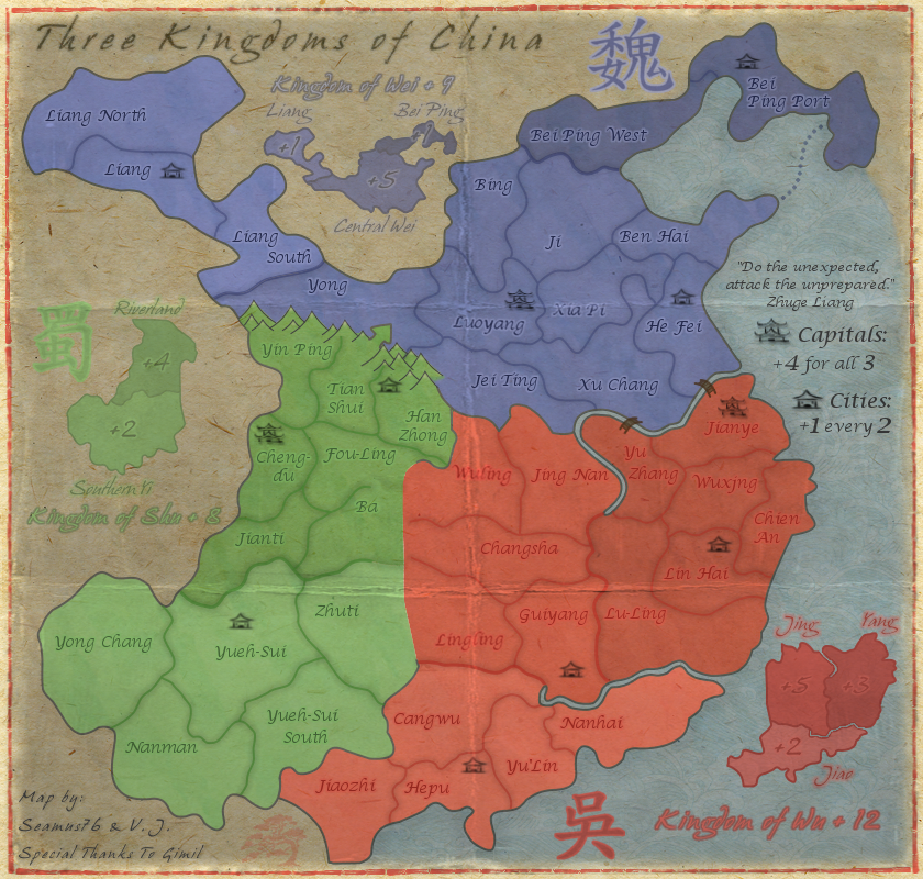
- Redid the Northern Shu mountains, and added a bit of "snow color" to the tops, but nothing else at the moment. Before I add more color to them, and more importantly before I do the Eastern mountains I want to get everyone's thoughts on these, especially isaiah40. I actually think they do look better and fit more with the style of the map, and if everyone agrees I'll go ahead and finish them up in this style.
CURRENT MAP VERSION
v6.0 - Large (840x800)
- Redid the Northern Shu mountains, and added a bit of "snow color" to the tops, but nothing else at the moment. Before I add more color to them, and more importantly before I do the Eastern mountains I want to get everyone's thoughts on these, especially isaiah40. I actually think they do look better and fit more with the style of the map, and if everyone agrees I'll go ahead and finish them up in this style.
CURRENT MAP VERSION
v6.0 - Large (840x800)
- Click image to enlarge.

-
koontz1973
- Posts: 6960
- Joined: Thu Jan 01, 2009 10:57 am
Re: Three Kingdoms of China - v5.2 [2013-02-25] p10
I like them. Lets hope the shading looks as nice.Seamus76 wrote:- Redid the Northern Shu mountains, and added a bit of "snow color" to the tops, but nothing else at the moment. Before I add more color to them, and more importantly before I do the Eastern mountains I want to get everyone's thoughts on these, especially isaiah40. I actually think they do look better and fit more with the style of the map, and if everyone agrees I'll go ahead and finish them up in this style.


Re: Three Kingdoms of China - v6.0 [2013-03-18] p11
those look nice. I wouldn't do much more with the shading or more color, sometimes less is more.
Re: Three Kingdoms of China - v6.0 [2013-03-18] p11
Thanks so much. I've been looking at them all day and you're right they don't need much if anything, maybe just a real light black brush, very low opacity.RjBeals wrote:those look nice. I wouldn't do much more with the shading or more color, sometimes less is more.
Re: Three Kingdoms of China - v6.0 [2013-03-18] p11
Well Seamus, these mountains are 1000 times better, as you said fits more with the theme. I don't think you will need to any shading. As for the snow on the mountains, I can't really see it. I had to look really close to see, even then the snow was very hard to notice. I think you can do away with the snow.
So all that being said, you have my blessing, and go and sin no more my child!
So all that being said, you have my blessing, and go and sin no more my child!
-
sannemanrobinson
- Posts: 255
- Joined: Mon Dec 20, 2010 6:35 am
- Gender: Male
Re: Three Kingdoms of China - v6.0 [2013-03-18] p11
THe one way assault from Tian Shui is less visible now, maybe adding a remark in the legend would be helpful for people who first see this map.
Between Han Zhong and Jet Ling the border would be more clear if there would be less mountains between those regions.
Overall I like the sharp and stylistic mountains!
Between Han Zhong and Jet Ling the border would be more clear if there would be less mountains between those regions.
Overall I like the sharp and stylistic mountains!
Re: Three Kingdoms of China - v6.0 [2013-03-18] p11
Aye mountains look good. I can barely notice the "snow" so if you like that, you'll have to make it more noticeable. My -only- gripe with the mountains would be that at least a couple of them should be blue as well.
Re: Three Kingdoms of China - v6.1 [2013-03-20] p11
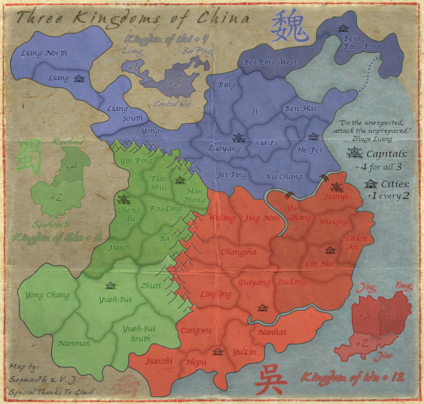
CURRENT UPDATE INFO - 2013-03-20:
- Added in the Eastern mountains.
- Redid the Northern mountains to include a few blue ones.
- Did a ton of general touch ups, border lines, stray pixels, etc. Still need to go over it again.
If this is acceptable I'll go ahead and start on the small map. Let me know your thoughts.
CURRENT MAP VERSION
v6.1 - Large (840x800)
- Added in the Eastern mountains.
- Redid the Northern mountains to include a few blue ones.
- Did a ton of general touch ups, border lines, stray pixels, etc. Still need to go over it again.
If this is acceptable I'll go ahead and start on the small map. Let me know your thoughts.
CURRENT MAP VERSION
v6.1 - Large (840x800)
- Click image to enlarge.
Re: Three Kingdoms of China - v6.1 [2013-03-20] p11
Looking for any kind of feedback on this last update. I think the mountains look awesome, if I do say so myself.
-
nolefan5311
- Posts: 1768
- Joined: Mon Nov 22, 2010 11:51 am
- Gender: Male
- Location: Florida
Re: Three Kingdoms of China - v6.1 [2013-03-20] p11
I agree Seamus. I really like them.
-
koontz1973
- Posts: 6960
- Joined: Thu Jan 01, 2009 10:57 am
Re: Three Kingdoms of China - v6.1 [2013-03-20] p11
Seamus, the only problem I can see with the current draft is the borders between bonus zones. Green is good, blue is OK but red is really hard for me to see. Mainly between Jing and Yang. Might be an idea to run the darker lines you have between bonus groups in between the bonuses themselves.
Re: Three Kingdoms of China - v5.2 [2013-02-25] p10
What about these?
isaiah40 wrote:1. The bonus amounts on the mini-map for Wu, especially on Yang is very hard to read. Maybe increase the outer glow a tad bit to make it stand out more. The same on Jing.
2. The bonus amount on Bei Ping is also hard to read, move it beside Bei Ping.
3. The Chinese character for Shu is hard to see as well, it needs to be darkened a bit.
4. Kingdom of Wu text is hard to tell exactly what it is. It looks like the "g" is an "s".
5. Kindom of Shu text is hard to read due to the light color you have. My suggestion is to use the same dark color you have for the bonus amounts.
6. I think that you will also need to adjust the kerning of the text for each "the Kingdom of ..." as the letters are very close together which also makes them hard to read. I can read them fine because I've been following the map, but first time players probably will have a hard time reading them.
Re: Three Kingdoms of China - v5.2 [2013-02-25] p10
Yes, sorry, working on these too. Just needed a quick break, the mountains took a lot out of me.isaiah40 wrote:What about these?isaiah40 wrote:1. The bonus amounts on the mini-map for Wu, especially on Yang is very hard to read. Maybe increase the outer glow a tad bit to make it stand out more. The same on Jing.
2. The bonus amount on Bei Ping is also hard to read, move it beside Bei Ping.
3. The Chinese character for Shu is hard to see as well, it needs to be darkened a bit.
4. Kingdom of Wu text is hard to tell exactly what it is. It looks like the "g" is an "s".
5. Kindom of Shu text is hard to read due to the light color you have. My suggestion is to use the same dark color you have for the bonus amounts.
6. I think that you will also need to adjust the kerning of the text for each "the Kingdom of ..." as the letters are very close together which also makes them hard to read. I can read them fine because I've been following the map, but first time players probably will have a hard time reading them.

Re: Three Kingdoms of China - v5.2 [2013-02-25] p10
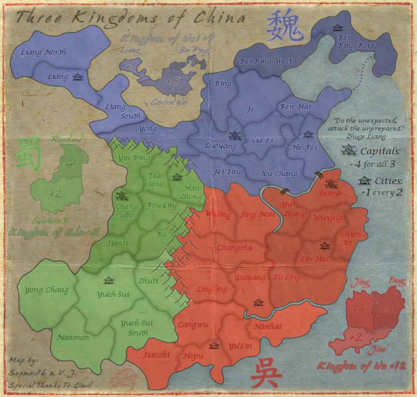
CURRENT UPDATE INFO - 2013-03-22:
- Made a lot changes, including all of the below from isaiah40, and Koontz, I also made those bonus lines darker, they should work for you.
v6.2 - Large (840x800)
- Made a lot changes, including all of the below from isaiah40, and Koontz, I also made those bonus lines darker, they should work for you.
CURRENT MAP VERSIONisaiah40 wrote:1. The bonus amounts on the mini-map for Wu, especially on Yang is very hard to read. Maybe increase the outer glow a tad bit to make it stand out more. The same on Jing. Done
2. The bonus amount on Bei Ping is also hard to read, move it beside Bei Ping. I don't want to move it out, but I did bring out the outer glow more, which makes it easier to read.
3. The Chinese character for Shu is hard to see as well, it needs to be darkened a bit.Done
4. Kingdom of Wu text is hard to tell exactly what it is. It looks like the "g" is an "s".
5. Kindom of Shu text is hard to read due to the light color you have. My suggestion is to use the same dark color you have for the bonus amounts.
6. I think that you will also need to adjust the kerning of the text for each "the Kingdom of ..." as the letters are very close together which also makes them hard to read. I can read them fine because I've been following the map, but first time players probably will have a hard time reading them.Numbers 4-6 should be good as well. I brought them all out more, and increased the kerning on all of the "Kingdoms" test from 2-4, so double. Also, used a separate layer for the "+" values so I could bring them closer to the text, rather than being effected so much by the kerning.
v6.2 - Large (840x800)
- Click image to enlarge.
Re: Three Kingdoms of China - v6.2 [2013-03-22] p11
Looking good seamus!! Just a couple more things. The text "Kingdom of Wu +12" and the associated character, I think they need a lighter outer glow like what you have around the text for the mini-map bonus regions. That's it for now.
Re: Three Kingdoms of China - v6.2 [2013-03-22] p11
The Characters are all solid colors, with a center color added by hand, so there is actually no outer glow on those. All of the colors are the same though, just reversed around. So the inside color of "Kingdom of Wu" is the same as the light border of the character, and the darker outer glow of the text is the same color as the inside of the character. The light border color of the character (inside Kingdom of Wu color), is the same as the outer glow of the smaller bonus region names. Not sure that all makes sense, but I'm basically playing off of the same colors for each area.isaiah40 wrote:Looking good seamus!! Just a couple more things. The text "Kingdom of Wu +12" and the associated character, I think they need a lighter outer glow like what you have around the text for the mini-map bonus regions. That's it for now.
Re: Three Kingdoms of China - v6.2 [2013-03-22] p11
Yes it makes sense. In that case I suggest to make the "center" color lighter to match the other two kingdom texts. It just looks out of place, and not only that but harder to see and read.
Re: Three Kingdoms of China - v6.2 [2013-03-22] p11
Would the mountains look even better with a bit of shadow on one side of the flanks?
Re: Three Kingdoms of China - v6.2 [2013-03-22] p11
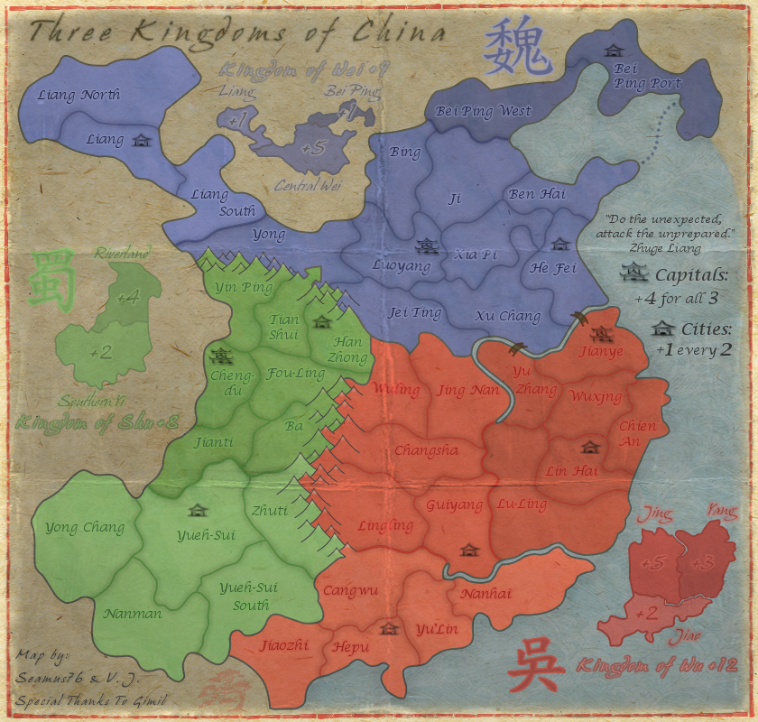
CURRENT UPDATE INFO - 2013-03-24:
- Swapped out the inner color of the "Kingdom of Wu" mini-map header for the lighter glow color of the mini-map bonus names. This looks a more in line with the other headers. Thanks, isaiah40.
- Moved the Wu character closer to the header.
Not sure there is much else I can do with this one.
CURRENT MAP VERSION
v6.3 - Large (840x800)
- Swapped out the inner color of the "Kingdom of Wu" mini-map header for the lighter glow color of the mini-map bonus names. This looks a more in line with the other headers. Thanks, isaiah40.
- Moved the Wu character closer to the header.
Not sure there is much else I can do with this one.
CURRENT MAP VERSION
v6.3 - Large (840x800)
- Click image to enlarge.
Re: Three Kingdoms of China - v6.3 [2013-03-24] p12
I think the Wu character would look better if the outside is a lighter color, which would also be in line with the other 2. While you get that done I'll go ahead and get this stickied for you!!
Re: Three Kingdoms of China - v6.3 [2013-03-24] p12
CURRENT UPDATE INFO - 2013-03-24:
Thanks for the sticky. Working on small version now as well.
CURRENT MAP VERSION
v6.4 - Large (840x800)
- Changed the Wu character outer edge color to the lighter color that's also inside the Kingdom of Wu header.isaiah40 wrote:I think the Wu character would look better if the outside is a lighter color, which would also be in line with the other 2. While you get that done I'll go ahead and get this stickied for you!!
Thanks for the sticky. Working on small version now as well.
CURRENT MAP VERSION
v6.4 - Large (840x800)
- Click image to enlarge.

-
SoulCrasher

- Posts: 1
- Joined: Fri Dec 24, 2010 2:06 pm
Re: Three Kingdoms of China - v6.4 [2013-03-24] p12
Looks great! Get this map out there ASAP, I want to play it.
-
ManBungalow
- Posts: 3431
- Joined: Sun Jan 13, 2008 7:02 am
- Location: On a giant rock orbiting a star somewhere
Re: Three Kingdoms of China - v6.4 [2013-03-24] p12
This indeed looks cool.
Though I think the colours of the regions are a little too intense. What's it like if you reduce the opacity of the playable area by 10 or 20% ?
Though I think the colours of the regions are a little too intense. What's it like if you reduce the opacity of the playable area by 10 or 20% ?
