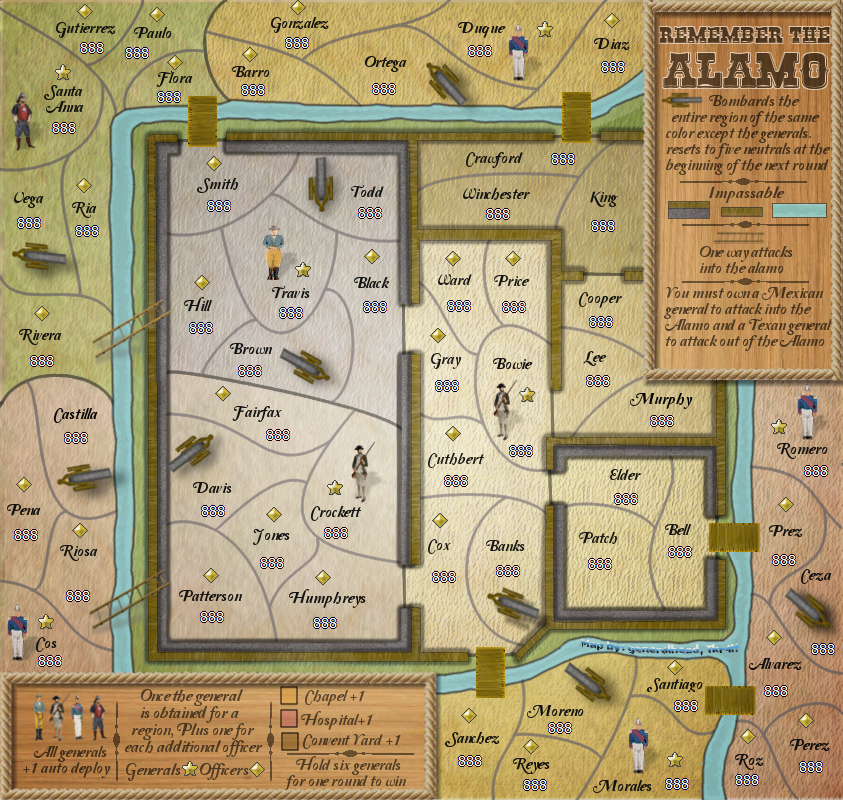
[Abandoned] Alamo
Moderator: Cartographers
Re: Alamo map [1/12/13] Pg16
this has really improved since I last checked in!!! I'm loving it!!! One suggestion. For the double cannons (ones that bomb two regions) would it maybe look better/be easier to distinguish if you signified that by just having one half of the cannon the one color and its second color across the other half? I think its something to consider, Looking AMAZING!!!
-

 Swimmerdude99
- Posts: 2498
- Joined: Mon Aug 09, 2010 6:07 pm
- Location: North Carolina


 2
2 5
5

 4
4 5
5
Re: Alamo map [1/12/13] Pg16
I guess this is where I'm confused GH.
You say that there will be 6 territory drops inside for player 1 and 6 outside for player 2, but the list shows 11. Am I missing something?
Also, something I missed, but you will also need to make sure that 1 region in each Hospital, Chapel, and Convent Yard are coded as neutrals so that a bonus isn't dropped (since you don't need a General for those bonuses).
1v1 will entail that one player is dropped inside of the Alamo and one player is dropped outside of the Alamo
So 6 territory drops inside fpr player one and 6 territory drops outside for player 2
2= 11
3= 11
4= 8
5= 7
6= 5
7= 5
8= 4
You say that there will be 6 territory drops inside for player 1 and 6 outside for player 2, but the list shows 11. Am I missing something?
Also, something I missed, but you will also need to make sure that 1 region in each Hospital, Chapel, and Convent Yard are coded as neutrals so that a bonus isn't dropped (since you don't need a General for those bonuses).
-

 nolefan5311
- Posts: 1768
- Joined: Mon Nov 22, 2010 11:51 am
- Location: Florida


Re: Alamo map [1/12/13] Pg16
nolefan5311 wrote:I guess this is where I'm confused GH.1v1 will entail that one player is dropped inside of the Alamo and one player is dropped outside of the Alamo
So 6 territory drops inside fpr player one and 6 territory drops outside for player 2
2= 11
3= 11
4= 8
5= 7
6= 5
7= 5
8= 4
You say that there will be 6 territory drops inside for player 1 and 6 outside for player 2, but the list shows 11. Am I missing something?
Also, something I missed, but you will also need to make sure that 1 region in each Hospital, Chapel, and Convent Yard are coded as neutrals so that a bonus isn't dropped (since you don't need a General for those bonuses).
Sorry, I meant to update that when I updated the starting drop map but forgot to do it. It is fixed now.
On the Starting neutrals and territories map on the front page it shows the three neutrals for those bonus regions. I installed them in those bonus regions, but made them so they wouldn't block the doorways; I hope you agree with this.
-
 generalhead
- Posts: 806
- Joined: Mon Apr 26, 2010 10:09 pm


Re: Alamo map [1/12/13] Pg16
I will update these graphics request ASAP. My good computer with my Alamo files was confiscated by my wife for a week. I hope to get it this weekend so I can implement some of these graphics request. Thank you all for your input and for being patient with me. 
-
 generalhead
- Posts: 806
- Joined: Mon Apr 26, 2010 10:09 pm


Re: Alamo map [1/12/13] Pg16
generalhead wrote:nolefan5311 wrote:I guess this is where I'm confused GH.1v1 will entail that one player is dropped inside of the Alamo and one player is dropped outside of the Alamo
So 6 territory drops inside fpr player one and 6 territory drops outside for player 2
2= 11
3= 11
4= 8
5= 7
6= 5
7= 5
8= 4
You say that there will be 6 territory drops inside for player 1 and 6 outside for player 2, but the list shows 11. Am I missing something?
Also, something I missed, but you will also need to make sure that 1 region in each Hospital, Chapel, and Convent Yard are coded as neutrals so that a bonus isn't dropped (since you don't need a General for those bonuses).
Sorry, I meant to update that when I updated the starting drop map but forgot to do it. It is fixed now.
On the Starting neutrals and territories map on the front page it shows the three neutrals for those bonus regions. I installed them in those bonus regions, but made them so they wouldn't block the doorways; I hope you agree with this.
Everything looks good GH.

Onwards and upwards. Congrats!
-

 nolefan5311
- Posts: 1768
- Joined: Mon Nov 22, 2010 11:51 am
- Location: Florida


Re: Alamo map [1/12/13] Pg16
Well done GH on your second stamp. Now the hard slog starts with graphics.  Lets see an update and we can work from that.

-

 koontz1973
- Posts: 6960
- Joined: Thu Jan 01, 2009 10:57 am


Re: Alamo map [1/12/13] Pg16
koontz1973 wrote:Well done GH on your second stamp. Now the hard slog starts with graphics.Lets see an update and we can work from that.
Wow.
-

 Seamus76
- Posts: 1574
- Joined: Fri Feb 25, 2011 5:41 pm
- Location: Atlanta, GA


Re: Alamo map [1/12/13] Pg16
-
 generalhead
- Posts: 806
- Joined: Mon Apr 26, 2010 10:09 pm


Re: Alamo map [1/12/13] Pg16
Seamus76 wrote:koontz1973 wrote:Well done GH on your second stamp. Now the hard slog starts with graphics.Lets see an update and we can work from that.
Wow.

-
 generalhead
- Posts: 806
- Joined: Mon Apr 26, 2010 10:09 pm


Re: Alamo map [1/12/13] Pg16
Moved the sig
Changed the glows around the cannons that hit two territories
Changed the territory borders
Removed paper rope thing in the upper right legend
lowered the opacity of wording in the legend
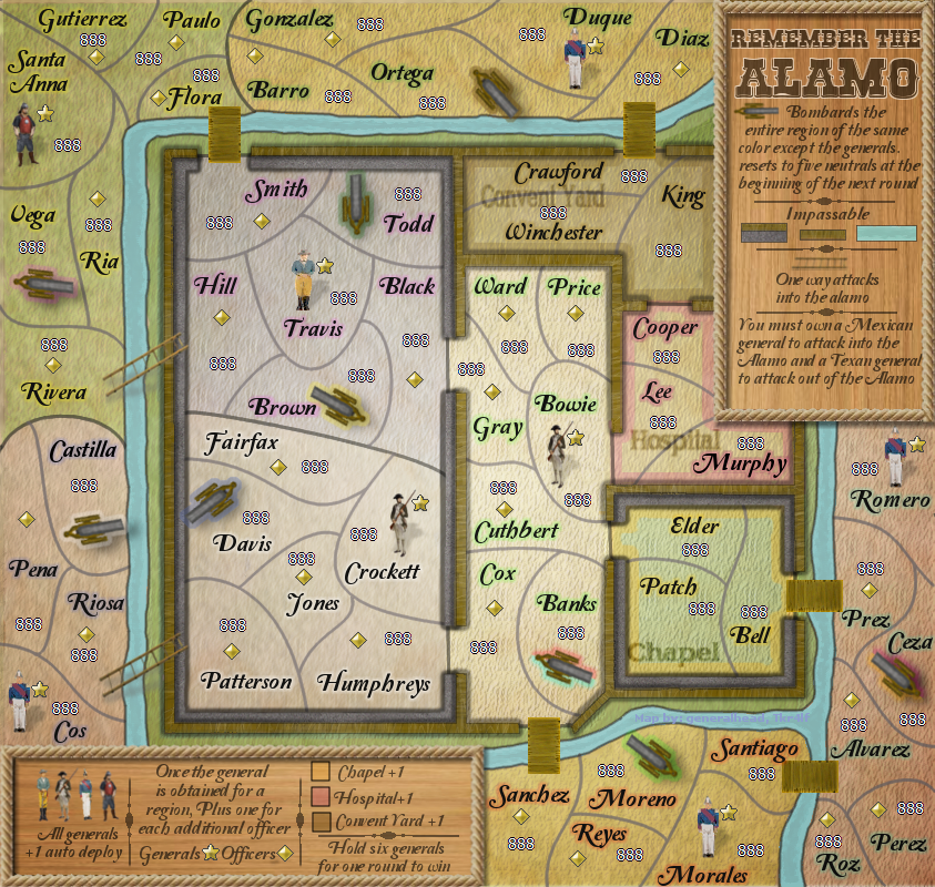
Need to reposition items in the upper right legend to fill it in more
Changed the glows around the cannons that hit two territories
Changed the territory borders
Removed paper rope thing in the upper right legend
lowered the opacity of wording in the legend

Need to reposition items in the upper right legend to fill it in more
-
 generalhead
- Posts: 806
- Joined: Mon Apr 26, 2010 10:09 pm


Re: Alamo map [1/20/13] Pg18
OK gh, time for the graphics. Do not get discouraged here as this is the time lots of things will be worked on and changed. Remember, not all of my ideas will work and others will have ideas as well. Please follow them but if you have a better option or you feel it is good enough now, then you need to say so.
Two things for you this time around.
Names.
What this will give you overall is a map that does not looked swamped by black text and a map that is less confusing as the amount of glows is reduced. You may need to make your colours for the map itself different again. But like the Mexican army side, you went earthy but with a light dark route. Do the same for the Alamo but with greys and browns. So Travis is a dark brown, Crockett is a light brown, Bowie can be a dark grey. What ever works to get them looking different enough.

Two things for you this time around.
Names.
- Region names are very large for the map. I understand the need to fill space but to have more name pixels than map pixels looks bad. Decrease the size of text to the same size as in the legend. You can them move names around so the 888s will fit on top or below.
- Glows, I am not liking these at all. I know you have redone them a couple of times, but lets hope third time is the charm. You have three types on the map and that is 2 to many. Around names, bonuses and canons. The glows are bright, colours do not match the map and too large. Here are some suggestions.
- Remove all glows from names apart from Generals.
- Replace these with glows like you have for the chapel.
- Glows should be the same colour as the backing. Just stronger. So if you have a green background like Santa Anna, the glow should be the same green for the bonus and for Santa Anna name.
- Remove all cannon glows. Replace these with symbols on the barrel of the cannon to indicate which area it bombards. Take some inspiration from Trench Warfare map. See how small the targets and shells are. This should be the size for yours.
What this will give you overall is a map that does not looked swamped by black text and a map that is less confusing as the amount of glows is reduced. You may need to make your colours for the map itself different again. But like the Mexican army side, you went earthy but with a light dark route. Do the same for the Alamo but with greys and browns. So Travis is a dark brown, Crockett is a light brown, Bowie can be a dark grey. What ever works to get them looking different enough.

-

 koontz1973
- Posts: 6960
- Joined: Thu Jan 01, 2009 10:57 am


Re: Alamo map [1/20/13] Pg18
I will work on this, it will take me a little while. I never get discouraged because every time I redo some thing I learn more about using gimp. Every time you make a suggestions my map keeps looking better and better. Thank for your hard work buddy.
-
 generalhead
- Posts: 806
- Joined: Mon Apr 26, 2010 10:09 pm


Re: Alamo map [1/20/13] Pg18
the more you use your gfx program the better, there are plenty of good guides out there too, check youtube out! There is a wide margin for improvement here, but there is potential here!
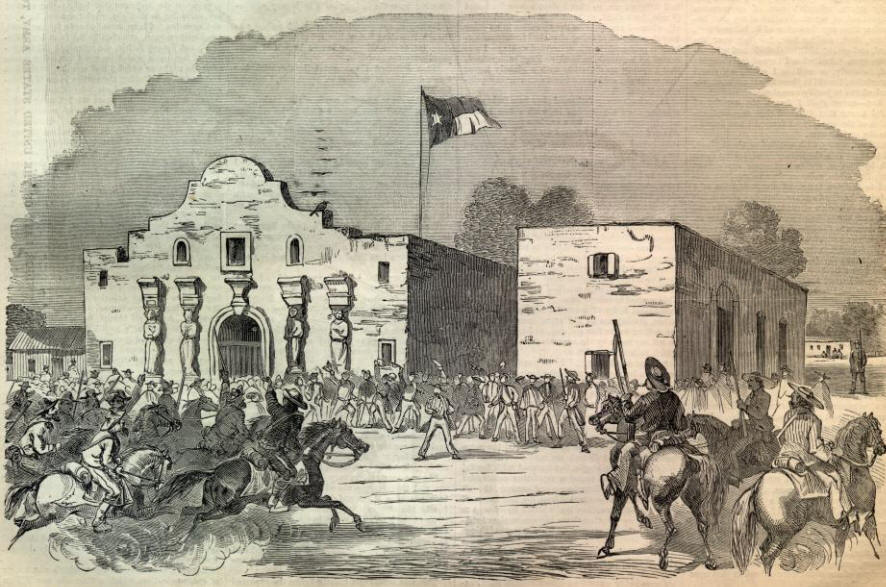
My main gripe for the moment is that this map is really missing any sort of graphical representation of the well known facade of the Alamo:
My main gripe for the moment is that this map is really missing any sort of graphical representation of the well known facade of the Alamo:


-

 RedBaron0
- Posts: 2657
- Joined: Sun Aug 19, 2007 12:59 pm
- Location: Pennsylvania


Re: Alamo map [1/20/13] Pg18
RedBaron0 wrote:the more you use your gfx program the better, there are plenty of good guides out there too, check youtube out! There is a wide margin for improvement here, but there is potential here!
My main gripe for the moment is that this map is really missing any sort of graphical representation of the well known facade of the Alamo:
Thanks RB0. At a few differing times I did have the Alamo facade located in a few differing areas of the map. The best place I had it was the background
of the legends. Everywhere I installed the facade didn't look like it fit. I agree with you that it would be neat to have it somewhere, but when placed didn't look good. I will try again though; now that the map has progressed some Maybe it will work now.
-
 generalhead
- Posts: 806
- Joined: Mon Apr 26, 2010 10:09 pm


Re: Alamo map [1/20/13] Pg18
Cool beans kiddo, get too it! A quick check confirmed my suspicions... your current map is a shade too big. Max size is 840x800, and you're a couple pixels over that at 843x800. I know its 3 pixels, but they gotta go, hate to see you get far into this only to have it be noticed later... 3 pixels can really make a ton of difference!!!


-

 RedBaron0
- Posts: 2657
- Joined: Sun Aug 19, 2007 12:59 pm
- Location: Pennsylvania


Re: Alamo map [1/20/13] Pg18
I think the last couple comments on the most recent map were excellent, especially Koontz's. Knowing that it is too big, this might not work, but what about a banner of the image of the Alamo across the top. There is probably a wide, thin one out there that could be across the top. not sure if that would work, but might be worth a try.
Z
Z
-
 Zorban
- Posts: 3
- Joined: Mon Jan 17, 2011 1:59 am


Re: Alamo map [1/20/13] Pg18
Zorban wrote:I think the last couple comments on the most recent map were excellent, especially Koontz's. Knowing that it is too big, this might not work, but what about a banner of the image of the Alamo across the top. There is probably a wide, thin one out there that could be across the top. not sure if that would work, but might be worth a try.
Z
Thanks my friend.
My good computer with my Alamo files is still gone and will be gone for another week. The computer I am using now has
a bad hard drive and is very hard to use. sorry for the delay of any updates. As soon as my computer is back in my possession I will get back to work.
-
 generalhead
- Posts: 806
- Joined: Mon Apr 26, 2010 10:09 pm


Re: Alamo map [1/20/13] Pg18
It's cool kiddo, you have time before anything gets binned, take your time.


-

 RedBaron0
- Posts: 2657
- Joined: Sun Aug 19, 2007 12:59 pm
- Location: Pennsylvania


Re: Alamo map [1/20/13] Pg18
[Moved]
It would appear that development of this map has stalled. The map is moved to the Recycling Box and put into Vacation status for the next 6 months. If the mapmaker wants to continue with the map, then one of the Cartographer Assistants will be able to help put the thread back into the Foundry system, after an update has been made.
It would appear that development of this map has stalled. The map is moved to the Recycling Box and put into Vacation status for the next 6 months. If the mapmaker wants to continue with the map, then one of the Cartographer Assistants will be able to help put the thread back into the Foundry system, after an update has been made.
-
 isaiah40
- Posts: 3990
- Joined: Mon Aug 27, 2007 7:14 pm


Alamo map [3/2/13] pg19
Still have a lot of work to do but here is a quick update
Last edited by generalhead on Sat Sep 28, 2013 5:46 pm, edited 2 times in total.
-
 generalhead
- Posts: 806
- Joined: Mon Apr 26, 2010 10:09 pm


Re: Alamo map [2/3] Pg1/19
Back you go GH, will look at it later for you. But please use
- Code: Select all
[BigImg][/BigImg]

-

 koontz1973
- Posts: 6960
- Joined: Thu Jan 01, 2009 10:57 am


Re: Alamo map [2/3] Pg1/19
Size of names is now nice. You can keep these as they are. Good job.
Colours are also really nice for the ground.
Check your settings for the region names text. Some like Fairfax look nice, others like Bowie look slightly of. Do you have the same setting for these? Sig is in a nice place but is hard to read.
Go back and read the glows part again. Get this done and you should start seeing a look that works.

-

 koontz1973
- Posts: 6960
- Joined: Thu Jan 01, 2009 10:57 am


Re: Alamo map [2/3] Pg1/19
One minor thing for now, you need to chop off 3px from the width to get the map to 840x800. Right now you are at 843x800. My suggestion is to chop it off the left side. I'll take a closer look at it later.
-
 isaiah40
- Posts: 3990
- Joined: Mon Aug 27, 2007 7:14 pm


Who is online
Users browsing this forum: No registered users

