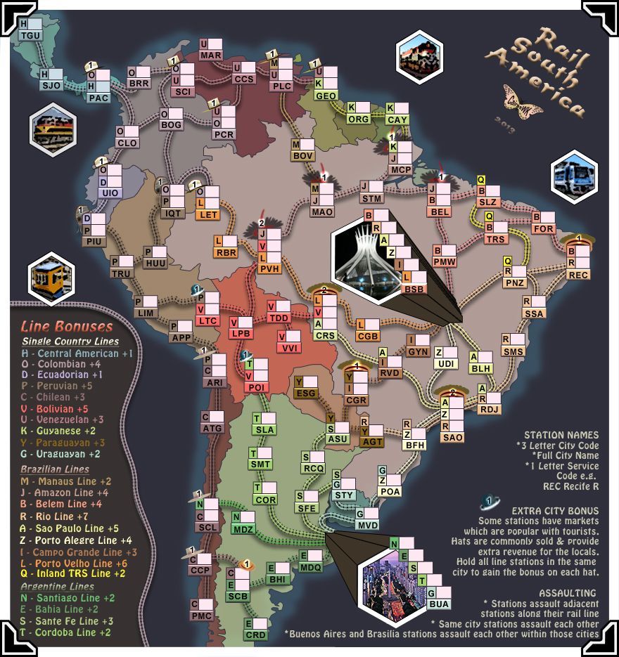
Thank-you for those comments.thenobodies80 wrote:Just a quick thought while I take a coffee at work...graphically speaking it looks really great, I strongly suggest to use always PS if the above is the result you can achieve using it.
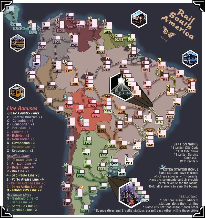
No time now to look at it in depth now but I have a quick suggestion about rail lines that maybe are worth a note for when you will reach the graphics stage. Some rail lines are very similar to the region color. I can distinguish them easily but , if i'm not wrong, someone had a similar issue when you did your africa map. I don't think they are not visible, but where the lines are short, it would be better to have more contrast with the land color, like the Belem Line. About belem line, JB BEL and B PMW could be done better (again just a note)
Finally I notice that you have a couple of short line that are a bit hidden behind the hats(?), like B FOR - BR REC for example.
Agree about have smaller and less pics about place, it's one of the thing I said to koontz to suggest to you, anyway we agree here so
Final Note, if you want to go BR, remember that , if approved, this map will be ONLY for battle royale. On that side it would make more sense to me to have this one as standard map and instead go with a World Rail Map (just an example) for battle royale...in that way you will have a series of rail maps and a final BR maps to complete the series....obviously these are just random thoughts.
The coffee break is taking too long...maybe it's time for me to go back to my RL work.
Again it looks very nice.
Nobodies
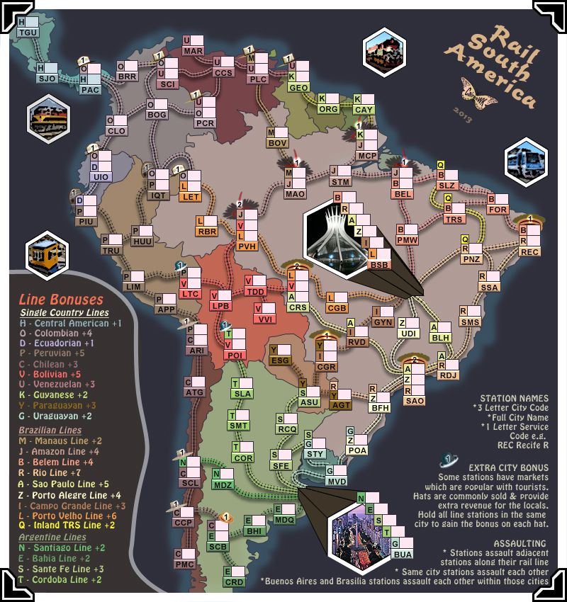
Please refresh the above image....some small changes to address the issues you mentioned...
1. Better drop shadow given behind the rail lines to make them stand out more...i think this is better than changing the line colours...this map because of the dark sea can cope visually better with darker drop shadow than could Rail Africa.
2. Lines have been moved around hats and altered to look better
I will have to consider more the BR situation.


